
How to Change the Menu Items Style on Hover and Click
Find out how to change the style and behavior of the mega menu items once the user hovers and clicks on the items.
As a matter of fact, you can easily create a stylish menu appearance using the JetMenu plugin. It allows the creation of eye-catching mega menu items and also provides hundreds of stylization options for the main menu and submenu items.
From this tutorial, you’ll learn how to adjust the style settings of the menu items on hover and click according to your needs with the JetMenu plugin for Elementor.
Customizing the Menu Items Style on Hover and Click
You can style up the main menu item’s appearance on hover and click from WordPress Dashboard or Elementor page builder. Proceed to the JetMenu > Main Menu Styles or directly via Elementor page builder to customize the styles for Mega Menu or Vertical Mega Menu widget.
In this tutorial, we’re going to change the menu items style on hover in Elementor.
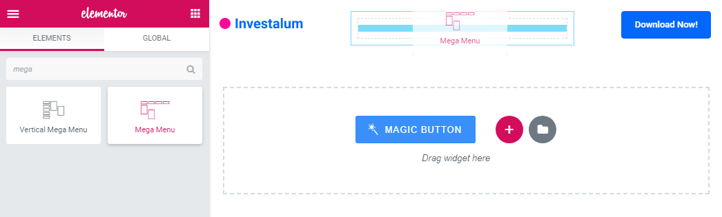
Add the Mega Menu widget to the page you’re editing or to the header template.
Open Style > Main Menu Items block in the sidebar on the left.
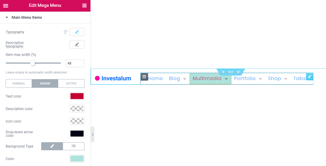
Here you can access the Normal, Hover, and Active settings for the Main Menu items.
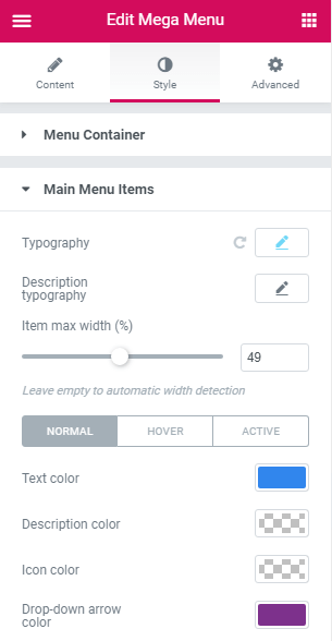
Just switch between the modes and define the different style settings for each of them whenever you need to alter the main menu item’s appearance on hover or when it becomes active.
E.g., you can change the item’s text or description color when you hover over it.
Colors and Backgrounds
Also, you can set a different color for the item’s icon and set the color for the drop-down arrow so that it changes when the drop-down opens.
You can as well set different background color and use different background types. E.g., keep using the solid color in the normal mode and add a gradient with the light opacity on hover and when the item becomes active.
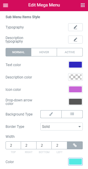
Another effect is to underline the item when one hover over it. To accomplish this, you can add a Solid border type on hover and then set its width to 0 px for Top, Right and Left and set the necessary border width (e.g., 3 px) for the Bottom value.
The border color can also be adjusted.
Actually, it can be fun to manage the main menu item’s appearance on hover and when they become active. You can create different stylish designs in a matter of a few clicks.
Customizing Sub Menu Items Style
Also, the same Hover and Active modes are available for the Sub menu items. To access them, open the Sub Menu block and here, look for the corresponding settings.
After you’re done with creating the styles for Hover and Active modes of your menu items, save all the changes by clicking the Update button below.