
Select Filter Overview
Learn how to create the JetSmartFilters WordPress plugin’s Select Filter and manage its settings in Elementor/Block editor/Bricks to display Custom Post Types posts, meta fields, taxonomies, terms, and queried data.
The JetSmartFilters plugin’s Select Filter displays selected data from meta fields, taxonomies, terms, and queries. It sets the predefined values to the default ones and shows the filtered data on any Block Editor/Elementor/Bricks edited pages.
A new filter can be created in the WordPress Dashboard > Smart Filters > Add New tab.
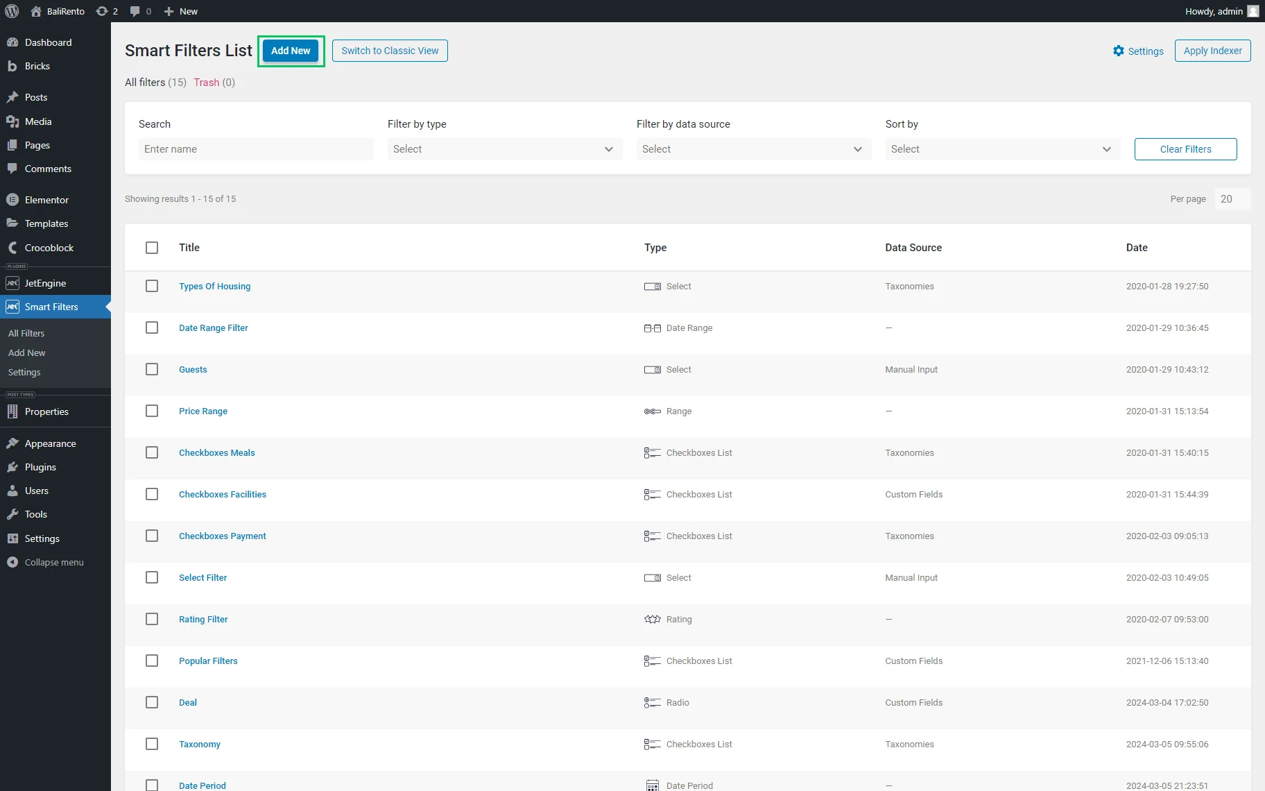
Pressing the “Add New“ button opens the Edit Filter page.
Filter Settings
The page has the following setting sections:
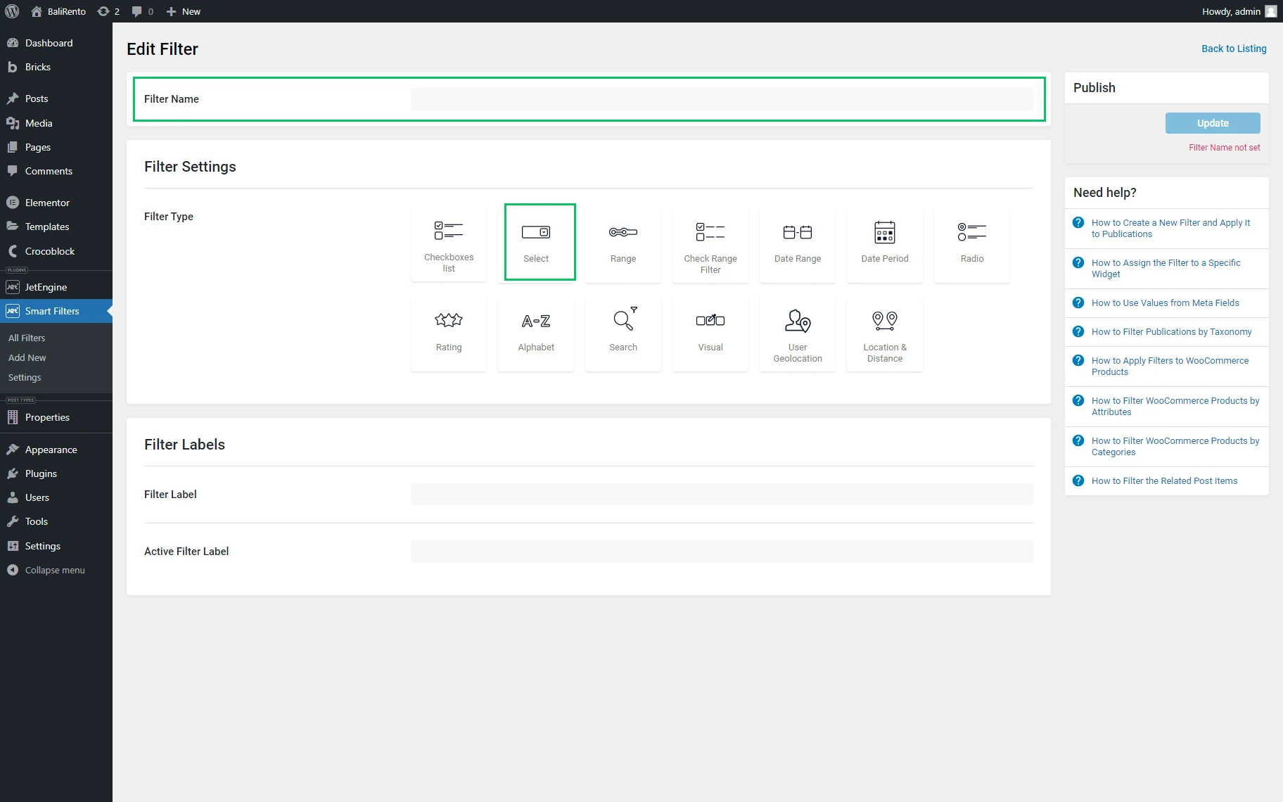
- Filter Name 一 a text field for typing the filter’s name;
- Filter Settings 一 a set of Filter Type options allowing for selecting the needed filter type. Now, the “Select” option should be chosen as the Filter Type;
- Filter Labels 一 a block with two text fields representing the Filter Label and Active Filter Label.
Once picked, the “Select” Filter Type activates the following settings: Is hierarchical toggle, Data Source drop-down menu, and Use Default Filter Value toggle.
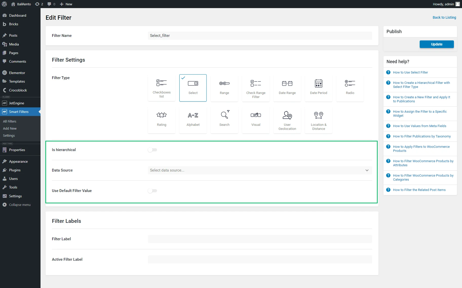
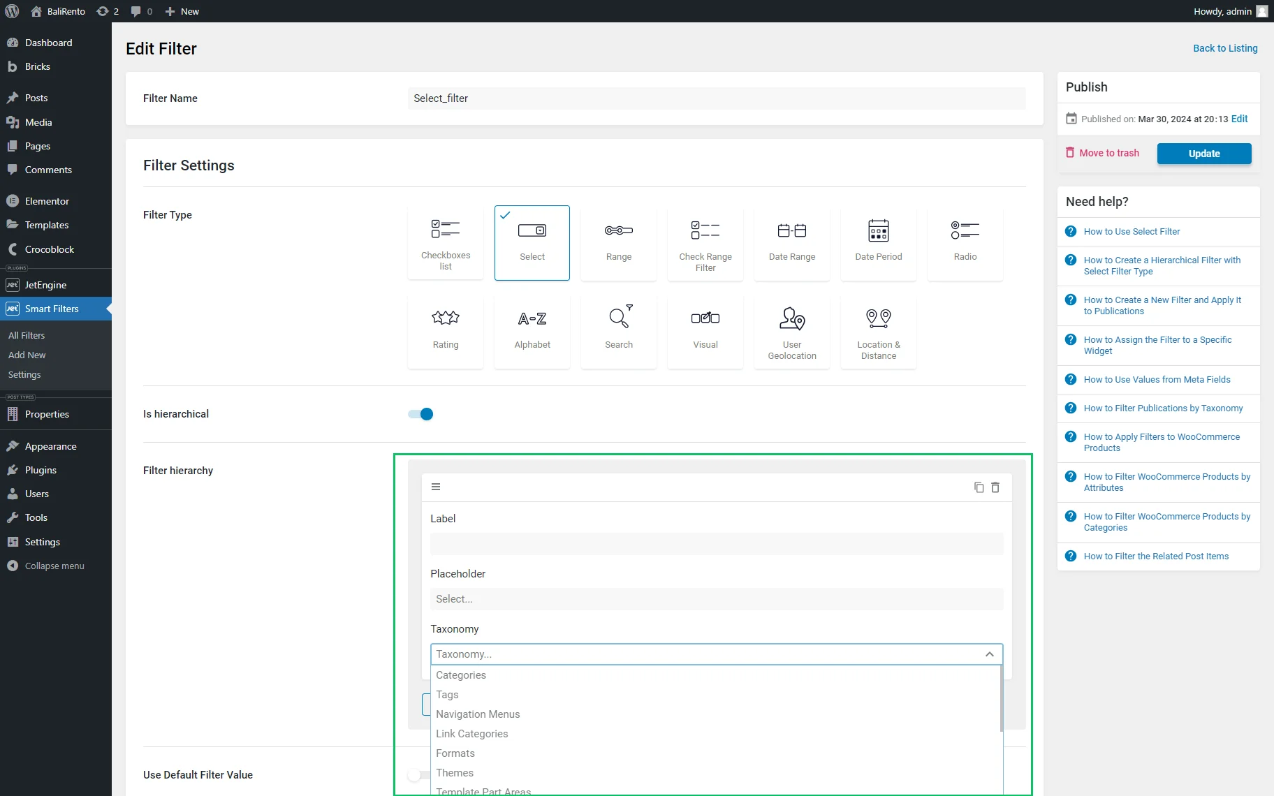
After enabling the Is hierarchical toggle, the Data Source drop-down menu will be hidden, and the Filter hierarchy window will be shown. The Filter hierarchy window includes the Label and Placeholder text fields and the Taxonomy drop-down list to build the filter hierarchy for the “Tags,” “Categories,” “Formats,” etc.
Data Source drop-down menu
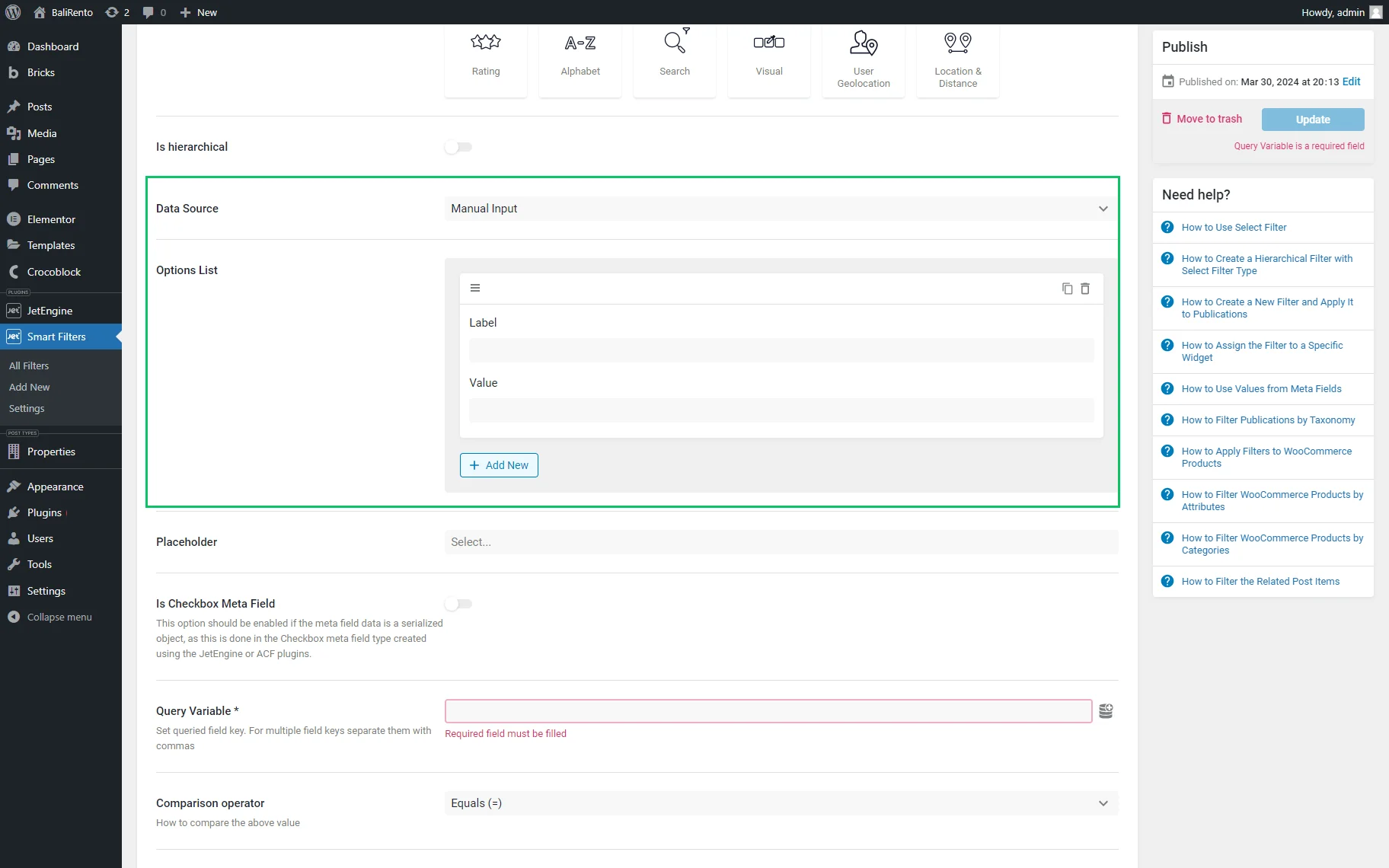
If the Is hierarchical toggle is disabled, the Data Source drop-down menu is activated.
This drop-down list allows selecting data sources among the “Taxonomies,” “Manual Input,” “Posts,” “Custom Fields,” “JetEngine Custom Content Types,” “JetEngine Glossary,” “JetEngine Query Builder,” and “JetEngine Query Builder Switcher” options. Read the Filters Data Source Overview tutorial to know how to select the needed data source.
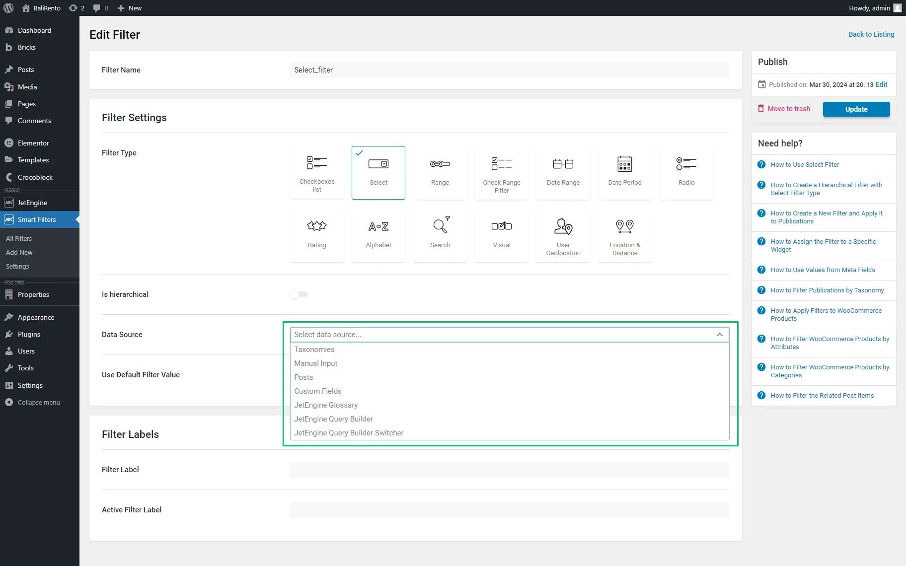
If any option from the Data Source drop-down list is selected, the Placeholder field, Is Checkbox meta field toggle, Query Variable field, and Comparison Operator drop-down list are activated. In contrast, some options from the list turn on specific settings (i.e., the “Taxonomy” option, if selected, activates the Show empty terms and Show only children of current term toggles).
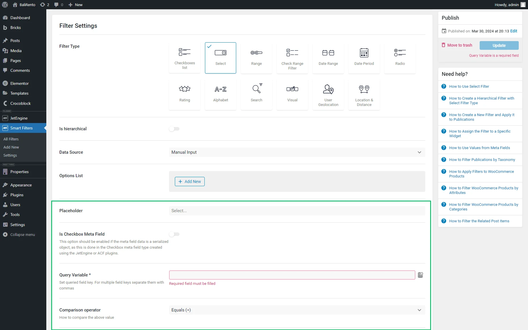
- Placeholder 一 a field that is intended for typing a text to be displayed in the dropdown instead of the default “Select” text;
- Is Checkbox meta field 一 a toggle that allows filtering metadata stored as an array (e.g., data from the “Checkbox” meta field saved as an array, “Select” meta field saved as multiple select, “Posts” meta field saved as multiple, or “Checkbox” meta field of ACF). This option is available for metadata created using the JetEngine or ACF plugins, but the toggle should be disabled to filter taxonomies;
- Query Variable — a field that allows selecting the needed qualified field key. Pressing the dynamic tag icon unrolls the list of queries available;
- Comparison Operator — a drop-down menu that allows selecting how to compare the above values, i.e., by the “Equals,” “Less than or equals,” “Greater than equals, “LIKE,” “EXIST,” or “REGEXP” options. These fields are available for any source type except the “Taxonomy” option;
- Use Default Filter Value — a toggle that activates the Default Filter Value text field, allowing the data from the metadata, categories, dynamic tags, and posts to be displayed with predefined values.
You can also read how to Create Predefined Filter Results with Dynamic Tag. The setting works without query strings and is intended to display results as the initial state. Additionally, check for more information about Redirecting to Predefined Results via Select Filter.
Taxonomies
The “Taxonomies” Data Source can be selected to use the term titles as the labels for the chosen filter. For instance, one might have the “Clothes” post type and “Colors” taxonomy and will assign each list item to different terms, as clothes may be in various colors. So, this filter will display the terms and filter the posts by them.If the “Taxonomies” option is selected, the Taxonomy drop-down list with “Categories,” “Tags,” “Formats,” “Themes,” and more options will be activated:
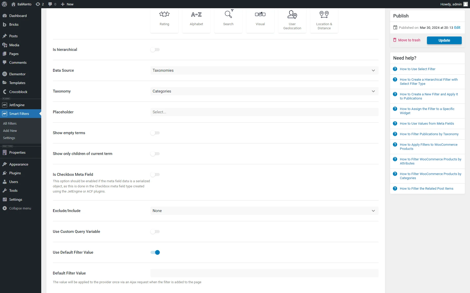
- Show empty terms — a toggle which, if enabled, allows showcasing the empty terms if no items were filtered;
- Show only children of the current term — a toggle which, if enabled, displays child terms in the hierarchy for the parent term on the parent category archive. On all other pages, all categories will be displayed;
- Exclude/Include — a drop-down list with three options: “None,” “Include,” and “Exclude,” allowing to display or hide some of the terms. If selected, the “Include” or “Exclude” option activates the Exclude Or Include Items drop-down menu, which lists terms to be included or excluded. If the “None” option is selected, no terms will be included or excluded;
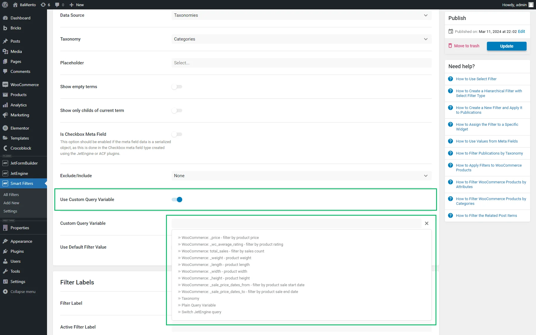
- Use Custom Query Variable — a toggle which, if enabled, shows the Custom Query Variable field allowing one to type or select a variable from JetEngine’s or WooCommerce’s queries. This setting allows filtering the related items and is not necessary for the “Taxonomy” Data Source option.
Manual Input
The “Manual Input” Data Source option allows adding filtering options manually. Selecting the “Manual Input” option activates the Options List tab and the Query Variable field:
- Options List — a section that includes Label and Value fields. Clicking the “Add New” button activates a new block with the same fields for adding new options to select. The number of options to choose from is not limited;
- Query Variable — a required field for the query variable key. If the metadata are filtered, the Name/ID of the meta field should be inserted into this field, and multiple meta fields should be separated with commas.
Posts
The “Posts” option of the Data Source drop-down list allows data from different post types to be displayed, such as “Posts,” “Pages,” “Media,” meta fields, related items, taxonomies, and queries.
The Filters Data Source Overview details how to filter related items.
Selecting the “Posts” option activates:
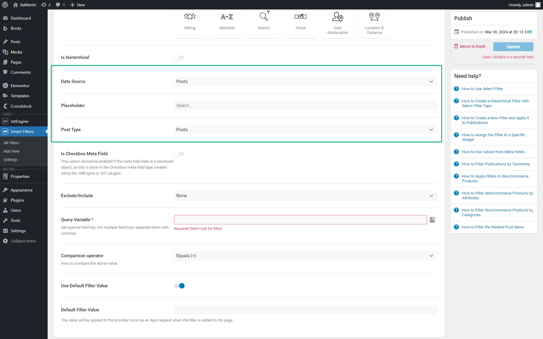
- Post Type — a drop-down menu for selecting the needed post type for filtering;
- Exclude/Include Items — a drop-down menu with three options: “None,” “Include,” and “Exclude” allowing to display or not display some of the terms. No terms will be included or excluded if the “None” option is selected.
Custom Fields
The “Custom Fields” Data Source option allows displaying the values of the meta field as an option in the filter. If selected, this option activates the following settings:
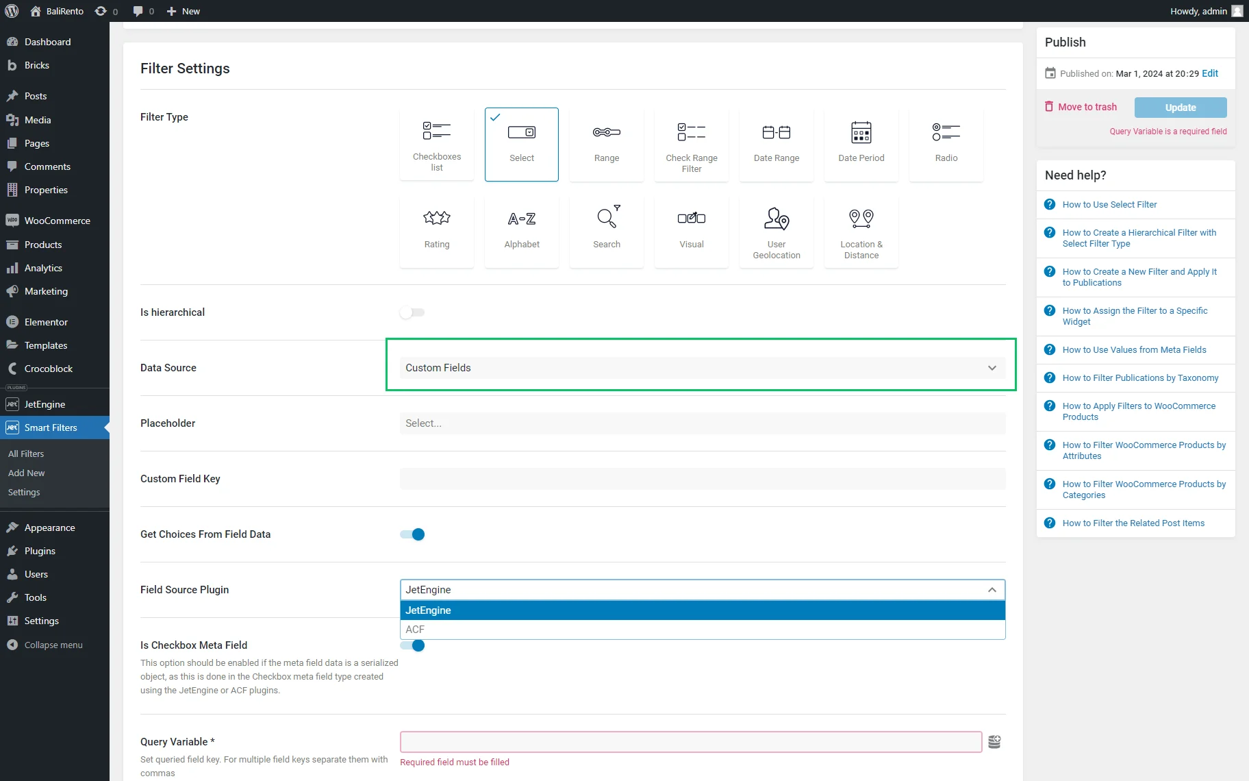
- Custom Field Key — a field for adding a custom field key that will be used as the source for filtering;
- Get Choices From Field Data — a toggle which, if enabled, allows selecting the custom meta fields built with the one of the plugins presented in the Field Source Plugin drop-down list.
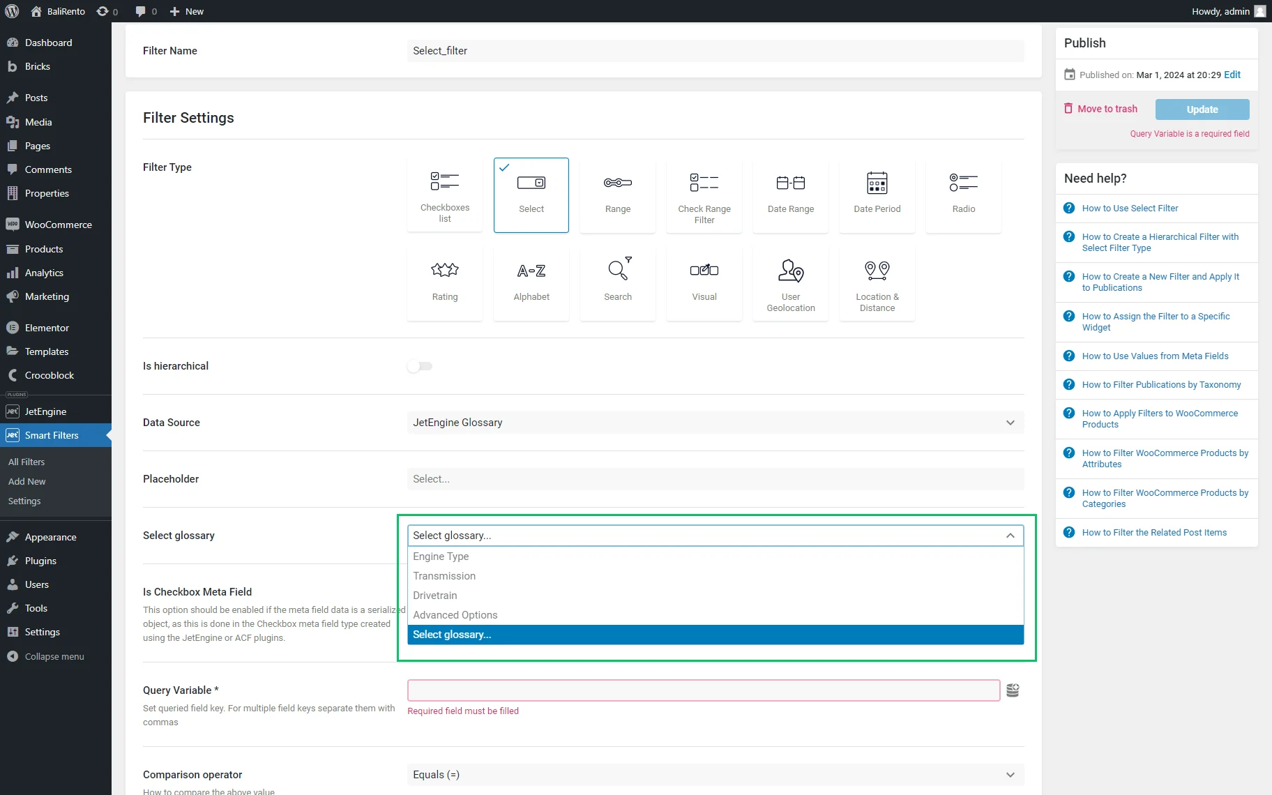
JetEngine Glossary
If enabled, the JetEngine Glossary option activates the Select glossary drop-down list, allowing users to select the needed glossary.
JetEngine Query Builder
If selected, this option activates the following fields:
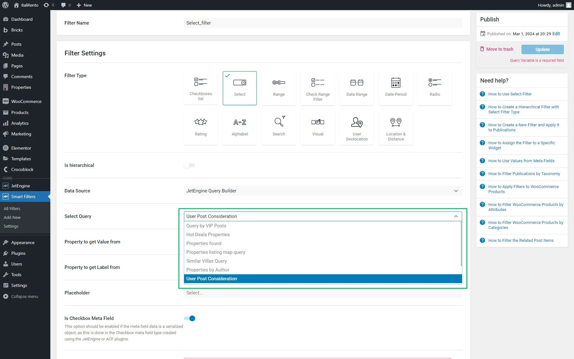
- Select Query — a drop-down list of all built queries;
- Property to Get Value from — a field for selecting the source of the options’ value. The “ID” value is set here by default;
- Property to get Label from — a field for selecting the source of the options’ label. The “post_title” value is set here by default.
Read more about How to Create Filters with Query Builder Source in the tutorial.
JetEngine Query Builder Switcher
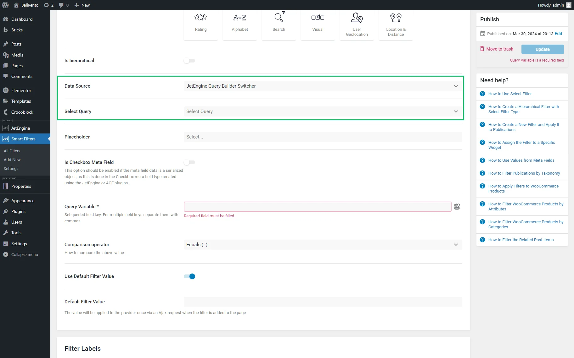
Find out more about How to Set Query Builder Switcher Data Source.
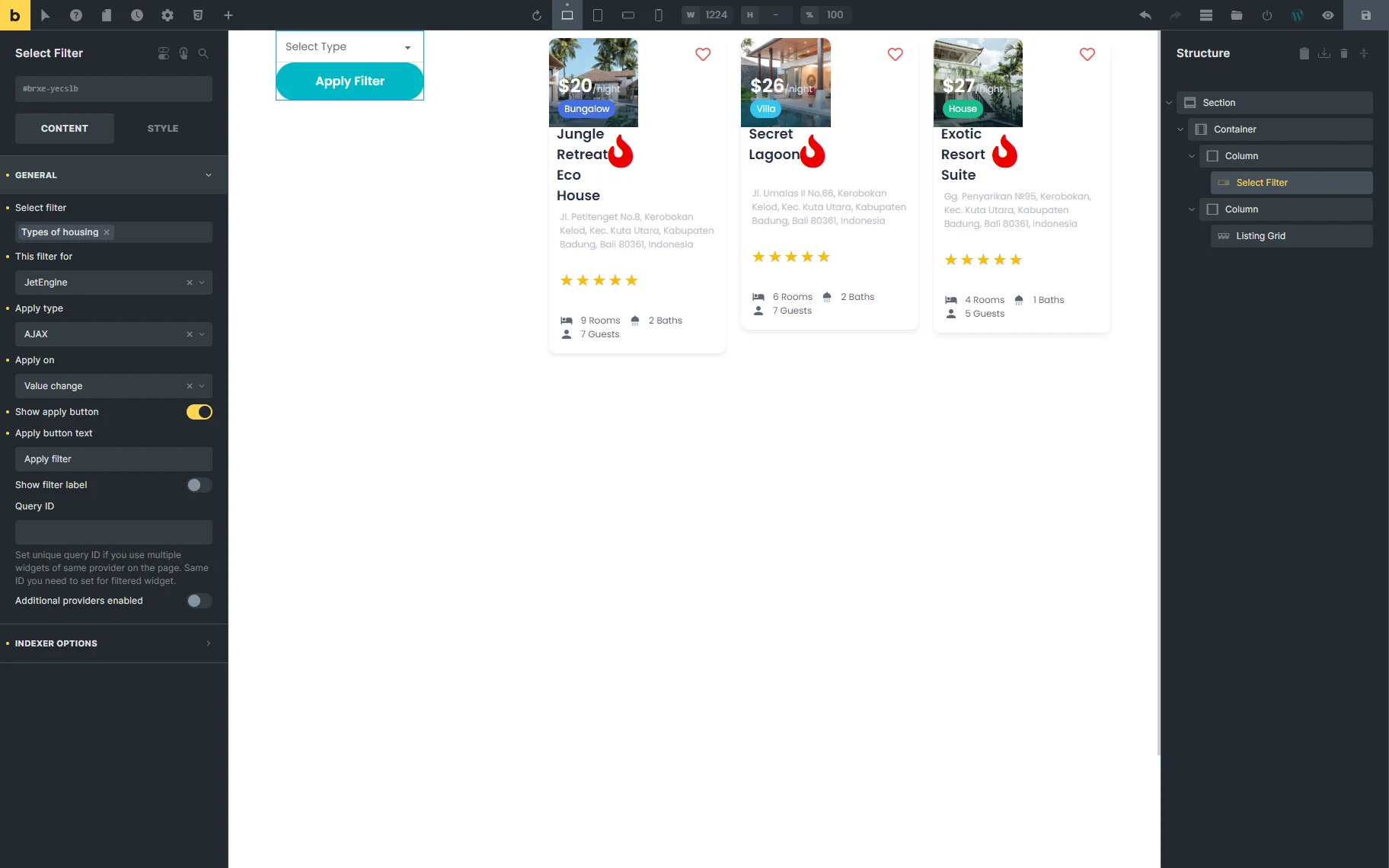
Select Filter Widget in Elementor
The Select Filter widget is available in the Elementor Page Builder.
Content
The Content tab includes the following settings:
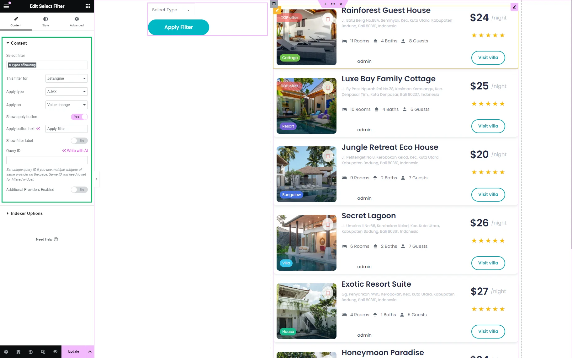
- Select filter — a bar that allows selecting the needed filter;
- This filter for — a drop-down list that allows selecting the filter provider as “JetEngine,” “JetEngine Calendar,” JetEngine Maps,” etc. The selected provider is associated with the widgets that can be connected to the page;
- Apply type — a drop-down list that allows selecting which apply type is preferable for this filter: the “AJAX” (filtering using the AJAX method without reloading the page, which makes the filtering through the products much faster for the visitors), “Page Reload,” (reloads the page each time the visitor applies the filter) or “Mixed” (adds values to the page’s URL without reloading the page; therefore, the URL can be copied to send the search results);
- Apply on — a drop-down list that allows selecting how to apply the filter: by the “Value change” or by clicking the “Apply” button;
- Show apply button — a toggle that adds a button to apply the filter. This toggle, if enabled, activates the Apply button text field, where one can complete the text on the corresponding button. This toggle should be activated if the “Click on apply button” option in the Apply on drop-down menu is selected;
- Show filter label — a toggle that enables or disables the appropriate label;
- Query ID — a field that allows selecting a query for selecting a widget for filtering if some widgets on the same page are applied or assigning a filter widget to a specific Listing Grid. Also, read the tutorial on Applying Filters to Several Widgets on Page to know how to apply the filter to one of some widgets on the page;
- Additional Providers Enabled — a toggle that activates the Additional Providers List button that allows applying the filter to additional providers on the page. The tutorial details How to Apply One Filter to Different Providers.
Indexer Options tab
The Indexer Options is intended to display counters for the filtered items. The tab has the following settings:
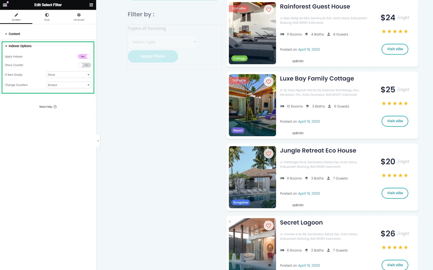
- Apply Indexer — a toggle that allows saving the filtering data in the database with further retrieval;
- Show Counter — a toggle that allows showing the number of obtained filter results;
- If Item Empty — a drop-down menu which allows showing, hiding, or disabling the results;
- Change Counters — a drop-down list with the “Always,” “Never,” and “Other Filters Changed” options, allowing displaying the item counter according to the selected option. Read How to Index Filters with Indexer Option in the tutorial.
Style settings
The Style settings manage the typography, colors, background, borders, padding, and alignment options of the Content, Select, Label, Button, and Grouped Filters.
Advanced settings
The Advanced settings customize the Layout settings (i.e., Margins, Padding, Width, etc.), Dynamic Visibility, Motion Effects, Transformation, and more.
Select Filter Block in Gutenberg
In the Block Editor, the Select Filter block has the same settings as in Elementor.
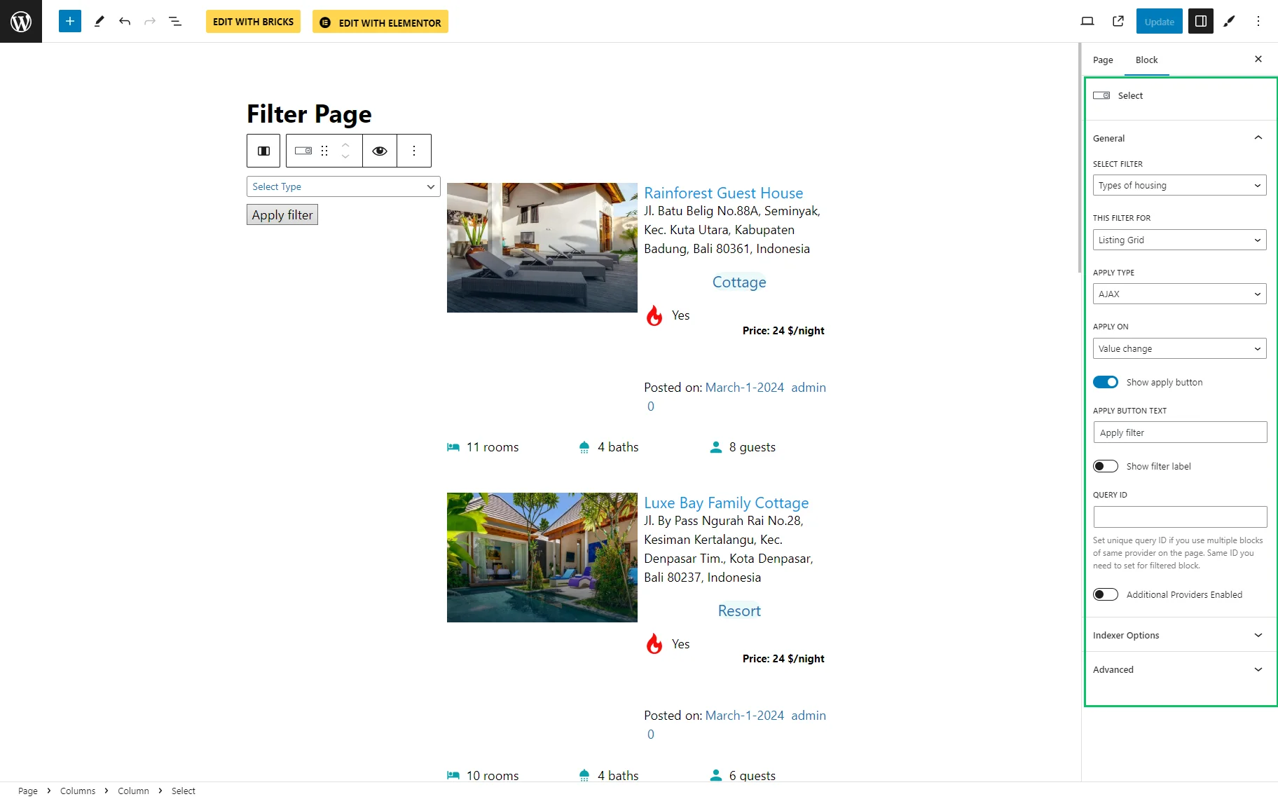
alt text: select filter block settings
The Advanced tab has the ADDITIONAL CSS CLASS(ES) field, which allows adding CSS class(es) to change the block’s appearance.
Select Filter Element in Bricks
In the Bricks builder, the Select Filter element has the same settings as in Elementor.
Front End Result
The result can be later checked on the front end. Now, the Select Filter is active.
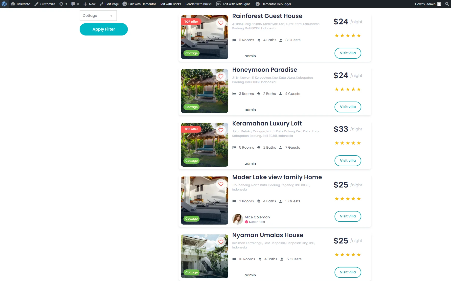
That’s it. Now you know how to help your WordPress website users filter posts or products on the page using the “Select” filter available with JetSmartFilters.