It’s quite sad when you are lost or the link you’ve entered doesn’t lead anywhere or is broken (ouch! 😲). So the 404 page is on its way to the rescue. It is the place on the website where designers and copywriters can finally afford to get a little quirky. Or smart. Or both. But there are a few things we need to talk about.
What Is a 404 Page, and How to Customize It?
Let’s figure things out: what is that 404 page? Can it be easily modified in WordPress? And why is it important?
Page 404 and legends
Legends say that in those dark and gloomy times when the Internet didn’t exist, there was room number 404 in CERN (The European Organization for Nuclear Research, which is in Switzerland). The brightest minds of that time decided to create a database to collect information about their research. So they called it “a 404 database.” Later, it grew enormously as the world wide web and finally snarred us all.
A nice story, right? Well, in fact, 404 is just an HTTP response status code, and the 404 room never existed in CERN. All the codes that start from 4 mean client errors (and those beginning with 5 mean server errors). So, if you see the 404 error, that simply means that the server is fine, but something happened on the browser side – for example, it tries to open a non-existent URL.
404 page, SEO, and UX
Google states that 404 errors don’t directly hurt the website’s SEO ranking. But there are several things to consider:
- If a 404 error happened not because of the user who typed the wrong URL, it’s not a problem. But if the page actually existed but later has been moved or renamed, it’s a different story. If that page has a big reference (link) weight, you will lose it if you do not set up a 301 redirection that transfers that weight automatically.
- In case there were many links leading to that page, you will lose all that traffic unless you set up a 301 redirect.
- If there are a lot of broken links, they simply waste search engines’ crawling budget.
In conclusion, redirection is essential if the page has been moved, renamed, or deleted.
For the rest of the cases (when a visitor used a wrong URL or the site developer made a mistake), there can be at least three scenarios about what to display to the user:
- 404 page that says that the URL is wrong and (probably) offers you to check other links;
- redirection to the Home page;
- redirection to the Sale or other pages you are promoting.
Some developers use redirection to the home or promoted pages. But it’s confusing for visitors because they might not understand why and how they got there, and it most probably makes them leave the website feeling that something doesn’t work properly there. So, it’s a bad user experience practice.
Instead, you can create a cool 404 page with links to pages you want users to visit. It will help lead them where you want them to be and create additional internal links.
For some URLs, a 301 redirection might be a better solution, for example, when you can guess which page people actually meant – let’s say, from yourwebsite.com/shok to yourwebsite.com/shop.
How to customize the 404 page in WordPress?
There are two types of plugins you might need for your error page:
- plugins for redirecting;
- plugins for customizing the page template.
You can find a lot of free plugins for 301 redirects (or set it up manually by modifying the .htaccess file, of course).
For customizing the design, you can use the 404 Page plugin: simply create a page with a favorite builder and then assign it with this plugin as the error page.
If you are a Crocoblock user, you don’t need this plugin because you can easily do it with JetThemeCore.
Also, if you use a theme that supports full theme editing, this template can be customized there. Alternatively, if you have Elementor Pro, you can do the same.
Ten 404 Pages for Your Inspiration
Mantra Labs and disappearing
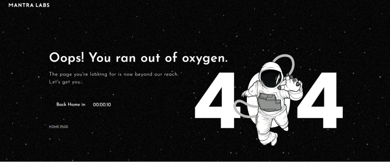
Space is the central visual theme of this website of this consulting agency that specializes in UX and technologies. So they use the witty phrase “Oops, you ran out of oxygen” when the visitor is a bit lost or an error happens. The cool part is that it has a timer that brings you back to the main page after ten seconds. During this time, an astronaut moves away, gets smaller, and finally disappears inside the “0” digit. Much more fun than just being redirected somewhere immediately, isn’t it?
Ueno and several versions of the error page
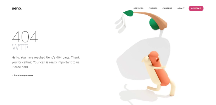
The content creators of this website, without a doubt, are legends. Because there are at least five versions of the 404-page text, so every time you find yourself there, it’s pure entertainment. They tell stories about a wild goose chase, web admins in the nineties, or simply make fun of most companies’ standard “caring” messages. And there’s an animation of a running hotdog with a spinning sphere background.
Why it’s a hotdog and why it runs in from the loop of flying pictures of reality – is another question that brings a smile.
Yes, of course, this is a website of an agency. Their website is full of witty texts, and even preloaders are entertaining. This is an amazing example of how to make people stay longer on their pages.
Wizarding World with a pinch of Floo powder
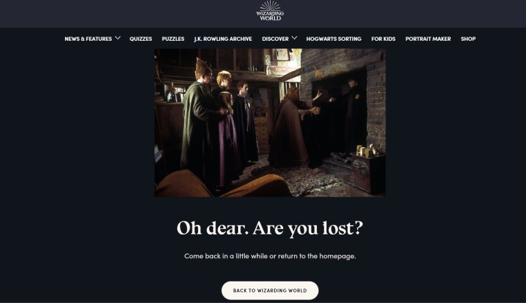
I always desire to have some Floo powder during long and tedious journeys; the only problem might be a chimney shortage. Anyway, this website gives us hope not only by telling an incredible story but also with its 404 page. Very simple and straight to the point.
Alts Digital and inside jokes
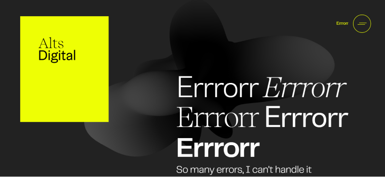
Guess what, ladies and gentlemen? Yes, of course, this is a website of a digital agency. It uses large typography, many animations (that don’t glitch and load very fast, by the way), and not-a-dad’s-jokes. The big yellow block is a link to the main page; also, there’s the “Error” word next to the hamburger icon instead of the normal “Menu” word on the rest of the pages. The animated background is aligned with the visual style of the rest of the site. Good job, that’s it.
Maibru and calming Bob Ross
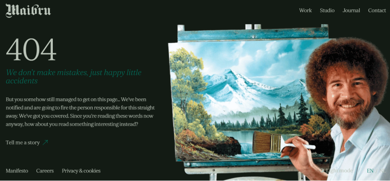
If you run out of calming pills while in a stressful situation, just start to watch Bob Ross’s videos. This legendary artist made thousands of people feel confident while learning painting and convinced them that almost any mistake could be fixed if you use some creativity. He wasn’t afraid to make them himself. Well, enough words of wisdom; just look at this error page on the website of another (here we go again) agency.
Bluepath and some encouraging news
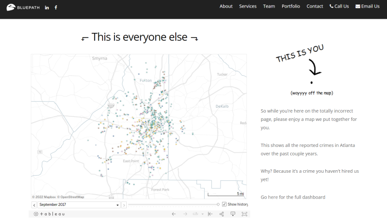
If Bob Ross is not enough for you, this is the page that gives hope. It’s a website of a company from Atlanta that works with data structuring and visualization. On the left, you can see an interactive city map with the location of all the crimes committed during the given period. But the arrow on the right reassures the lost visitors that they are safe but a little bit out of the path – a fantastic way to show some skills, even on the “not found” page.
Eva Habermann and some drama

This is an amazing example of a website of an actress. It shows some short videos from different movies Eva took part in, tells what she does, and gives categories to choose from. But the error page is the most dramatic here: there’s no header, just a black background, this photo, and a straightforward statement that I broke Eva. Poor her, so I’d better be back to the home page.
Coulee Creative with some facepalms
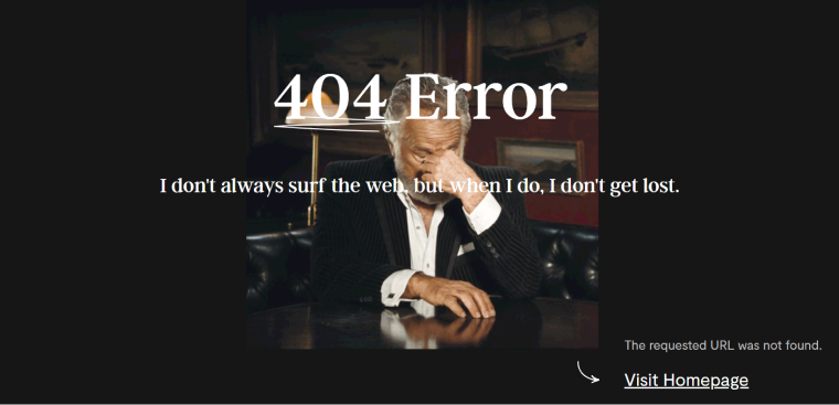
This design and branding agency has a bold statement to tell us. And a facepalming GIF to show. Actually, it fits their overall website design and vibe. Definitely approved!
Ready To Go Survival and times when grass was greener
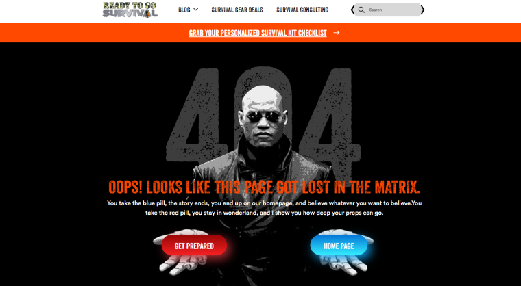
This website sells survival gear and kits for emergencies and helps people prepare for them and develop self-defense, tactical, and survival skills. So even using a character from an old movie doesn’t feel irrelevant.
By the way, the design solution of this website is very interesting: they use a logo that looks as if it hasn’t been changed for 20 years. But the rest looks quite modern. Together with the topic the site is about, it seems remarkably applicable.
Trippin non-stop
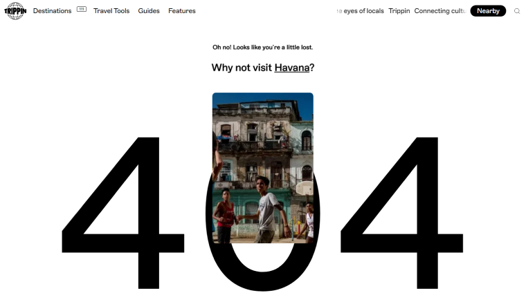
Trippin is a tremendous website about travel destinations described by locals. It’s really hard to stop surfing it if you love to travel. And even if you type the wrong URL, they still don’t let you leave and hook up to learn about another destination. Ok, this is the last inspiring 404 on this list – I’m off to plan a new trip.
FAQ
404 error means that the URL the visitor has entered doesn’t exist, but the website and the server are up and running.
No, they don’t affect SEO ranking directly if it happens because of the wrong URL entered by a user. But if a page is moved or renamed, you risk losing the link weight of this page. Plus, if there are a lot of 404 errors, they use a crawling budget, meaning that the search engine bots will not reindex other pages.
Yes, you can find it in the root folder of a WordPress theme under the 404.php name.
Final Thoughts
404 pages is a fantastic opportunity for web designers and copywriters to have fun. And it’s an excellent chance for the visitors to fall in love with the team behind the website because even if the company works in a “serious” industry, it can demonstrate that it’s still approachable. But, as experience shows, all the jokes and design ideas must be genuine and aligned with the rest of the website not to look awkward or even cringy.
