stand for ukrainian independence image
Stand for Ukrainian Independence. Contribute.
stand for ukrainian independence image

Crocoblock Style Guide

Follow these guidelines and learn the right way to use the Crocoblock logos, ad
creatives, and brand assets.

Download all

Crocoblock Logos

crocoblock primary logo with horizontal orientation

Primary logo

This is our primary logo – note the horizontal orientation. Do not attempt to recreate or move logo elements.

Clear space. To maximize visibility and impact, ensure the logo has enough clear space to breathe.

Minimum size. The primary logo should be at least 116 px wide or 16 px high.

crocoblock secondary logo with vertical orientation

Secondary logo

When the primary logo doesn’t fit your composition, use the vertical orientation.

Clear space. Our logo should always have space to breathe. To maintain consistency, it is recommended not to place other elements around the logo.

Minimum size. This logo should be at least 72 px wide or 36 px high.

Logos and backgrounds

We have two logo variations – colored and monochrome. Colored logos can be used on contrasting light and dark backgrounds.

Monochrome logos are best to use on rich backgrounds but pay attention to readability.

Format: PNG, SVG

Download logos
using crocoblock primary and secondary logos on different backgrounds

Crocoblock icon

The Crocoblock icon can be used in the menus, list items, and footers. Make sure to leave enough space around the icon and choose a flattering background color. The icon looks its best in a small size.

Note: Do not use instead of the logo.
crocoblock svg icons

JetPlugins Logos

jetplugins primary logo example

Primary logo

We have 20 plugin logos, each with its own name and corresponding color. Depending on the plugin name, there are one-line and two-line logos. We recommend you use a primary logo for product recognition.

Clear space. It should be provided around the logo. To maintain consistency, it is advised not to place other elements within the clear space.

Minimum size. The minimum height for a one-line logo is 40 pixels, and 60 pixels for a two-line logo.

jetplugins secondary logo example

Secondary logo

If the primary logo turns out unfit for style reasons, you can use secondary logos. Please do not change the plugin colors and their shape/rounding, as it affects the recognizability.

Clear space. To maximize visibility and impact, ensure our logo has enough clear space to breathe.

Minimum size. The secondary logo should be 80 x 80 pixels.

JetPlugins primary logos for light themes

If you use the plugin logo on a colored background, please make sure the logo does not blend in with the background.

Logo JetFormbuilder for light themes
Logo JetElements for light themes
Logo JetSearch for light themes
Logo JetPopup for light themes
Logo JetGridbuilder for light themes
Logo JetBlocks for light themes
Logo JetBlog for light themes
Logo JetMenu for light themes
Logo JetTabs for light themes
Logo JetReviews for light themes
Logo JetAppointment for light themes
Logo JetBooking for light themes
Logo JetEngine for light themes
Logo JetWoobuilder for light themes
Logo JetTricks for light themes
Logo JetStyleManager for light themes
Logo JetThemeCore for light themes
Logo JetSmartFilters for light themes
Logo JetProductGallery for light themes
Logo JetCompareWishlist for light themes

JetPlugins primary logos for dark themes

Secondary JetPlugins logos

There is only one version of secondary logos used for light and dark themes without alterations.

secondary jetelements logo for light and dark themes
secondary jettricks logo for light and dark themes
secondary jetengine logo for light and dark themes
secondary jetsmartfilters logo for light and dark themes
secondary jetbooking logo for light and dark themes
secondary jetappointment logo for light and dark themes
secondary jetwoobuilder logo for light and dark themes
secondary jetproductgallery logo for light and dark themes
secondary jetcomparewishlist logo for light and dark themes
secondary jetpopup logo for light and dark themes
secondary jetreviews logo for light and dark themes
secondary jetmenu logo for light and dark themes
secondary jetblocks logo for light and dark themes
secondary jetsearch logo for light and dark themes
secondary jetblog logo for light and dark themes
secondary jettabs logo for light and dark themes
secondary jetstylemanager logo for light and dark themes
secondary jetthemecore logo for light and dark themes
secondary jetgridbuilder logo for light and dark themes
secondary jetformbuilder logo for light and dark themes

JetPlugins icons

JetPlugins icons can be used in the menus, list items, and footers. Make sure to leave enough space around each icon and choose a flattering background color. The minimum size is 48 x 48 pixels.
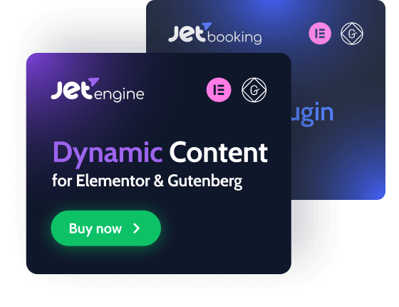
Note: Do not use instead of the logo.
all jetplugins icons presented as tiles

Brand Assets

Colors

Primary colors

Shamrock, Royalblue, and Orchid are primary colors in the Crocoblock identity system. It is preferable to use these colors when a project requires a bunch of signature colors.

Shamrock
#0DC167
Royalblue
#4272F9
Orchid
#9D64ED

Secondary colors

The secondary colors give vibrancy and variety to the brand. We have the unique opportunity to express our brand through a wide range of colors spanning the whole spectrum.

Tomato
#FA5450
Mango
#F66A21
Chocolate
#EE7B16
Orange
#F2D23C
Olive
#A2AE08
Grassgreen
#6AAC1E
Limegreen
#1ABC48
Turquoise
#0CB6B3
Pacific
#0EAEC9
Cerulean
#10A9D6
Steel
#159EE4
Denim
#2588F3
Indigo
#506EF8
Violet
#D652EB
Hotpink
#F648BF
Blush
#F94D84
Maroon
#FA4C6A

Neutral colors

Neutral colors are used for texts: black is for headings and background, white is for the background, and grey is for text content.

Black
#0F172A
Grey dark
#64748B
Grey light
#94A3B8
White
#FFFFFF

Typography

Cabin for titles and headlines

Bold is the primary typeface for Crocoblock. Use it at large sizes for any display copy, headline, and pull quotes.

Download font
Aa
ABCDEFGHIJKLMNOPQRSTUVWXYZ
abcdefghijklmnopqrstuvwxyz
1234567890(,.;:?!$&*)

Roboto for plain texts and paragraphs

Sans serif typeface is used in smaller contexts, in the user interface, and as a functional support to the primary serif.

Download font
Aa
ABCDEFGHIJKLMNOPQRSTUVWXYZ
abcdefghijklmnopqrstuvwxyz
1234567890(,.;:?!$&*)

Need extra materials?

Please contact us at [email protected]