How to Customize Table Widget
Learn more about how to customize a schedule or a list to a webpage with the Table widget provided by the JetElements plugin.
JetElements Table widget has loads of customization settings so that you can style it up as you need. With the help of this widget, you are able to create a schedule, classify the information, etc.
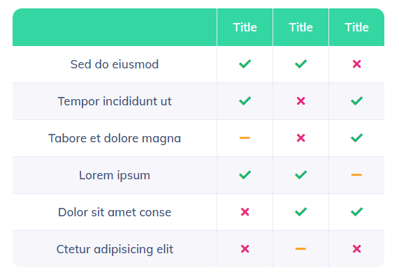
1 Step — Add the Table widget to the page
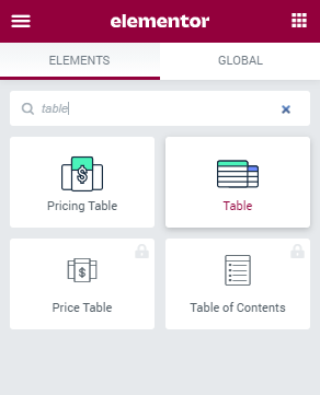
Log in to your website. Then, navigate to the page where you want to add the Table widget and click the “Edit with Elementor” button. Search for the Table widget and drag-and-drop it into a new section.
2 Step — Create the header of the table
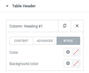
Move on to the Content menu tab and open the Table Header section. Each of the items here represents a column. You are able to add or remove items and this will affect the number of columns. It is also possible to duplicate the column after customizing it.
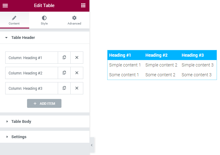
Each item has three tabs with settings. Let’s take a closer look at each of them
- Content. In this tab, you can choose what will be displayed in the table heading cells. Fill in the Text field and in the Add icons/images drop-down choose either icon or image to add to the heading cell. You will also have an opportunity to specify their position.
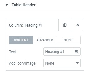
- Advanced. This tab contains settings for the column itself. Column Span field defines how many columns will be gathered under the heading you are currently working with. New columns will be added on the left. Column Width slider allows you to set the width of the column in pixels or percent.

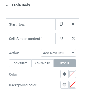
- Style. Here you can choose the individual colors of the current cell. In the Color field, you set the color of the text, and in Background Color the color of the cell’s background.
3 Step — Create the body of the table
Proceed to the Table Body section of the Content menu tab. This is a section, where you can add more rows to your table.
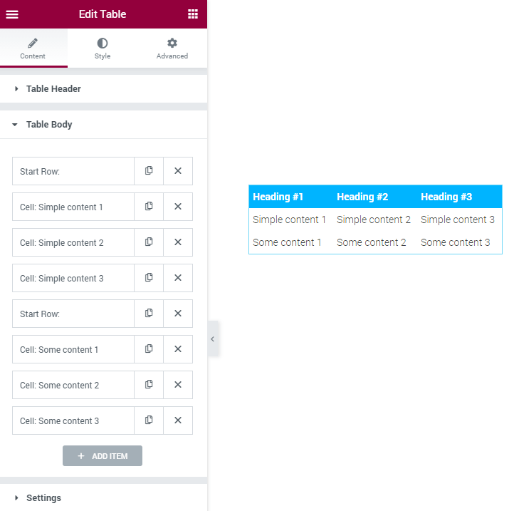
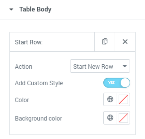
To add a new row, create an item by clicking the “Add Item” button and select the “Start New Row” option in the Action dropdown. If you enable the Add Custom Style toggle you will be able to change the Background Color of the row and the text Color.
A row consists of the cells, it should have at least one cell in order to become visible. To add a new cell, create a new item by clicking the “Add Item” button and select “Add New Cell” from the Action dropdown. All the cells added after the Start Row item will be placed into the row it starts.
Each of the items also has three tabs with settings, so let’s go through them.
- Content. It is almost the same as the one in the heading cell. You can also type in the Text that will be placed in the cell, and add an icon or image. Besides that, you can add a Link, that will lead the user to another page.
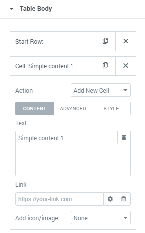
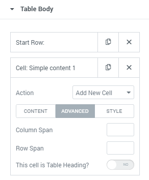
- Advanced. The Column Span feature defines how my columns will the cell you are working with merge together. New cells will be added on the left. The Row Span does the same but for the rows. Each new cell will be added from the bottom. This cell is Table Heading toggle when enabled makes the current cell a heading of the column it is in.
- Style. This tab is completely the same as the one in the heading cell item. You can choose the Color of the text and Background Color.
You are able to drag the Cell and Row items higher or lower according to your needs to change the order of the cells in places or change the position of rows, etc.
4 Step — Define the settings
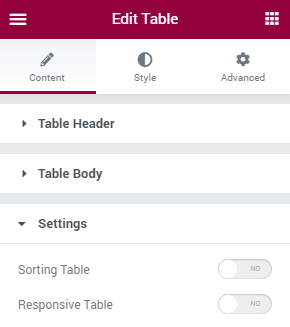
Navigate to the Settings block of the Content tab. Here you can enable or disable the Sorting Table option to allow the visitors to sort through the content of the specific column. The Responsive Table toggle, when enabled, makes the table responsive and change its size according to the screen of the user. Don’t forget to specify the devices, for which this table will be responsive.
It is now time to define the appearance of the table. Go forward to the Style block, where you are able to make your table look more eye-candy. Afterward, click the “Update” button at the bottom of the page.
That’s it! Build the table and place any type of content in the cells, rows, and columns.