Product Table Widget Overview
This guide covers the Product Table widget for Elementor, a feature of the JetProductTables plugin for WordPress.
JetProductTables allows creating WooCommerce product tables for WordPress websites in different ways — with general settings, with a shortcode generator, or with widgets/blocks for editors like Gutenberg (Block Editor) and Elementor.
In this overview, we will focus on the Product Table widget and its settings that are available for the Elementor builder.
To check the widget and its settings, one should open the Elementor page or template and add the Product Table widget to it.
Preset
When the widget is clicked on, the Preset tab is opened right away. In this tab, one can select the preset previously created and saved in the JetProductTables settings:
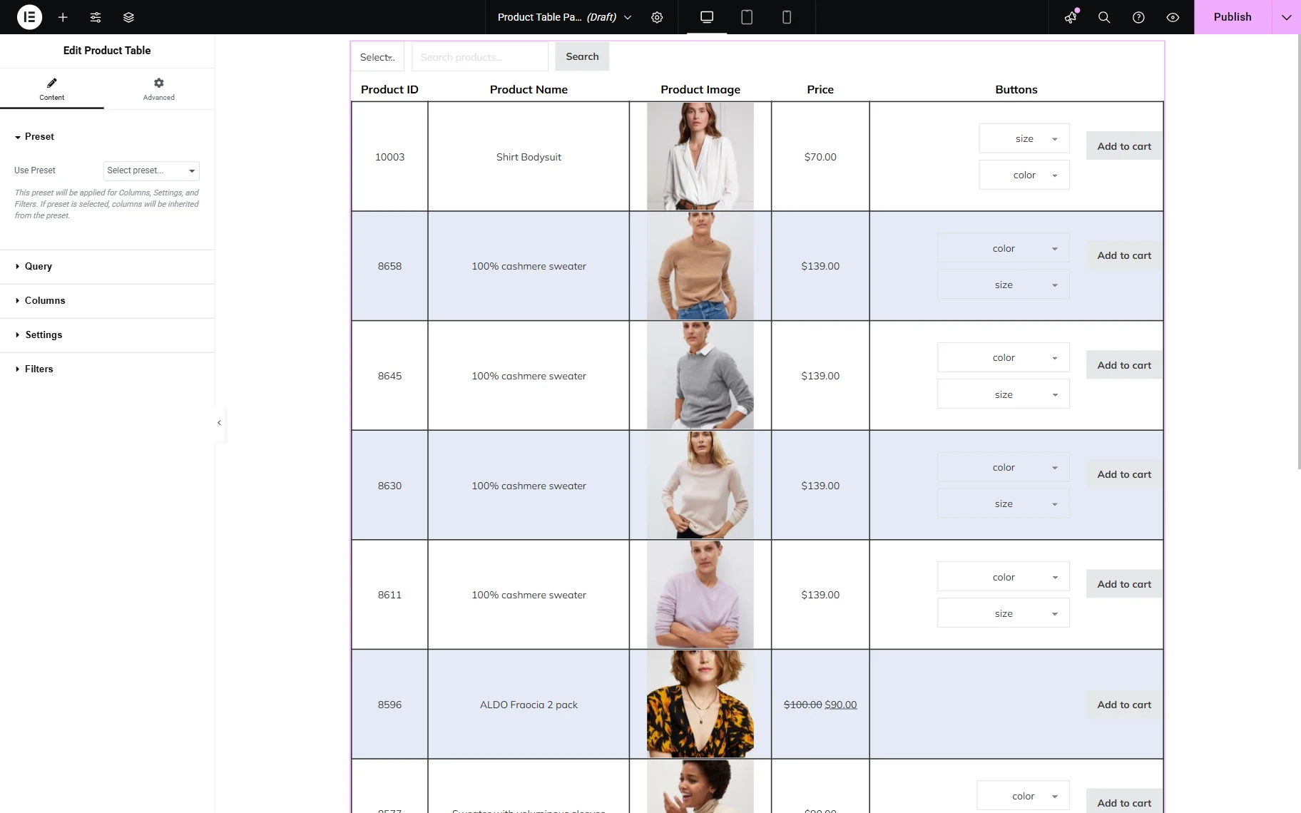
- Use Preset — a dropdown menu where all the saved presets are presented. Here, one should select a preset that will be applied to the current Product Table widget or leave this field empty to create one’s own table layout.
More information about the Presets can be found in the How to Create a Preset for Product Table tutorial.
Query
The next Query tab allows setting the source for the table. Among the options are “Products” and “Product Variations.”
Products
This option allows the display of all WooCommerce products, including variations, in the table.
If the “Products” Query Type is selected, three sections with settings appear: “General,” “Product,” and “Date.”
General
The following fields can be adjusted in the General section:

- Product Status — a dropdown field that allows selecting the status of the product that will be displayed in the table;
- Products Limit — a field where the maximum number of products per page can be specified;
- Page — a field that allows setting the number of the table’s page that will be opened. For instance, if one puts “2” in this field, the table will be opened on the second page;
- Offset — a field where one can put the value of products that will be skipped in the table. For example, if one puts “3” to this field, the table will start from the fourth product;
- Include Products — a field where one can put the ID(s) of the products to include them in the table;
- Exclude Products — a field where one can put the ID(s) of the products to exclude them from the table;
- Product Type — a type of the WooCommerce product that will be queried;
- Order By — a criterion by which the order will be set: “Date,” “ID,” “Name,” “Type,” put in the random order (“Random” option) or by the modification date (“Modified” option);
- Order — a kind of sorting (ascending or descending).
Product
The next fields are presented in the Product section:

- SKU — a field to specify SKUs of the products to be visible in the table;
- Name — a field to specify the names of the products to be visible in the table;
- Tag — a field to specify tags of the products to be visible in the table;
- Tag ID — a field to specify tag IDs of the products to be visible in the table;
- Category — a field to specify categories of the products to be visible in the table;
- Category ID — a field to specify category IDs of the products to be visible in the table;
- Weight — a field to specify the weight of the products to be visible in the table;
- Width — a field to specify the width of the products to be visible in the table;
- Length — a field to specify the length of the products to be visible in the table;
- Height — a field to specify the height of the products to be visible in the table;
- Price — a field to specify the price of the products to be visible in the table;
- Regular Price — a field to specify the regular price of the products to be visible in the table;
- Sale Price — a field to specify the sale price of the products to be visible in the table;
- Total Sales — a field to specify the total sales of the products to be visible in the table;
- Virtual — a dropdown field that allows selecting whether the displayed products should be virtual or not;

- Featured — a dropdown field that allows selecting whether the displayed products should be featured or not;
- Downloadable — a dropdown field that allows selecting whether the displayed products should be downloadable or not;
- Manage Stock — a dropdown field that allows selecting whether the displayed products should have stock management enabled or not;
- Sold Individually — a dropdown field that allows selecting whether the displayed products should be sold individually;
- Reviews Allowed — a dropdown field that allows selecting whether the displayed products should have the reviews allowed;
- Backorder — a dropdown field that allows selecting the backorder status of the displayed products;
- Visibility — a dropdown field that allows selecting the visibility status of the displayed products;
- Stock Quantity — a field that allows specifying the stock quantity of the displayed products;
- Stock Status — a dropdown field that allows selecting the stock status of the displayed products;
- Shipping Class — a field that allows specifying the shipping class slugs of the displayed products;
- Tax Status — a dropdown field that allows selecting the tax status of the displayed products;
- Tax Class — a field that allows specifying the tax class slugs of the displayed products;
- Average Rating — a field that allows specifying the average rating of the displayed products;
- Download Expiry — a field that allows specifying the days till the download expiration of the displayed products;
- Download Limit — a field that allows specifying the download limit of the displayed products;
- Review Count — a field that allows specifying the review count of the displayed products;
Date
The “Date” tab allows showing products depending on the dates connected to them:

- Date Created — a field that allows specifying the creation date of the displayed products;
- Date Modified — a field that allows specifying the modification date of the displayed products;
- Date On Sale From — a field that allows specifying the start date when the displayed products become available for sale;
- Date On Sale To — a field that allows specifying the end date when the displayed products are available for sale.
Product Variations
The “Product Variations” Query Type can be selected to display only product variations in the table.
If one selects the “Product Variations” option as the Query Type, the following field becomes available:
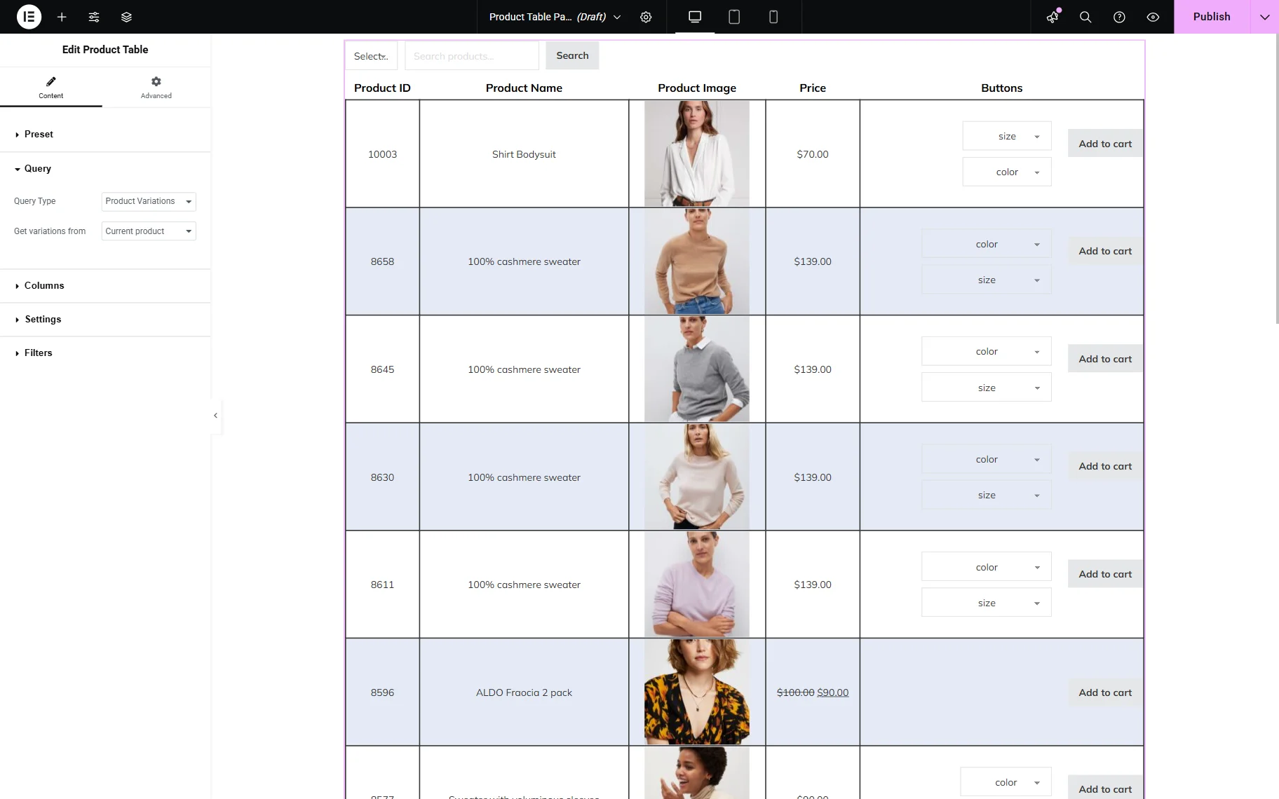
- Get variations from — a dropdown field that allows selecting the source for variations. Among the options are: “Current product” (can be used on the specific product page), “Specific product ID(s),” and “Specific product SKU(s)”. If the “Specific product ID(s)” option is selected, the Product ID(s) field appears, allowing one to paste the ID(s) of the product. Samely, if one selects the “Specific product SKU(s)” option, the Product SKU(s) field becomes available for SKU(s) specification.
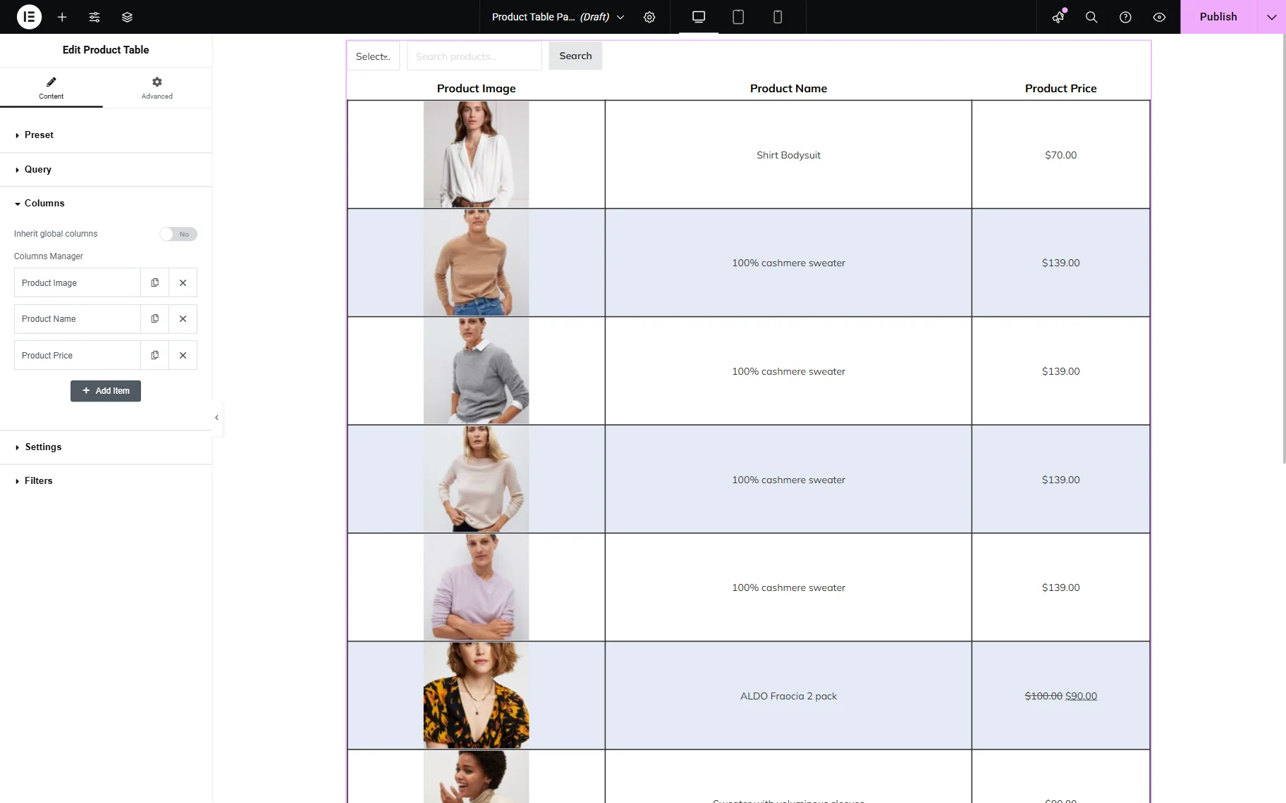
Columns
The Columns tab allows setting the columns that will be displayed in the current table. Here, by default, one toggle is presented:

- Inherit global columns — a toggle that is activated by default. When activated, the columns are taken from the global settings.
If the Inherit global columns toggle is deactivated, the Columns Manager section with the “Product Image,” “Product Name,” and “Product Price” columns appear. These can be edited by clicking on them or duplicated/deleted by pressing the corresponding icons next to column titles.
Each column has its own settings. More information about them can be found in the JetProductTables Dashboard Settings Overview.
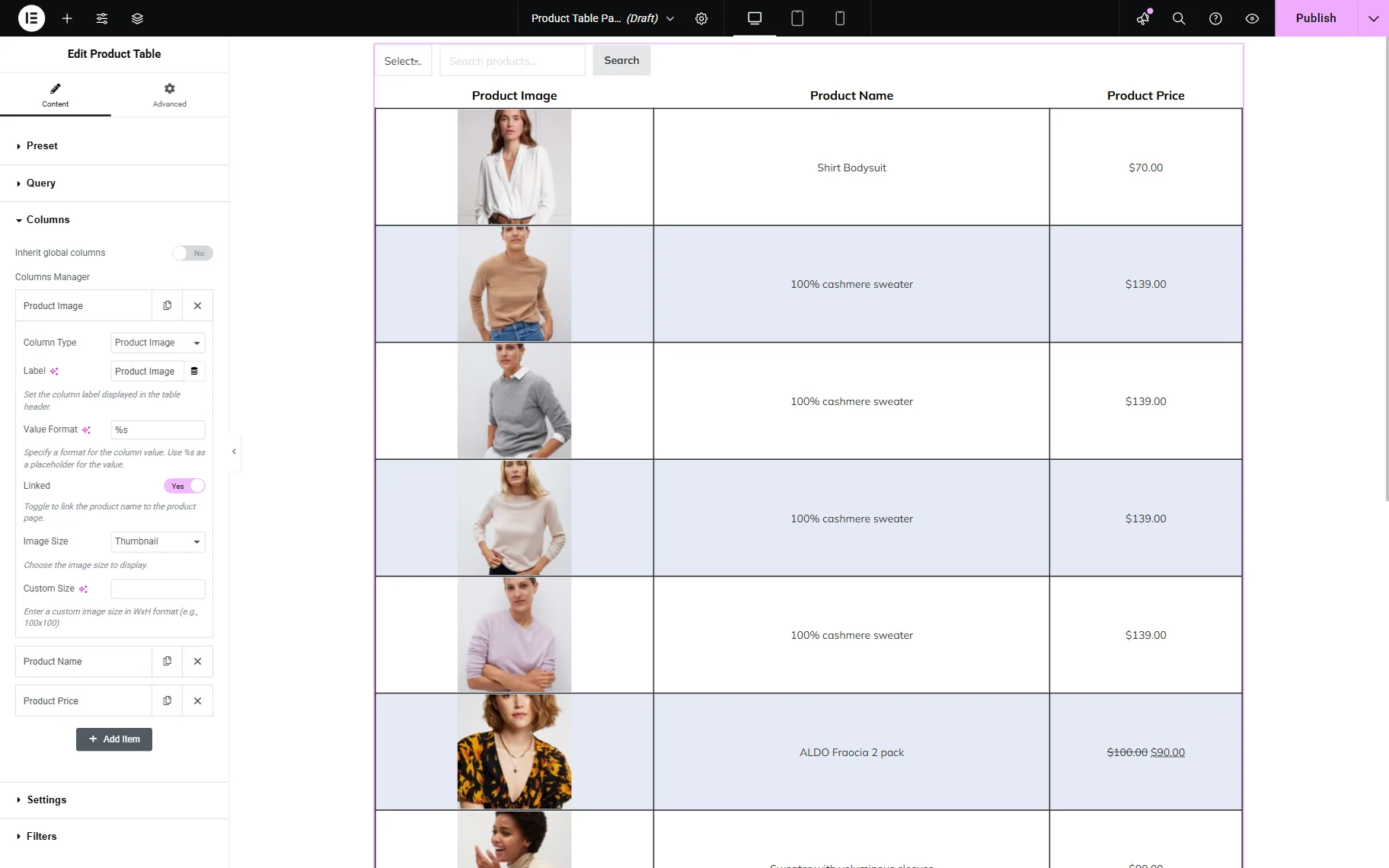
To add a new column to the list, the “Add Item” should be clicked.
Settings
The Settings tab contains the following fields for customization:
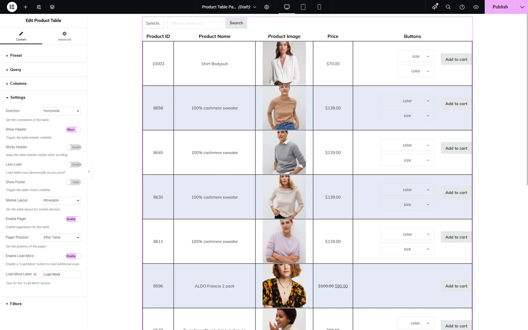
- Direction — a dropdown field that allows setting a direction of the table: horizontal or vertical;
- Show Header — a toggle that is activated by default. When activated, the header of the table (the column labels) is shown;
- Sticky Header — a toggle that is deactivated by default. When activated, the header will be still visible on the top of the page whenever the table is scrolled;
- Lazy Load — a toggle that is deactivated by default. When activated, the table data will be loaded incrementally whenever a user scrolls through the table;
- Show Footer — a toggle that is deactivated by default. When activated, a footer (the column labels) is shown under the table;
- Mobile Layout — a dropdown field that allows selecting the mobile layout of the table:
- “Moveable” — an option that is set by default. If selected, the current table will be shown partially on mobile devices, but it can be moved horizontally to see the rest of the table;
- “Transform” — an option that, if selected, transforms the content into a set of cards. Every card looks like a separate vertical table, where the desktop columns become rows. The first column of the table is the column name, and the second is the value. Also, when this layout is selected, the sticky header and sorting stop working because there is no global header now, and the layout changes globally, so there are no corresponding controls;
- “Collapsed” — an option similar to “Transform” but more compact. Once the table is opened, the user sees only the first column and the “+” button. When the button is clicked, the rest of the line content becomes visible. When this option is picked, the header with the first column is stored, so sorting will work with such a layout.
- Enable Pager — a toggle that is deactivated by default. When activated, the pagination of the table will be enabled.
- Pager Position — a dropdown field that appears when the pagination is enabled. The pagination can be displayed before, after, or both before and after the table;
- Enable Load More — a toggle that is deactivated by default. When activated, the “Load More” button will be enabled.
- Load More Label — a field that appears when the “Load More” button is enabled. It allows changing the default “Load More” text into a different desired one.
Filters
The Filters tab allows one to set the product table filters and includes one toggle:
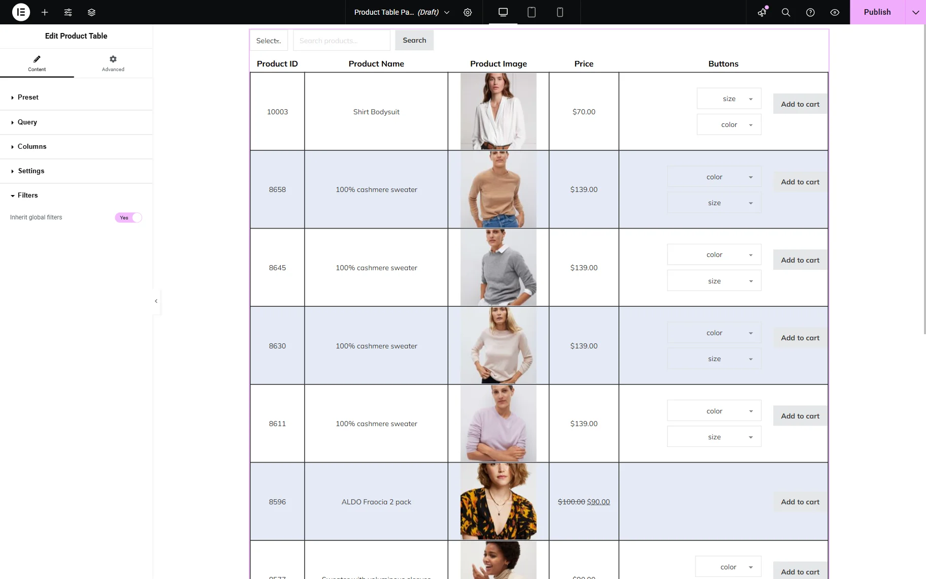
- Inherit global filters — a toggle activated by default. When activated, the global filters will displayed above the table.
When the Inherit global filters toggle is deactivated, the “Product Categories” filter is added. It can be duplicated with the corresponding button if desired.
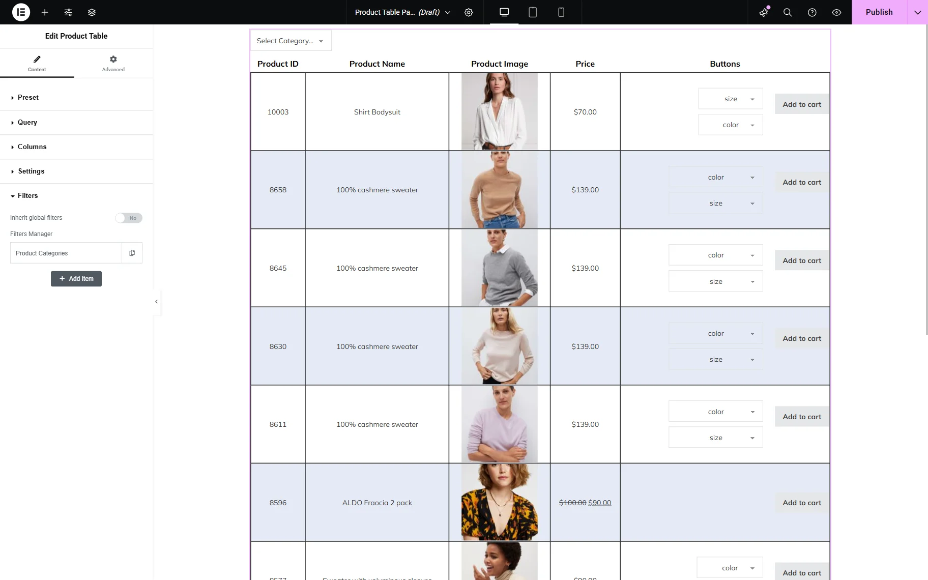
Each filter has its own settings. More information about the filter settings can be found in the JetProductTables Dashboard Settings Overview.

One can also click the “Add item” button to add more filters next to the product table if needed.
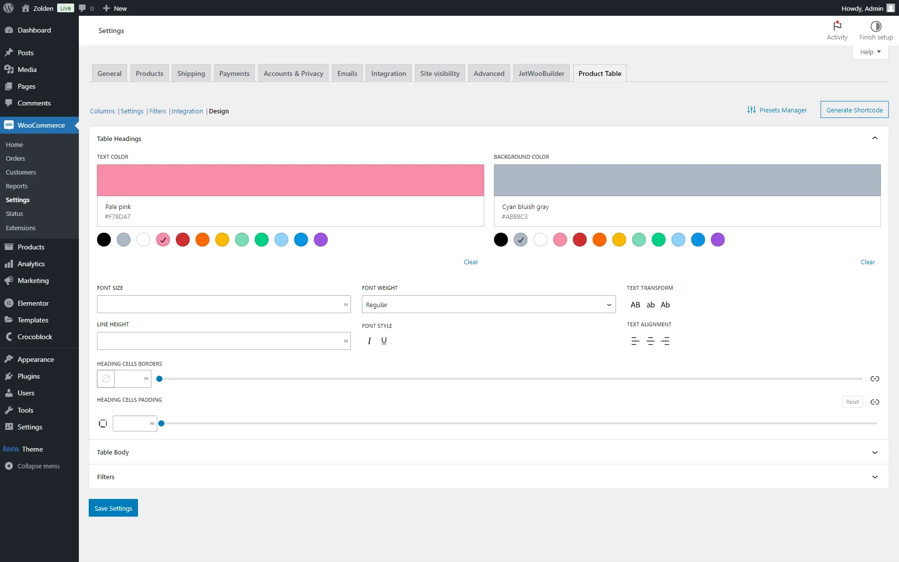
Also, if some styling changes are desired to be applied to the Product Table widget, it can be done in the global settings in the Design section of the WordPress Dashboard > WooCommerce > Settings directory.
That’s all about the Product Table widget available in Elementor with the JetProductTables plugin for WordPress.