Product Table Element Overview
This overview is about the Product Table element settings in Bricks builder, which are available as a part of the JetProductTables plugin for WordPress.
JetProductTables is a plugin that allows creating WooCommerce product pages with the help of the general settings, shortcode generator, and Product Table block/widget/element. In this overview, the focus will be on the Product Table element settings in the Bricks builder.
To check the element settings, it should first be added to the Bricks template.
Preset
The first tab of the Product Table settings. It allows selecting the previously created product table preset.

- Use Preset — a list of all created presets. Here, the table preset should be selected or the field should be left empty to customize the product table with the help of further element settings.
Query
In this tab, one can define the source of items for the table: products or product variations (Query Type field).
Products
An option that, when selected, displays WooCommerce products, including product variations in the table.
If this option is selected, three sections appear: General, Product, and Date.
General
The General settings tab includes the following fields:

- Product Status — a status of the products that will be displayed in the table;
- Products Limit — a maximum number of products per page in the table;
- Page — the number of the table page that will be opened. For example, if one puts “2” in this field, the table will be opened on the second page right away;
- Offset — a number of the products that will be skipped in the table. If one puts “2” in this field, the table will start from the third product;
- Include Products — a field where one can put the specific product IDs to include them in the table;
- Exclude Products — a field where one can put the specific product IDs to exclude them from the table;
- Product Type — a type of WooCommerce product that will be queried;
- Order By — a criterion by which the order will be set: “Date,” “ID,” “Name,” “Type,” put in the random order (“Random” option) or by the modification date (“Modified” option);
- Order — a kind of sorting (ascending or descending).
Product
If one proceeds to the Product section, the following settings can be adjusted:

- SKU — SKUs of the products to be included in the table;
- Name — names of the products to be included in the table;
- Tag — tags of the products to be included in the table;
- Tag ID — tag IDs of the products to be included in the table;
- Category — categories of the products to be included in the table;
- Category ID — category IDs of the products to be included in the table;
- Weight — weight of the products to be included in the table;
- Width — width of the products to be included in the table;
- Length — length of the products to be included in the table;
- Height — height of the products to be included in the table;

- Price — price of the products to be included in the table;
- Regular Price — regular price of the products to be included in the table;
- Sale Price — sale price of the products to be included in the table;
- Total Sales — total sales of the products to be included in the table;
- Virtual — a dropdown field that allows selecting whether the displayed products should be virtual;
- Featured — a dropdown field that allows selecting whether the displayed products should be featured;
- Downloadable — a dropdown field that allows selecting whether the displayed products should be downloadable;
- Manage Stock — a dropdown field that allows selecting whether the displayed products should have stock management enabled;
- Sold Individually — a dropdown field that allows selecting whether the displayed products should be sold individually;
- Reviews Allowed — a dropdown field that allows selecting whether the displayed products should have reviews allowed;

- Backorder — a dropdown field that allows selecting the backorder status of the products;
- Visibility — a dropdown field that allows selecting the visibility status of the products;
- Stock Quantity — a field that allows specifying the stock quantity of the products;
- Stock Status — a dropdown field that allows selecting the stock status of the products;
- Shipping Class — a field that allows specifying the shipping class slugs of the products;
- Tax Status — a dropdown field that allows selecting the tax status of the products;
- Tax Class — a field that allows specifying the tax class slugs of the products;
- Average Rating — a field that allows specifying the average rating of the products;
- Download Expiry — a field that allows specifying the number of days till the download expiration of the products;
- Download Limit — a field that allows specifying the download limit of the products;
- Review Count — a field that allows specifying the review count of the products.
Date
This tab allows showing products in the table according to the following date settings:

- Date Created — a field that allows specifying the creation date of the displayed products;
- Date Modified — a field that allows specifying the modification date of the displayed products;
- Date On Sale From — a field that allows specifying the start date when the displayed products become available for sale;
- Date On Sale To — a field that allows specifying the end date when the displayed products are available for sale.
Product Variations
With this option selected in the Query Type field, only the product variations will be displayed in the tab. One field is available for customization by default:
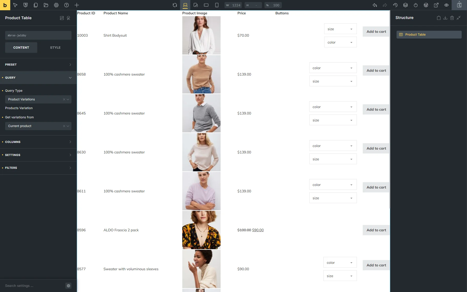
- Get variations from — a source of variations. Among the options: “Current product,” “Specific product ID(s),” and “Specific product SKU(s)”. If the “Specific product ID(s)” option is selected, the Product ID(s) field appears, allowing one to paste the ID(s) of the product. Similarly, if one selects the “Specific product SKU(s)” option, the Product SKU(s) field becomes available.
Columns
This tab allows customizing the columns included in the product table. By default, in this tab, one toggle is activated:
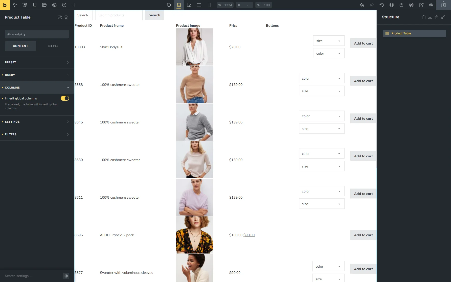
- Inherit global columns — a toggle that, when activated, takes the columns from the global settings.
When the toggle is deactivated, one can adjust the table settings right here, in the Product Table element settings.
By default, four columns are displayed. These can be edited or deleted.
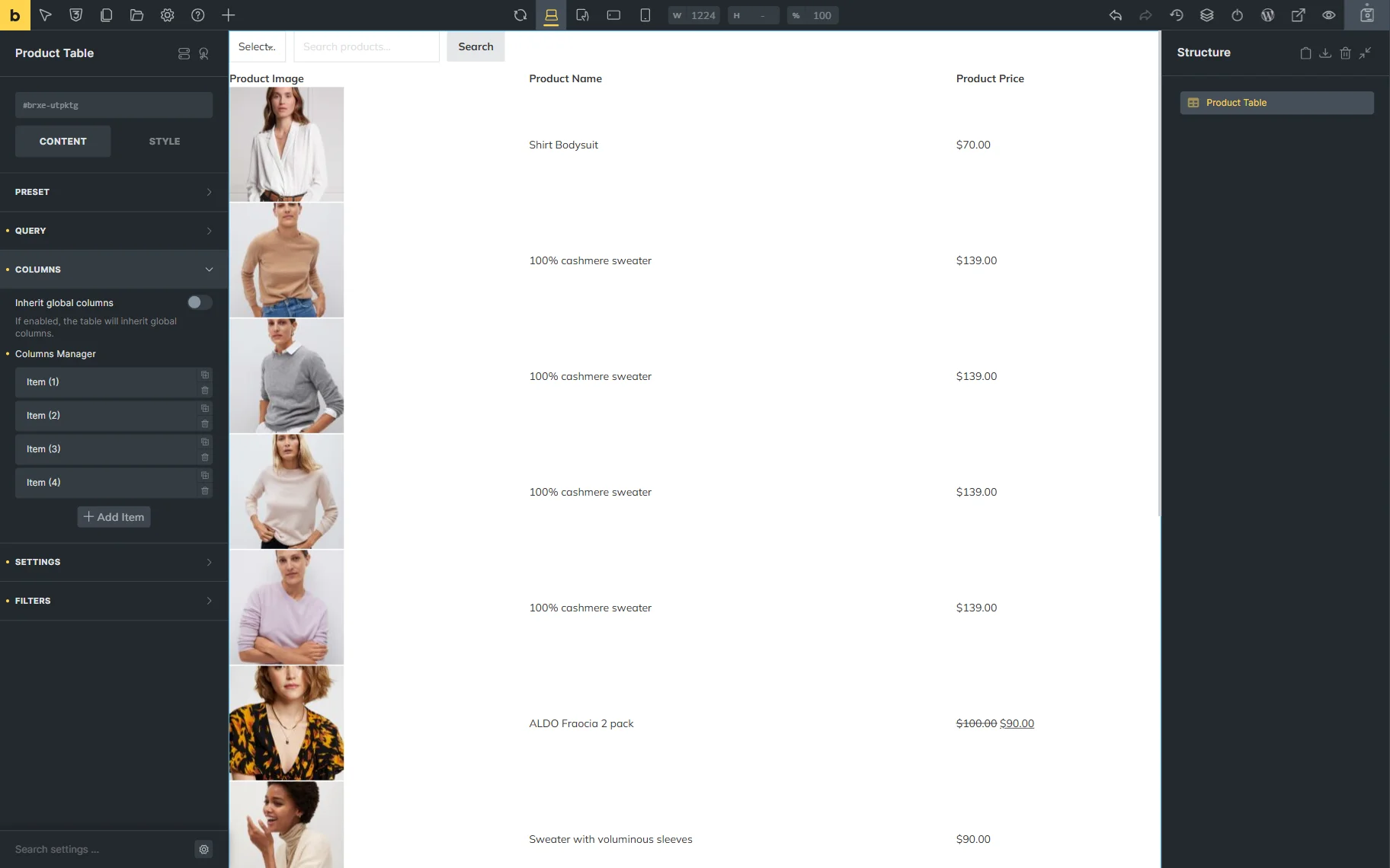
When the item tab is unrolled, by default, two fields are presented for customization:
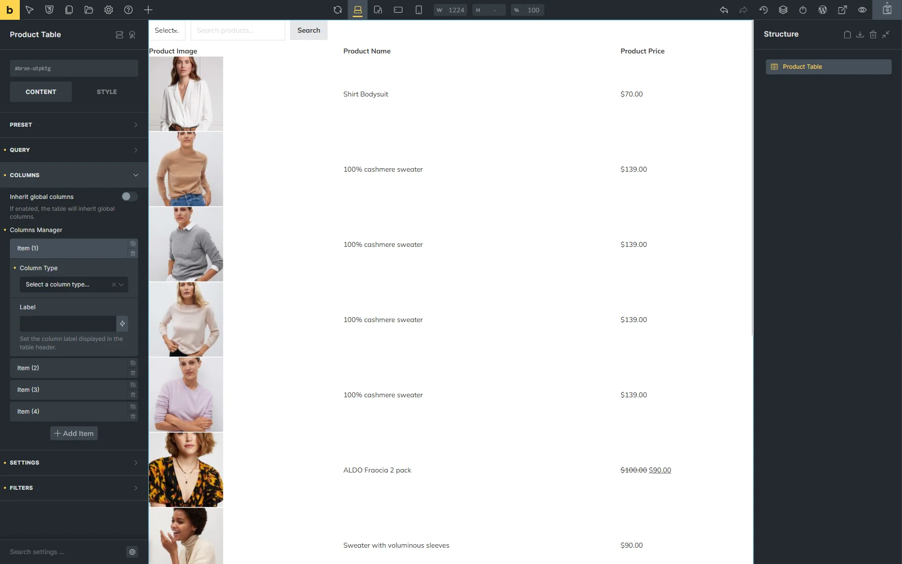
- Column Type — a type of the current column;
- Label — a label of the current column.
Further settings that are displayed depend on the Column Type selected.
To add one more column, one should press the “Add Item” button.
Settings
The Settings tab includes the following fields for customization:
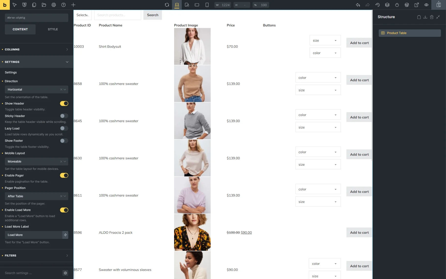
- Direction — a direction of the table: horizontal or vertical;
- Show Header — a toggle that, if activated, shows the header (column labels) above the table;
- Sticky Header — a toggle that, if activated, makes the header sticky (the header is always visible on top of the page whenever the page is scrolled down);
- Lazy Load — a toggle that, if activated, loads the table incrementally whenever the table is scrolled;
- Show Footer — a toggle that, if activated, shows the footer under the table (column labels);
- Mobile Layout — a mobile layout that will be used for the table. Among the options are:
- “Moveable” — if selected, the table will be displayed partially and can be scrolled in a horizontal direction;
- “Transform” — if selected, the table will be transformed into product cards. These cards will look like separate vertical tables where the desktop columns will become rows. The first column will be the name, and the second column will be the value. Also, note that when this option is selected, sorting and sticky header stop working because there is no global header now, and the layout changes globally, so there are no corresponding controls;
- “Collapsed” — if selected, the view is similar to the one when the “Transform” option is selected, but is more compact. With this layout, only the first product card and the “+” button are visible. When clicked, the rest of the line content is displayed. Also, with this layout, the header with the first column is stored, so that the sorting will work;
- Enable Pager — a toggle that, if activated, shows the pagination of the table;
- Pager Position — a position of the table: before, after, or before and after the table;
- Enable Load More — a toggle that, if activated, shows the “Load More” button under the table;
- Load More Label — a label of the “Load More” button.
Filters
The Filters tab allows adjusting the product filters and includes one toggle by default:
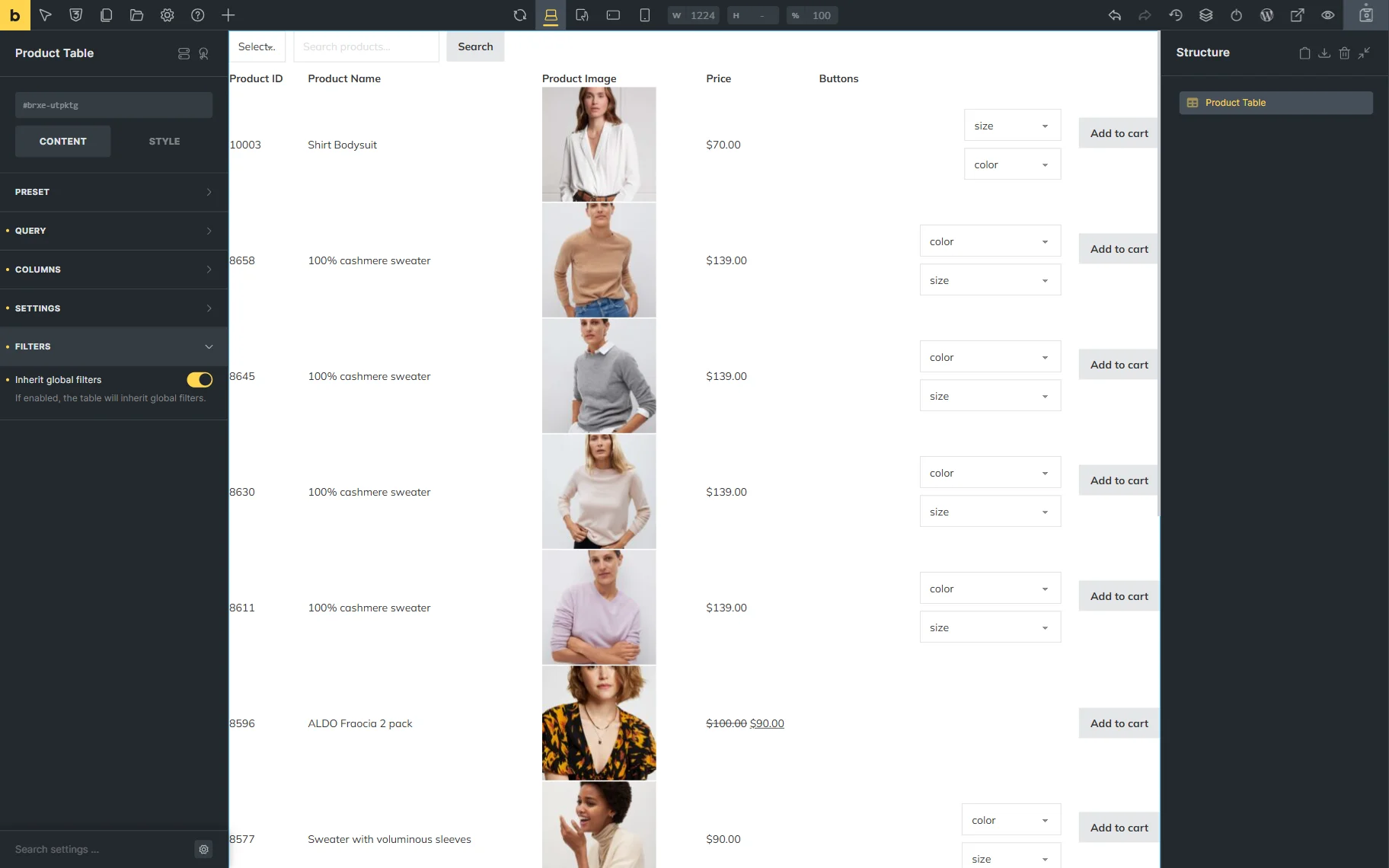
- Inherit global filters — a toggle that, if activated, adds global filters to the table.
When the toggle is deactivated, one can set up table filters here in the Product Table element settings.
In the newly displayed Filters Manager section, one item is presented. It can be edited by clicking on it.
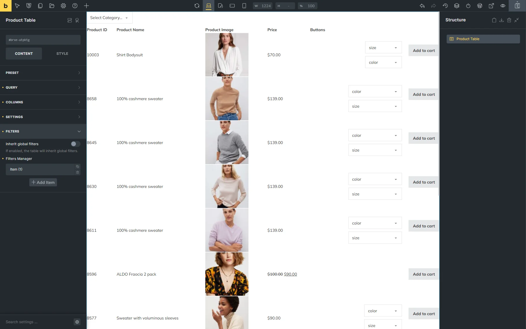
The filter settings fields here are the same as in the global settings.
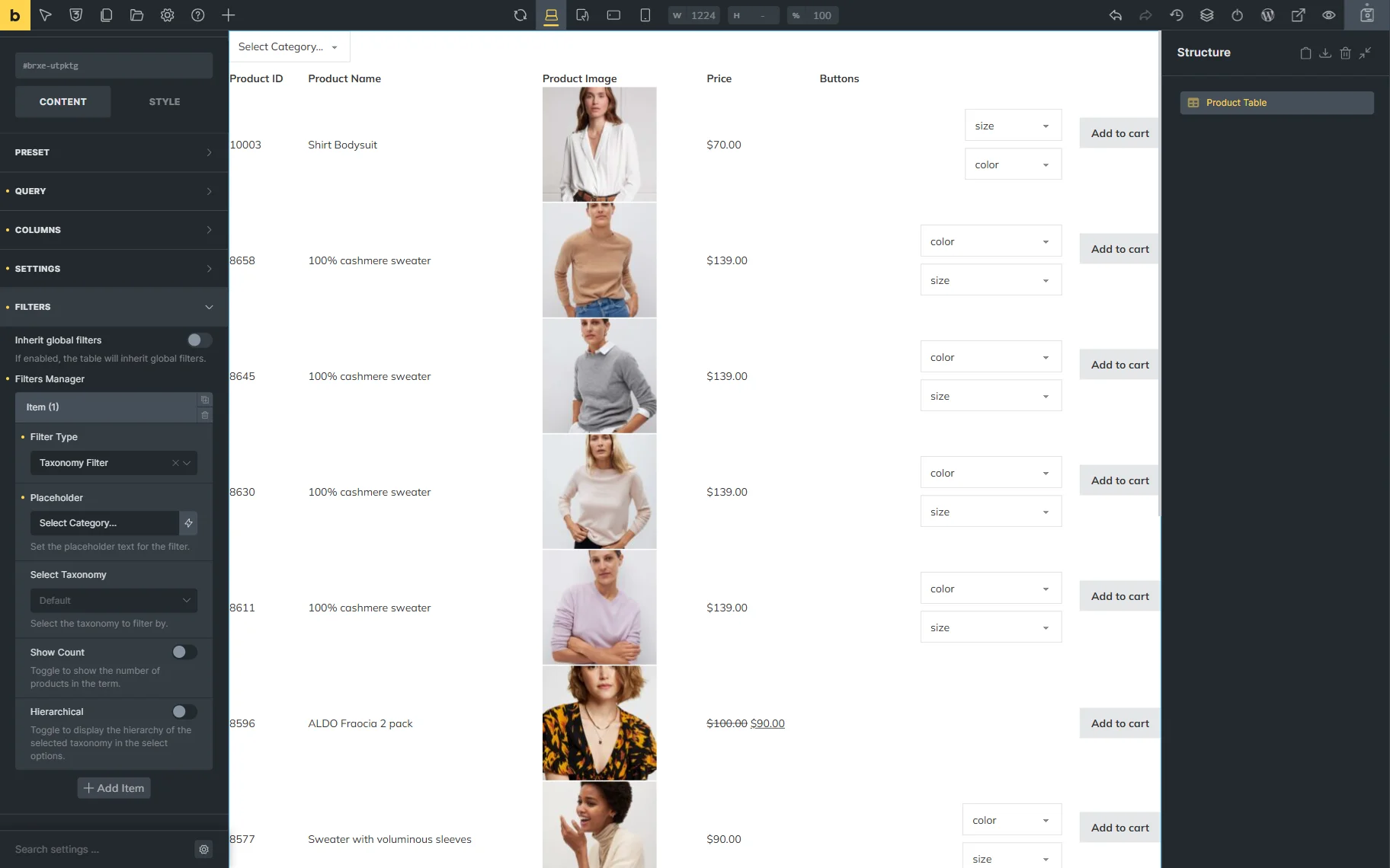
To add a new filter, one should press the “Add Item” button.
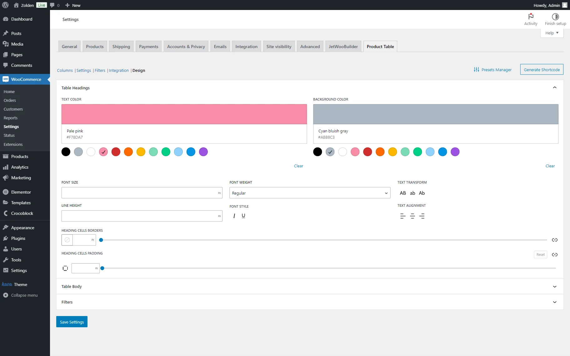
Basic styling can be made in the STYLE tab. However, the table headings, body, and filter styles will be dependent on the global Design settings.
That’s all about the Product Table element for Bricks builder, which is available as a part of the JetProductTables plugin for WordPress websites.