How to Use Advanced Carousel Widget
This tutorial shows how to create and customize a carousel using the Advanced Carousel widget from the JetElements WordPress plugin.
Before you start, check the tutorial requirements:
- Elementor (Free version), Block editor (Gutenberg), or Bricks
- JetElements plugin installed and activated
This tutorial shows how to create and customize a carousel using the Advanced Carousel widget from the JetElements WordPress plugin.
The Advanced Carousel widget of JetElements enables you to add multiple images or posts to the items and display them in a slider format with multiple items, utilizing pagination or navigation elements.
Find the page where you need to add the Advanced Carousel. Click the “Edit with Elementor” button in order to continue. Then, find the Advanced Carousel widget and add it to the desired area.

In the Content tab, the first section opened by default is Slides.
The first toggle, called Use JetEngine query, allows you to use the Custom Query created with the JetEngine’s Query Builder as a source for the carousel.
When the Use JetEngine query toggle is on, the new Select Query input appears. Choose the needed custom query from the dropdown list.

When the custom query is used, you need only one Item to be set. Use the one that is added by default. Thus, the Advanced Carousel widget enables you to display results from a Custom Query in a carousel list format, where only one item should be set as a template.
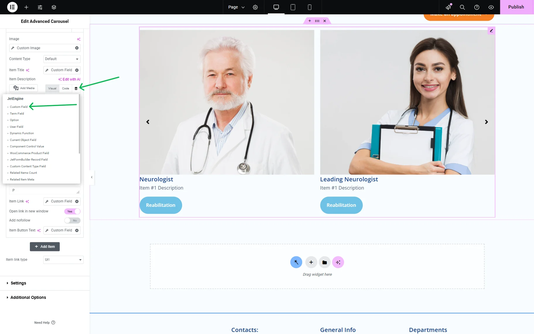
Let’s take a look at the item’s settings.
- Image — you can insert any image from the Media Library here. Additionally, if you use the JetEngine plugin or have Elementor Pro, you can dynamically add pictures using Dynamic Tags. Dynamic Tags should be used when a Custom Query is used as the source for the carousel;
- Content Type — here you choose how the item will look. The “Default” means that you will set everything from scratch, and the “Template” allows you to use the pre-made template for the carousel items;
- Item Title — the text you insert into this field will be shown right under the picture of the item;
- Item Description — if you would like, you can add more information by typing it into this text area;
- Item Link — the link you add here will direct the user to the product page or any other page on your website;
- Open link in new window and Add nofollow — those two toggles affect the link. It makes the link open in a new window and adds the “nofollow” tag to it. Both of these features are useful for both the client and you, so it is highly recommended to enable them;
- Item Button Text — if you leave this field empty, the item won’t contain a button. If you would like it to be added, type its title here.
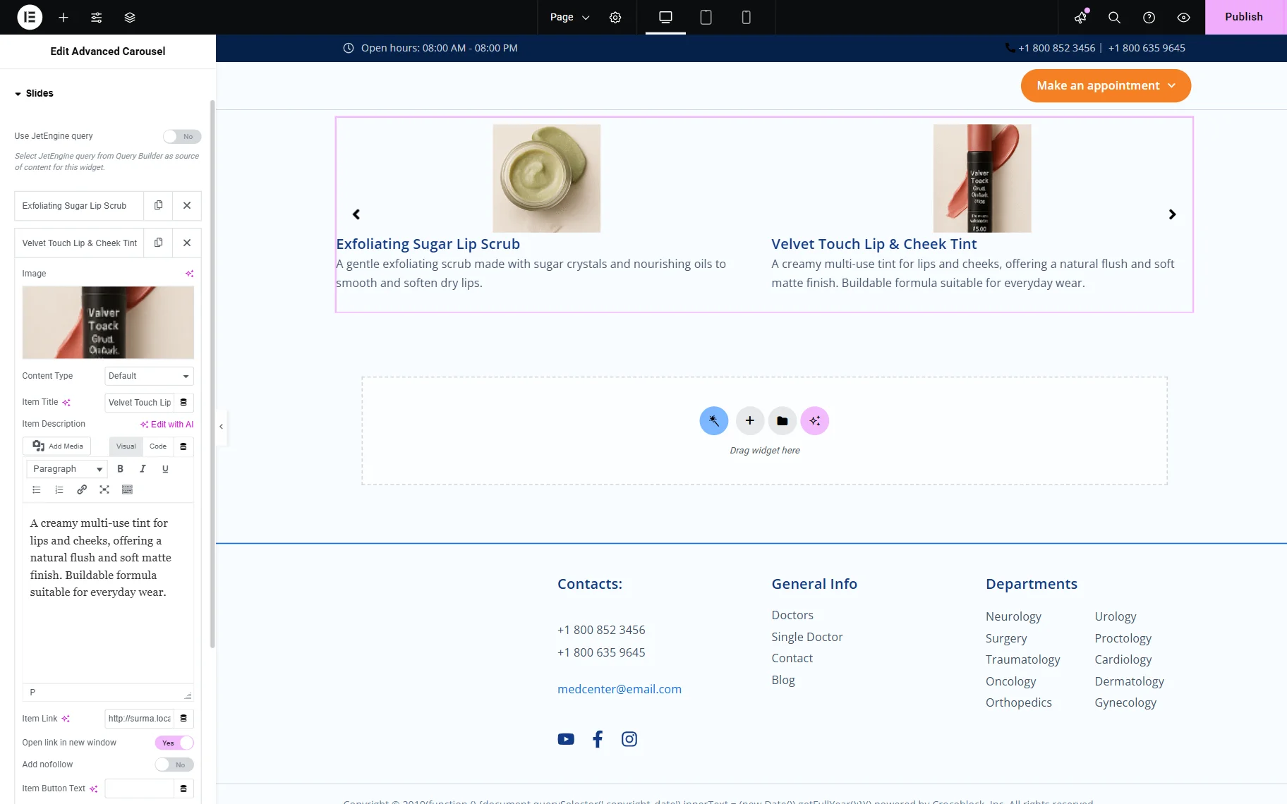
In case you do not need to use a Custom Query as a source for the carousel, you can add items manually — as many as you need.
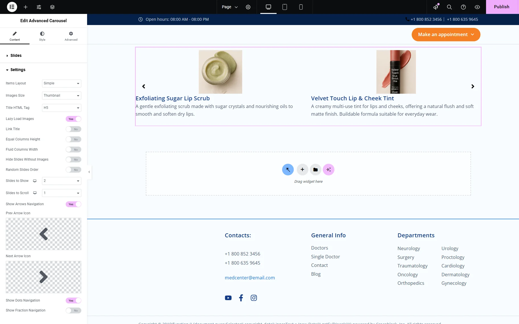
Proceeding to the Content > Settings section, we get more inputs:
- Items Layout — here you can choose whether the items will be displayed as Simple pictures with the titles and descriptions below them, or as Banners with the titles and descriptions directly on them.
- When you choose the “Banners” option, a new Animation Effect field will appear. It provides a dropdown with available effects for the items to appear;
- Images Size — this drop-down list helps you to define the size of the pictures;
- Title HTML Tag — define the size and importance of the item’s title;
- Lazy Load Images — the option enhances the page’s rendering performance. When this toggle is enabled, the carousel loads as the user scrolls the page and not when the page is opened;
- Link Title — if enabled, this toggle adds the link to the title;
- Equal Columns Height option — unifies the height of the columns, making their heights equal;
- Fluid Columns Width function — allows the columns to have different widths depending on the size of the image;
- Hide Slides Without Images — the toggle allows you to hide items without images;
- Random Slides Order — to order your slides randomly, enable this toggle on;
- Slides to Show — here, you can select the preferred number of slides to display. By the way, if you choose 1, it will appear as a slider, not a carousel;
- Slides to Scroll dropdown — allows you to pick the number of slides to move left at a time.
- When it comes to navigation, you have a choice between the Arrows, Dots, and Fraction navigation. You can apply Arrows and Dots simultaneously and choose icons for the Arrows.
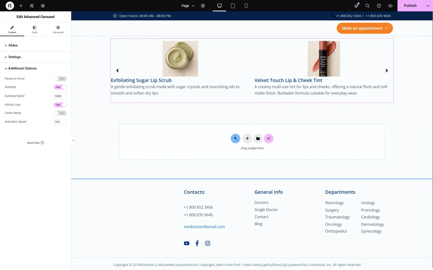
Move on to the Content > Additional Options block.
- Pause on Hover – if you want the autoplay stopped when the user hovers a mouse cursor over the item, turn this toggle on;
- Autoplay — enable this option to have the items move automatically to the left. You will be able to choose the Autoplay Speed;
- Infinite Loop — if you turn this toggle on, the carousel will be moving infinitely and show the first item right after the last one;
- Center Mode — in this mode, every new item will be displayed in the center of the block, rather than on the left side;
- Animation Speed input — allows you to set the desired speed of the carousel scroll.
Finally, proceed to the Style block, where you can customize columns, items, title typography, content typography, arrows, dots, and more.
Once you are ready, click the “Publish” button.
That’s it. Now you know how to set up and use the Advanced Carousel widget from the JetElements WordPress plugin.