How to Use Scroll Navigation Widget
This tutorial explains how to enrich our website's content presentation using the Scroll Navigation widget.
The Scroll Navigation widget is included in the JetElements plugin for the Elementor page builder. Its main function is to allow switching from section to section within a page by adding vertical pagination along the existing sections.
1 Step — Add Scroll Navigation functionality
Navigate to the WP Dashboard and open the page to which you want to add the Scroll Navigation functionality in the Elementor page builder.
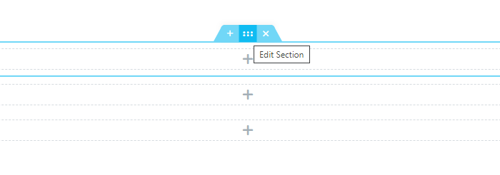
In the Elementor editor, locate the sections to which you want to attach the Scroll Navigation pagination dots. Click the “Edit Section” button.
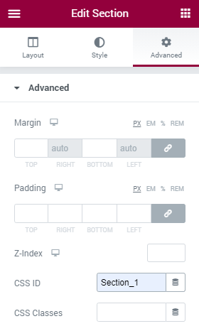
Switch to the Advanced settings tab of the section and input the ID into the CSS ID field.
 NOTE.
You need to add unique CSS IDs for each of the sections in order to link them to the pagination dots of the Scroll Navigation widget.
NOTE.
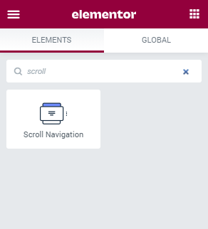
You need to add unique CSS IDs for each of the sections in order to link them to the pagination dots of the Scroll Navigation widget.Now, open the Elementor widgets menu, drag the content to the sections, and create the design. Then, find the Scroll Navigation widget in the list of available widgets for Elementor. Drop it above all the sections to which you need to add the pagination dots.
2 Step — Manage the content
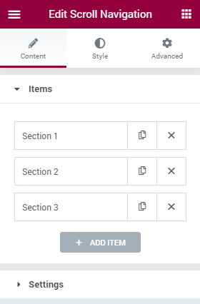
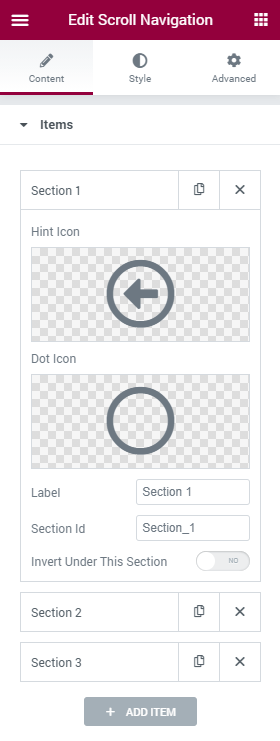
By default, in the Content menu tab of the Scroll Navigation widget, there are three items that are now empty. In case there are more sections on your page, click the “Add Item” button to add a new section. You need to create an item for each of the sections you want to link.
When the number of items satisfies you, it’s time to define the settings.
- Hint Icon. When the user hovers the pointer over the navigation dot – a small hint appears. And here, you can choose an icon that will be shown in that hint near the text;
- Dot Icon. To decorate the dots, you can place an icon over them. Choose the one in the Icon Library or upload an SVG file;
- Label. This is the text that will be shown in the hint notification window;
- Section Id. Input the CSS ID you’ve set up for the section here. You have to input the IDs for each of the sections into the corresponding items. Please, make sure the section CSS IDs completely match the IDs you’re adding in the Section ID fields of the items;
- Invert Under This Section. In the Style menu tab, there is a Dots section that has an Invert settings block. If the Invert Under This Section toggle is turned in, the dots design will change according to the settings in the Invert block after the user scrolls it down.
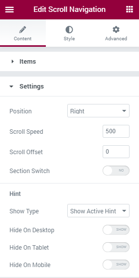
Switch to the Settings section of the Content menu tab.
- Position. In this drop-down menu, you can choose the position of the navigation dots. they can be shown to the left and to the right;
- Scroll Speed. When the user scrolls the page that has Scroll Navigation functionality, and the Section Switch toggle is enabled, the current section is automatically scrolled down to the next one. In the Scroll Speed field, you can choose how quickly that will be performed;
- Scroll Offset. When the section is automatically scrolled down, the widget places the top side of the next section on the top of the screen. The number you place in the Scroll Offset field defines the offset from the top of the screen;
- Section Switch. This toggle enables the automatic scrolling of the sections. The user moves the mouse wheel just a little, and the section is scrolled down. You can also enable that function for mobile devices, and the sections will be scrolled with just a single swipe;
- Show Type. In this drop-down menu, you will see the two ways of showing the hint. The Show Active Hint means the hint will be constantly shown. And if you choose Show Hint on Hover, the hint will be displayed only when the user hovers a pointer over it;
- Hide On Desktop, Hide On Tablet, Hade On Mobile. These toggles allow you to decide on what devices to show the hints.
Finally, open the Style settings tab in order to set the background type, use a background image, apply a border, change the appearance of the hints, and labels typography.
When you’ve finished, click the “Update” button to save the changes and check how the effect works on the front end.
Congrats, you’ve learned how to use the Scroll Navigation widget of the JetElements plugin. Good luck with creating an astonishing design!