The Editor Load Level function allows you to improve Elementor editor performance by selecting an appropriate level of workload (from “None” to “Full” one). the chosen level defines a set of options that will be available in the Style tab in JetBlocks widgets’ settings.
To adjust the load level of style settings for the JetBlocks widgets, you should go to the Crocoblock > JetPlugins Settings > JetBlocks > General Settings section in the WP Dashboard. Here you can see all the available adjustments for the JetBlocks plugin. The Editor Load Level drop-down menu allows specifying the editor load level of style settings for JetBlocks widgets in Elementor. There are 5 types:
- None;
- Low;
- Medium;
- Advanced;
- Full.

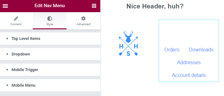
Let’s look at how it works on the example of the Nav Menu widget. If you enable the Full set of options for the widgets, you’ll see all the available style settings in the Style tab.
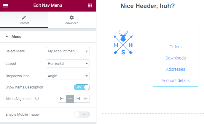
And when you select the None option, the Style tab will disappear from the widget’s settings panel at all.
You can see the full list of available options on different load levels for all JetBlocks widgets below.
Widgets | Style Options | Low | Medium | Advanced | Full |
---|---|---|---|---|---|
Auth Links | General Styles | Alignment | |||
Login Link Styles | Colors Background Color Margin Padding | Typography | Border Type Border Radius | Box Shadow | |
Logout Link Styles | Colors Background Color Margin Padding | Typography | Border Type Border Radius | Box Shadow | |
Register Link Styles | Colors Background Color Margin Padding | Typography | Border Type Border Radius | Box Shadow | |
Registered Link Styles | Colors Background Color Margin Padding | Typography | Border Type Border Radius | Box Shadow | |
Breadcrumbs | Low | Medium | Advanced | Full | |
Page Title | Color Margin | Typography | Background Color Padding Border Type Border Radius | ||
Breadcrumbs | Colors Background Color Padding Gap | Typography Icon Size | Border Type Border Radius | ||
Hamburger Panel | Low | Medium | Advanced | Full | |
Panel | Panel Width Padding Background Type Close Icon | Border Type Border Radius Box Shadow | |||
Toggle | Background Type Padding Margin Label Color Toggle Icon | Typography | Border Type Border Radius | Box Shadow | |
Login Form | Low | Medium | Advanced | Full | |
Fields | Background Color Text Color Padding Margin | Typography Border Type Border Radius | Box Shadow | ||
Labels | Text Color Margin | Typography Padding Background Color | Border Type Border Radius | Box Shadow | |
Submit | Background Color Text Color Padding Margin | Typography Alignment | Border Type Border Radius | Box Shadow | |
Errors | Colors Margin | Padding Background Color | Border Type Border Radius | Box Shadow | |
Lost Password Link | Colors Margin | Typography | |||
Site Logo | Low | Medium | Advanced | Full | |
Logo | Logo Alignment Image and Text Vertical Alignment | ||||
Text | Color Gap | Typography Alignment | |||
Nav Menu | Low | Medium | Advanced | Full | |
Top Level Items | Background Color Text Color Dropdown Icon Color Padding Margin | Vertical Menu Width Vertical Menu Alignment Typography Dropdown Icon Size Gap Before Dropdown Icon | Text Background Color Border Type Border Radius | ||
Dropdown | Container Width Background Color Padding Items: Background Color Text Color Padding | Gap Before 1st Level Sub Gap Before 2nd Level Sub Items: Typography Dropdown Icon Size Gap Before Dropdown Icon Description Typography | Border Type Border Radius Box Shadow Divider | ||
Mobile Trigger | Background Color Text Color | Width Height Icon Size | Border Type Border Radius | ||
Mobile Menu | Width Max Height Background color Padding Close icon color | Close icon font size | Box Shadow | ||
Registration Form | Low | Medium | Advanced | Full | |
Fields | Background Color Text Color Placeholder Color Padding Margin | Typography Border Type Border Radius | Box Shadow | ||
Labels | Text Color Margin | Typography Padding Background Color | Border Type Border Radius | Box Shadow | |
Submit | Background Color Text Color Padding Margin | Typography Alignment | Border Type Border Radius | Box Shadow | |
Errors | Text Color Margin | Padding Background Color | Border Type Border Radius | Box Shadow | |
Search | Low | Medium | Advanced | Full | |
Form | Field: Background Color Text Color Placeholder Color Padding Margin Submit Button: Background Color Text Color Padding Margin Form Style: Background Color Padding Margin | Field: Typography Border Type Border Radius Submit Button: Typography Icon Size | Submit Button: Border Type Border Radius Form Style: Border Type Border Radius | Box Shadow | |
Popup Box | Popup Content Width Background Color Padding Margin Popup Position | Border Type Border Radius Box Shadow | |||
Popup Trigger | Background Color Text Color Alignment Padding Margin | Icon Size | Border Type Border Radius | Box Shadow | |
Popup Close | Background Color Text Color Padding Margin | Icon Size | Border Type Border Radius | Box Shadow | |
Shopping Cart | Low | Medium | Advanced | Full | |
General Styles | Alignment | ||||
Cart Link | Background Color Colors Padding | Typography Font Size Gaps Margin | Border Type Border Radius | ||
Cart Dropdown | Background Color Width Padding Horizontal Position Labels: Margin | Labels: Typography Alignment Padding | Border Type Border Radius Box Shadow | ||
Cart Items Style | Product List Style: Max Height Margin Padding Product Item Style: Margin Padding Product Image Style: Width Margin Other components: Colors Margin | Other components: Typography Alignment | Border Type Divider | ||
Cart Buttons Style | Buttons Container Styles: Padding Margin Buttons: Padding Margin Background Color Text Color | Typography | Border Type Border Radius | Box Shadow |
As you can see, it is easy to determine the level of available style options for JetBlocks widgets via the WP Dashboard.