Video Player Widget Overview
From this tutorial, one will learn how to add video content using the JetElements Video Player widget for Elementor.
The JetElements Video Player widget helps one add video files from YouTube and Vimeo services, as well as custom videos, to your website in the easiest way. One can also customize the general views of the video block, and this overview shows how.
Adding the Video Player Widget
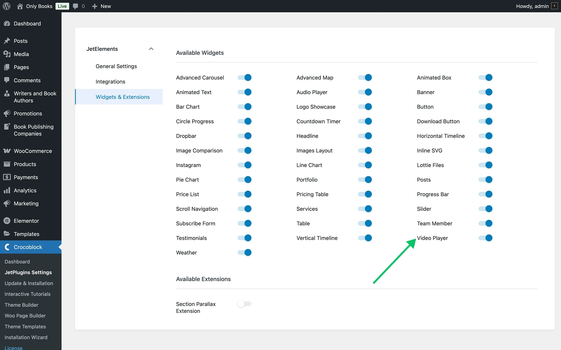
First of all, the Video Player widget should be enabled by going to WordPress Dashboard > Crocoblock > JetElements Settings > JetElements > Widgets & Extensions > Available Widgets section.
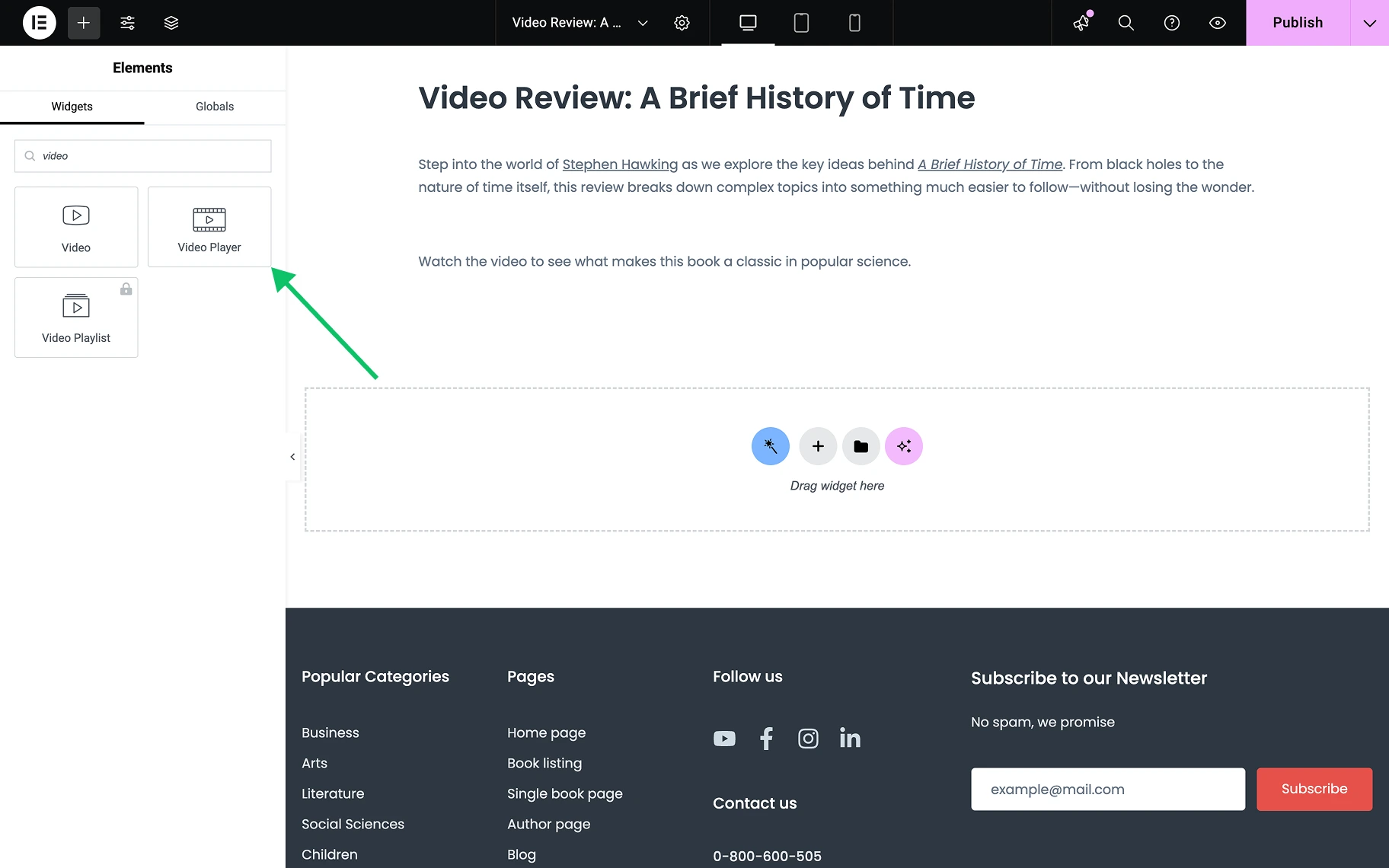
The page where the video is to be placed should be accessed and opened in the Elementor editor. The Video Player widget is to be found in the left panel and dragged to the page.
After that, the settings block is displayed, where one can customize the widget.
Video Player Widget Settings
In the Content tab, three sections are available: Video, Thumbnail Overlay, and Play Button.
Video section
In this section, the features available in the Video Player widget settings will be reviewed, depending on whether the “YouTube,” “Vimeo,” or “Self Hosted” option is selected in the Video Type field.
Youtube
Below are the features of a “YouTube” option in the Video Type field.
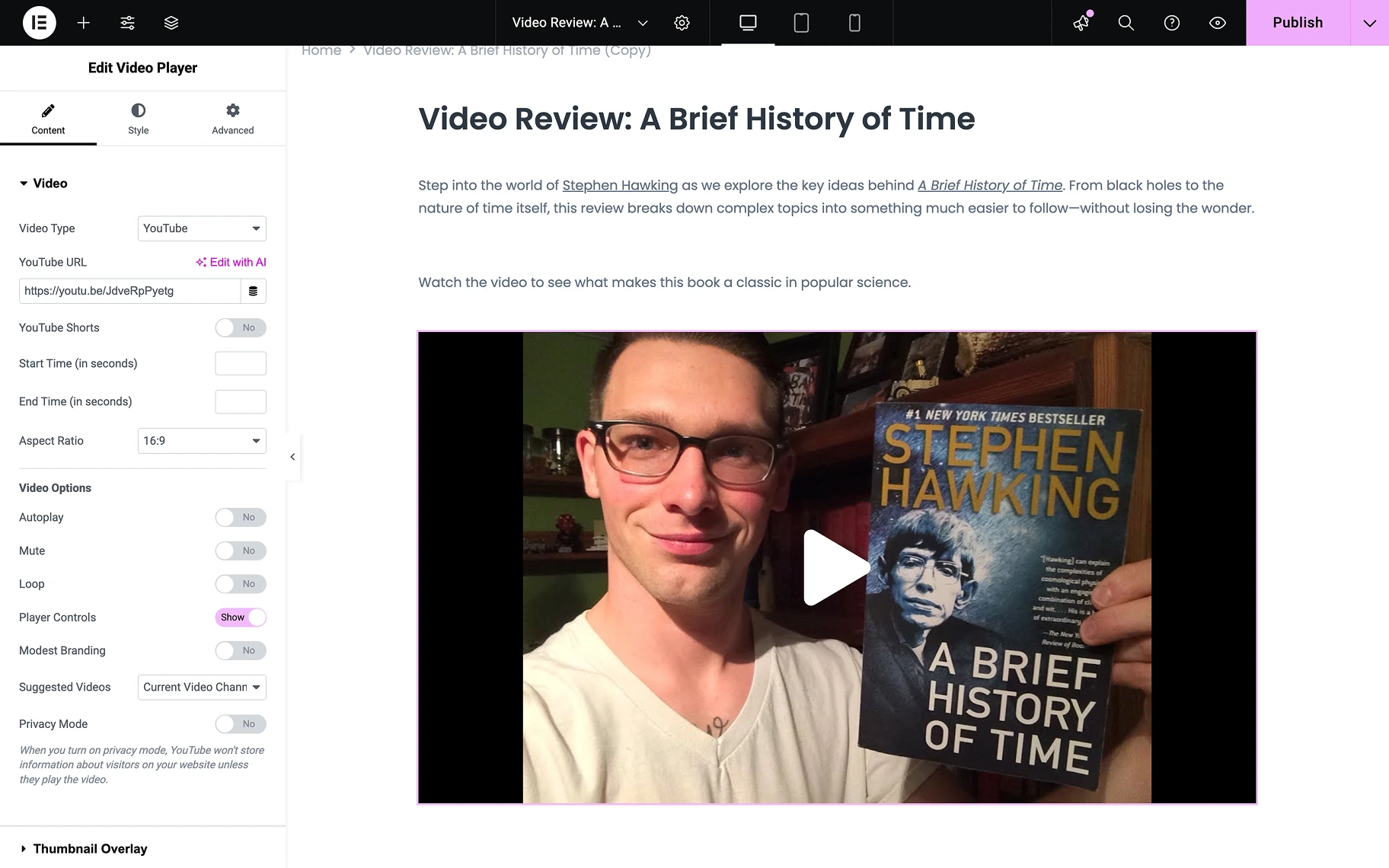
- Video Type — a drop-down menu where the source of the video is selected. Options include “YouTube,” “Vimeo,” or “Self Hosted” videos from the media library. If the “YouTube” option is selected, the following features are available:
- YouTube URL — a field where the URL of the video is inserted if “YouTube” or “Vimeo” options are chosen. For videos from the media library, the default player and the desired video are offered to be selected;
- YouTube Shorts — a toggle that enables the proper display format for YouTube Shorts videos, ensuring they maintain their vertical aspect ratio and appropriate player controls when embedded on the website;
- Start Time (in seconds) — a field where the desired start time in seconds is entered if the video is not to be started from the beginning;
- End Time (in seconds) — a field where the stop time in seconds is entered if the video is to be ended at a specific point;
- Aspect Ratio — a drop-down menu where the proportions of the shown video are selected, six options are available, including “1:1,” “3:2,” “4:3,” “9:16,” “21:9,” and “16:9”;
- Autoplay — a toggle that (when activated) causes the video to be played automatically;
- Mute — a toggle by which the audio is turned on or off;
- Loop — a toggle that activates the feature to replay the video immediately after it ends;
- Player Controls — a toggle that makes the video controls visible and accessible to users (when activated, the Modest Branding feature is revealed):
- Modest Branding — a toggle through which the YouTube or Vimeo logos are made visible on the video;
- Suggested Videos — a drop-down menu where the source of the automatically generated list of suggested videos is selected, two options are available: “Current Video Channel” and “Any Video”;
- Privacy Mode — a toggle that activates the privacy mode, preventing data collection from visitors by the video service before the video is watched.
Self Hosted
Below are the features of a “Self Hosted” option in the Video Type field.
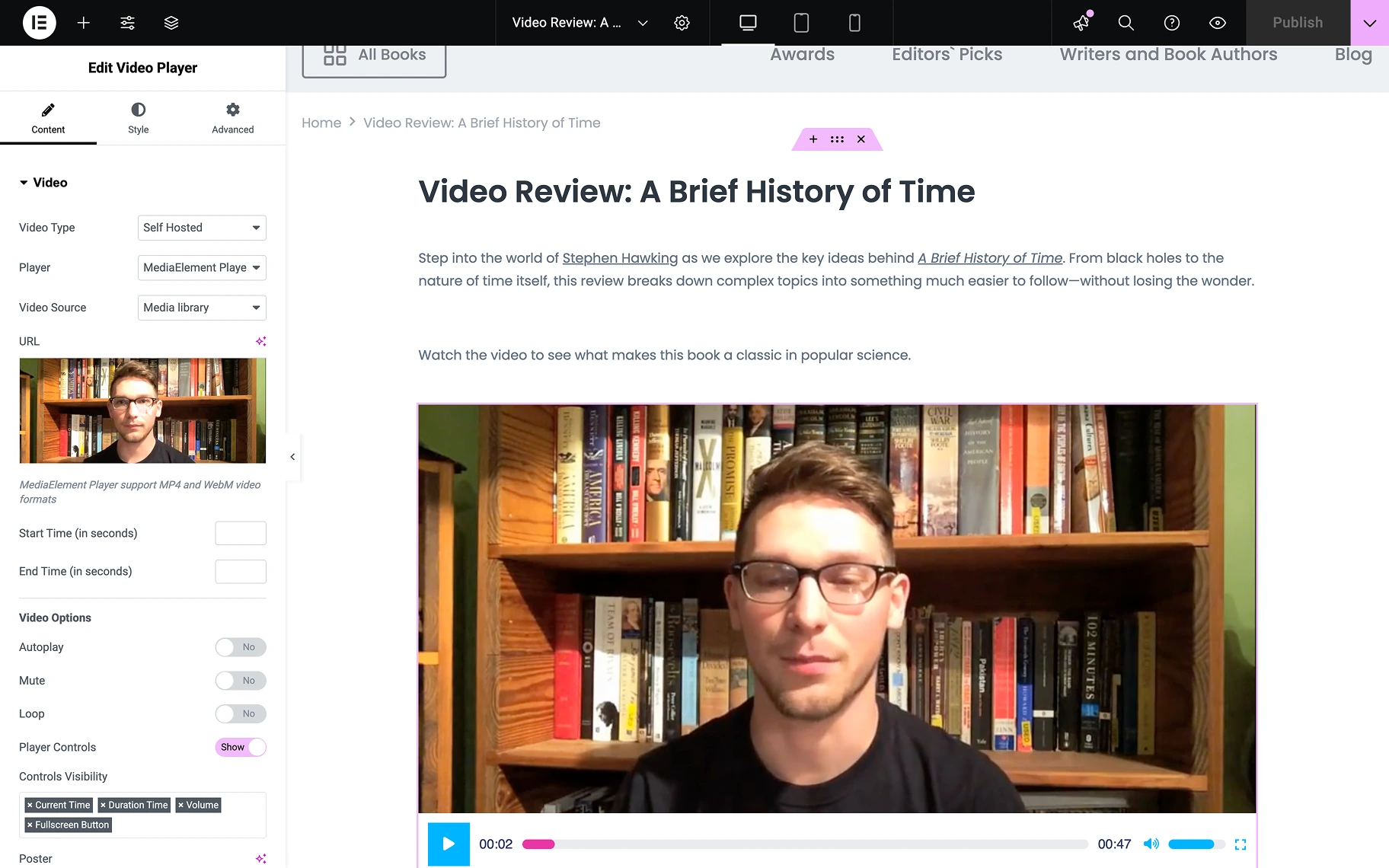
- Video Type — a drop-down menu where the source of the video is selected. Options include “YouTube,” “Vimeo,” or “Self Hosted” videos from the media library. If the “Self Hosted” option is selected, the following features are available:
- Player — a drop-down that allows choosing the type of player, “Default HTML5” or “MediaElement Player” options are available;
- Video Source — a drop-down where the source for a video can be selected, two options are available: “Media Library” and “External”;
- URL — a field where the URL of the video is inserted if “YouTube” or “Vimeo” options are chosen. For videos from the media library, the default player and the desired video are offered to be selected;
- Start Time — a field where the desired start time in seconds is entered if the video is not to be started from the beginning;
- End Time — a field where the stop time in seconds is entered if the video is to be ended at a specific point;
- Aspect Ratio — a drop-down menu where the proportions of the shown video are selected, six options are available, including “1:1,” “3:2,” “4:3,” “9:16,” “21:9,” and “16:9”;
- Autoplay — a toggle that, when activated, causes the video to be played automatically;
- Mute — a toggle by which the audio is turned on or off;
- Loop — a toggle that activates the feature to replay the video immediately after it ends;
- Player Controls — a toggle that makes the video controls visible and accessible to users;
- Control Visibility — five options are available: “Current Time,” “Duration Time,” “Volume,” and “Fullscreen Button;”
- Download Button — a toggle that reveals the video download button for users, allowing them to save the video file (disabled by default). This option is only available when “Default HTML5” is selected in the Player drop-down. The download button is available only if the browser supports this functionality;
- Poster — a field where one can select a preview image of the video, also “Dynamic Tags” are available, so one can dynamically pull images from various sources. Dynamic Tags allow for flexible content integration from JetReviews (such as “Review Author Avatar” and “Review Property”), JetEngine (including “Custom Image,” “Term Image,” “Image from options,” “User Image,” “Current Object Field,” “Current Object Image Field,” “Component Control Image”), and WooCommerce Product Images without needing to upload individual images manually.
Vimeo
Below are the features of a “Vimeo” option in the Video Type field.
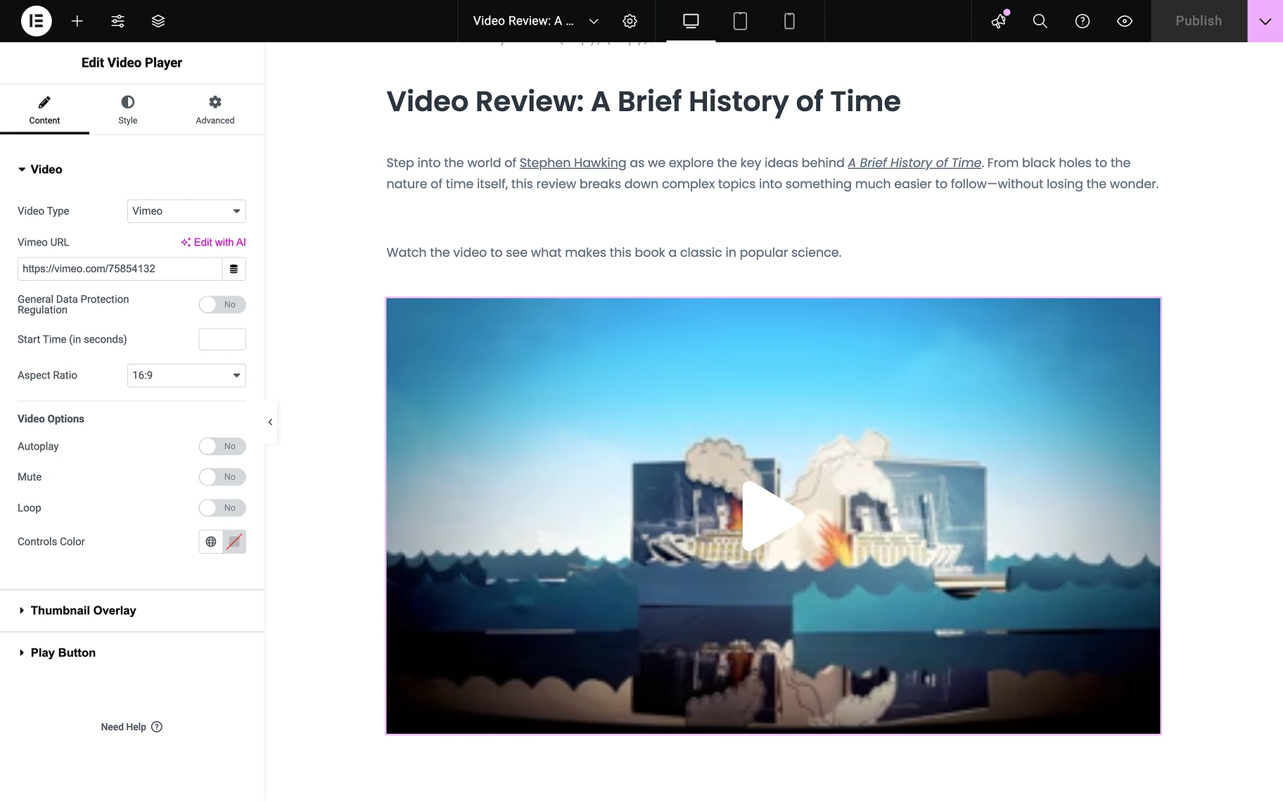
- Video Type — a drop-down menu where the source of the video is selected. Options include “YouTube,” “Vimeo,” or “Self Hosted” videos from the media library. If the “Vimeo” option is selected, the following features are available:
- Vimeo URL — a field where the URL of the video is inserted if “YouTube” or “Vimeo” options are chosen. For videos from the media library, the default player and the desired video are offered to be selected;
- General Data Protection Regulation — a toggle through which compliance with European data protection laws is enabled or disabled;
- Start Time — a field where the desired start time in seconds is entered if the video is not to be started from the beginning;
- Aspect Ratio — a drop-down menu where the proportions of the shown video are selected, six options are available, including “1:1,” “3:2,” “4:3,” “9:16,” “21:9,” and “16:9”;
- Autoplay — a toggle that, when activated, causes the video to be played automatically;
- Mute — a toggle by which the audio is turned on or off;
- Loop — a toggle that activates the feature to replay the video immediately after it ends;
- Controls Color — a select field where one chooses the color of the control elements.
Thumbnail Overlay section
In this section, one can overlay the video with a thumbnail if desired.
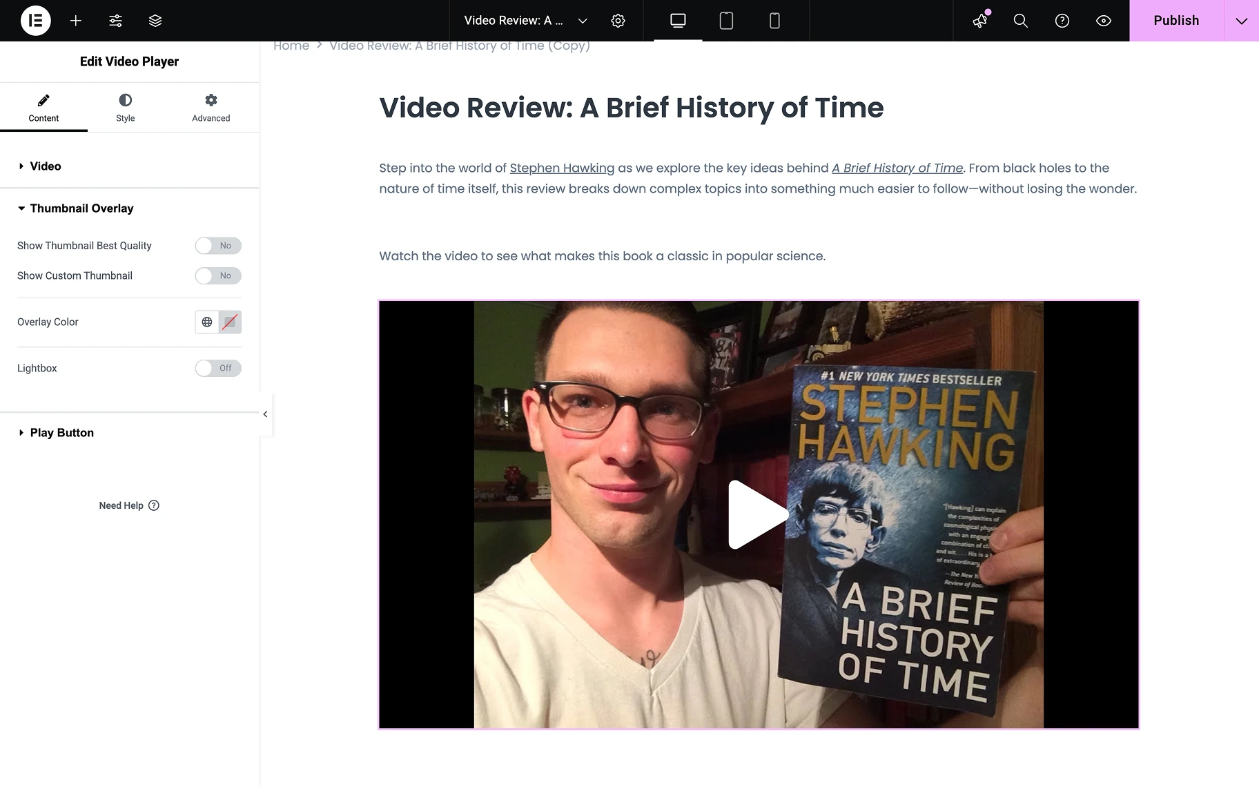
- Show Thumbnail Best Quality — a toggle by which the highest quality thumbnail is displayed;
- Show Custom Thumbnail — a toggle through which the usage of a custom-made thumbnail is enabled. When activated, the following features are revealed, and the Show Thumbnail Best Quality toggle is hidden;
- Thumbnail — a select field where one can choose an image from the Media Library;
- Image Resolution — a drop-down field where the quality level of the displayed image is selected. Options range from small thumbnail sizes to full resolution, with predefined dimensions;
- Overlay Color — a color picker where a plain color is selected to be used;
- Lightbox — a toggle by which the lightbox for the video is enabled.
Play Button section
If Autoplay is not selected, the video will only play after the user presses the play button. In this menu block, the play button can be customized.
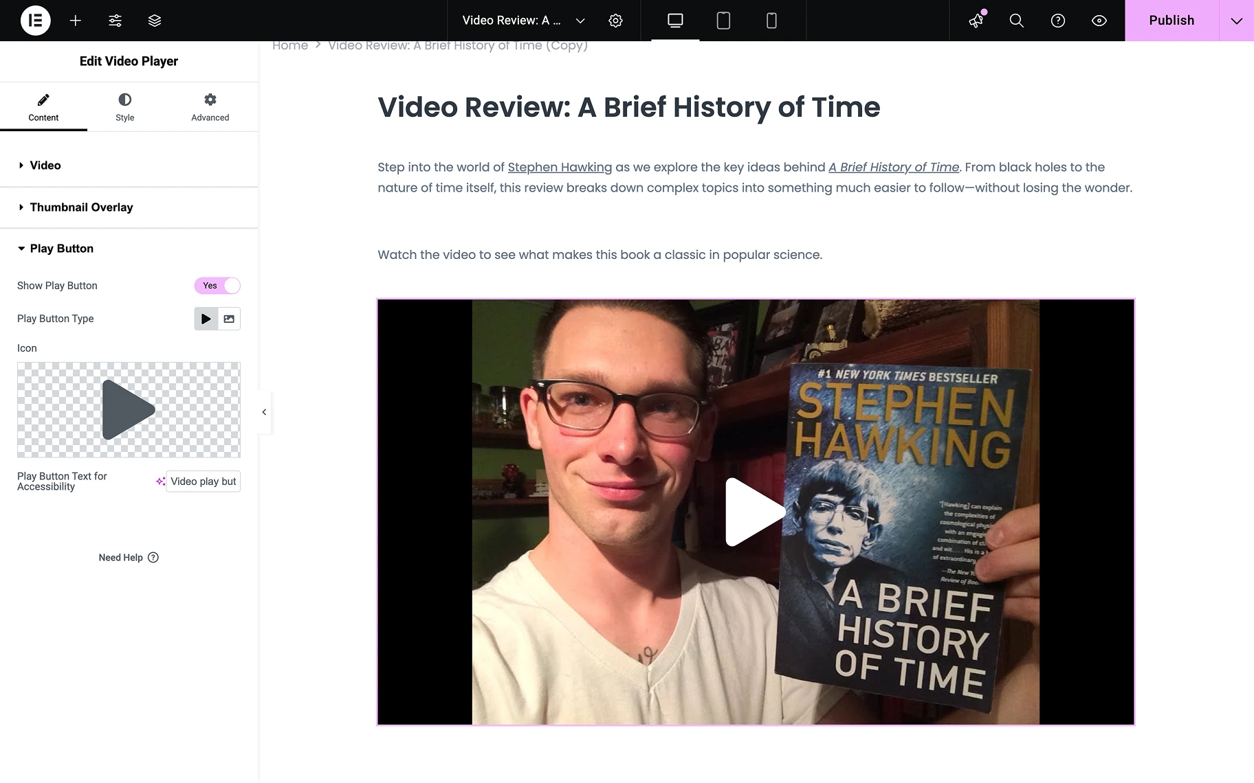
- Show Play Button — a toggle by which the play button is made visible to the user. When this toggle is activated, the following features are revealed:
- Play Button Type — a field where the play button type is chosen by clicking on the “Icon” or “Image” button, after which the specific icon or picture is selected from the Media Library;
- Icon — a select field where the play button icon is selected;
- Play Button Text for Accessibility — a field where the accessibility text for the play button is entered, with “Video play button” being provided as the default value.
When settings are completed, the Style tab should be accessed. The settings for styling the video player and the play button are available there. After customization is finished, click the “Update” button to save the results.
Video content can be showcased to greet visitors, inform about updates, announce special offers, present a company, or explain how any device works using the Video Player widget.
That’s all one needs to know about the setting of the Video Player widget for Elementor on a WordPress website.