Components Overview
This overview is about the components feature available with the JetEngine plugin for WordPress.
The Component feature allows creating and adjusting a custom widget/block/element, adding and reusing it on any needed page or template later.
For instance, a developer can build a custom widget and define what controls it will have. Then, this widget can be used by a client in the builder and customized according to their needs.
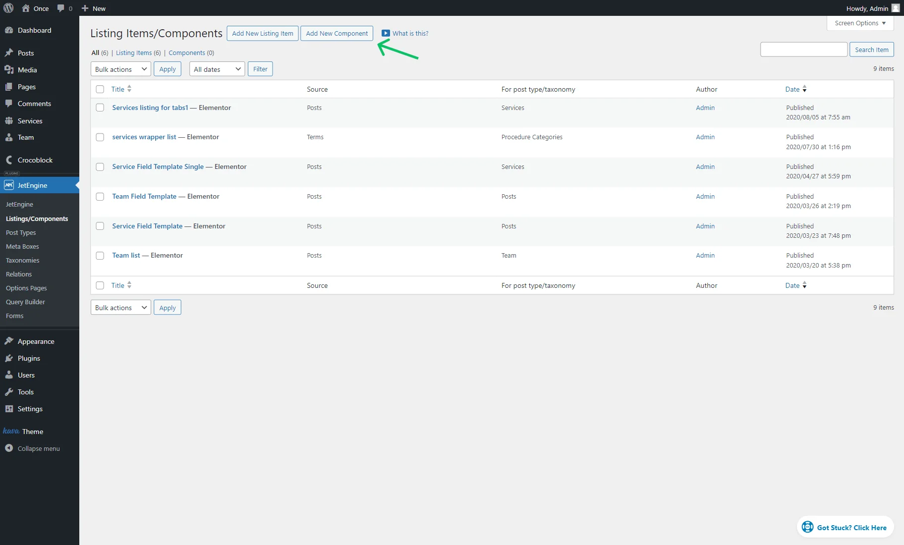
Listings/Components Directory
The components directory can be found in WordPress Dashboard > JetEngine > Listings/Components.
Both Listing templates and components are presented in one list.
One can also switch between the “All,” “Listing Items,” and “Components” lists and check the number of items already created (numbers next to the list labels).
To build a new component, one should press the “Add New Component” button.
In the opened pop-up, one should complete the following fields:
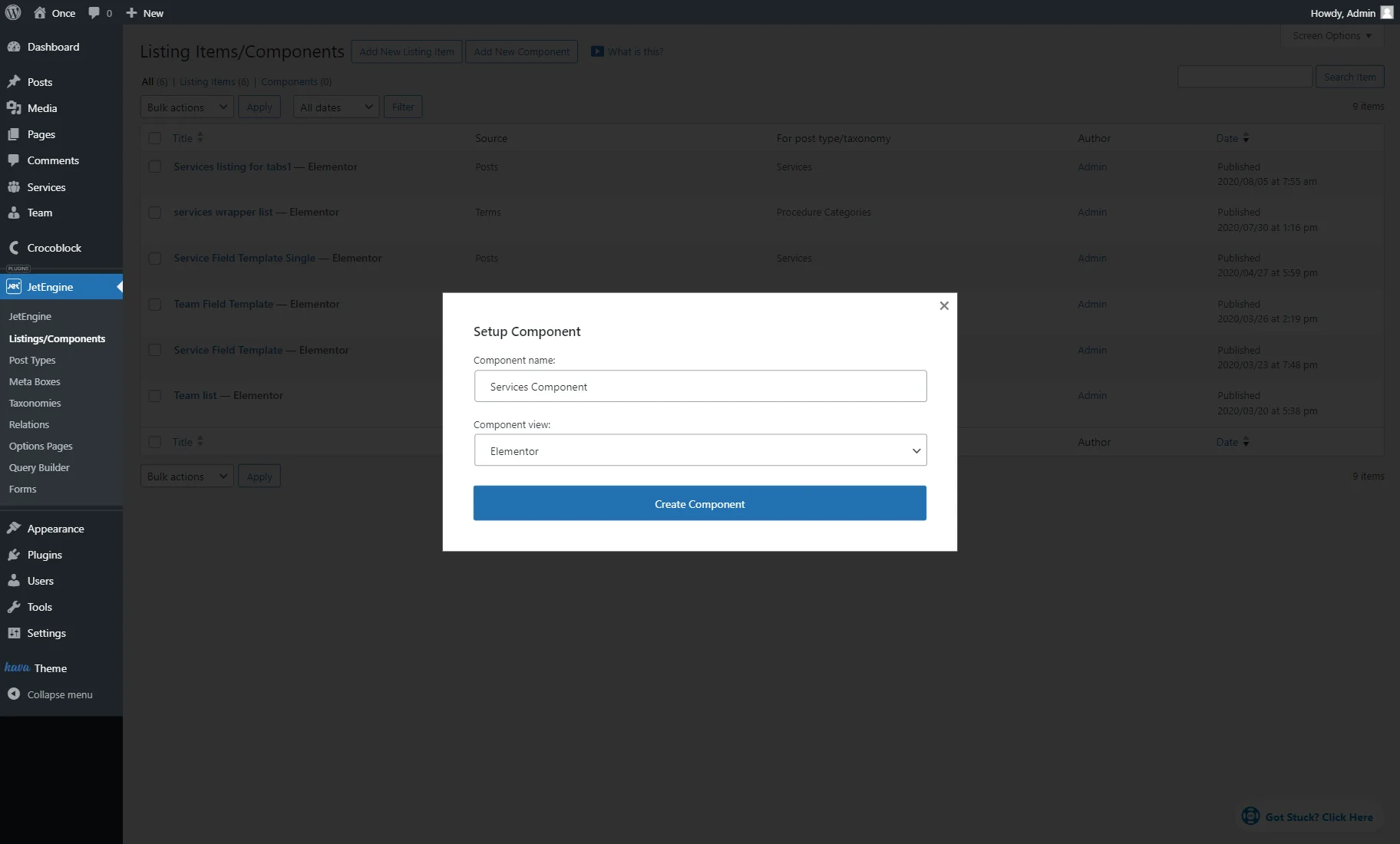
- Component name — a field that will be later displayed as the widget/block/element name;
- Component view — a dropdown menu with options that indicate the builder that will be used to build the component. Among possible options are: “Elementor,” “Bricks,” “Timber/Twig,” and “Blocks (Gutenberg).”
To proceed to the editor, the “Create Component” button should be clicked.
Find out more about components and what they are from this Components video overview.
Elementor Builder
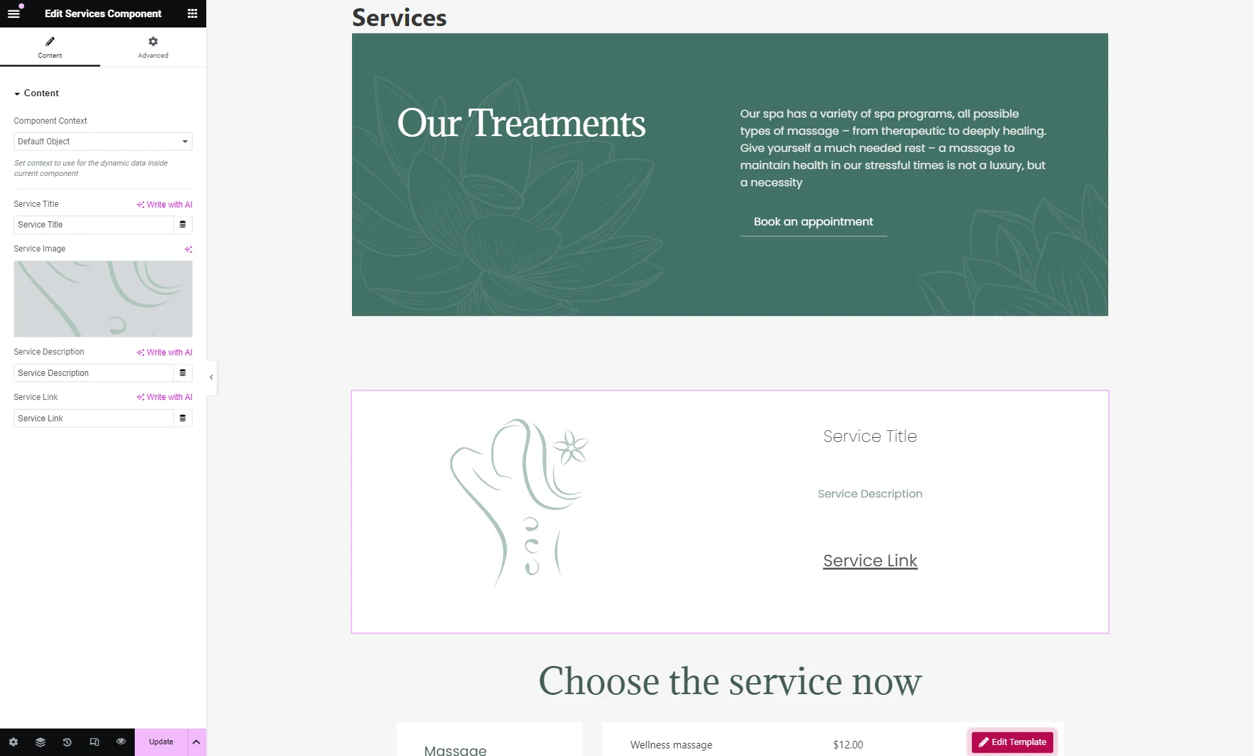
At first, one should add the widgets to the page and define them as controls.
The Component Settings can be found by clicking the “gear” icon in the bottom left corner.
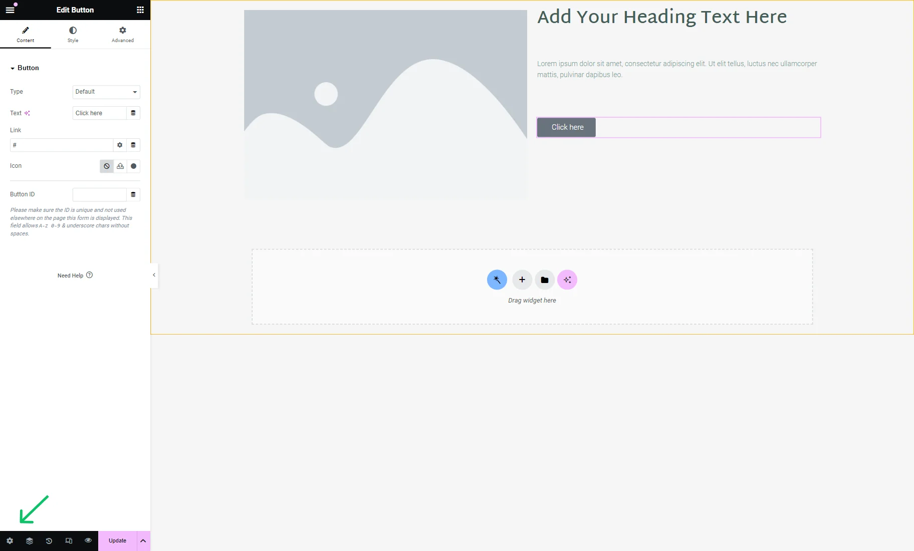
Here, three settings tabs are presented: General Settings, Component Content Settings, and Component Style Settings.
General Settings
In this tab, one can change the following settings:

- Title — a title of the component. This title can be changed if needed;
- Status — status of the current component that can be changed to: “Draft,” “Pending Review,” “Private,” or “Published.”
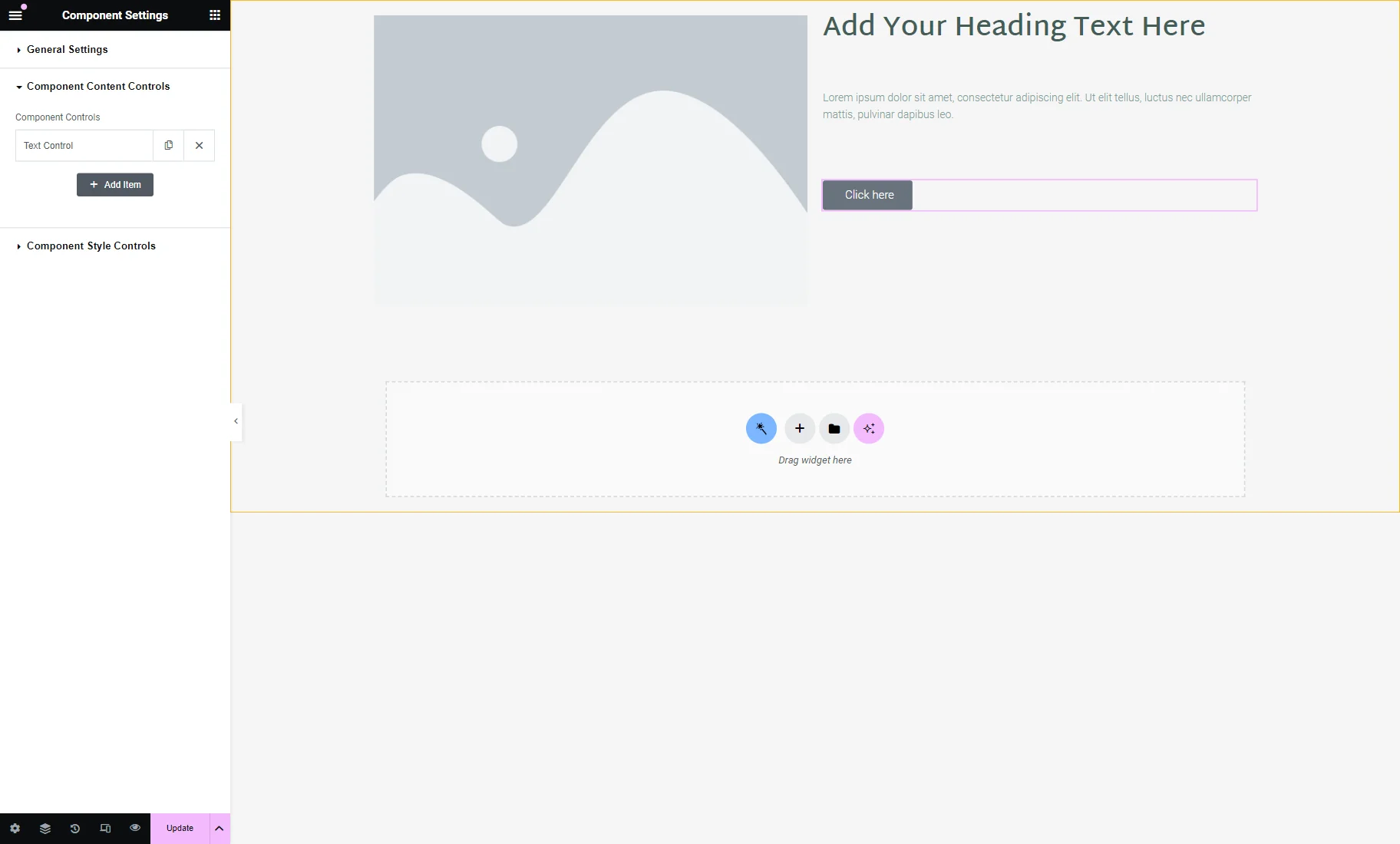
Component Content Controls
This tab contains the main content settings of the current component.
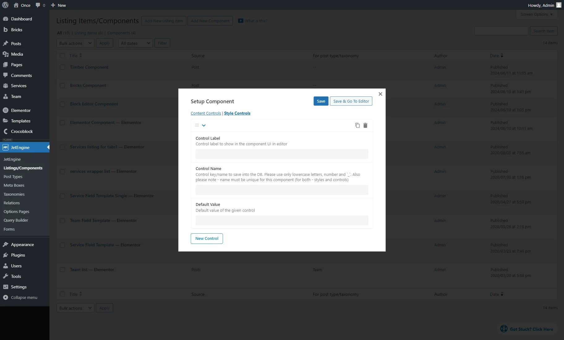
Inside the tab, there is one section called Component Controls. By default, it includes one Text Control tab and the “Add Item” button below it.
Next to the item label, one can find the “duplicate” and “delete” icons.
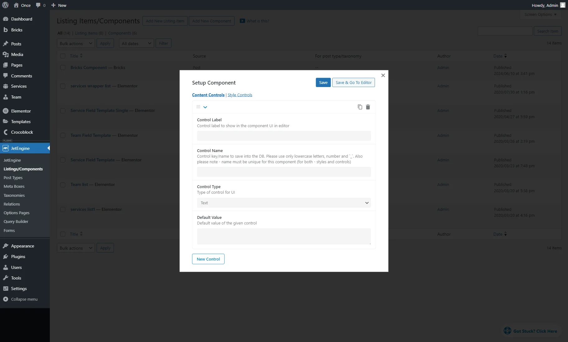
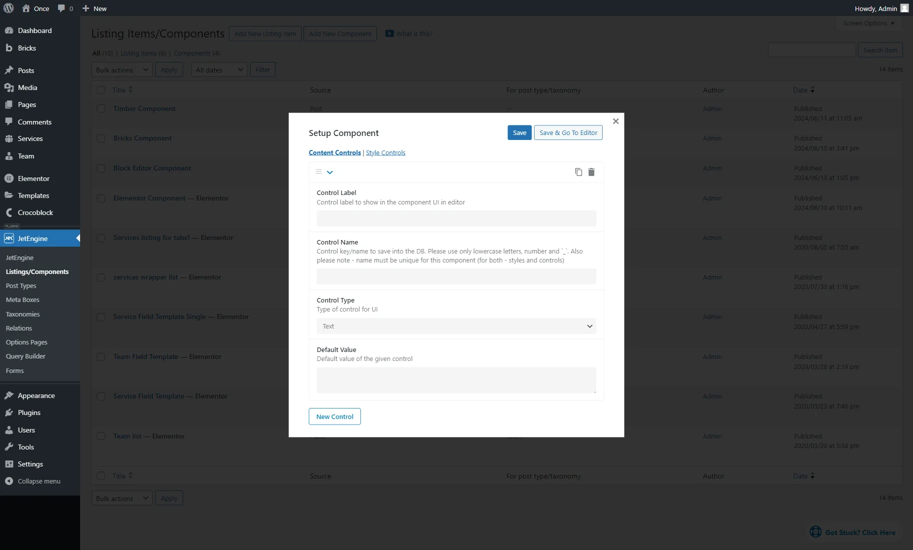
When unfolded, the item tab contains the following settings:
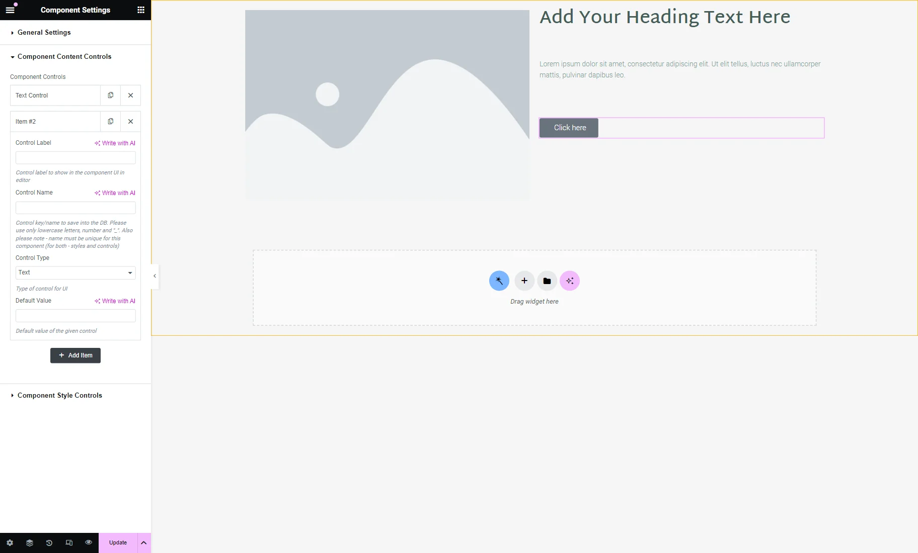
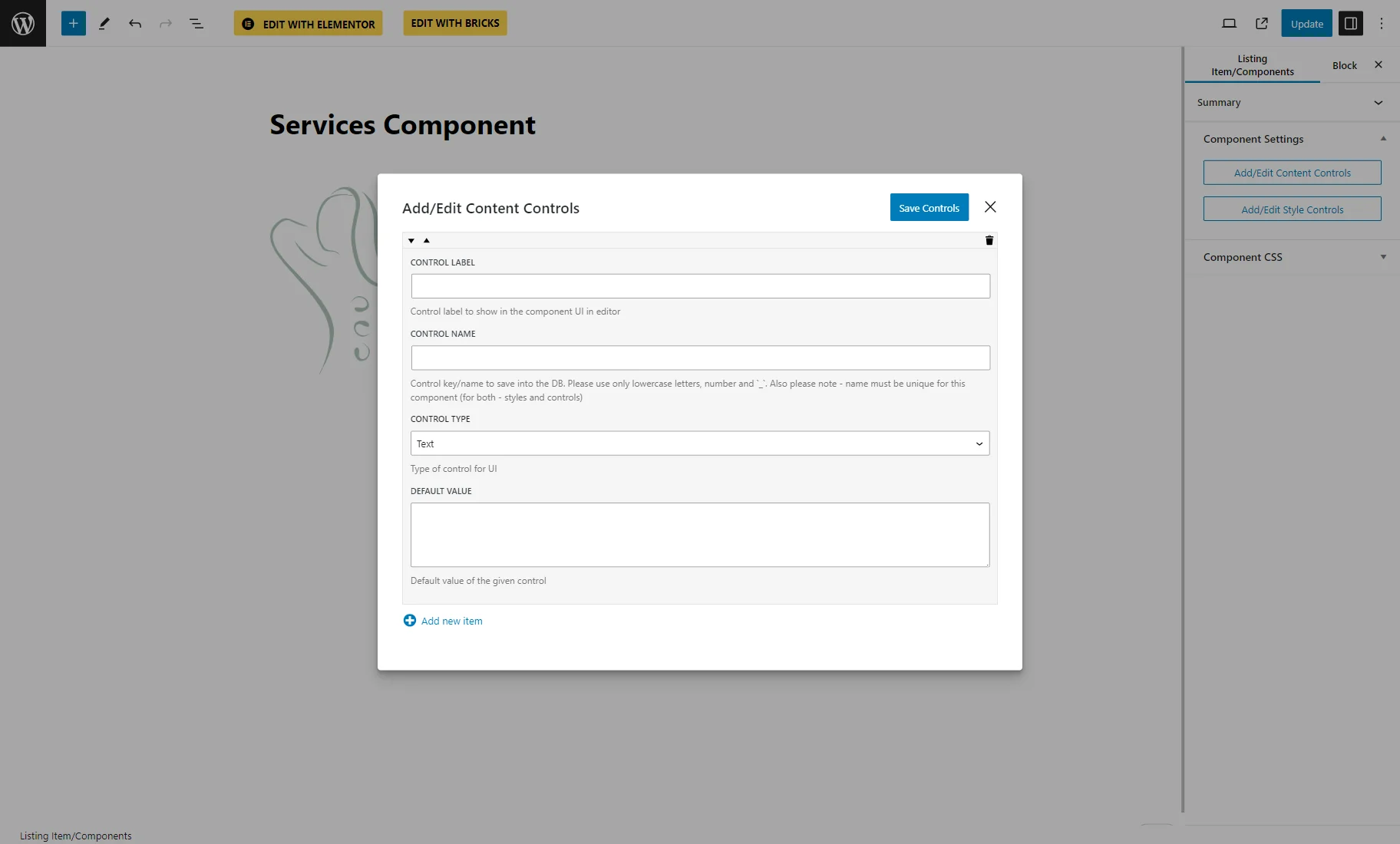
- Control Label — a label of the control that will be later displayed in this component’s widget/block/element settings;
- Control Name — a name attached to the control that will be saved to the database. This key should be unique for both styles and controls and include only lowercase Latin letters, numbers, and “_” symbol instead of spaces;
- Control Type — a type of control. It can be set to “Text,” “Textarea,” “Rich Text,” “Select,” or “Single Media”. If the “Select” option is picked, the Options field becomes available for customization. There, one can specify the options for the current “Select” control.
- Default Value — a default value set for the current control.
The new item can be added by pushing the “Add Item” button.
Component Style Controls
In the Component Style Controls settings tab, the Style Controls section is presented.
To adjust a new style control, one should press the “Add Item” button.
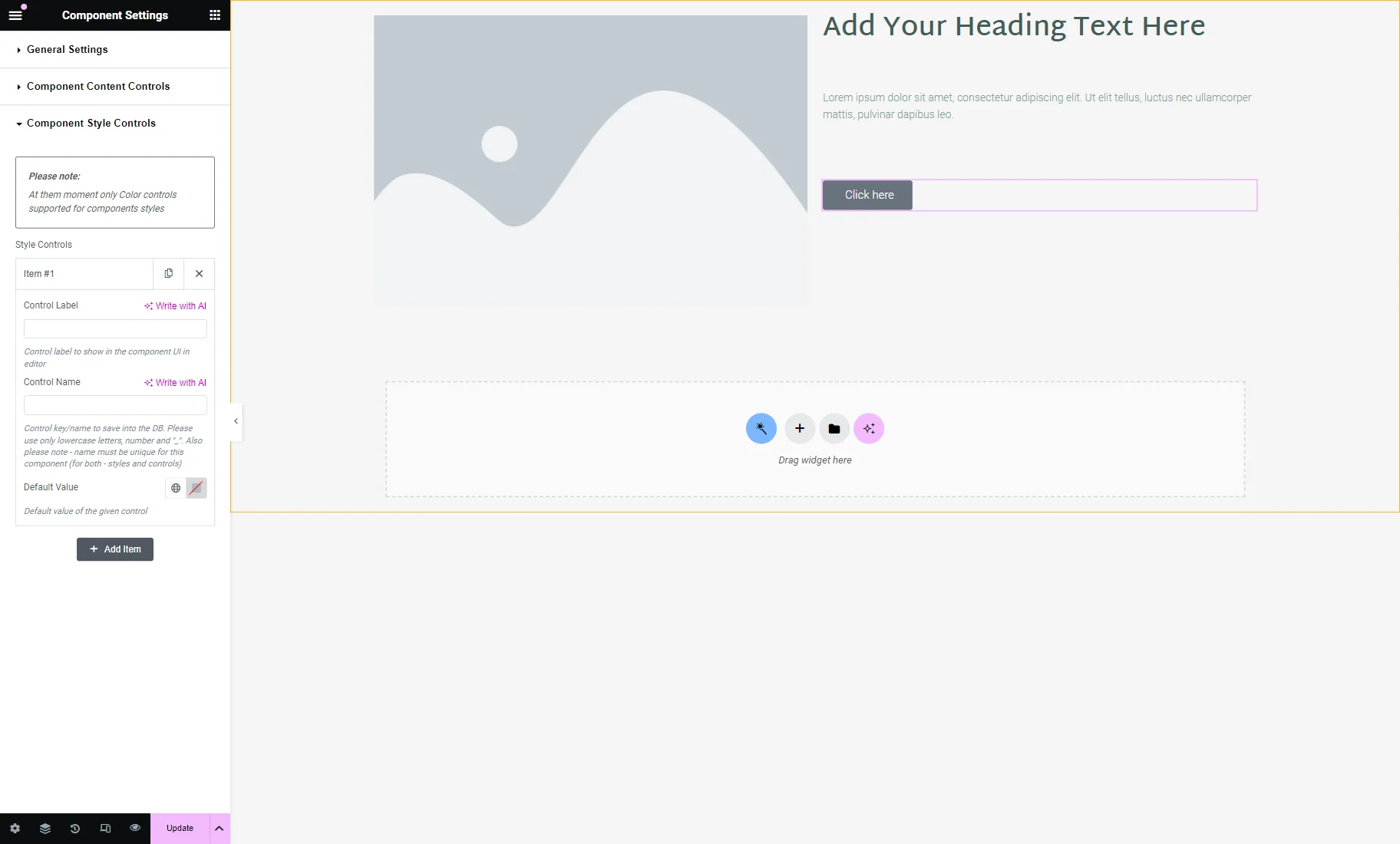
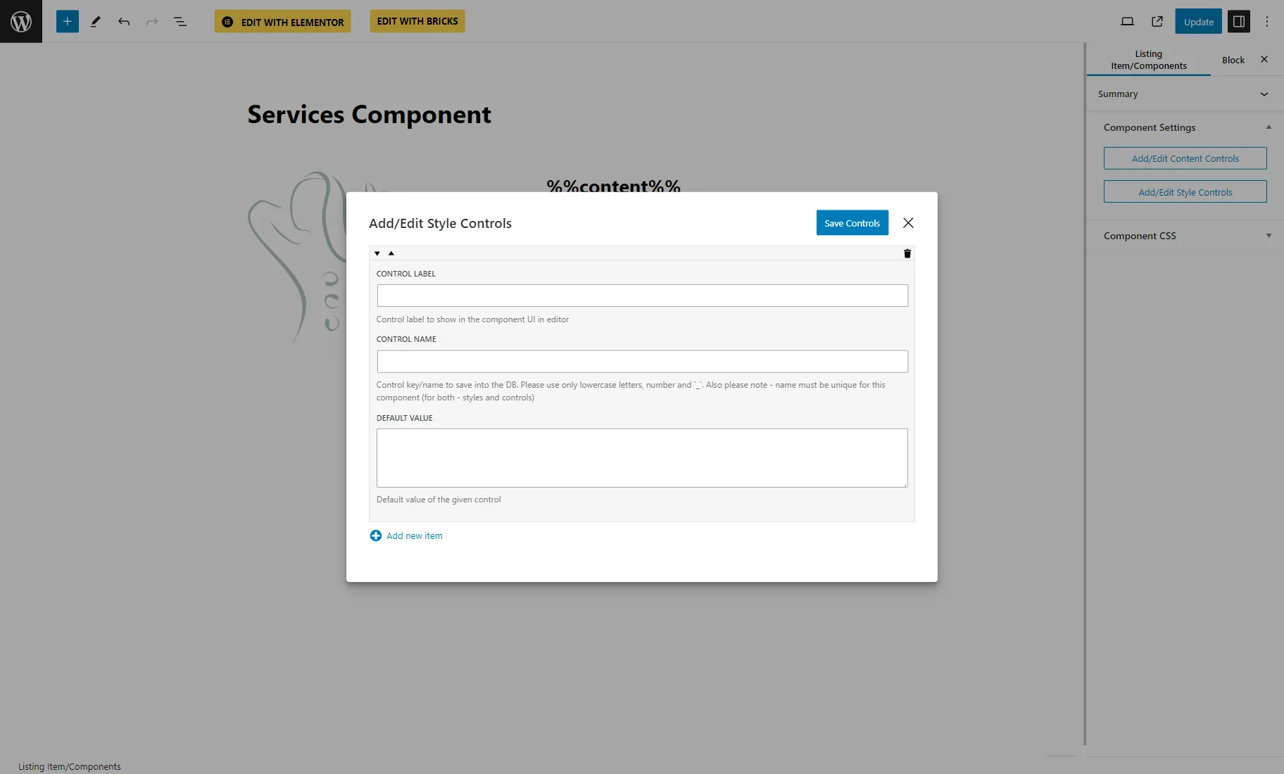
- Control Label — a field indicating the label of the control that will be later displayed in this component’s widget/block/element settings;
- Control Name — a name attached to the control that will be saved to the database. This key should be unique for both styles and controls and include only lowercase Latin letters, numbers, and “_” symbol instead of spaces;
- Default Value — a default value set for the current control.
Control Names
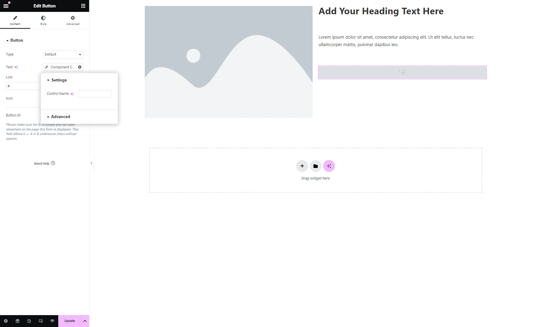
Every widget that will later be changed by control should have a Control Name attached.
To do so, the “dynamic tags” icon should be clicked in the corresponding widget’s settings, and the “Component Control Value/Component Control Image/Component Control Color” macro should be selected.
Then, the Control Name field should be completed with a value set earlier in the Control Name field of the Component Settings.
Check more information on How to Create a Component in Elementor.
Block Editor (Gutenberg)
The components’ settings can be found in the Component Settings section of the Listing Item/Components tab of the Block Editor.
Component Settings
There, the Component Settings tab is available. If it is opened, the following two buttons are presented:
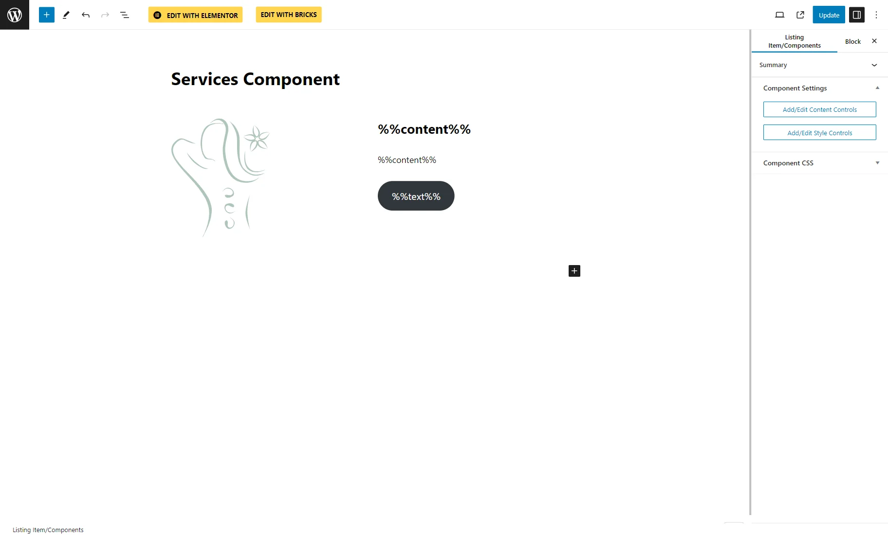
- Add/Edit Content Controls — a button that opens the editing pop-up for the content controls;
- Add/Edit Style Controls — a button that opens the editing pop-up for the style controls.
Once the “Add/Edit Content Controls” button is clicked, the editing pop-up is opened.
At first, only one “Add new item” button is presented. Once it is clicked, the settings for item adjusting are shown. These are identical to the Elementor Component Content Controls settings described in the previous part.
Every new item can be added by pressing the “Add new item” button.
To save the items, one should press the “Save Controls” button.
If one pushes the “Add/Edit Style Controls” button, another pop-up opens. It is identical to the one for the content controls described above.
To add a new item, one should press the “Add new item” button.
The style control settings here are the same as in the Component Style Controls tab of Elementor Builder.
The “Add new item” button should be pressed every time a new control should be added.
Component CSS
In Gutenberg, the corresponding Component CSS tab allows for specifying the CSS classes for a component.
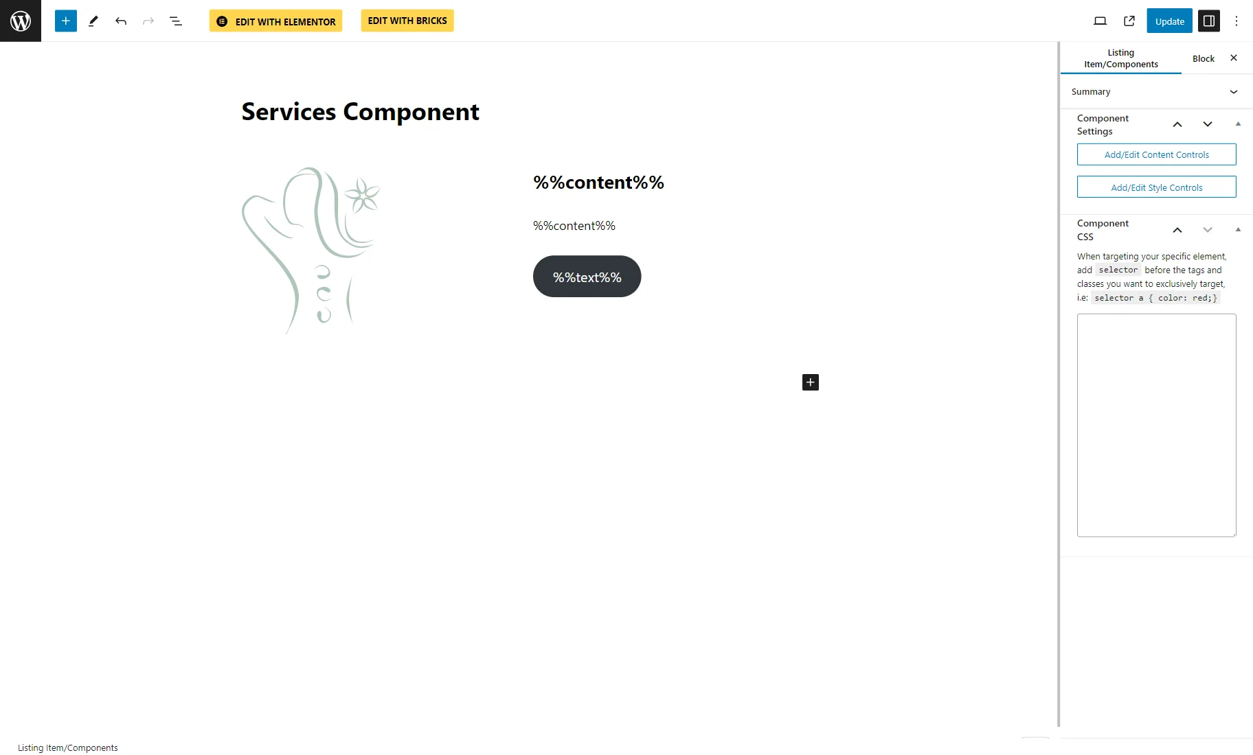
The added style components are stored below the Component CSS textarea and can be used in the CSS code.
Control Names
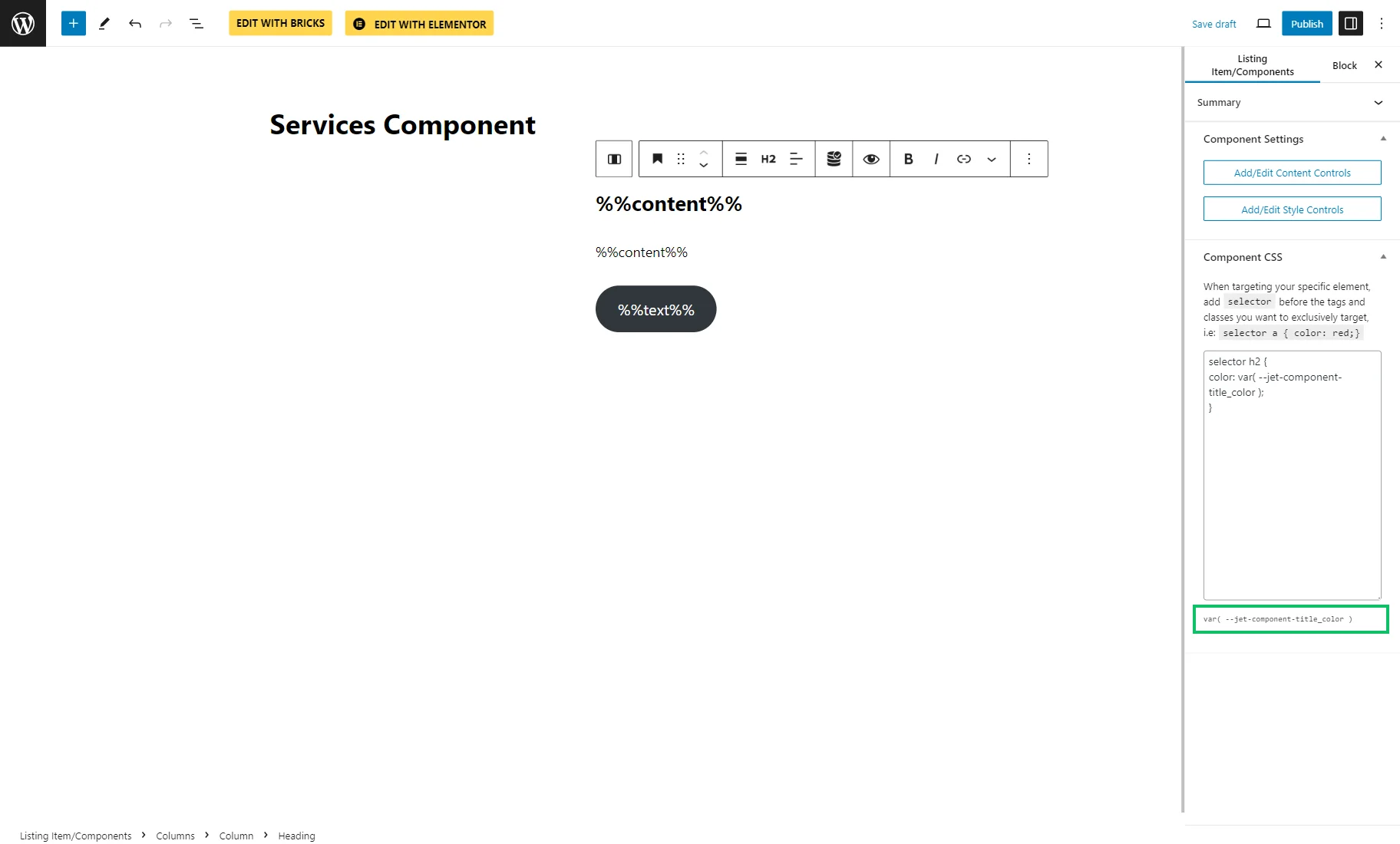
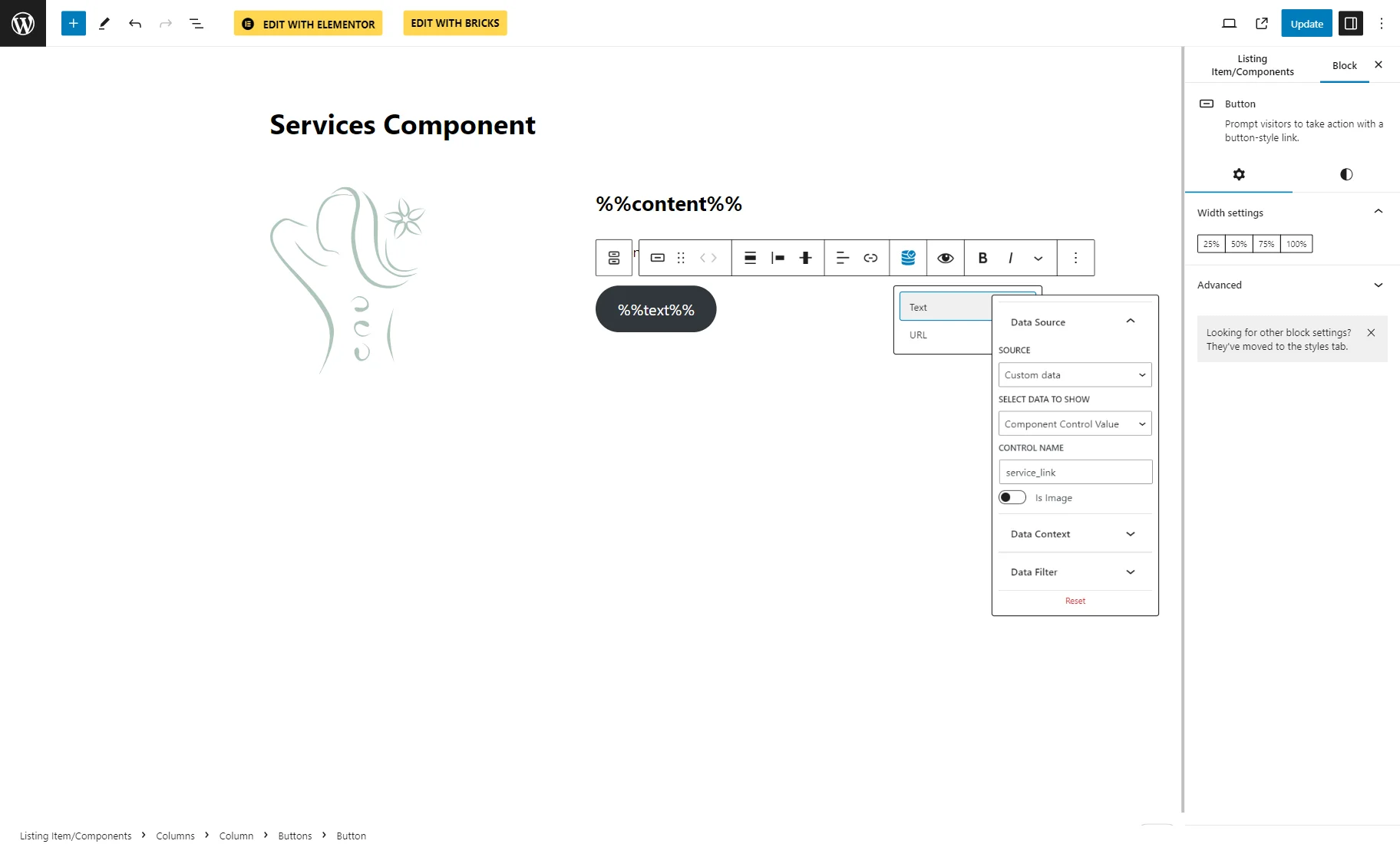
Once the controls are set, they should be attached to the corresponding blocks. To do so, in the Block Editor, one should click the “Dynamic Tags” button above the field.
Here, in the Data Source tab, one should pick the “Custom data” SOURCE and find the “Component Control Value” in the SELECT DATA TO SHOW dropdown menu.
Then, the CONTROL NAME should be specified.
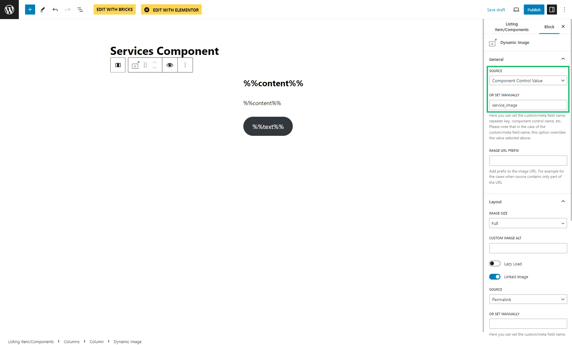
The controls can also be set right in the block settings. For instance, for the Dynamic Image, one should select the “Component Control Value” SOURCE and define the needed control name in the OR SET MANUALLY FIELD.
Bricks
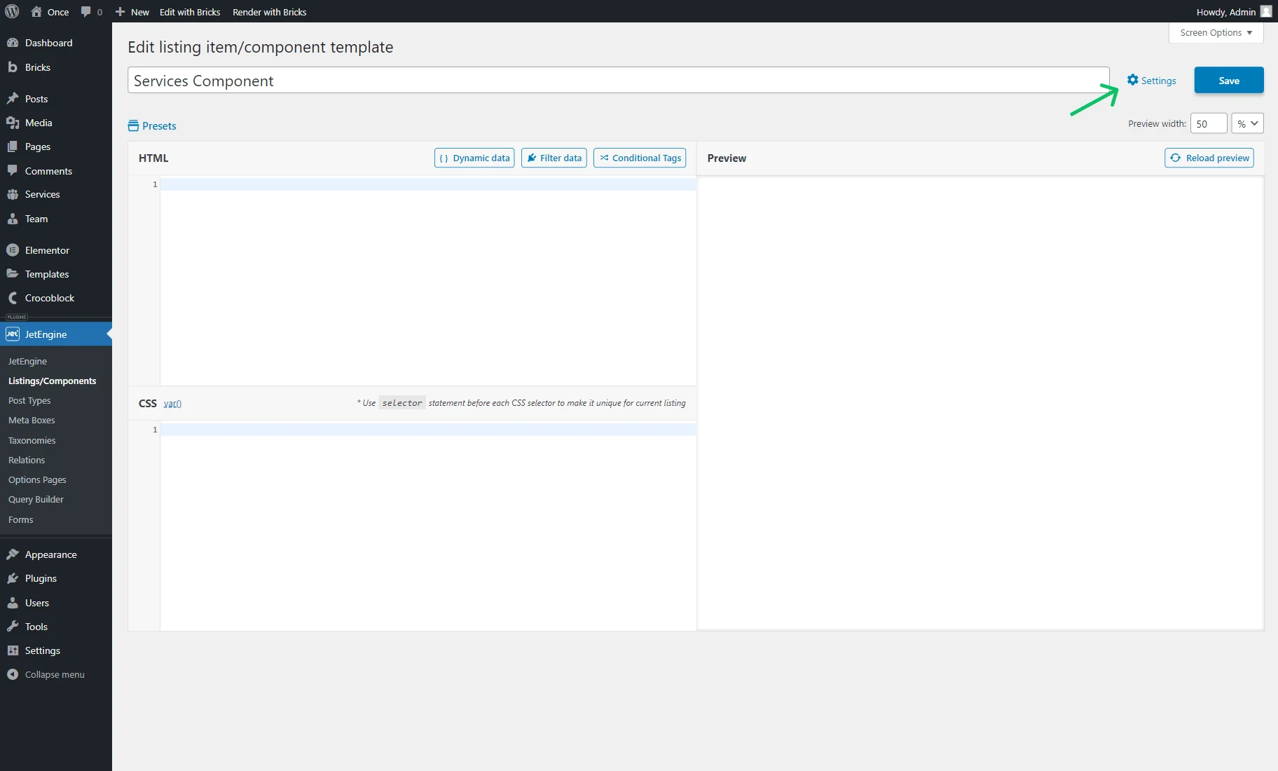
To edit a component in Bricks, one should first define its controls in the WordPress Dashboard > JetEngine > Listings/Components directory.
The “Edit component” button should be clicked once hovered over the item, and then the needed controls defined.
The first Content Controls tab in the opened pop-up has the same settings as described earlier in the Component Content Controls part of the overview.
The Style Controls tab is identical to the one described in the Component Style Controls part of the overview.
Then, the “Save & Go To Editor” button should be clicked.
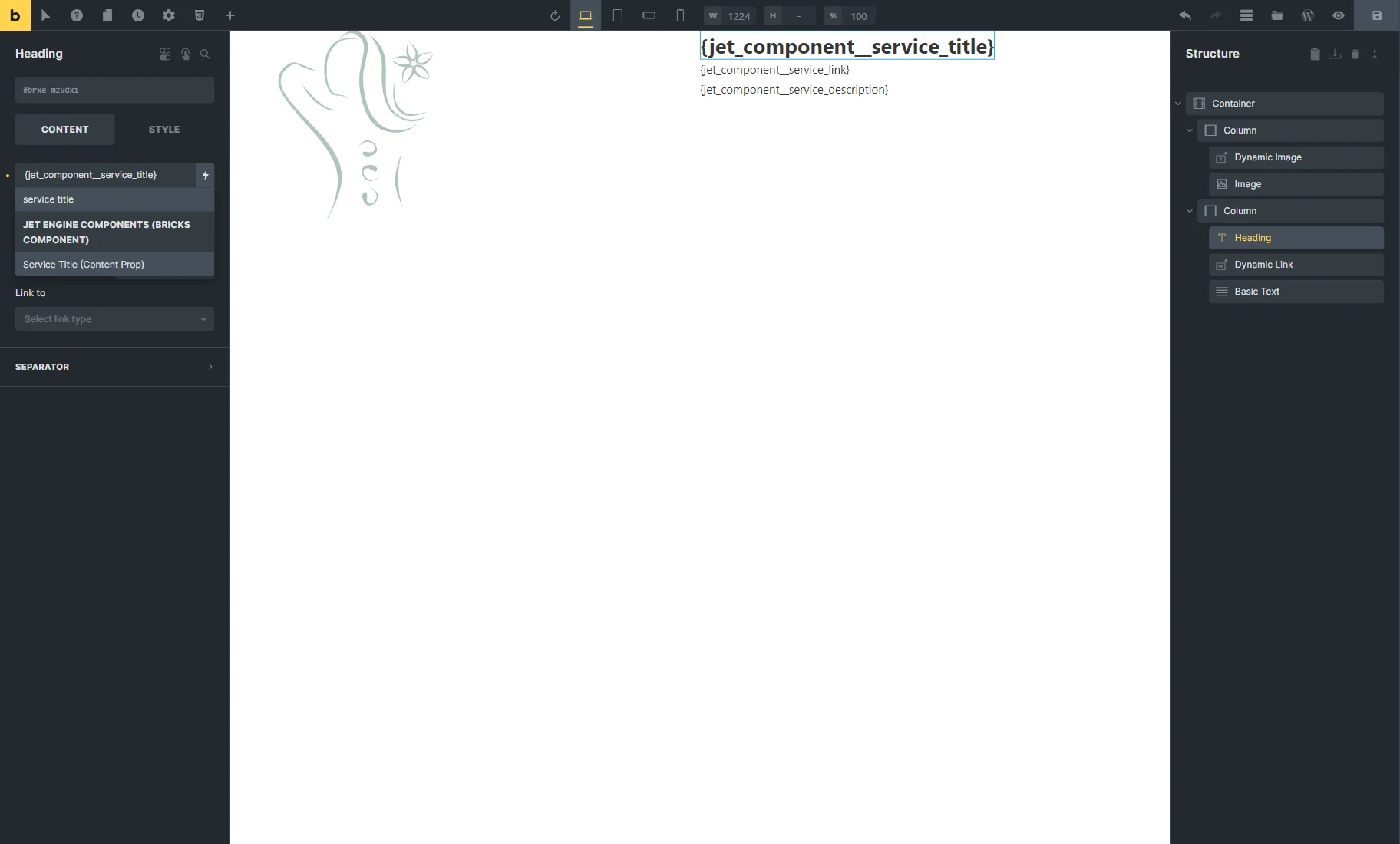
In the editor, the needed elements should be added and attached to controls.
To do so, the “Dynamic Data” button should be clicked in the needed element settings, and the set control should be found and selected.
The mentioned steps should be repeated for all the needed elements.
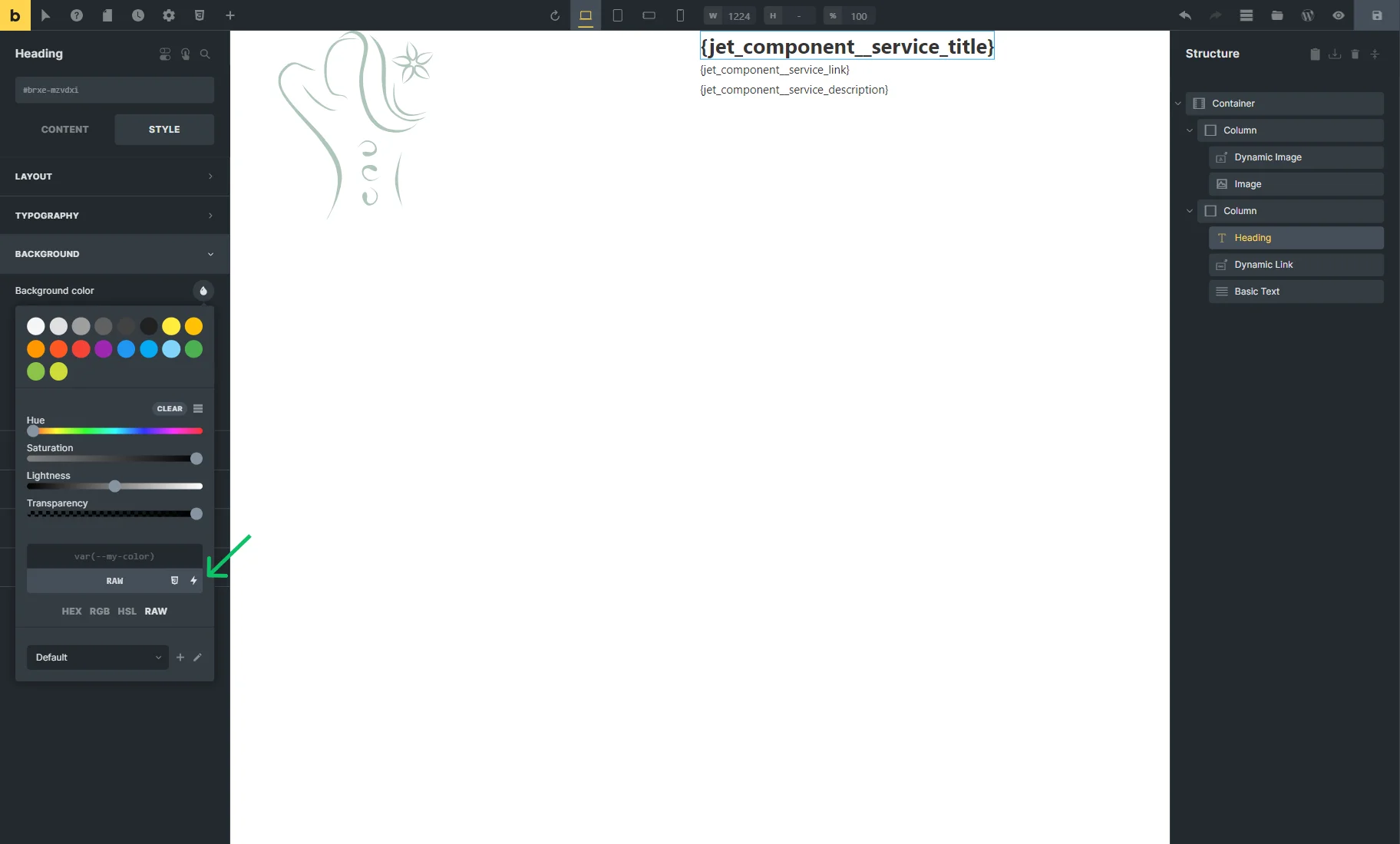
Also, one can attach the style controls by opening the STYLE tab and finding the “Dynamic Data” button.
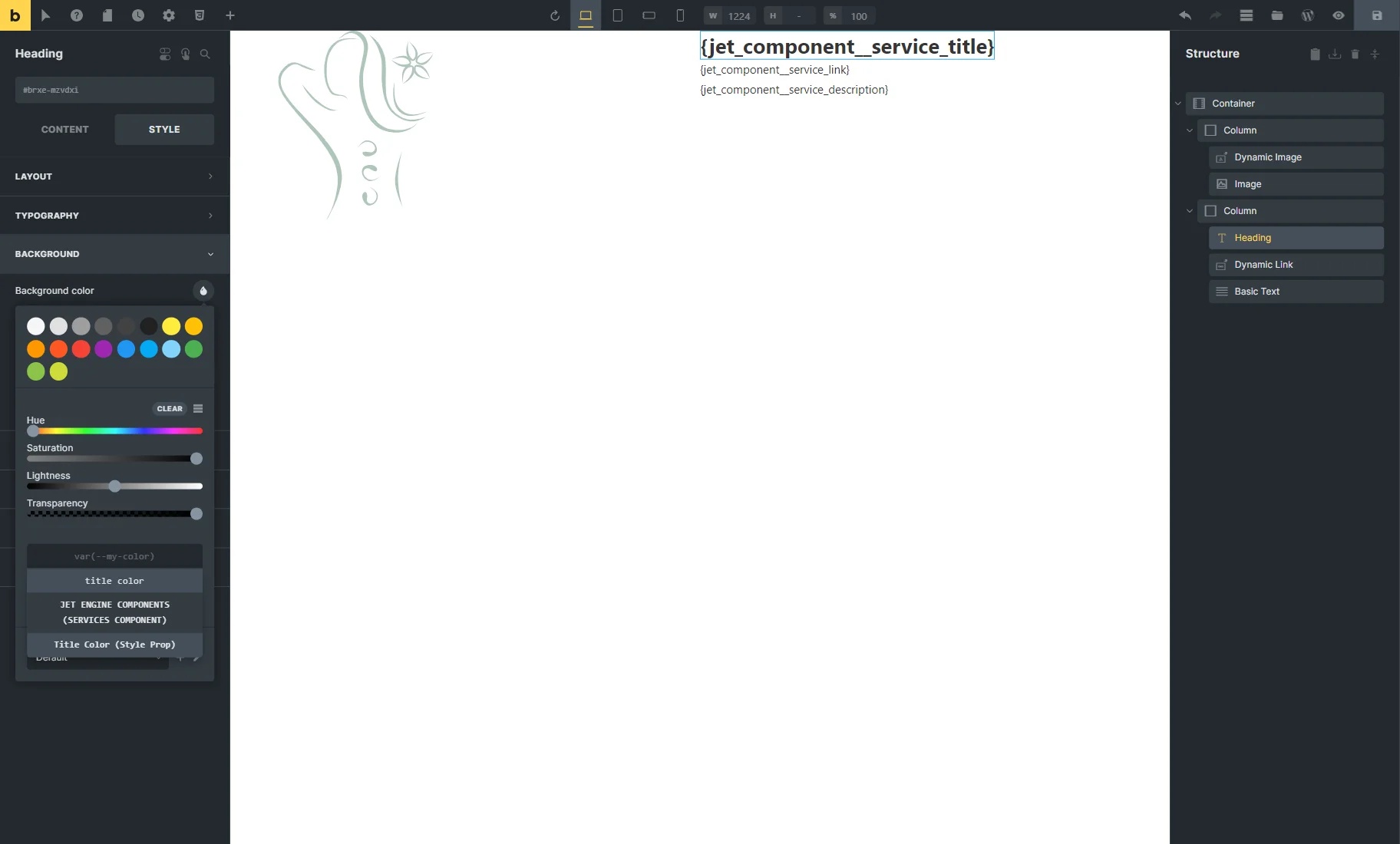
For instance, to set the Background color in the BACKGROUND tab, one should click the “drop” icon, select the “RAW” option, and press the “Dynamic Data” button.
Once done, one can pick the created style control.
Timber/Twig
The component controls can also be adjusted in the Timber builder by clicking the “Settings” button.
Once done, the pop-up is opened. It contains two tabs: Content Controls and Style Controls.
Below the tab title is a “New Control” button, which should be clicked to adjust the control.
The settings here are identical to those presented in the Component Content Controls tab of the Elementor Page Builder.
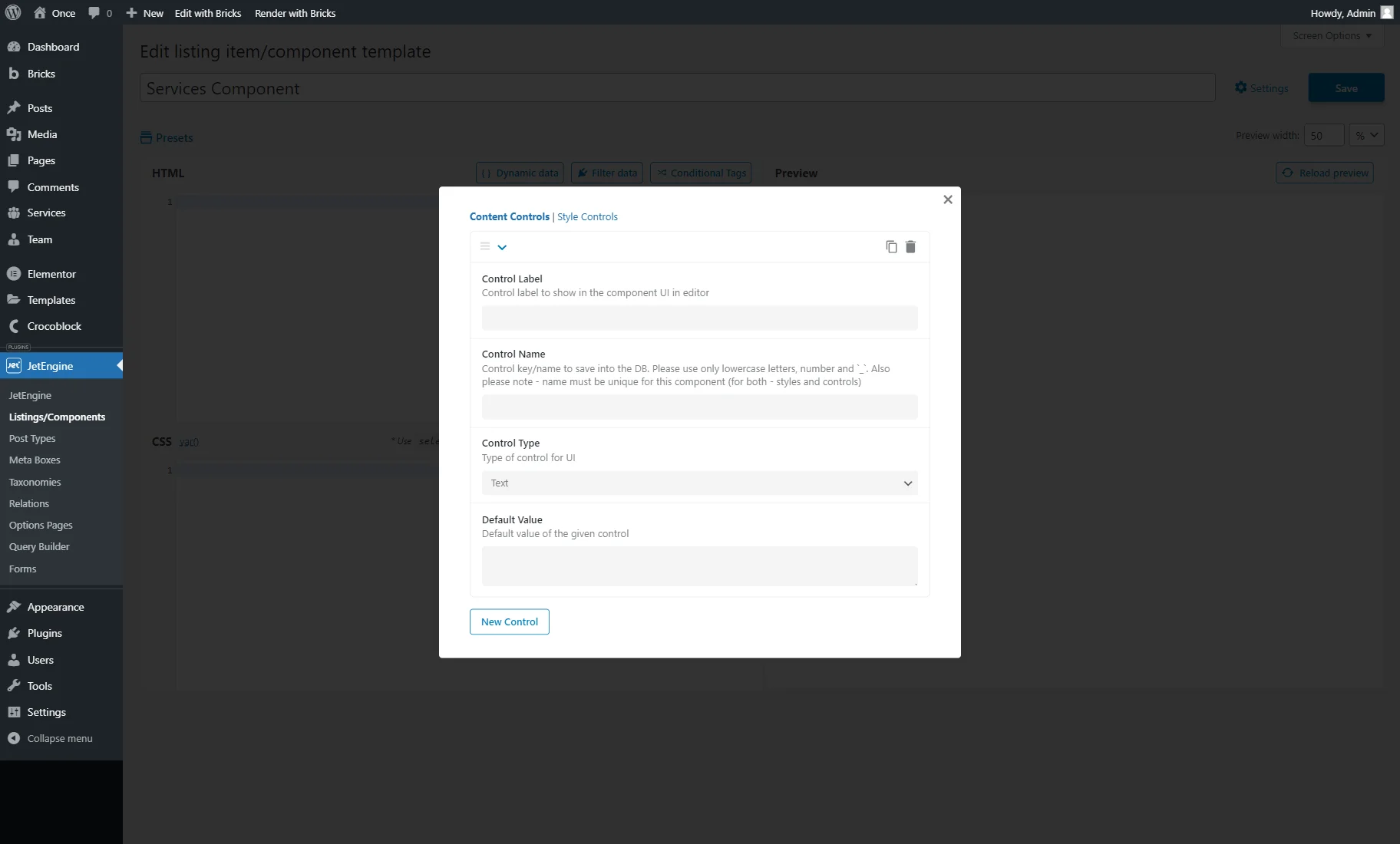
The Style Controls tab also includes the “New Control” button, which, when clicked, activates the style control’s settings.
The setting fields here are the same as in the Component Style Controls tab available in Elementor.
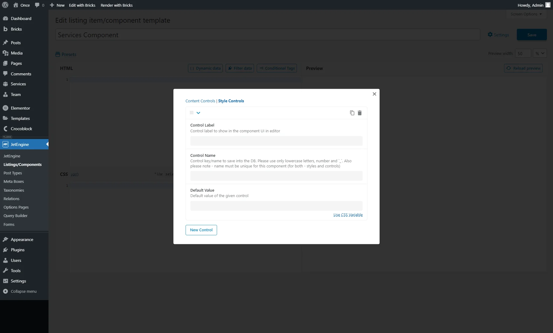
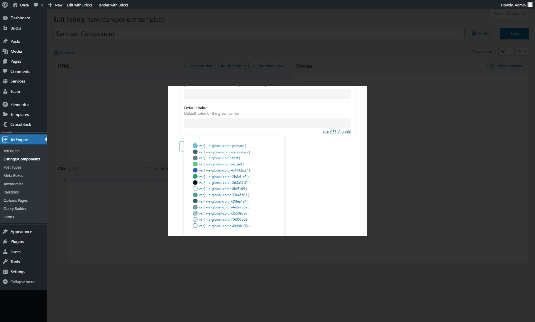
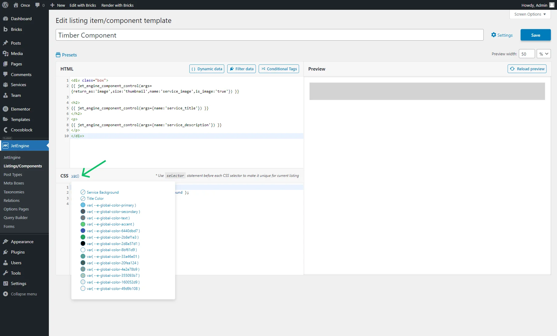
In the Default Value field, one can use the custom colors or global Elementor colors.
To use global Elementor colors, one can click the “Use CSS Variable” button below the Default Value field to select the needed value.
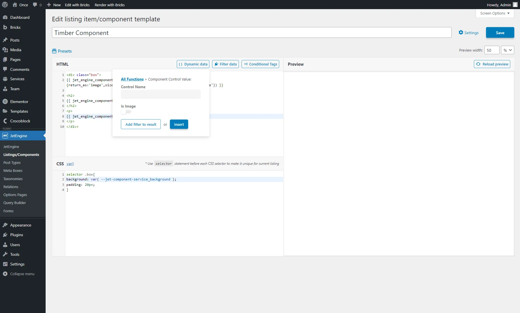
To use the added content controls in HTML code, one should press the “Dynamic data” button next to the HTML section.
There, the “Component Control Value” macro should be picked.
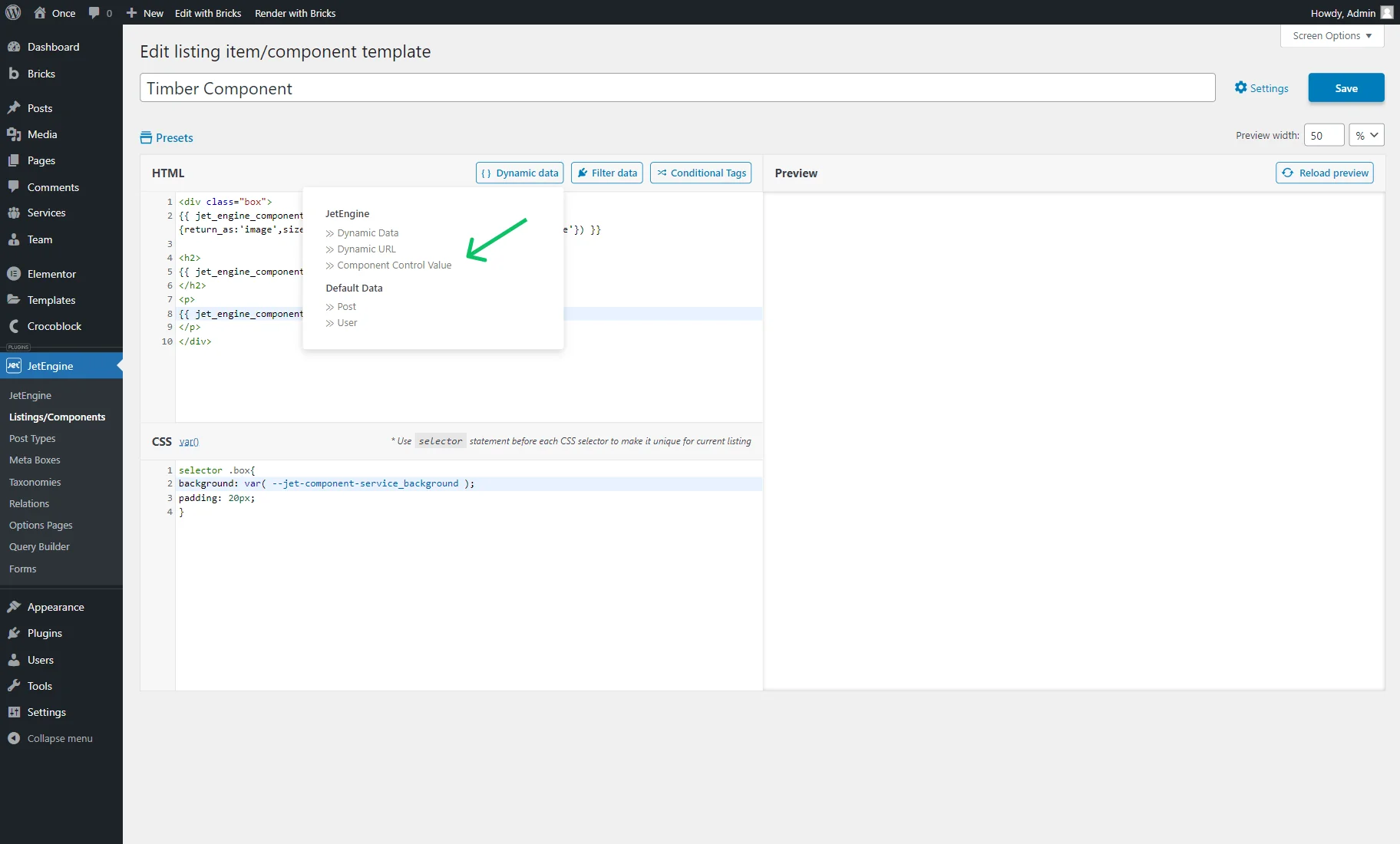
Once clicked, the Control Name and Is Image settings become available.
To save the settings and insert the control into the code, the “Insert” button should be clicked.
The previously added style controls can be inserted into the CSS code with the help of the “var()” button.
Settings in the Dashboard
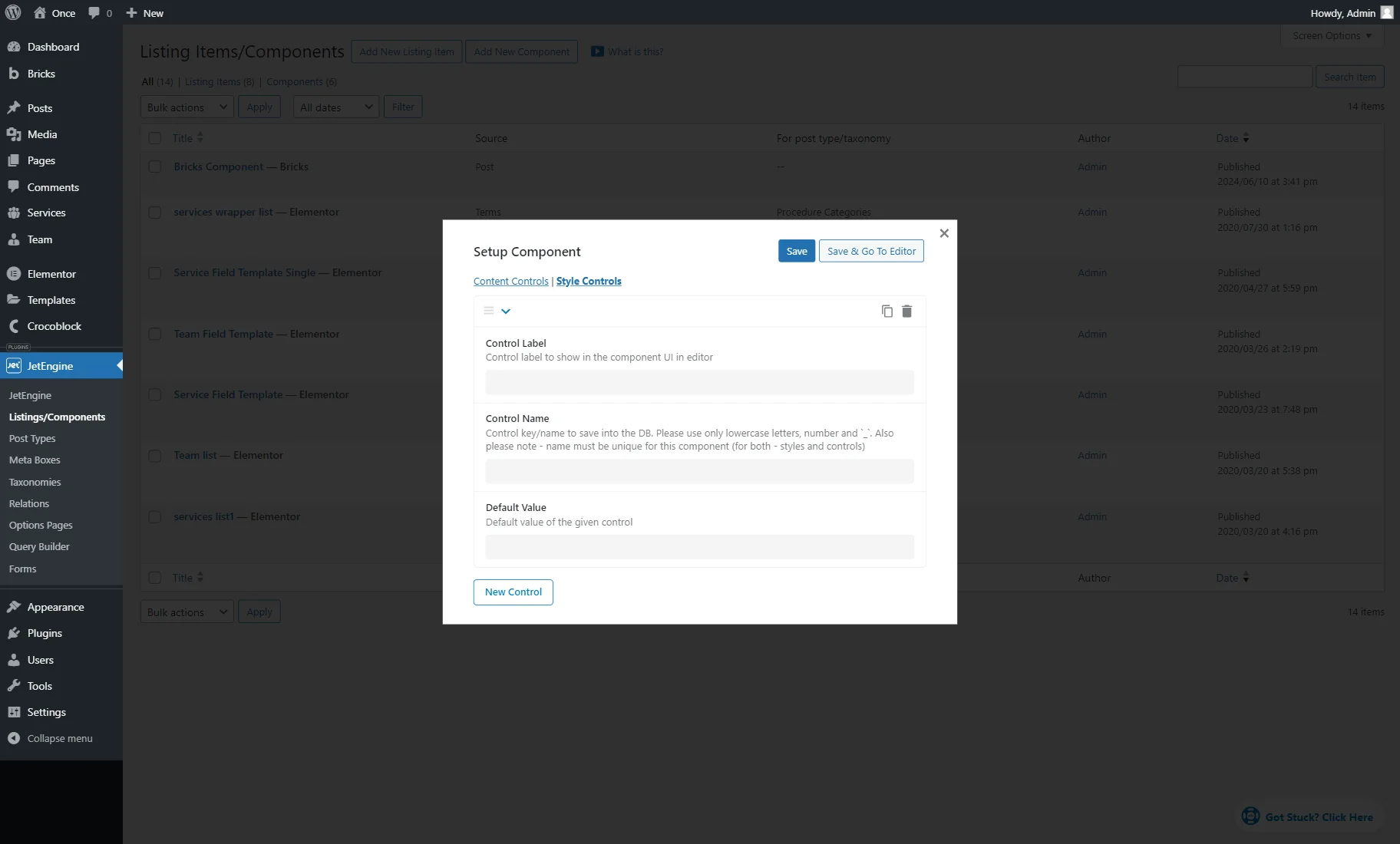
The control settings can also be adjusted right in the WordPress Dashboard > JetEngine > Listings/Components directory.
The “Edit Component” button appears when the items are hovered over; it should be clicked to trigger the pop-up with the settings.
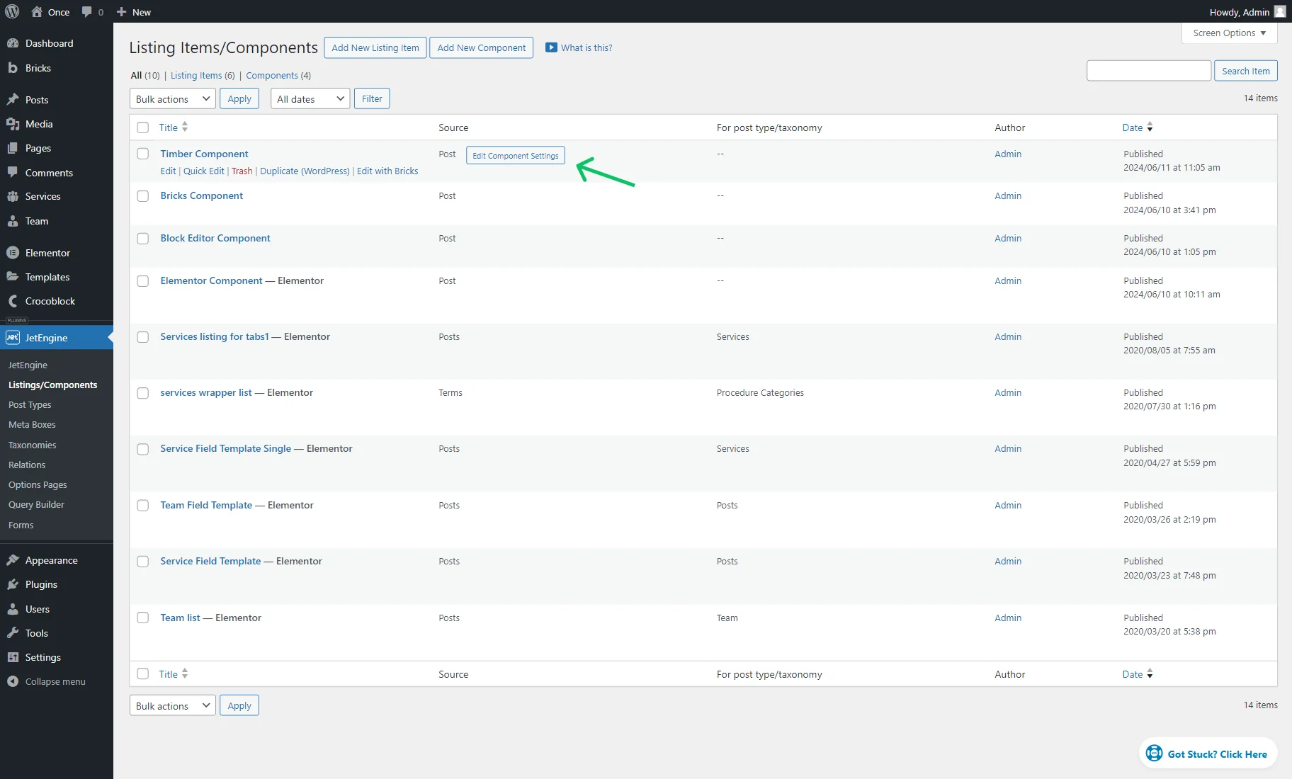
Here, both Content Controls and Style Controls are presented.
The settings in the Content Controls tab are the same as those described earlier in the Component Content Controls part of the article.
The Style Controls settings are identical to those described in the Component Style Controls part of the article.
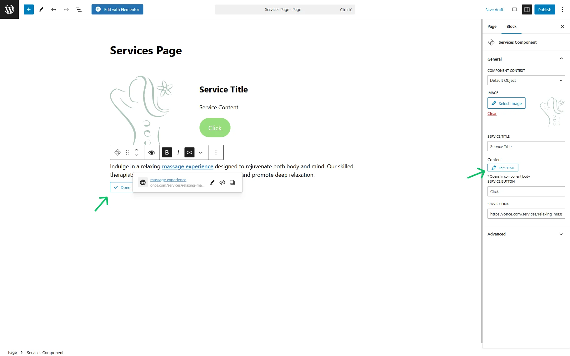
Component in the Editor
Once the content is adjusted and saved, it can be used in the Elementor, Block Editor, or Bricks editors.
The component can be found by its name in the search bar of the preferred editor.
One thing that is different for the Blocks Editor is the “Rich Text” control customization.
If the content for the “Rich Text” in Elementor or Bricks was entered right away when creating the component, then in the Blocks Editor, it can be entered when using the ready component on the page.
To do so, one should click the “Edit HTML” button next to the name of the added “Rich Text” and paste the needed text. For instance, it can be filled with linked, italic, or bold text.
Once done, one should save the text with the “Done” button.
That’s all about the components feature available with the JetEngine plugin for WordPress websites.