
Hamburger Panel Widget Overview
Read how to use the JetBlock Hamburger Panel widget to manage icons, toggles, and display templates.
The JetBlocks Hamburger Panel widget is one of the nine widgets of the JetBlocks plugin for Elementor, focusing on building headers and footers. The Hamburger Panel widget manages the appearance of icons, borders, toggles, and more; allows using templates for display, customizes the panel elements for different devices, etc.
Activating the Hamburger Panel Widget
The Hamburger Panel can be enabled in the WordPress Dashboard > Crocoblock > JetPlugins Settings > JetBlocks > Widgets & Extensions tab.

Please note that the number of activated widgets may impact the website’s performance, so only the required ones should be enabled.
Adding the Hamburger Panel Widget
The Hamburger Panel widget can be added to a page or template in the Elementor page builder by toggling the “+ Add Element” panel and typing the name of the widget or scrolling down the JetBlocks section of widgets.
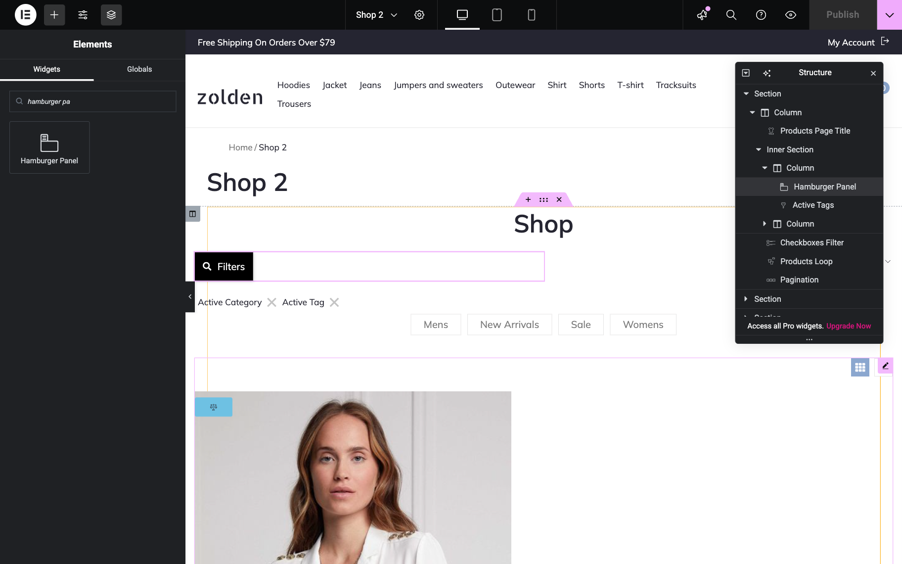
Settings of the Hamburger Panel Widget
Content settings
By clicking on the Content tab, one can access the Content section, which provides configuration options for the hamburger panel’s visual elements and behavior:
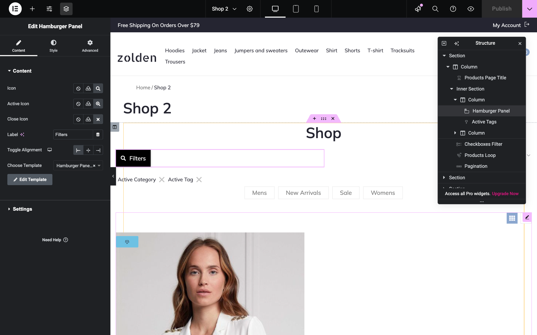
- Icon — a field that allows an icon to be selected (by uploading SVG files or choosing from the library) to display as the hamburger panel icon;
- Active Icon and Close Icon — fields that allow icons to be chosen (by uploading SVG files or choosing from the library) for the active and close states of the hamburger panel;
- Label — a field that allows custom text to be entered for display on the panel instead of the default “More” text, or enables dynamic content to be displayed by clicking the “Dynamic Tags” button;
- Toggle Alignment — a selector that allows one to align the panel horizontally, three options are available: “Start,” “Center,” and “End”;
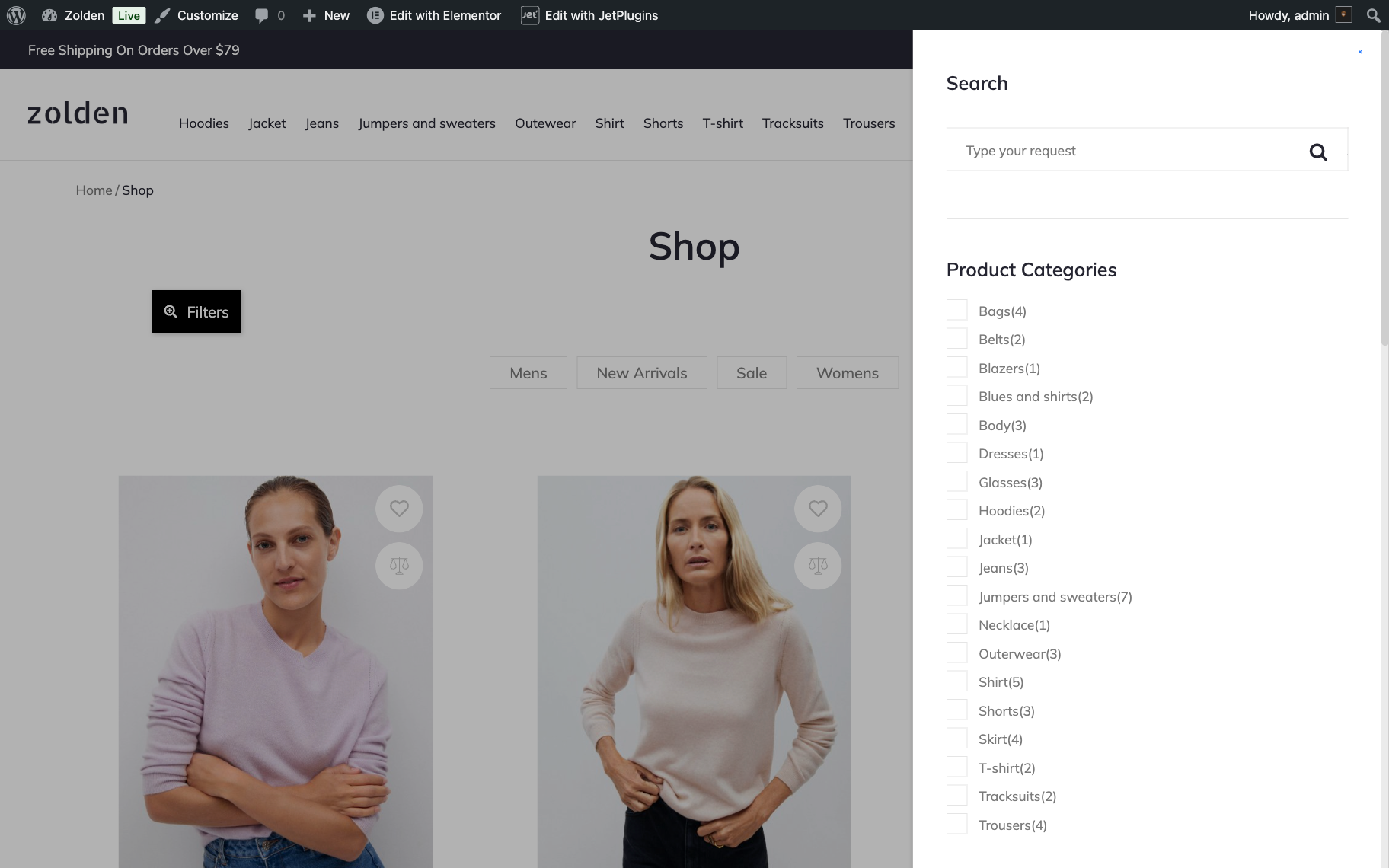
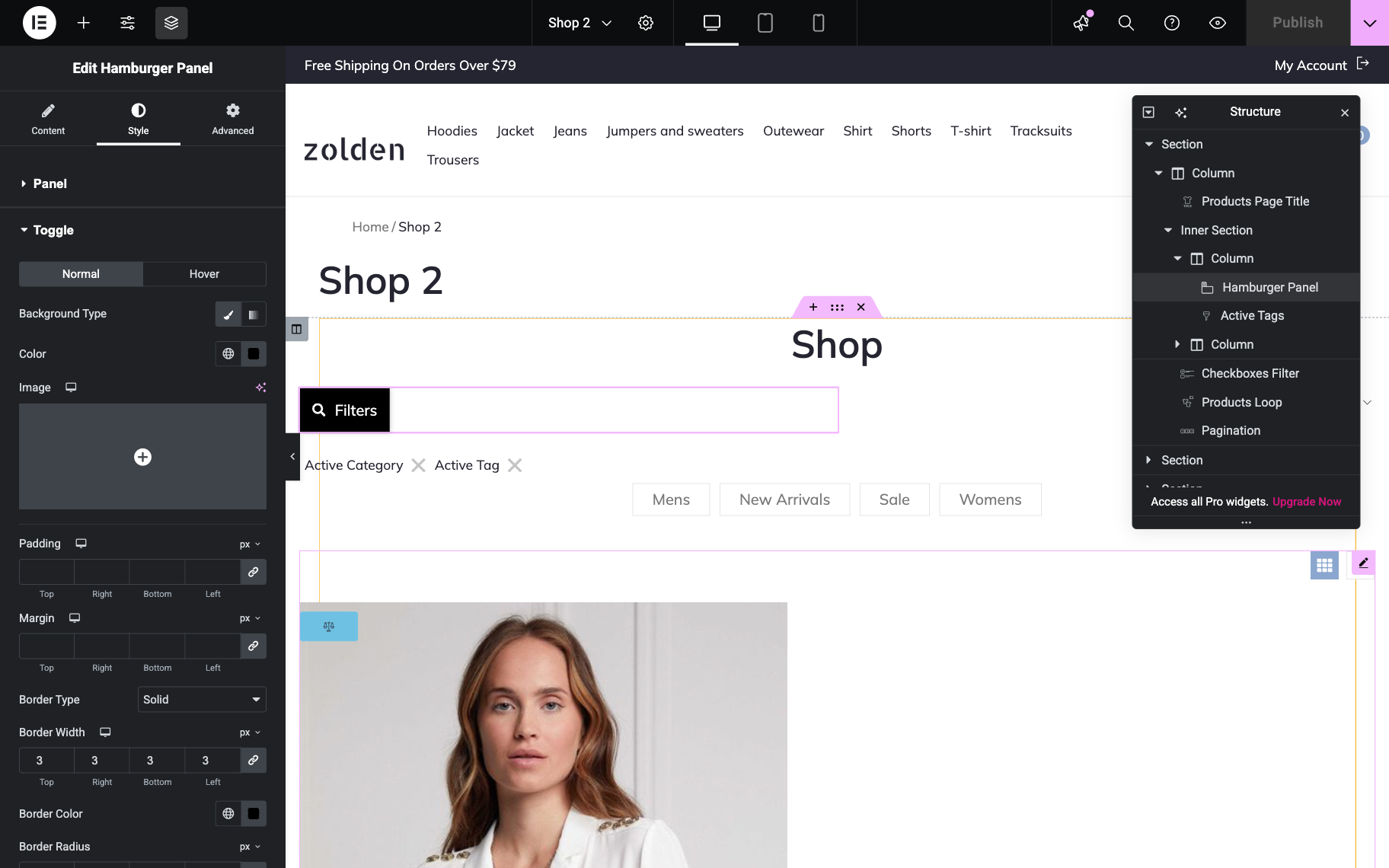
- Choose Template — a dropdown that allows a template to be selected for the panel (e.g., a filters template can be applied so the hamburger panel enables filtering). The selected template is displayed after the panel’s button is clicked.
On a store page Hamburger Panel widget can display a filters template, allowing users to access product filtering options through a collapsible side panel for enhanced mobile and desktop navigation.
The Settings section controls the positioning and animation properties of the hamburger panel:

- Position — a dropdown menu that allows the panel position to be chosen from “Right” or “Left”;
- Effect — a dropdown menu that allows “Slide”, “Fade”, or “Zoom” effects to be applied to the panel;
- Z-Index — a field that allows the hamburger panel’s position to be specified on the vertical axis;
- Use Ajax Loading for Template — a toggle that, when enabled, applies Ajax loading for the panel’s template and activates the Use Cache for Template toggle to control whether caching is used.
Style settings
The Style tab has the Panel and Toggle settings.
Panel section settings
The Panel section controls the visual styling and layout properties of the hamburger panel container and includes the following settings:
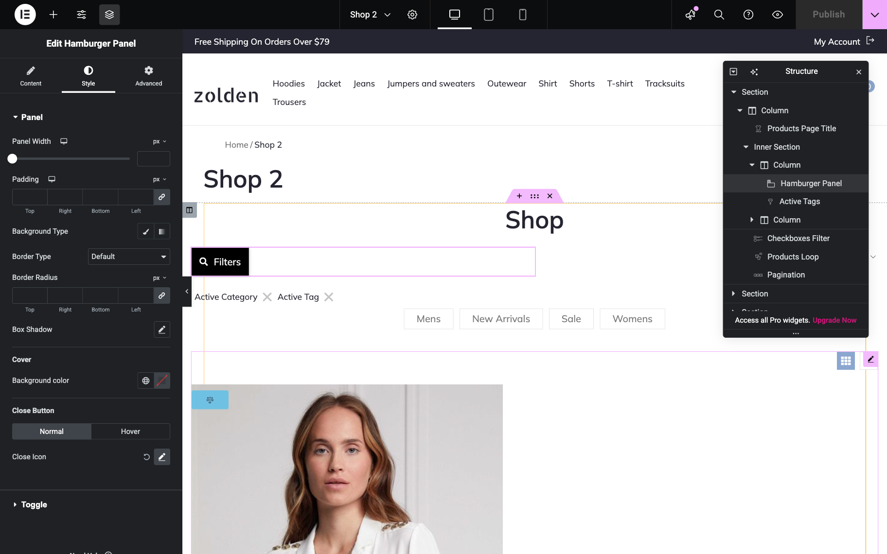
- Panel Width — a field that allows the width of the panel to be set in pixels or other units;
- Padding — controls that allow internal spacing to be configured for “Top,” “Right,” “Bottom,” and “Left” sides of the panel;
- Background Type — options that allow the panel background style to be selected (solid color or gradient);
- Border Type — a dropdown menu that allows the border style to be chosen from available options (“Default,” etc.);
- Border Radius — controls that allow rounded corners to be applied to “Top,” “Right,” “Bottom,” and “Left” sides of the panel;
- Box Shadow — a setting that allows drop shadow effects to be applied to the panel.
Cover subsection
- Background color — a field that allows the color of the cover overlay to be selected.
Close Button subsection
- Normal and Hover — tabs that allow different styles to be configured for the close button’s default and hover states.
Toggle section settings
The Toggle section controls the styling of the Hamburger Panel‘s toggle button (the button that opens/closes the panel), including the following settings:
- Normal and Hover — tabs that allow different styles to be configured for the toggle button’s default and hover states;
- Background Type — options that allow the toggle button background style to be selected (solid color or gradient);
- Color — a field that allows the background color of the toggle button to be set;
- Image — a control that allows a background image to be uploaded and applied to the toggle button;
- Padding — controls that allow internal spacing to be configured for “Top,” “Right,” “Bottom,” and “Left” sides of the toggle button;
- Margin — controls that allow external spacing to be set for “Top,” “Right,” “Bottom,” and “Left” sides of the toggle button;
- Border Type — a dropdown menu that allows the border style to be chosen (“Solid,” etc.);
- Border Width — controls that allow border thickness to be set for “Top,” “Right,” “Bottom,” and “Left” sides of the toggle button;
- Border Color — a field that allows the border color to be selected;
- Border Radius — controls that allow rounded corners to be applied to “Top,” “Right,” “Bottom,” and “Left” sides of the toggle button;
- Box Shadow — a setting that allows drop shadow effects to be applied to the toggle button.
Icon Styles subsection:
- Normal and Hover — tabs that allow different styles to be configured for the icon’s default and hover states;
- Toggle Icon — controls that allow the appearance and styling of the toggle icon to be customized.
Label Styles subsection:
- Normal and Hover — tabs that allow different styles to be configured for the label’s default and hover states;
- Label Color — a field that allows the text color of the label to be set;
- Typography — controls that allow font styling options to be configured for the label text.
That’s all one needs to know about the Hamburger Panel widget of the JetBlocks plugin.