JetProductTables Dashboard Settings Overview
The JetProductTables plugin is a tool that allows users to showcase the list of WooCommerce products on the front end as a table.
With JetProductTables, one can manage the table’s content — set the columns and the products displayed in it, add filters, and adjust the style of the table. Also, the adjusted content layout can be saved as a preset. One can even generate a shortcode with a table to be able to use it on any desired page.
When the JetProductTables plugin is installed and activated, its settings can be found in the WordPress Dashboard > WooCommerce > Settings > Product Table directory.
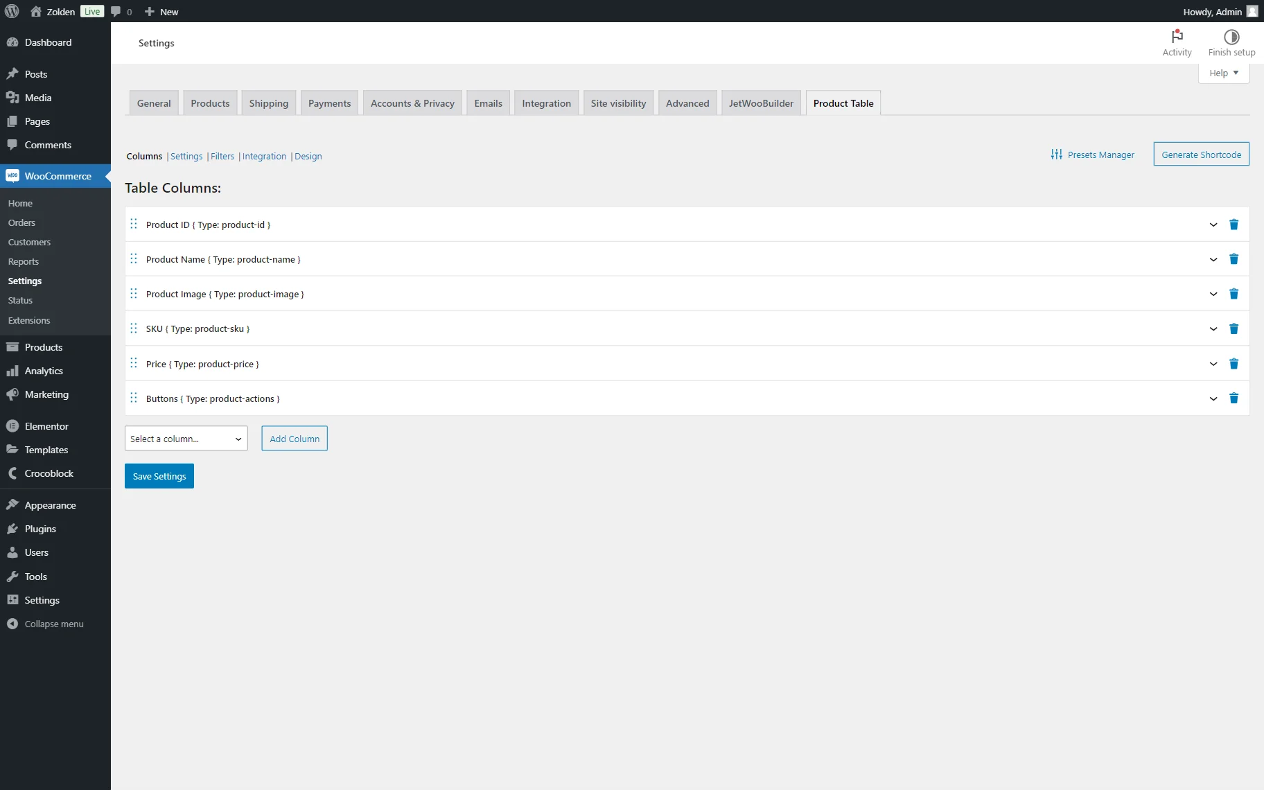
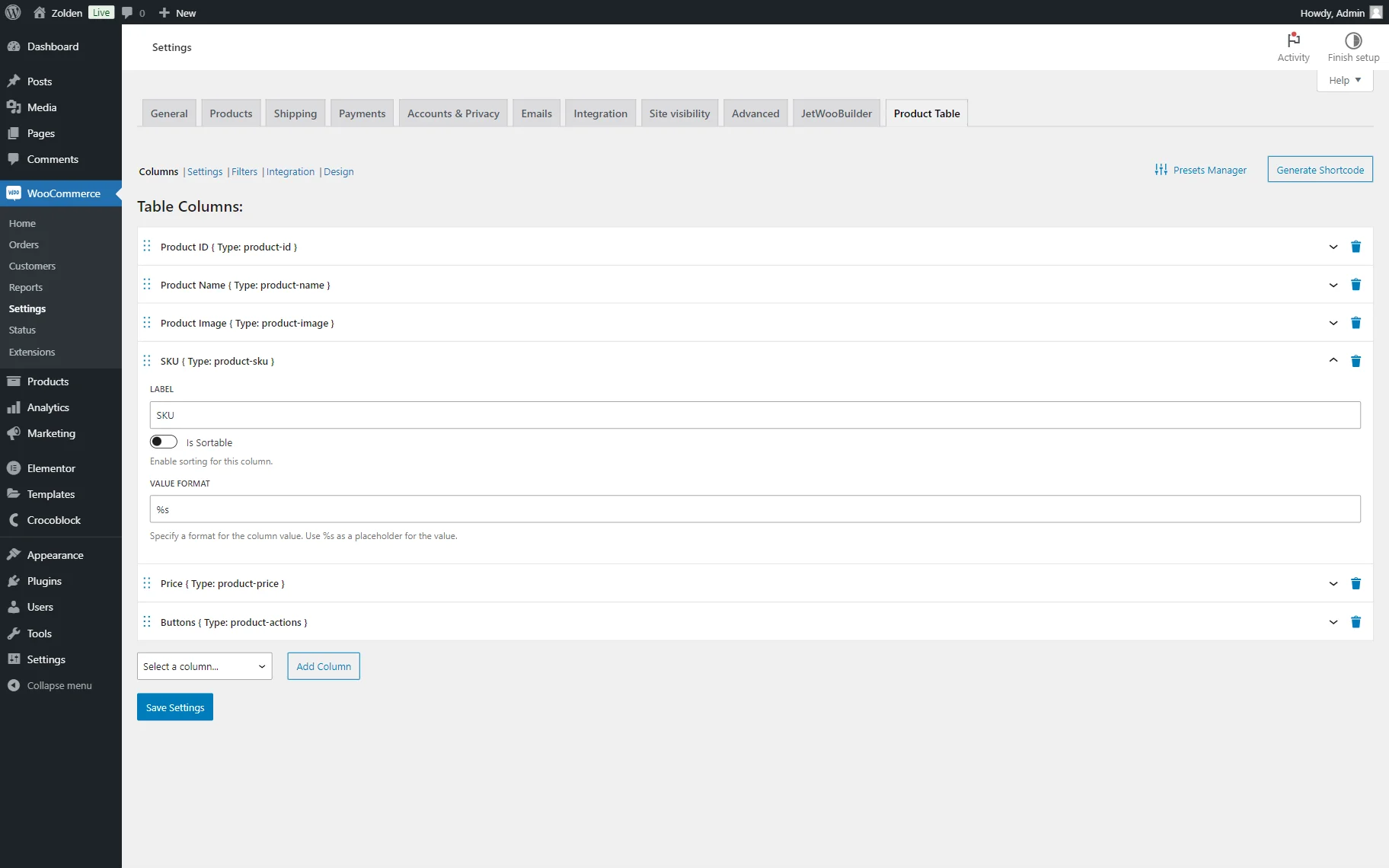
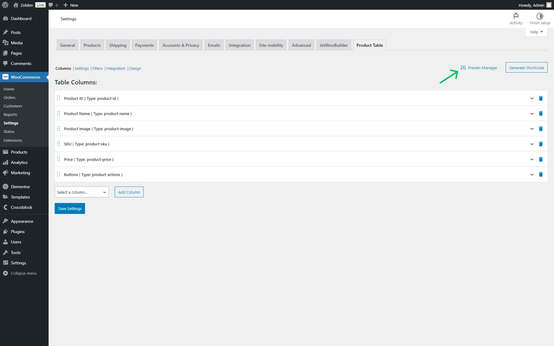
Columns
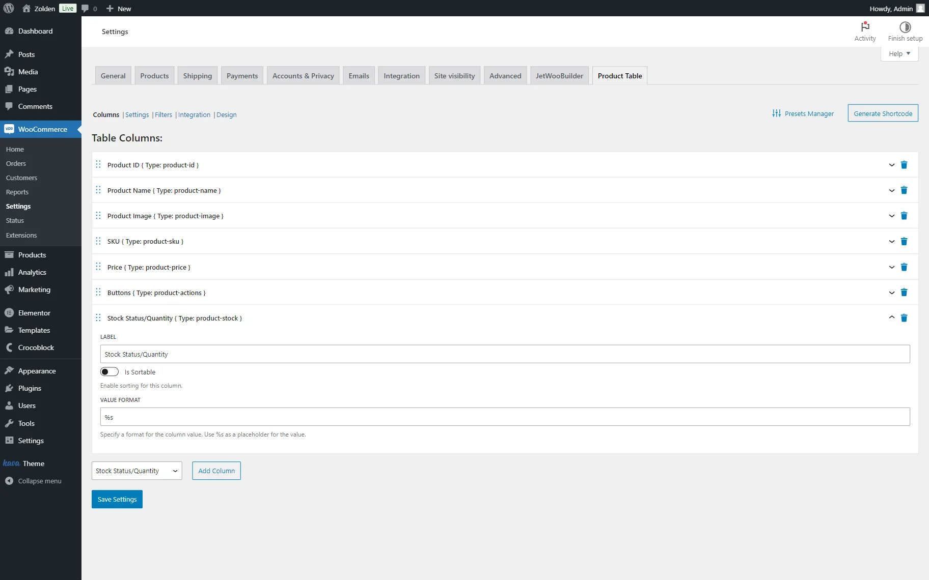
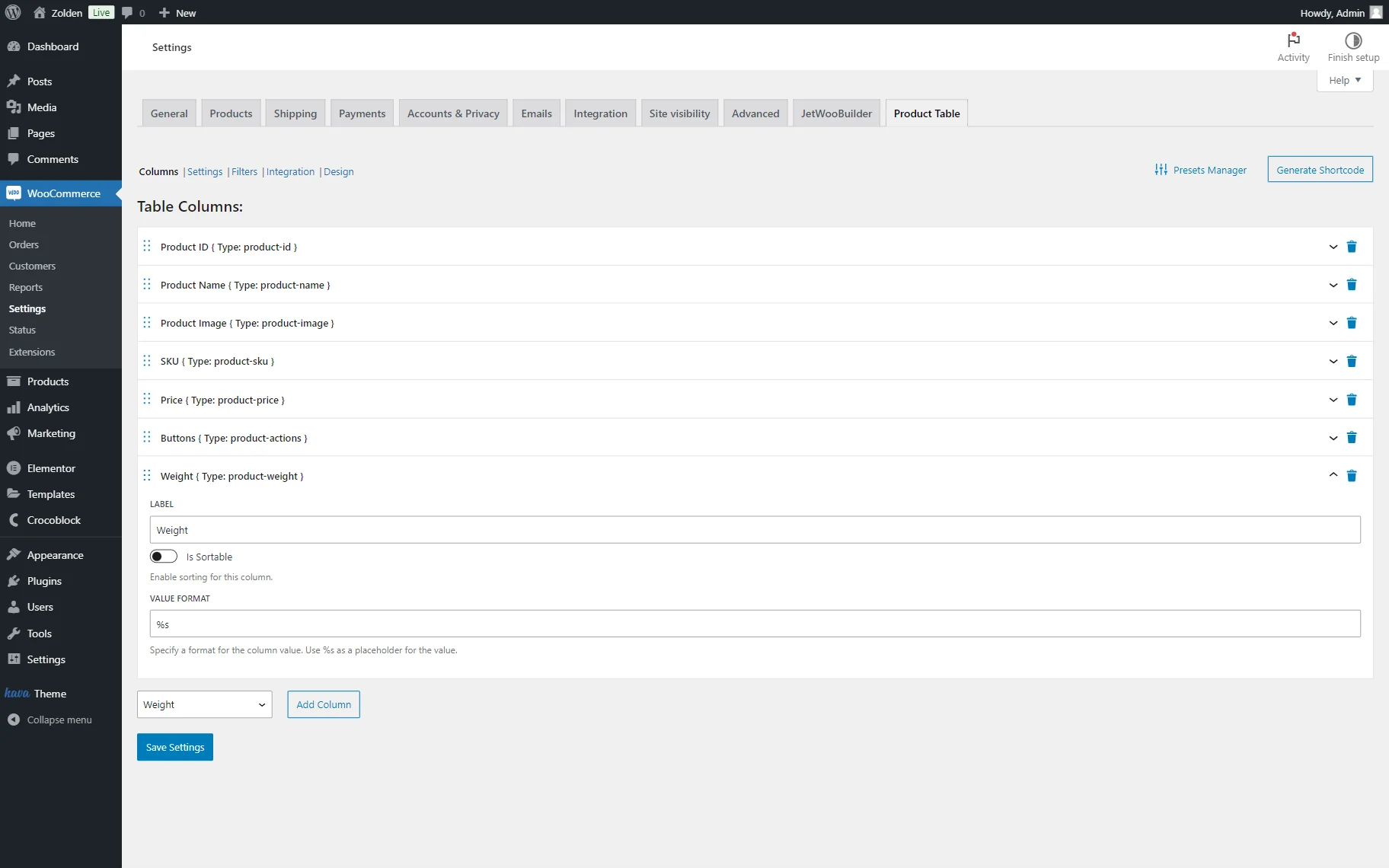
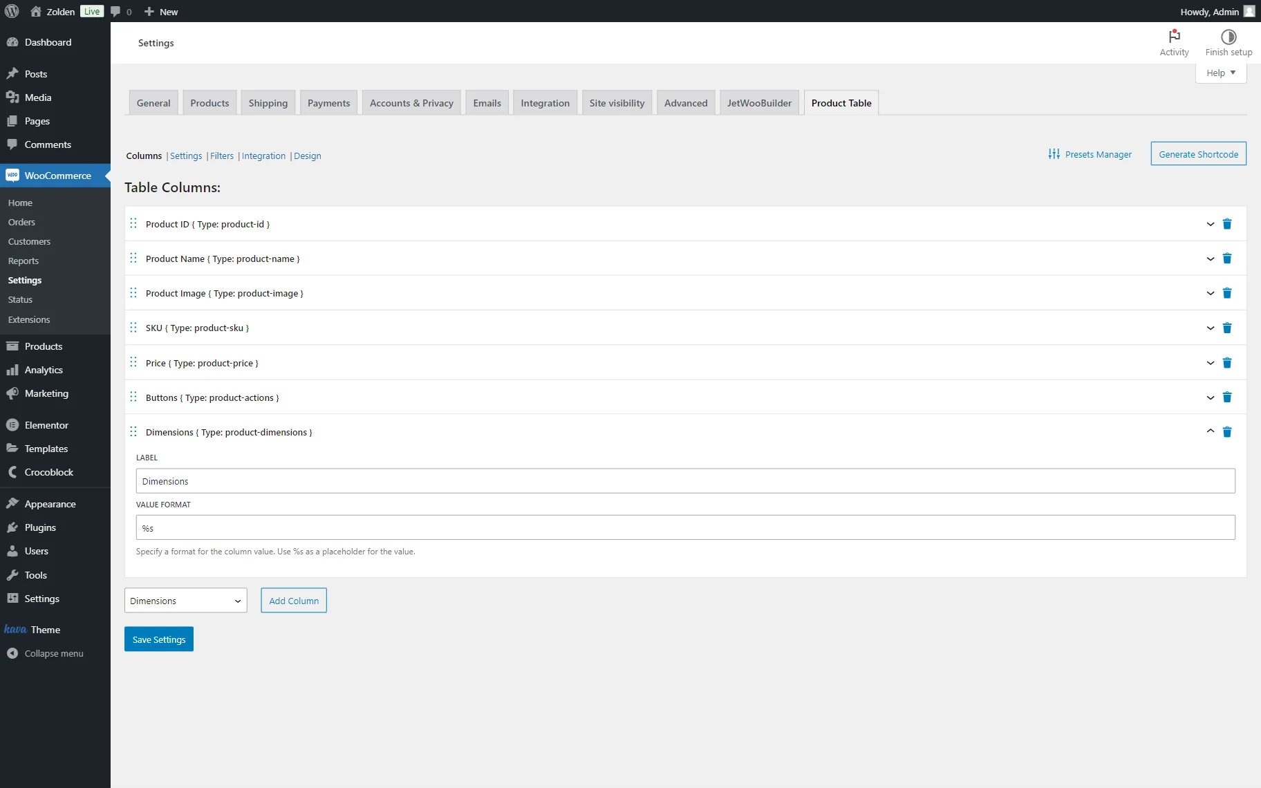
In this tab, one can add desired columns to the table. By default, six columns are added: Product ID, Product Name, Product Image, SKU, Price, and Buttons.
One can change their settings and order or even delete columns if needed.
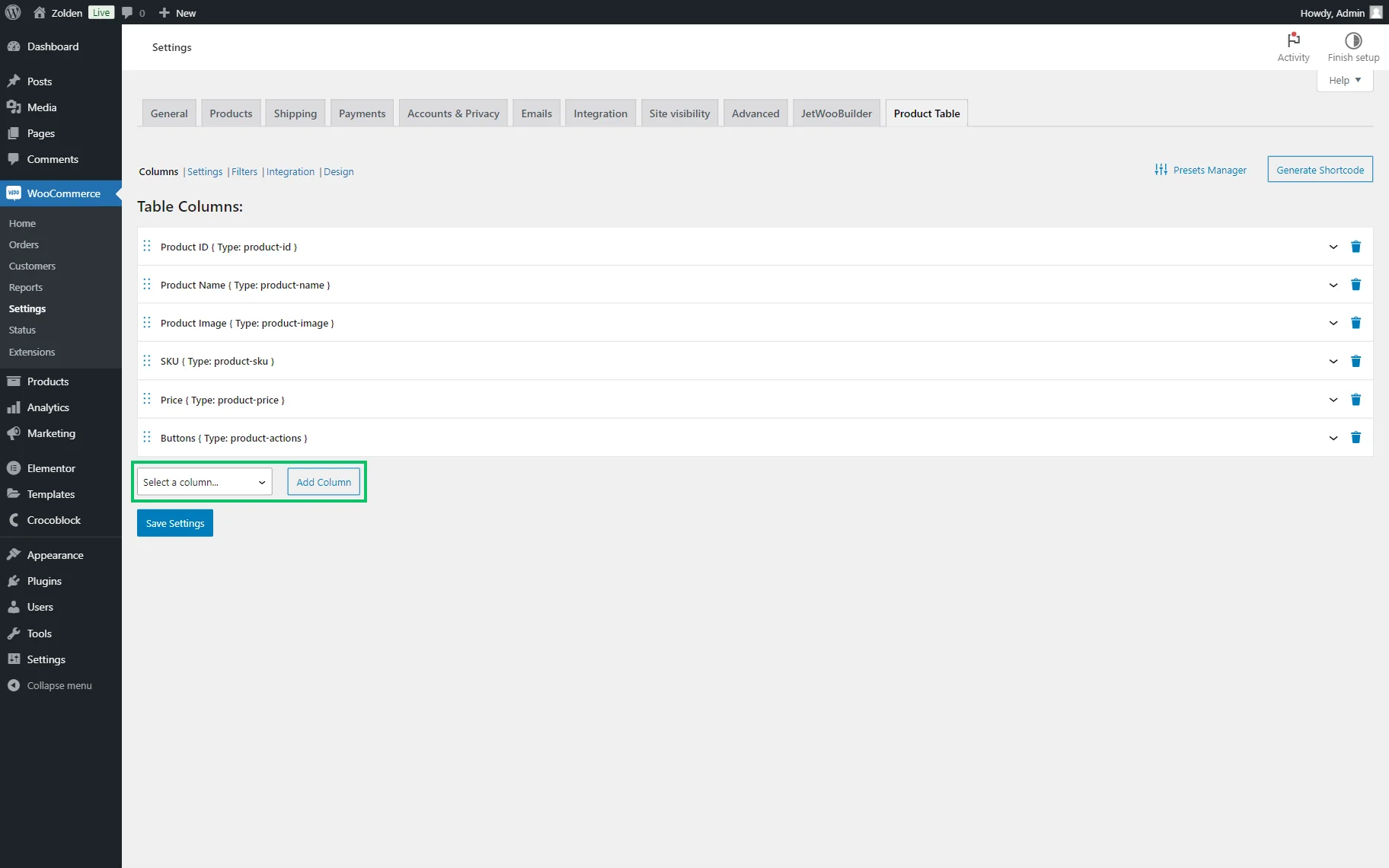
To add a new column, one should select the needed option from the list in the dropdown menu below the columns that have already been added and press the “Add Column” button.
The Product ID column displays the ID of the product. This tab includes the following fields for customization:
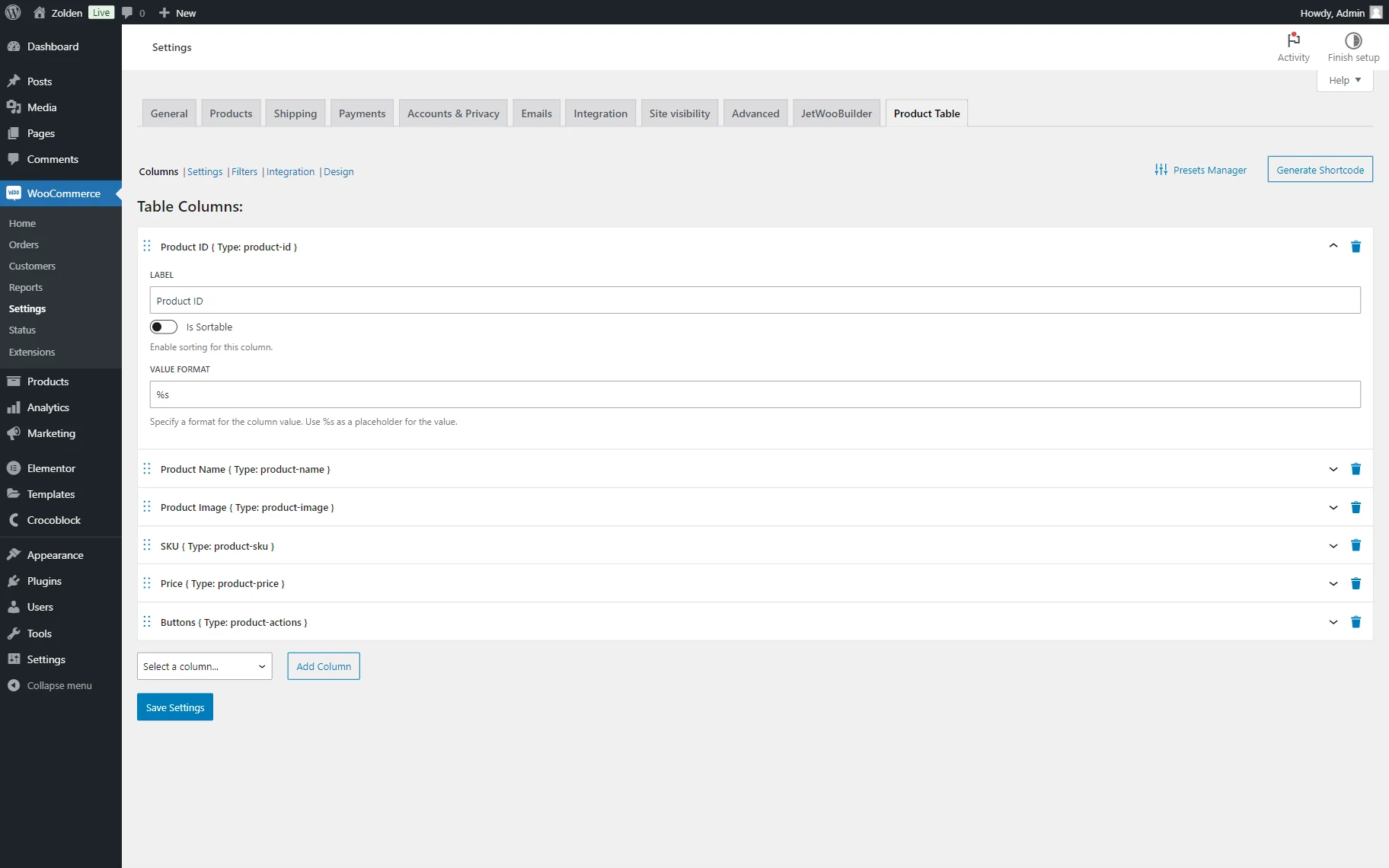
- LABEL — a label of the current column. Here, set to “Product ID”;
- Is Sortable — a toggle that is inactive by default. When activated, it allows sorting by the current column on the front end;
- VALUE FORMAT — a format of the column value. This field is already completed with “%s” by default, which is the placeholder for the value.
The Product Name column displays the name of the product in a separate column. Some of the settings are the same as in the previous column, so we don’t repeat their description:
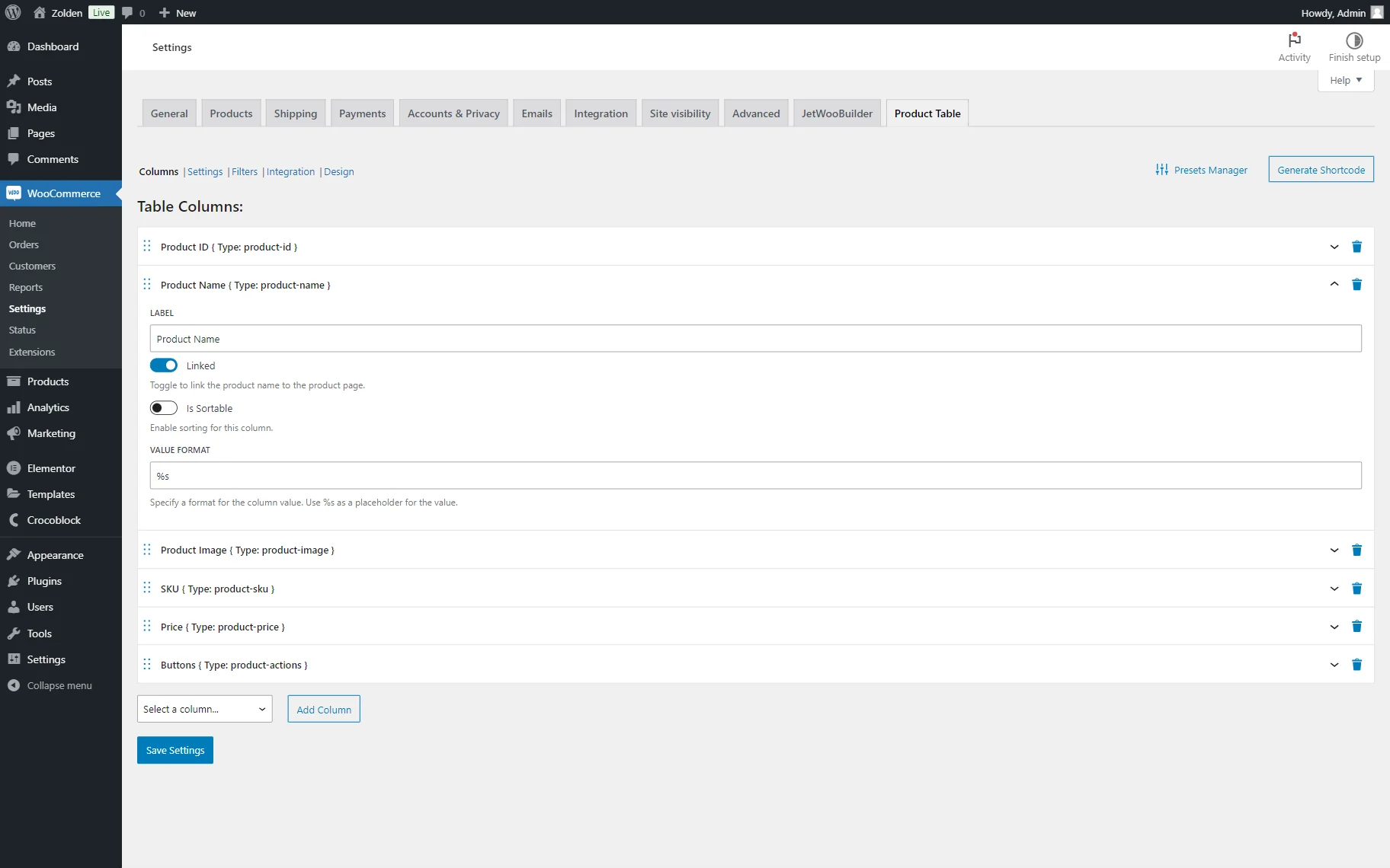
- Linked — a toggle activated by default. If left activated, the product name will be linked to the product page.
The following Product Image column will contain the product image correspondingly. This tab includes the following settings:
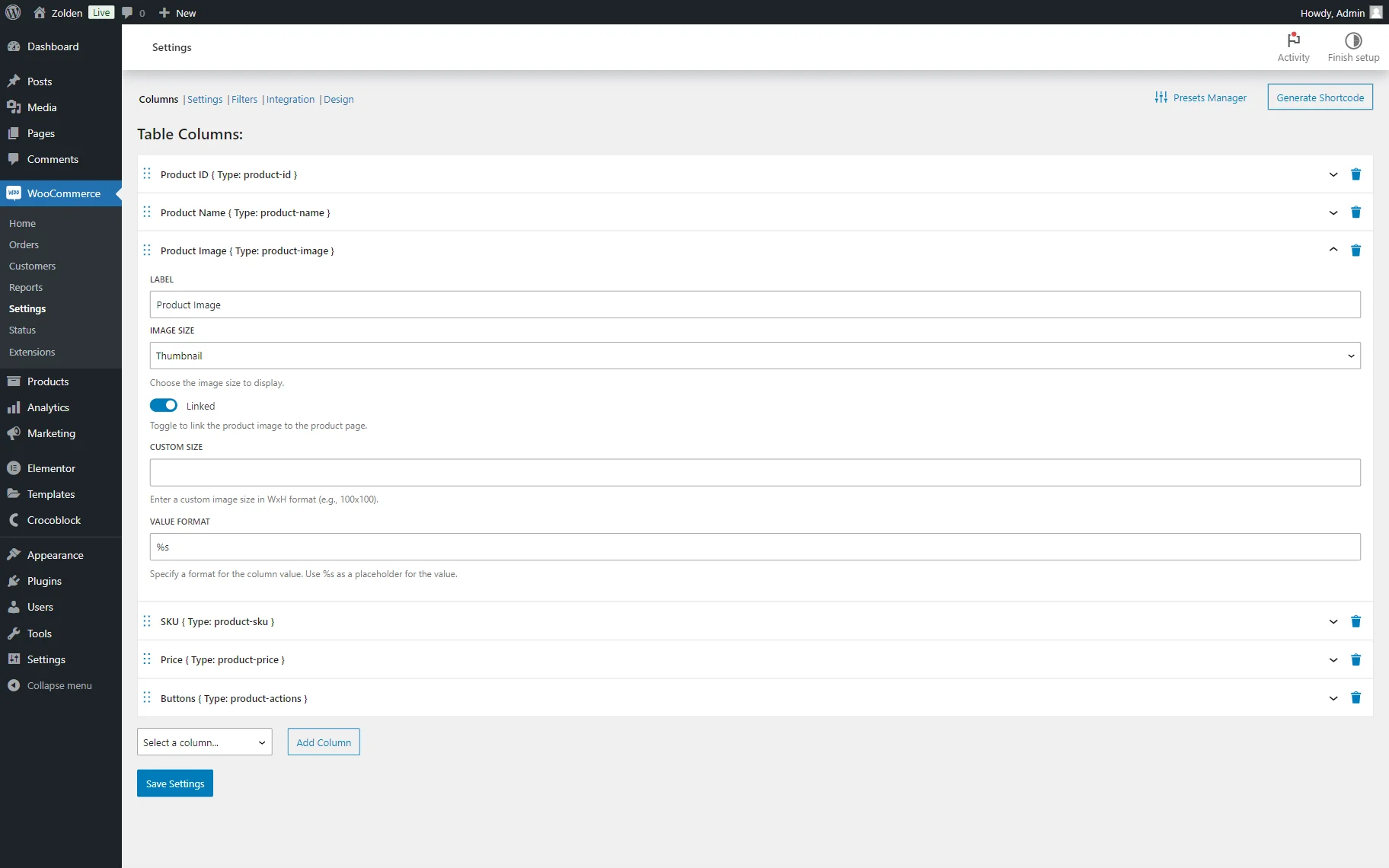
- Linked — a field that is, in the case of the “Product Image” column, links an image to the product page;
- IMAGE SIZE — the size of the displayed image;
- CUSTOM SIZE — a field that allows setting a custom image size. The value should be completed in the WxH format (e.g., “100×100”).
An SKU column will contain the product’s SKU. This tab includes the same settings as other columns, which were already described earlier.
The Price column will display the price of the products. Its settings are identical to the ones described earlier.

The Buttons column will contain product action buttons (“Add to cart,” “Go to the product page,” or the button sending to the external page of third-party products.) The Buttons tab has the following unique settings:
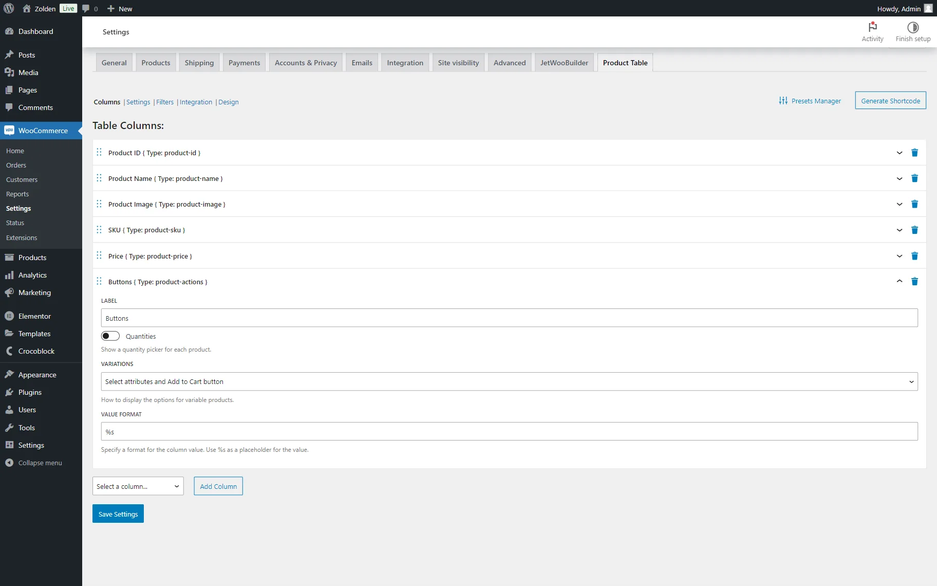
- Quantities — a toggle deactivated by default. If activated, it shows a quantity picker for each product. This feature can be used to select the number of products that will be added to the cart;
- VARIATIONS — a selector field where one can pick how to display the options for the variable products.
However, more columns can be added to the table if needed. To do so, one should select the desired option from the dropdown below the default fields list and click the “Add Column” button.
The Full Description column includes the following unique setting field:
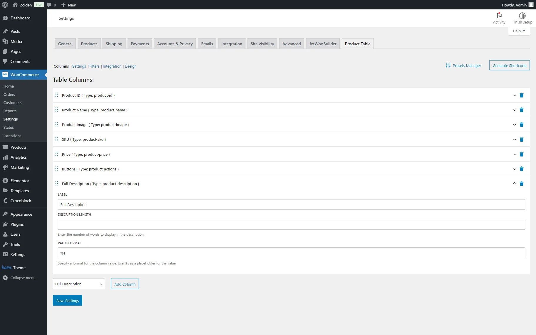
- DESCRIPTION LENGTH — the length of the product description.
The Summary tab includes the following field:
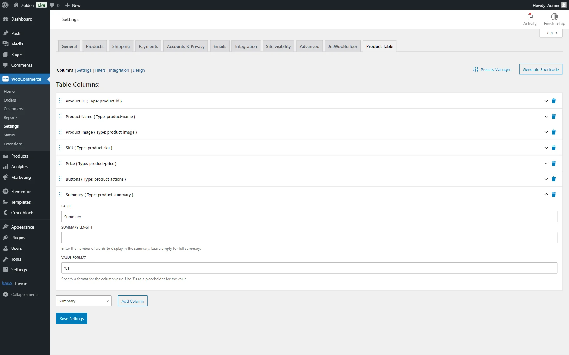
- SUMMARY LENGTH — a length of the product summary.
The Date tab has such settings:
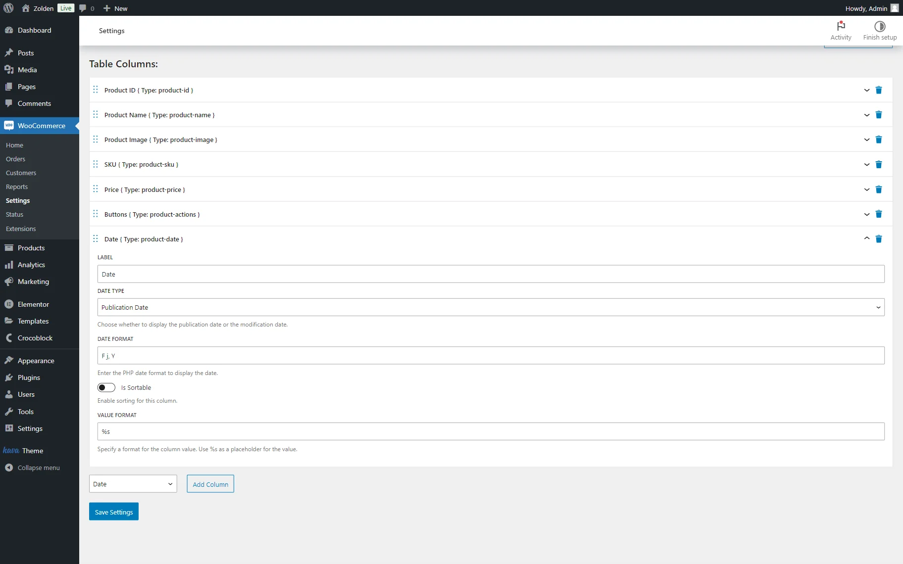
- DATE TYPE — a type of date that will be shown in the column: a publication date or a modification date;
- DATE FORMAT — a PHP format of the displayed date. By default, set to “F j, Y”. More information about formats can be checked in the corresponding article.
The Categories tab includes the following settings:
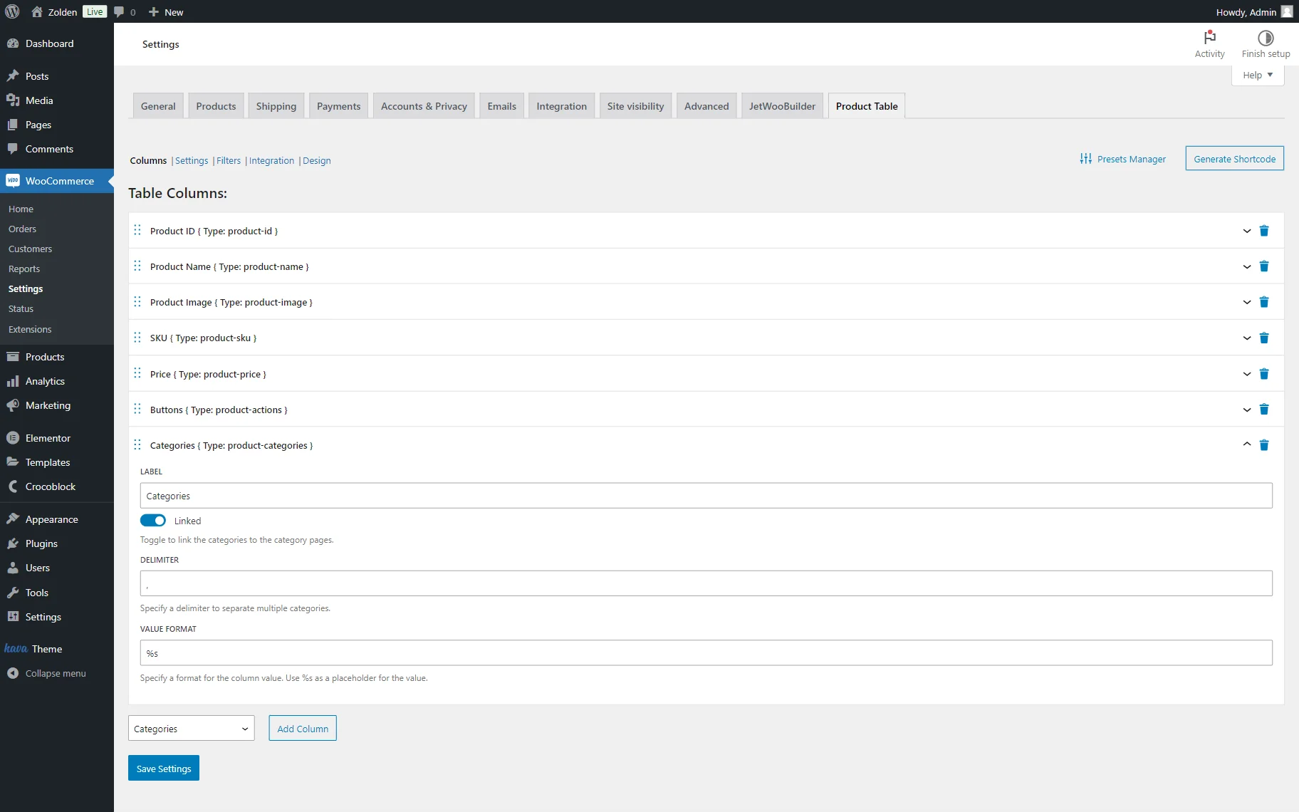
- Linked — a toggle that is active by default. Here, if left activated, the title will be linked to the term’s archive;
- DELIMITER — a delimiter that will separate categories. By default, set to “,”.
The Tags tab includes the already mentioned setting fields.

- Linked — a toggle that is active by default. Here, if left activated, the title will be linked to the term’s archive.
The Custom Taxonomy Terms tab has such fields for customization:
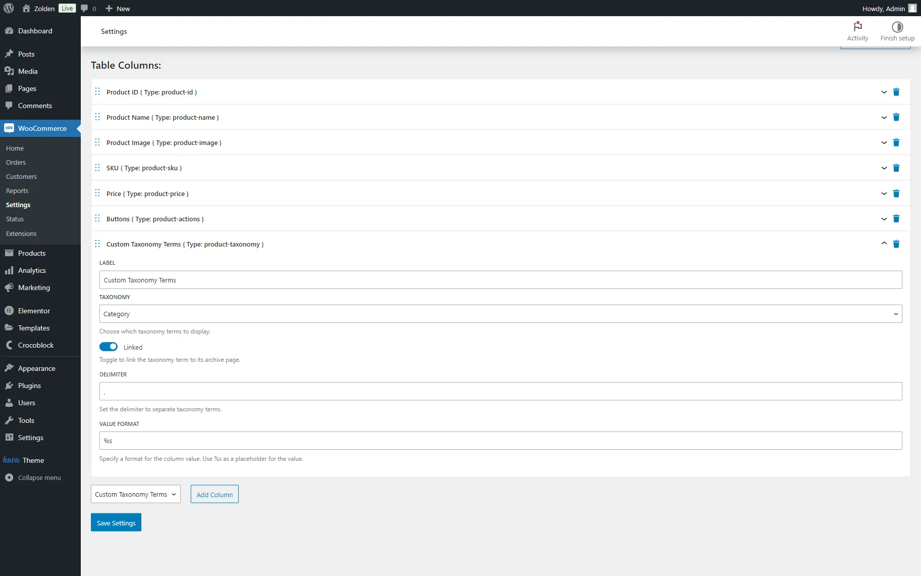
- TAXONOMY — a taxonomy terms of which will be displayed;
- Linked — a toggle that is active by default. If left activated, the taxonomy term will be linked to its archive page.
The Product Attributes tab has this unique setting:

- ATTRIBUTE TO SHOW — an attribute that will be displayed.
The Rating/Reviews tab has this field that can be customized:
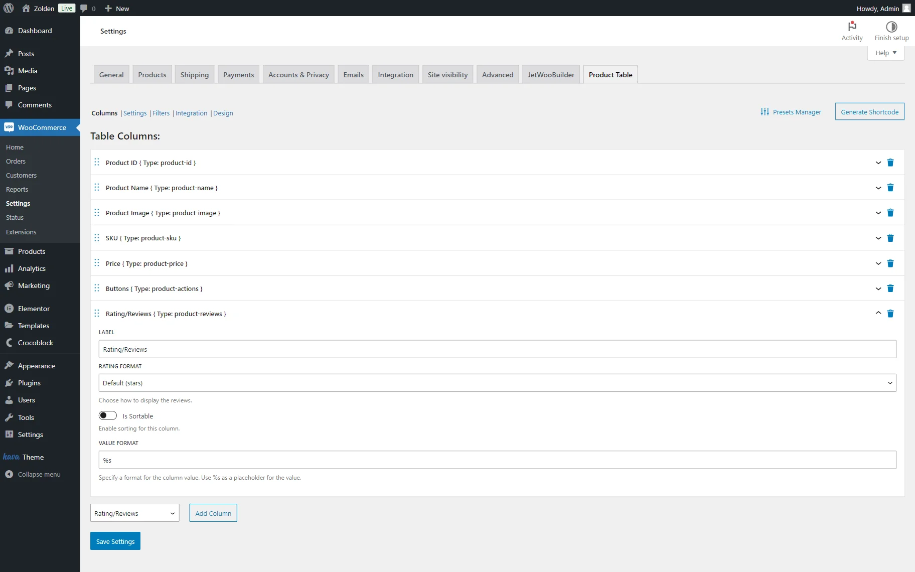
- RATING FORMAT — a format of the displayed WooCommerce rating. Initially, it is set to the “Default (stars)” option. However, it can be changed to the “Number (average rating)” view.
The next Stock Status/Quantity tab includes settings that were already displayed previously.
The Weight settings tab consists of the fields that were already described earlier.
The Dimensions tab also has the setting fields described earlier.
The Product Meta tab has such fields available for customization:
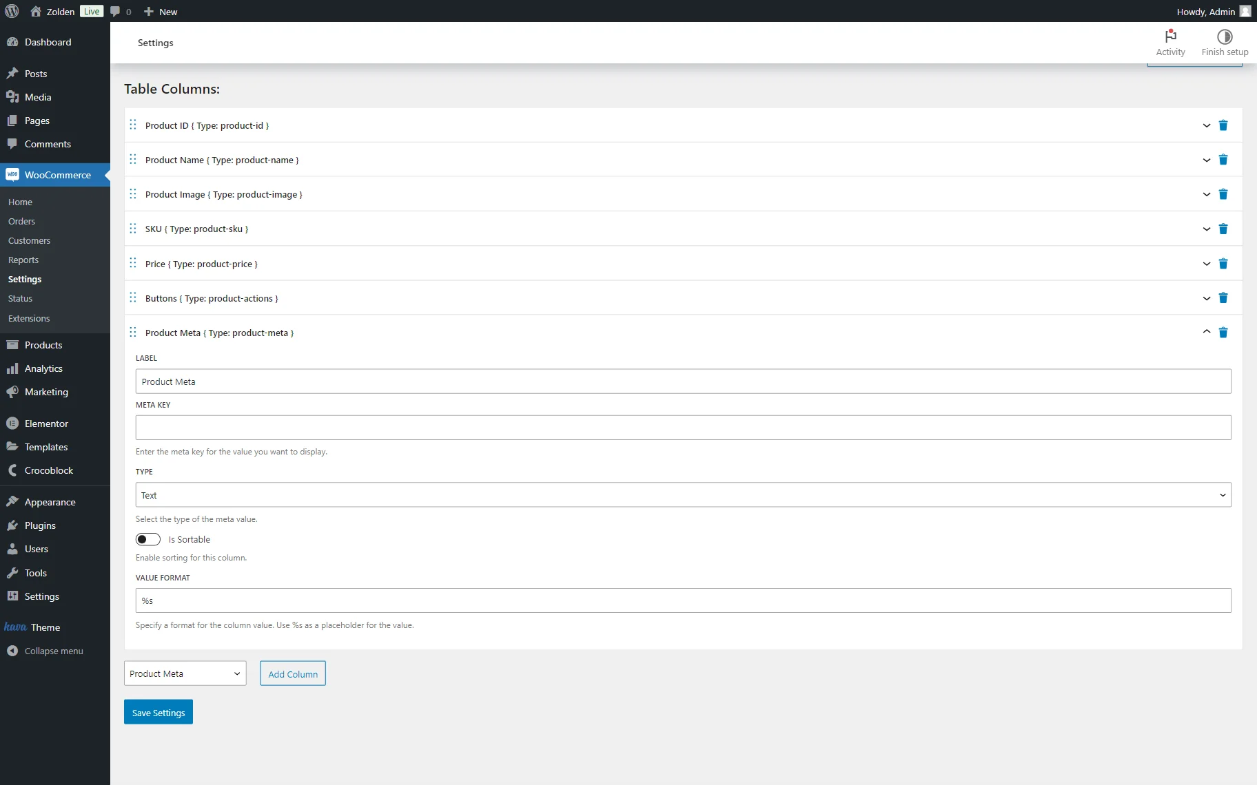
- META KEY — a meta key of the value that is needed to be displayed;
- TYPE — a type of the selected meta field. Among the available options: “Text,” “Number,” and “Date.”
Settings
The Settings tab is responsible for the features of the table display on the front end. It includes two additional tabs that can be customized: “General” and “Navigation.”
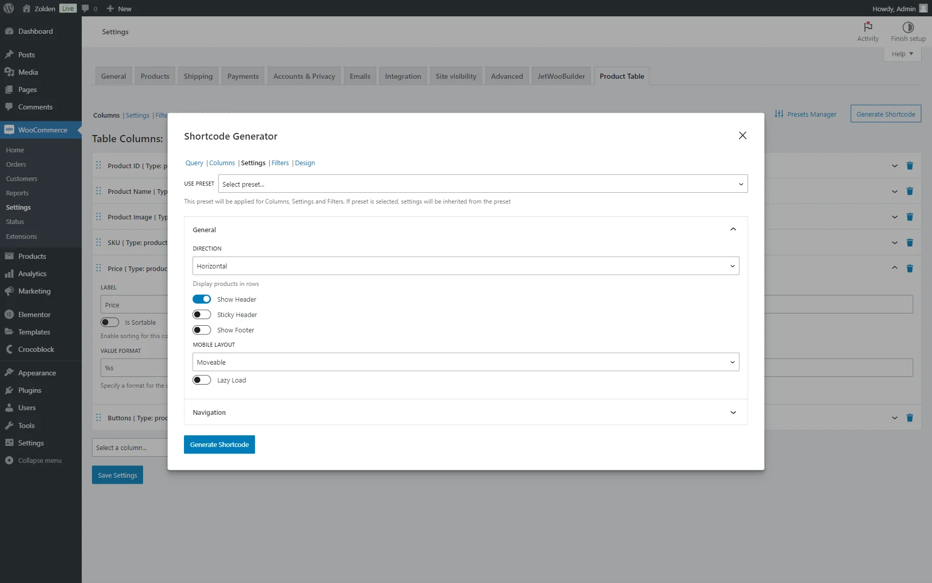
General
The General tab includes such settings:
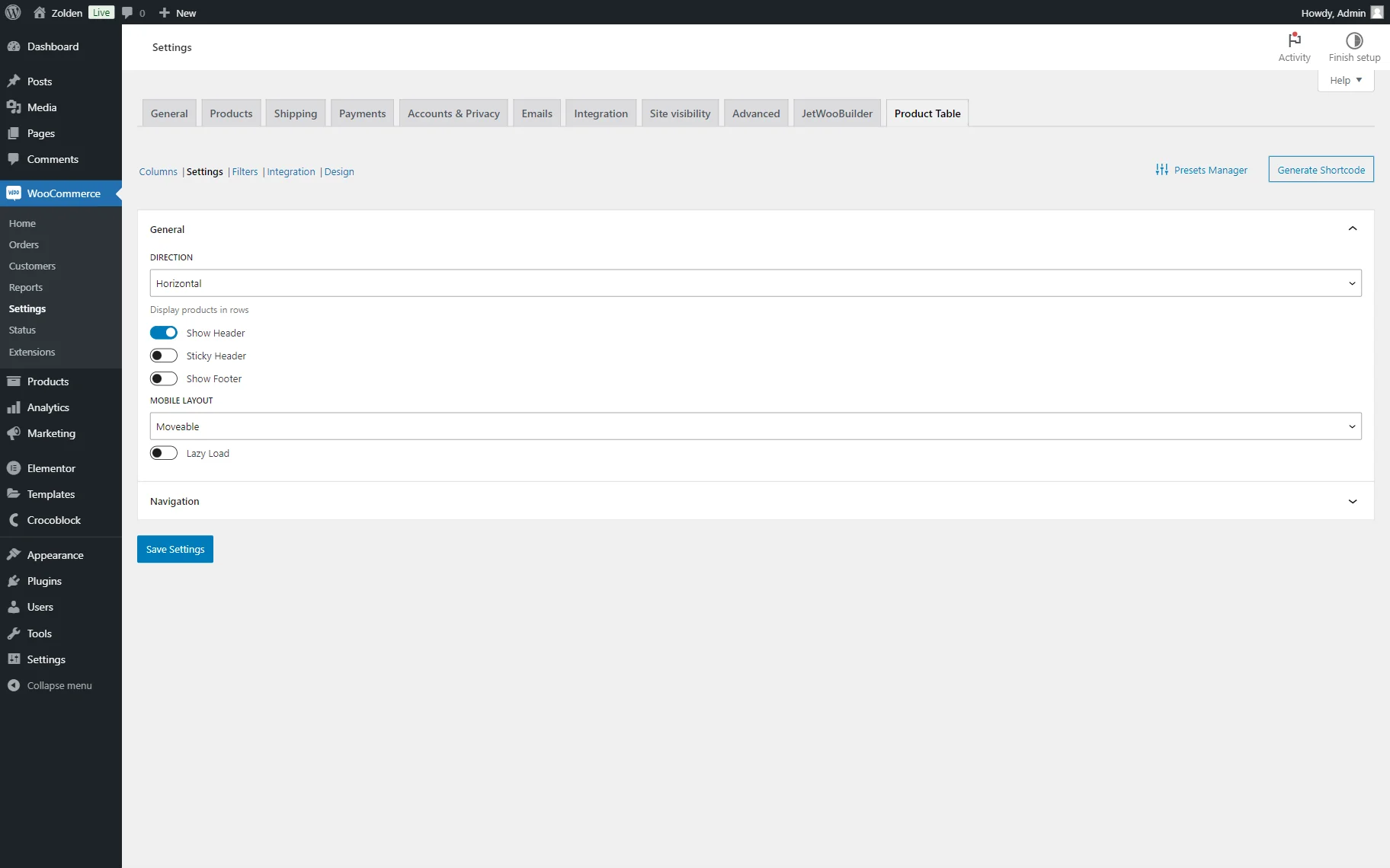
- DIRECTION — a table direction that is set to “Horizontal” by default. If “Horizontal” is selected, the content is displayed in rows, and if “Vertical” is picked, the table becomes inverted, and the products become columns, and columns created in the Columns tab will be used as rows;
- Show Header — a toggle activated by default. When left activated, the column name is shown in the header;
- Sticky Header — a toggle deactivated by default. When activated, the header becomes sticky, which means it stays on the top of the page when the page is scrolled;
- Show Footer — a toggle deactivated by default. When activated, the column name is shown in the footer;
- MOBILE LAYOUT — the way how the column will be displayed on mobile devices. More information about the options presented is given below:
- Moveable — an option is set by default. If selected, the table on the front end will be displayed partially but can be scrolled horizontally to see the rest of the columns;
- Shorten — an option that, if selected, leaves only several columns in the mobile device table. For this layout, columns should additionally be picked to display on mobile devices. So, the user should leave the most important columns that will be displayed correctly on mobile devices. All other functionality works as for desktop tables. This option is not sustainable for the vertical tables as every product is a column in such tables;
- Transform — an option with which the content is transformed into a set of cards. Each card has the appearance of a vertical table, where the desktop columns become rows. The first column of this table is the name of the corresponding desktop column; the second column is its value. For this layout, the content is saved, the visual display is completely changed, and the sticky header (because the table now has no global header) and sorting (because the layout changes globally and now there are no corresponding controls) stop working;
- Collapsed — an option similar to the previous one, but it is more compact. By default, the user sees only the first column of each line, and by clicking on the “+” icon, they can see the contents of the rest of the line. With this option, the header with the name of the first column is stored, so sorting can work for this column.
- Lazy Load — a toggle deactivated by default. When activated, the content will be loaded whenever the page is scrolled to it.
Navigation
The Navigation tab includes the following settings:
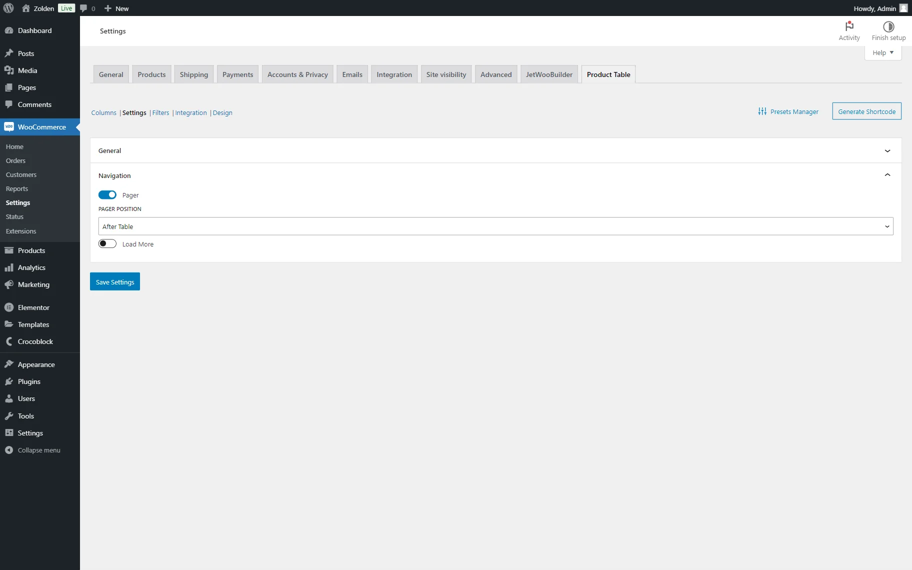
- Pager — a toggle activated by default. If left activated, the pagination will be displayed on the page;
- PAGER POSITION — the pagination position on the page. The pagination can be put before the table, after the table, or before and after the table;
- Load More — a toggle deactivated by default. If activated, the “Load More” button will appear below the table. Once the button is pressed, new products will be added after those already on the page.
If the Load More toggle is activated, one more setting is shown:
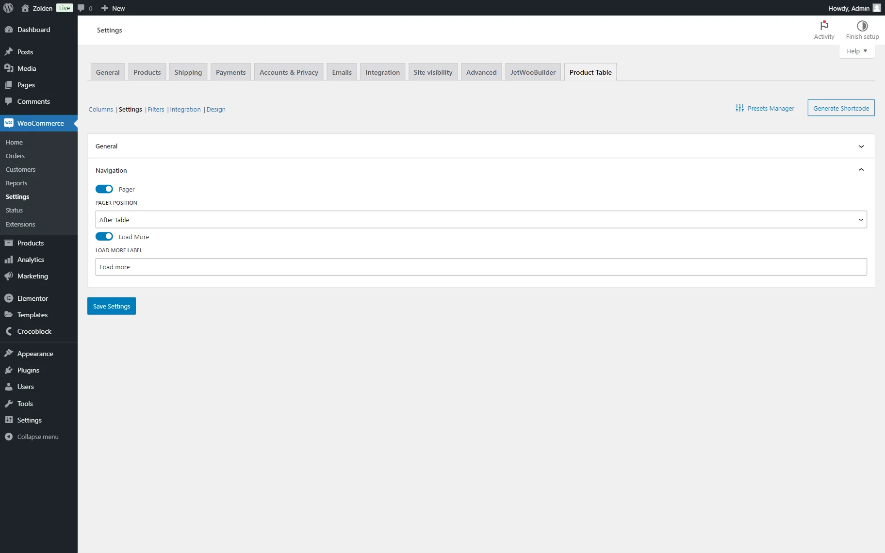
- LOAD MORE LABEL — a field where the “Load More” text of the button can be changed.
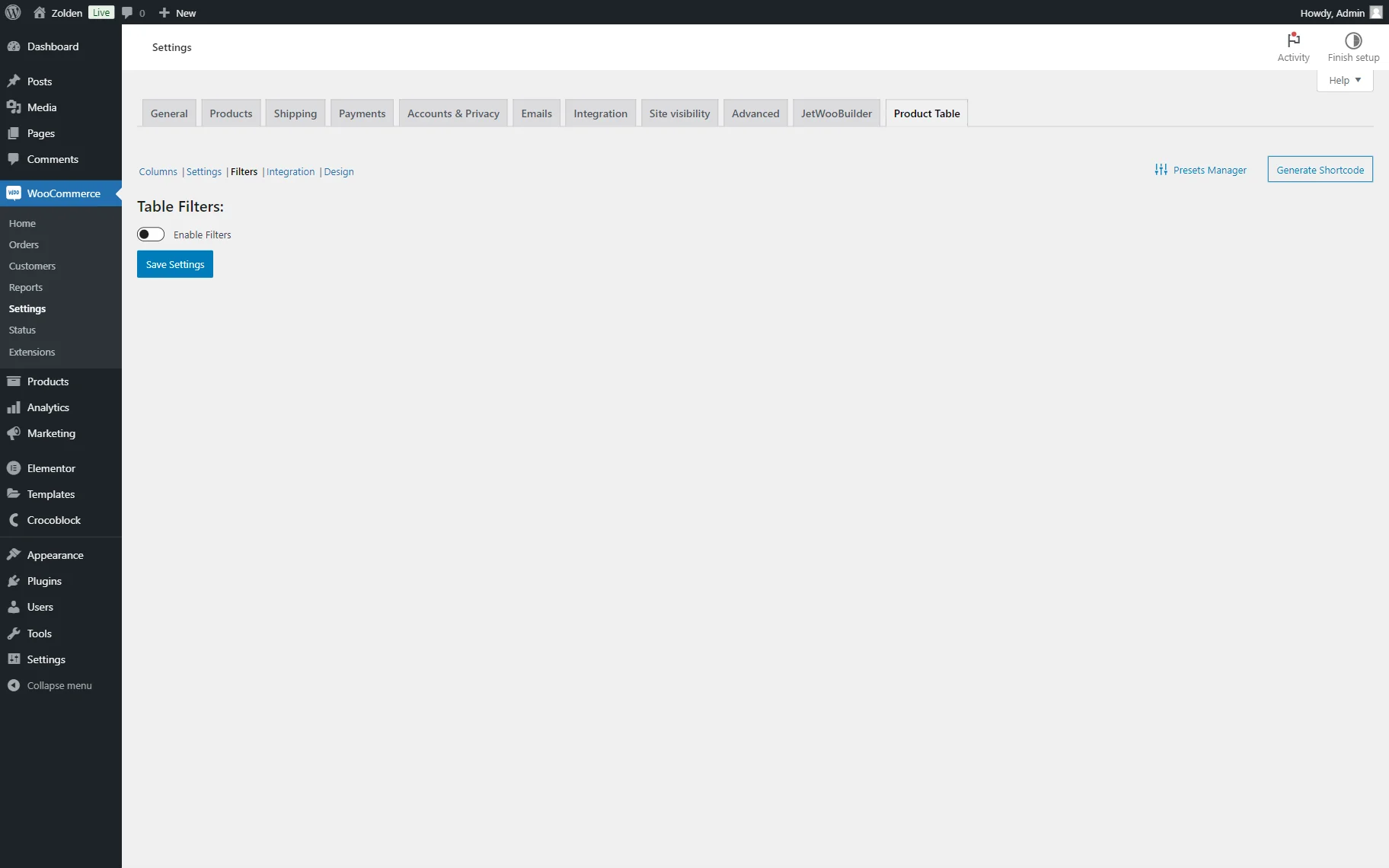
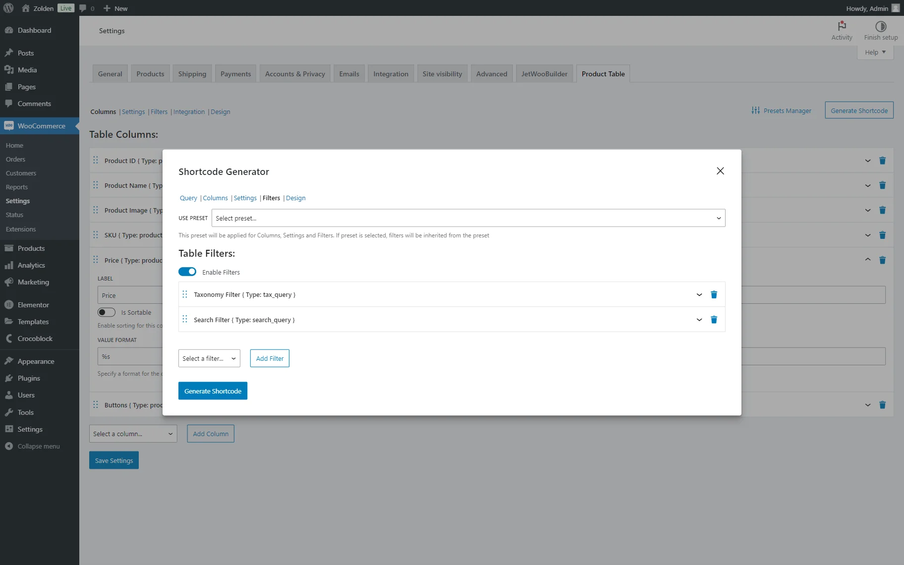
Filters
This tab allows one to add the filters to the table. By default, filters are deactivated.
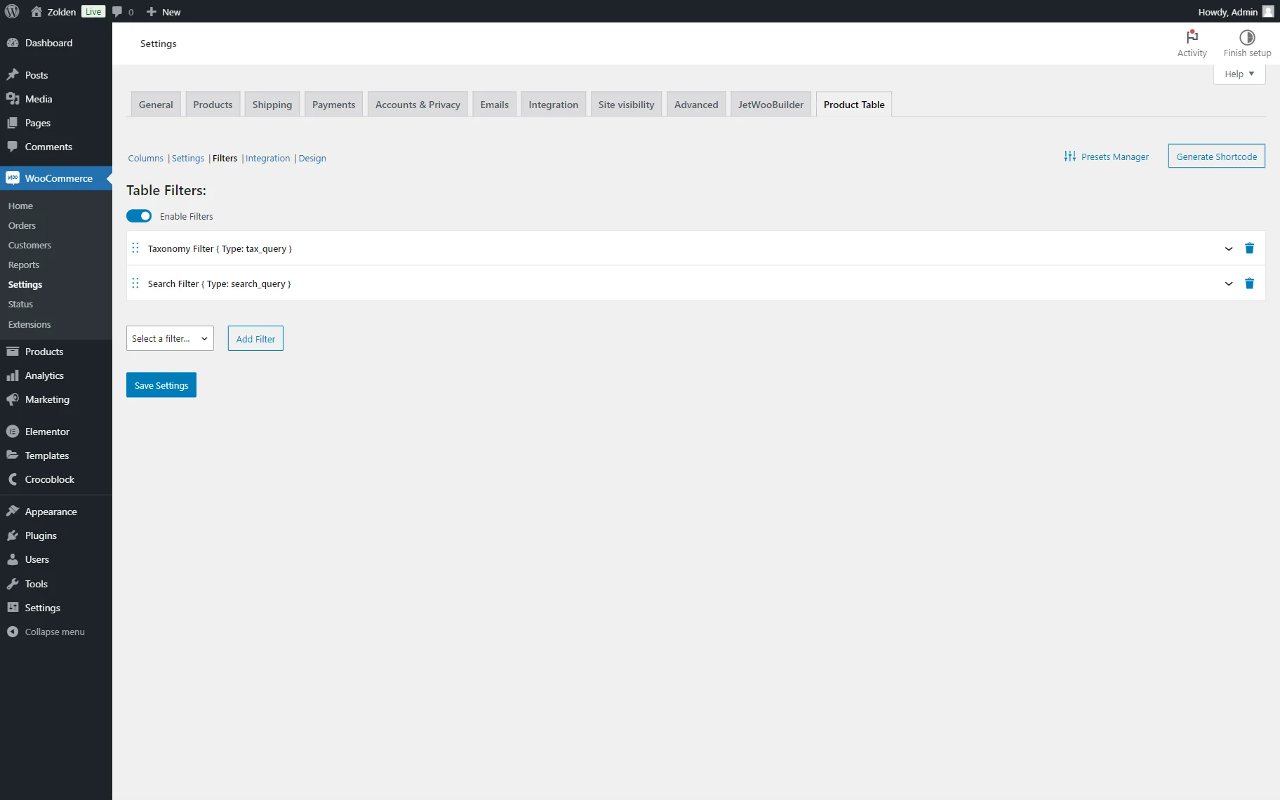
To add the filters to the table, one should activate the Enable Filters toggle.
If activated, two filters are added to the list by default: Taxonomy Filter and Search Filter.
The Taxonomy Filter tab includes the following settings:
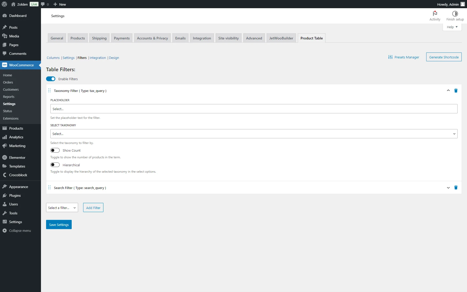
- PLACEHOLDER — a placeholder text of the first option of the filter;
- SELECT TAXONOMY — a dropdown menu where the available taxonomies are presented. Here, the needed taxonomy should be selected in order to be used as a filter source;
- Show Count — a toggle that is inactive by default. When activated, the number of products in the term is shown next to the filter option. The counter will show the total amount of items attached to the specific term and not only those displayed in the table;
- Hierarchical — a toggle that is inactive by default. When activated, the hierarchy of the taxonomy is preserved in the filter.
The Search Filter includes the following unique settings:
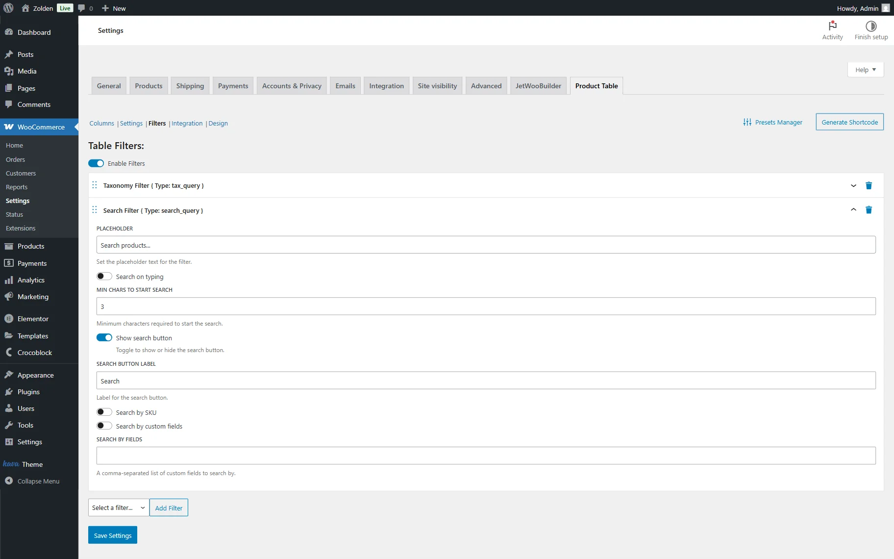
- Search on typing — a toggle that is inactive by default. When activated, the search will be conducted when the user types in a request in the search bar;
- MIN CHARS TO START SEARCH — a field where the minimum characters to start the search should be put. By default, it is set to “3”;
- Show search button — a toggle that is active by default. When deactivated, the search button will be hidden;
- SEARCH BUTTON LABEL — a field where the search button label can be changed;
- Search by SKU — a toggle that is inactive by default. When activated, the search will be conducted by the product SKUs;
- Search by custom fields — a toggle that is inactive by default. When activated, the search will be conducted by the product custom field values;
- SEARCH BY FIELDS — a field where the list of custom fields to search by should be put. The values should be separated by commas (no spaces).
To add one more filter, one should select its type in the selector below the fields and press the “Add Filter” button. Altogether, there are three filters available: the Taxonomy Filter and Search Filter, which were described above, and one more option becomes available, the Attributes Filter.
The Attributes Filter has the following unique field for customization:
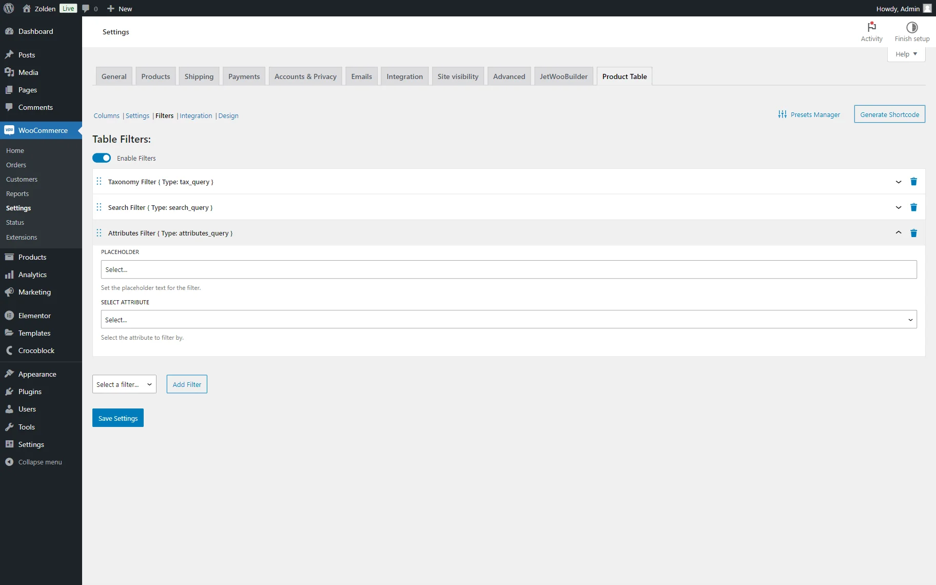
- SELECT ATTRIBUTE — a dropdown list where the WooCommerce attributes are presented. The attribute selected here will be the source of the filters.
Integration
In this tab, the user can configure which standard WooCommerce locations they want to add their own tables to.
For every location, the preset can be enabled (created with the Presets Manager) in the corresponding dropdown list.
Here, the following locations are presented:
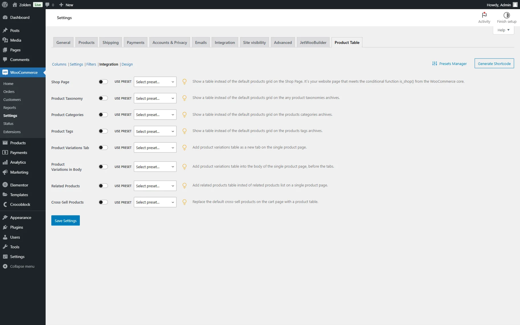
- Shop Page — if activated, the default products grid on the Shop Page will be replaced with the table;
- Product Taxonomy — if activated, the default products grid on any product taxonomies archives will be replaced with the table;
- Product Categories — if activated, the default products grid on the product categories archives will be replaced with the table;
- Product Tags — if activated, the default products grid on the products tags archives will be replaced with the table;
- Product Variations Tab — if activated, the product variations table will be added as a new tab on the Single Product Page;
- Product Variation in Body — if activated, the product variations table is added to the body of the single product page before the tabs;
- Related Products — if activated, a related products table is added instead of a related products list on a Single Product Page;
- Cross-Sell Products — if activated, a product table is added to the Cart Page instead of cross-sell products.
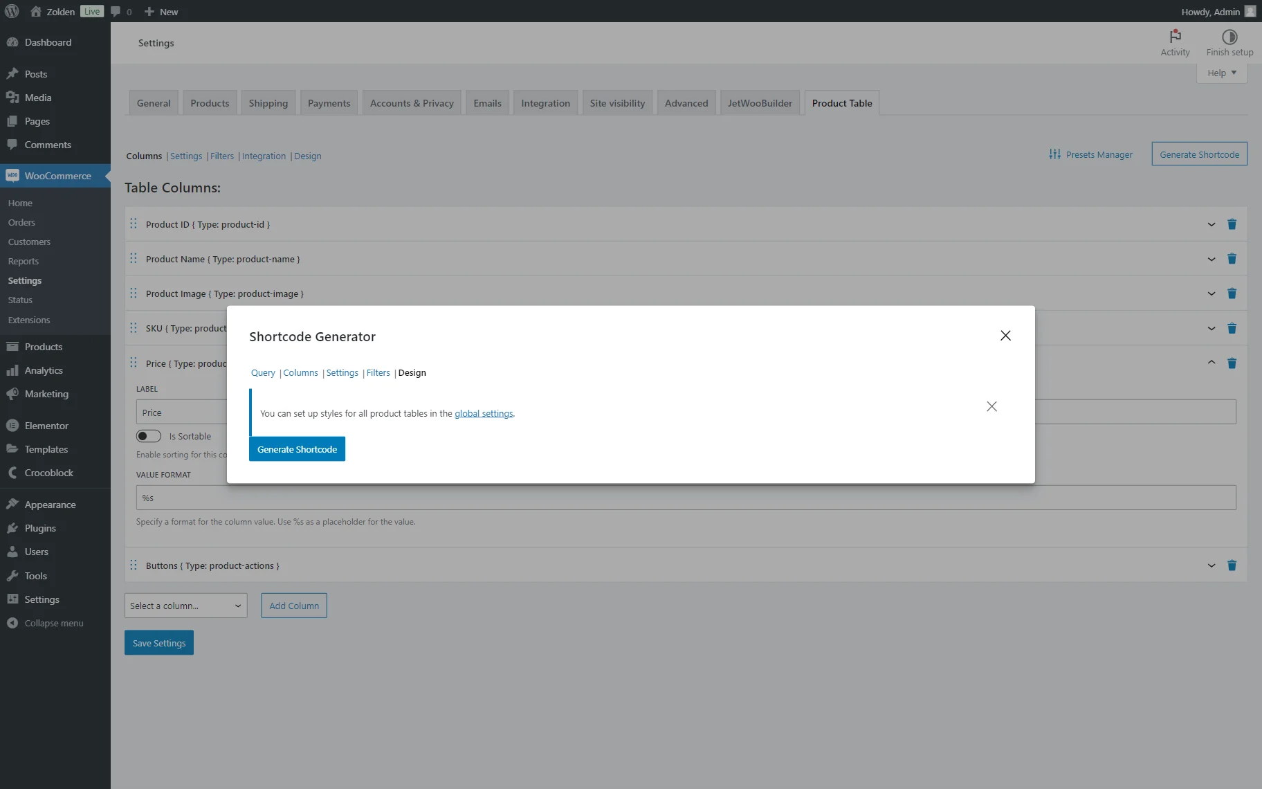
Design
This tab is responsible for the table’s design. Here, one can customize the Table Headings:
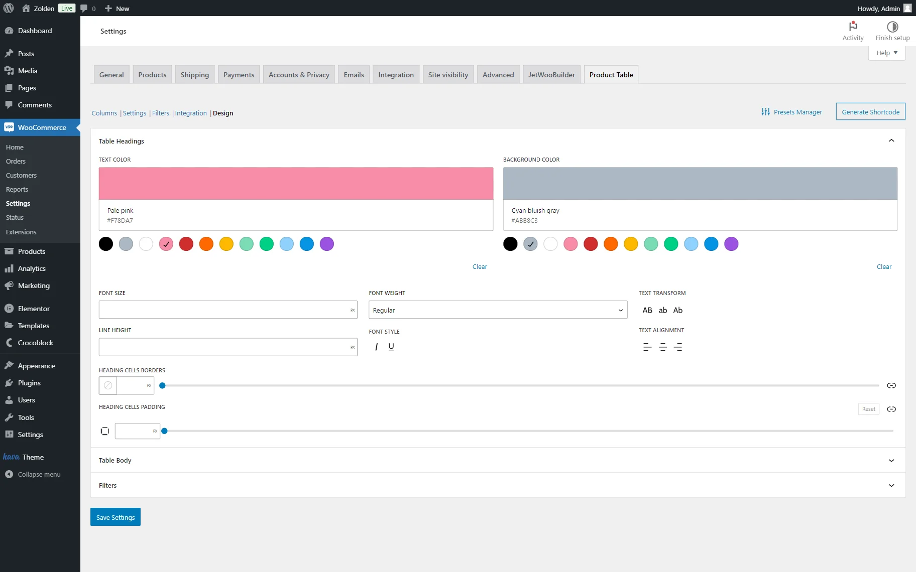
- TEXT COLOR — a color of the heading;
- BACKGROUND COLOR — a background color of the heading;
- FONT SIZE — a font size of the header;
- FONT WEIGHT — a font weight of the header. By default, it is set to “Regular”;
- LINE HEIGHT — a line height of the header cell;
- FONT STYLE — a style of the heading that can be set to italic or underlined. By default, it is deactivated;
- TEXT ALIGNMENT — an alignment of the header in the cell;
- HEADING CELL BORDERS — a field where the color, style, and border dimensions can be specified. By default, the format is set to pixels but can also be measured in %, EM, REM, VW, and WH;
- HEADING CELL PADDING — a field where the padding can be specified. By default, the format is set to pixels but can also be measured in %, EM, REM, VW, and WH.
The following tab is called Table Body. It includes the following unique settings:
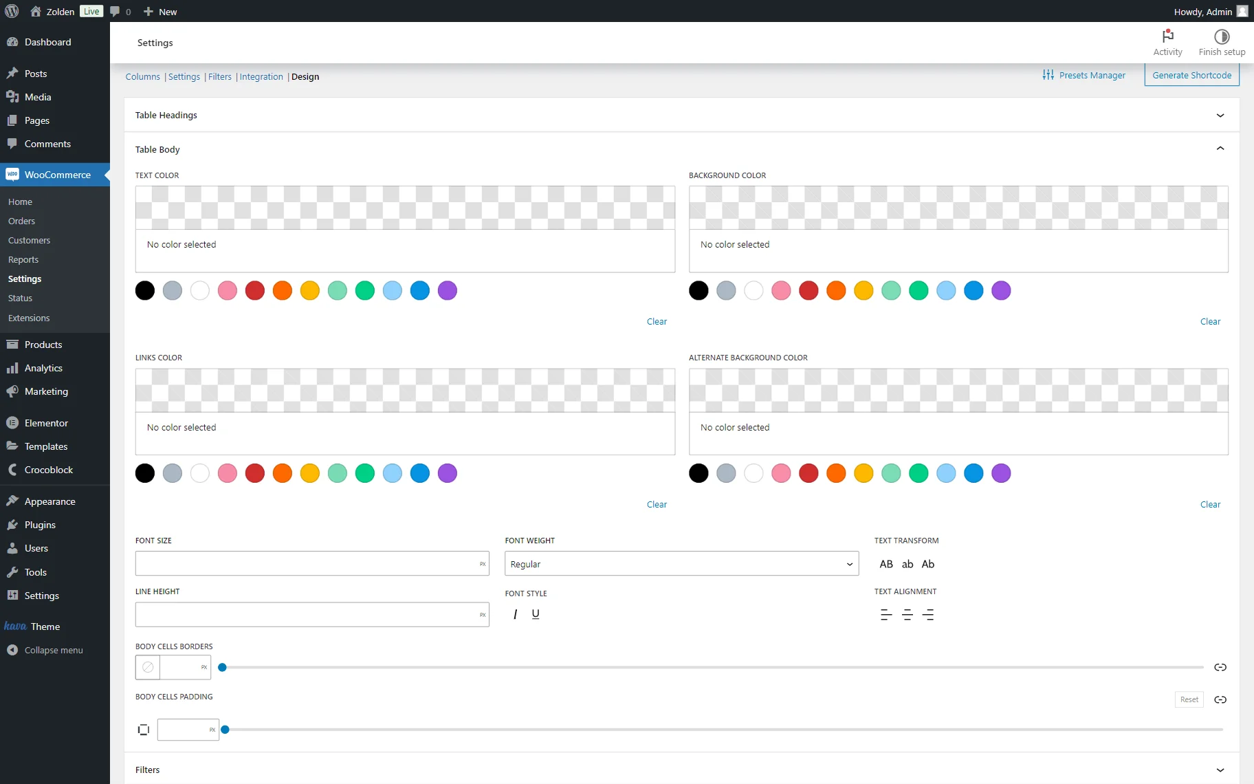
- LINKS COLOR — a color of the links;
- ALTERNATE BACKGROUND COLOR — an alternate background for the rows. If set, the color of the rows’ background will alternate.
The following Filters tab allows customizing two fields:
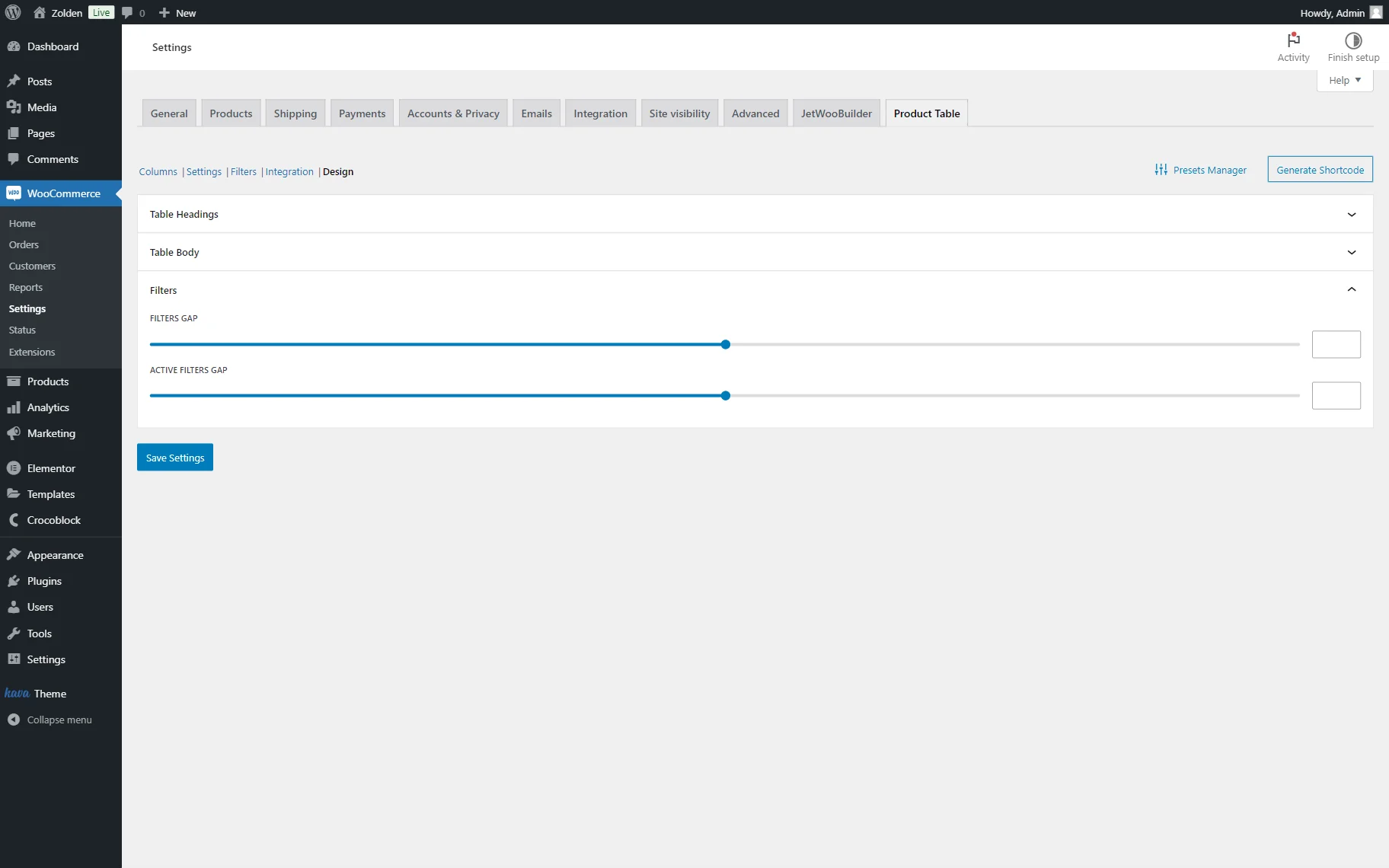
- FILTERS GAP — a gap between the filter items;
- ACTIVE FILTERS GAP — a gap between the active filter items.
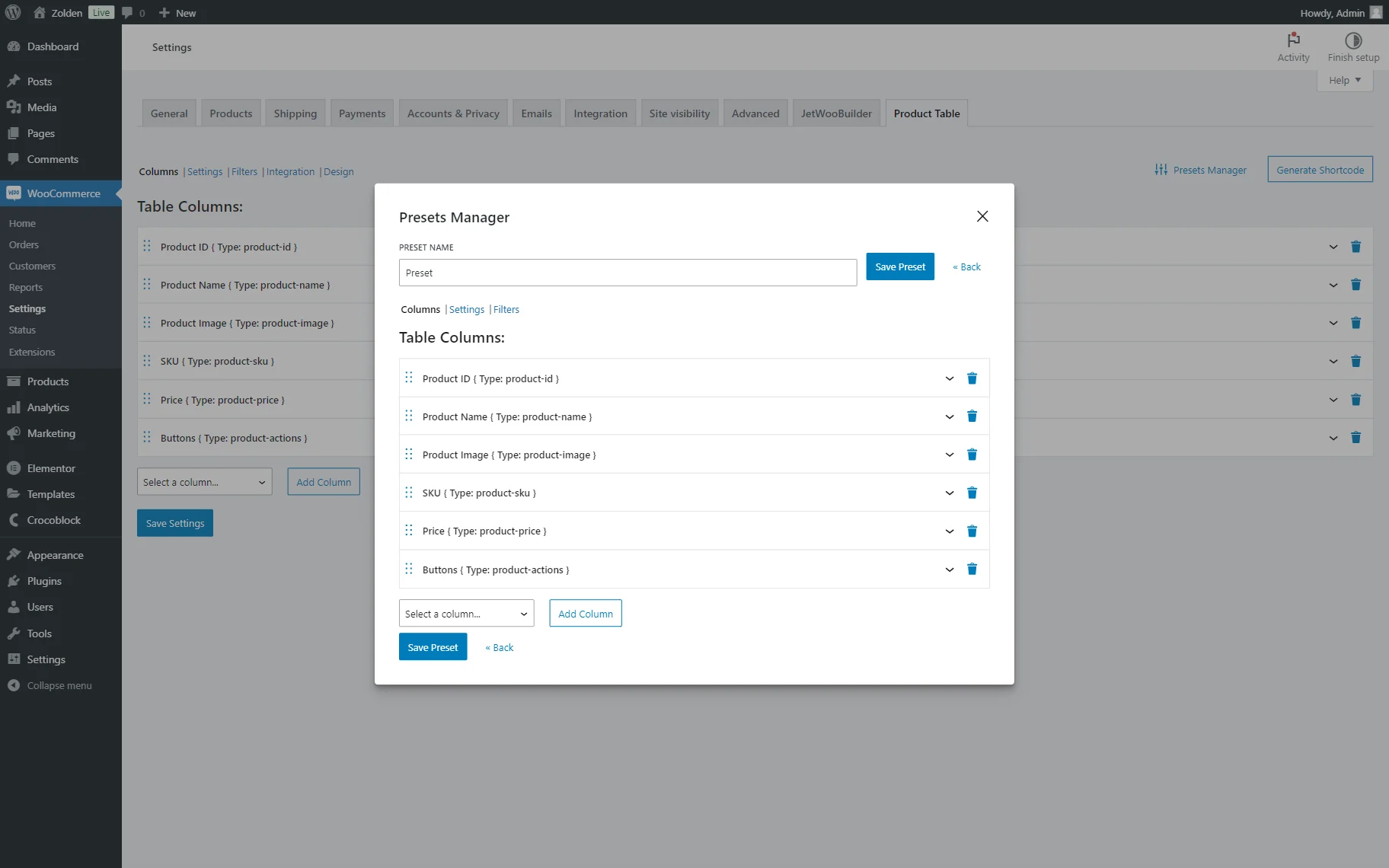
Presets Manager
A Presets Manager pop-up allows saving the current customizations as a preset to be later used for the needed locations in the Integration tab, Shortcode Generator pop-up, or the Product Table block.
It can be managed by pressing the “Presets Manager” button.
Initially, it has one customization field displayed:
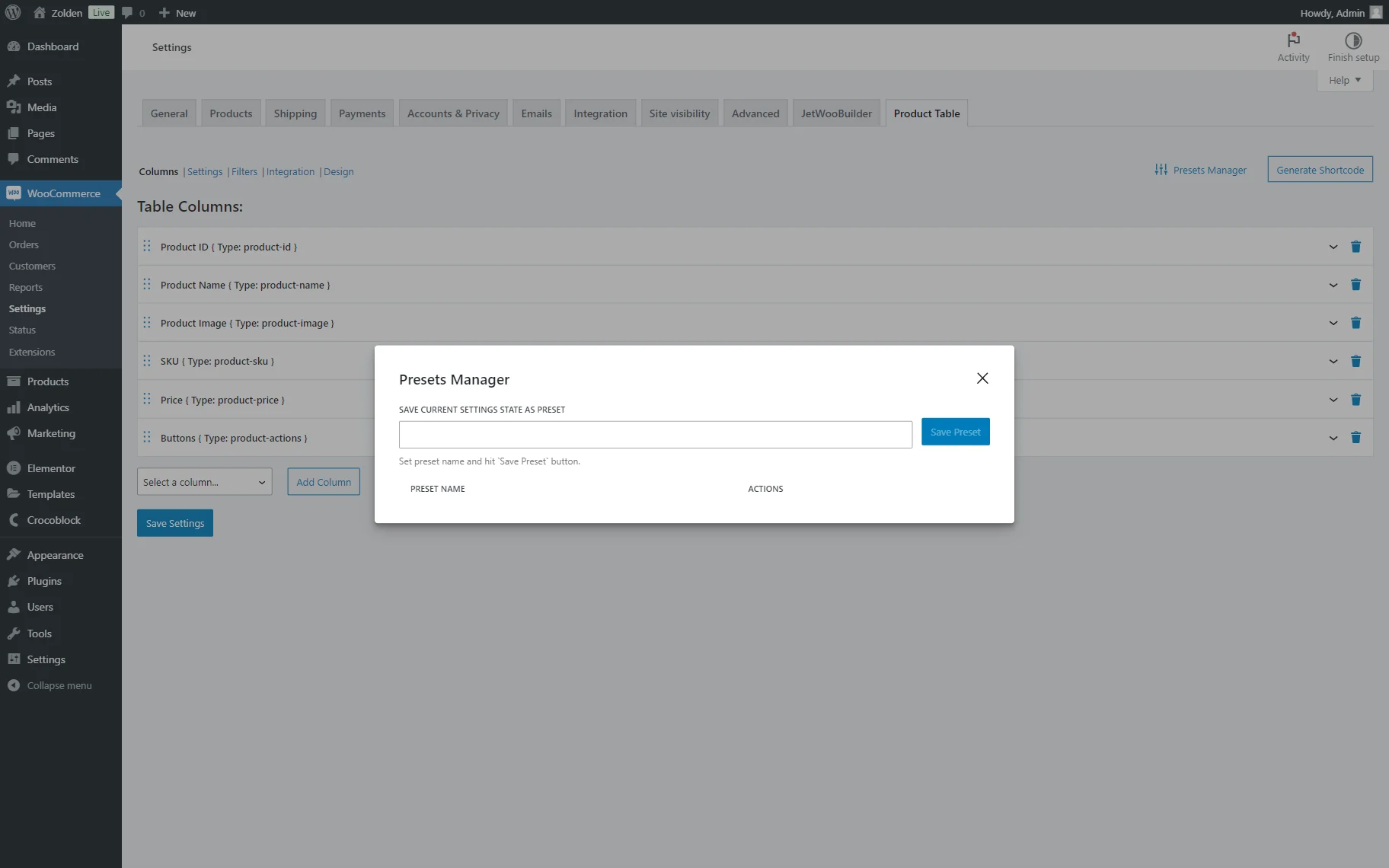
- SAVE CURRENT SETTINGS STATE AS PRESET — a field for the preset name. Once completed, one can click the “Save the Preset” button to add the current adjusted state of the settings as a preset.
When the new preset is added, it can be edited or deleted with the help of the corresponding buttons.
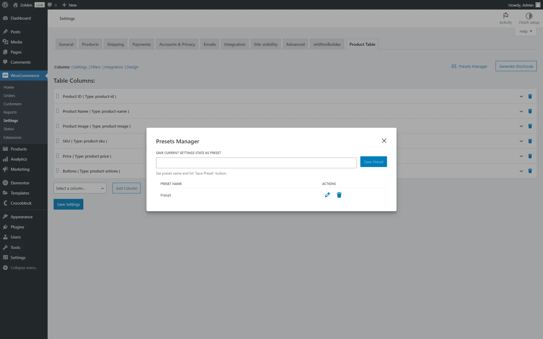
If the “pencil” button is pressed, additional preset settings are opened. These are presented in three tabs: Column, Settings, and Filters.
Here, the previously adjusted settings can be edited, the columns and filters can be deleted, or new ones can be added if desired.
Shortcode Generator
The Shortcode Generator pop-up allows one to generate a shortcode that can be later used in different locations. This means that one can create a desired table and use it on any page later.
It can be accessed by pressing the “Generate Shortcode” button.
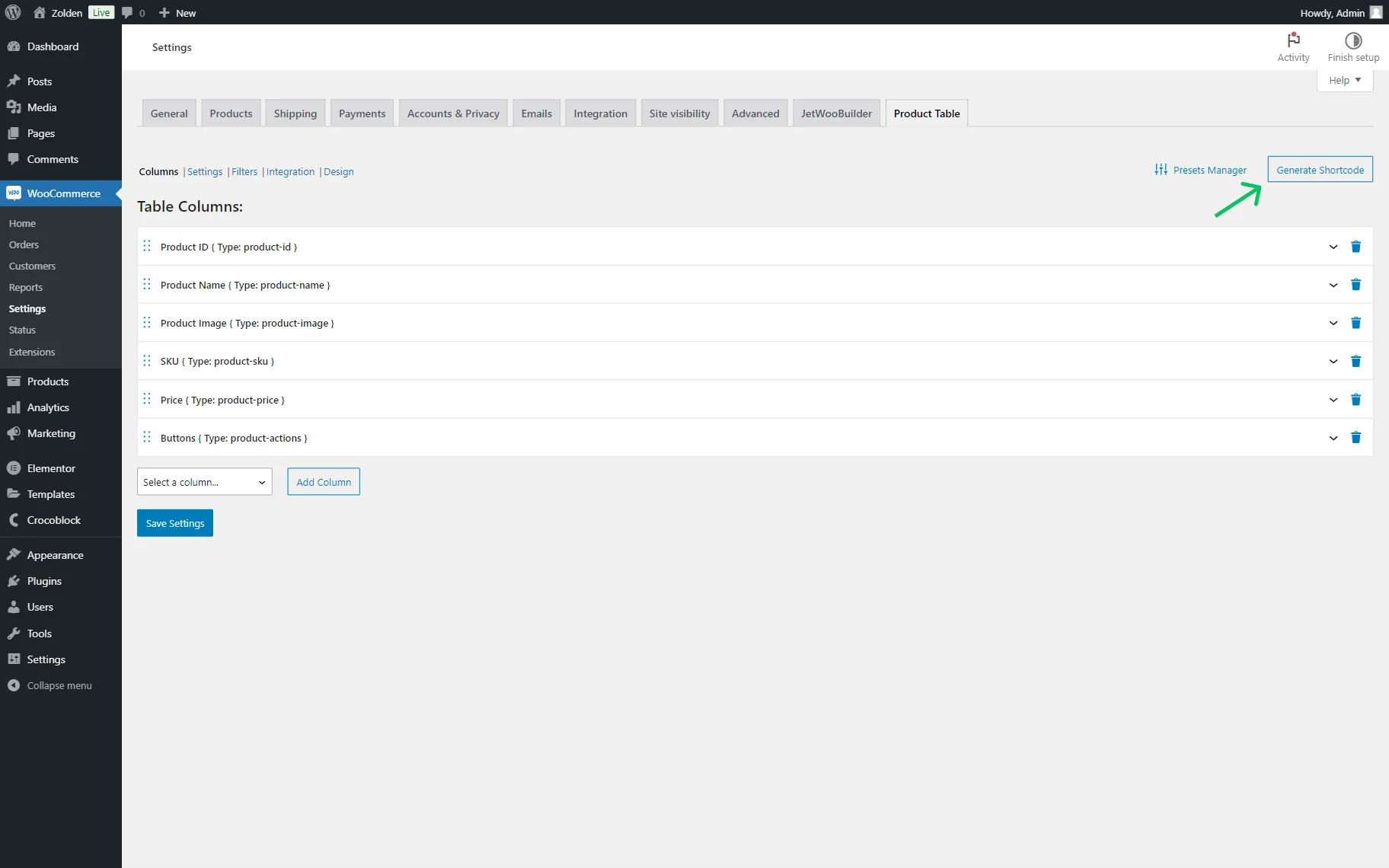
In this pop-up, five tabs are presented: Query, Columns, Settings, Filters, and Design.
The Query tab includes the internal tabs. The first one is Query and contains one field:
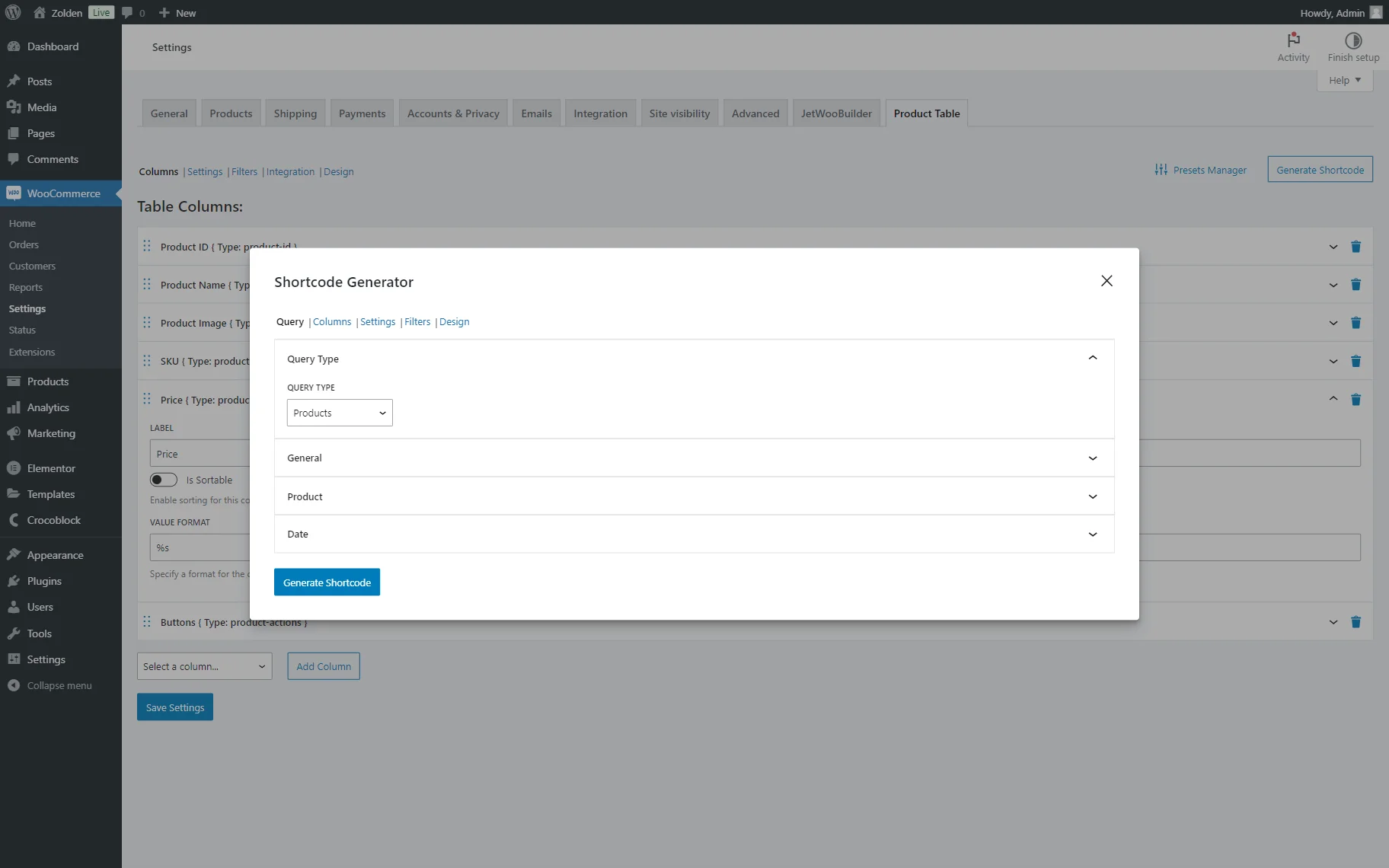
- QUERY TYPE — a type of query used for the shortcode. Among the options are “Products” and “Product Variations.”
If one selects the “Product Variations” option in the QUERY TYPE of the Query Type tab, the General tab will look different. It will include only one field:
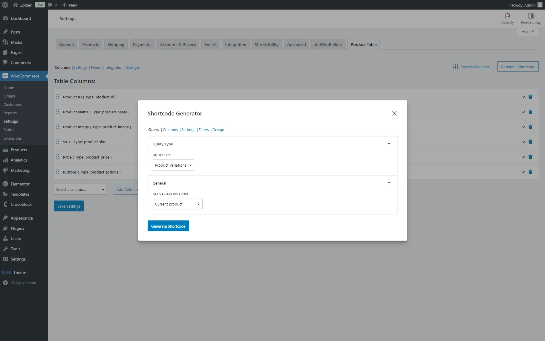
- GET VARIATIONS FROM — a selector that allows one to pick the source of variations. By default, the variations are taken from the current product; this option can be used on the Single page of the product to retrieve its variations. If the “Specific Product ID(s)” option is selected, one can specify the ID(s) of the product(s) in the appeared field, and if the “Specific Product SKU(s)” option is selected, the SKUs should be added in the corresponding field.
The General tab also appears if the “Products” option was selected as a QUERY TYPE.
This tab contains the following fields for adjustment:
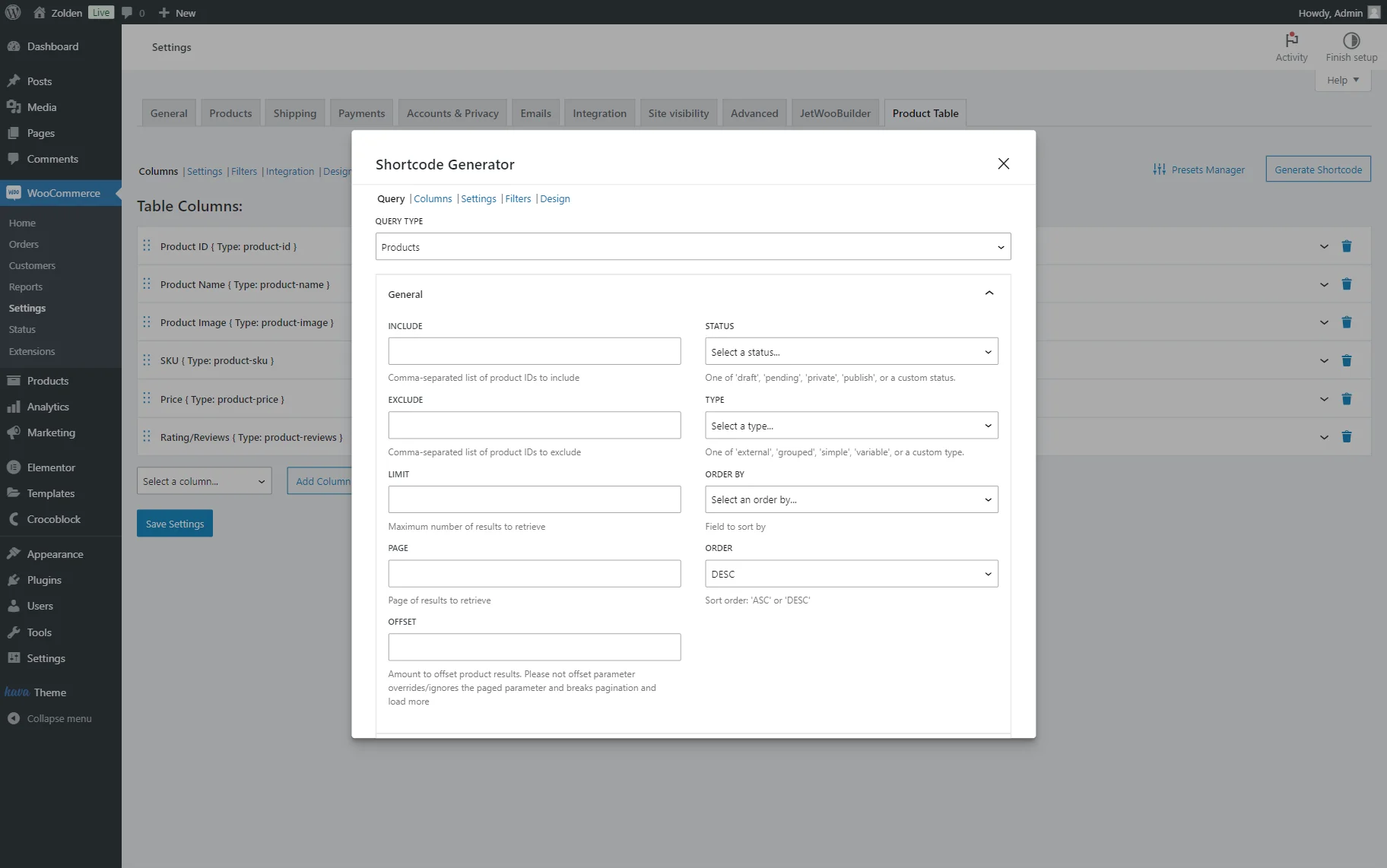
- STATUS — status of the product used for the query. Among the options are: “Draft,” “Pending Review,” “Private,” and “Published.”
- INCLUDE — a field for the specific product IDs that will be included in the query. If several IDs should be put in the field, one can separate them by commas;
- EXCLUDE — a field for the specific product IDs that will be excluded from the query. If several IDs should be put in the field, one can separate them by commas;
- LIMIT — a field for the maximum number of results to retrieve or maximum products per one page if navigation is enabled;
- PAGE — a field for the number of the page to retrieve. For instance, if the “2” value is put in the field, the table will be opened on the second page right away;
- ORDER — a sorting order. It can be set either to “ASC” (ascending) or “DESC” (descending) order;
- TYPE — a type of the queried products. Among the options are: “Simple product,” “Grouped product,” “External/Affiliate product,” and “Variable product”;
- OFFSET — a field that can be used to skip some of the products from the table. In this field, the number should be put. For instance, if one puts the “3” value in the field, three products will be skipped, and the table will start from the fourth product;
- ORDER BY — a field where the order of the displayed products can be picked. The products can be sorted by “Date,” “ID,” “Name,” “Type,” put in the random order (“Random” option) or by the modification date (“Modified” option);
- RETURN — a format that will be returned: “Objects” or “IDs.”
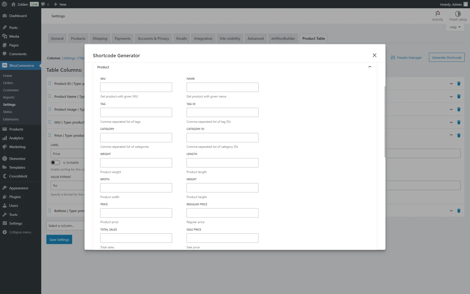
The next tab is called Product. It includes the customization fields of the product query.
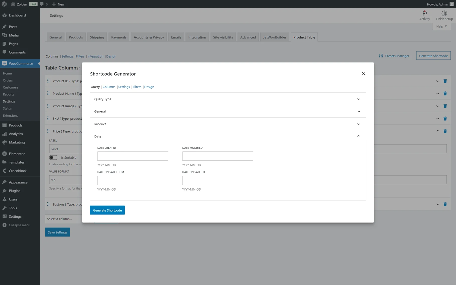
The following tab is called Date and allows for generating a shortcode based on the dates connected with the products.
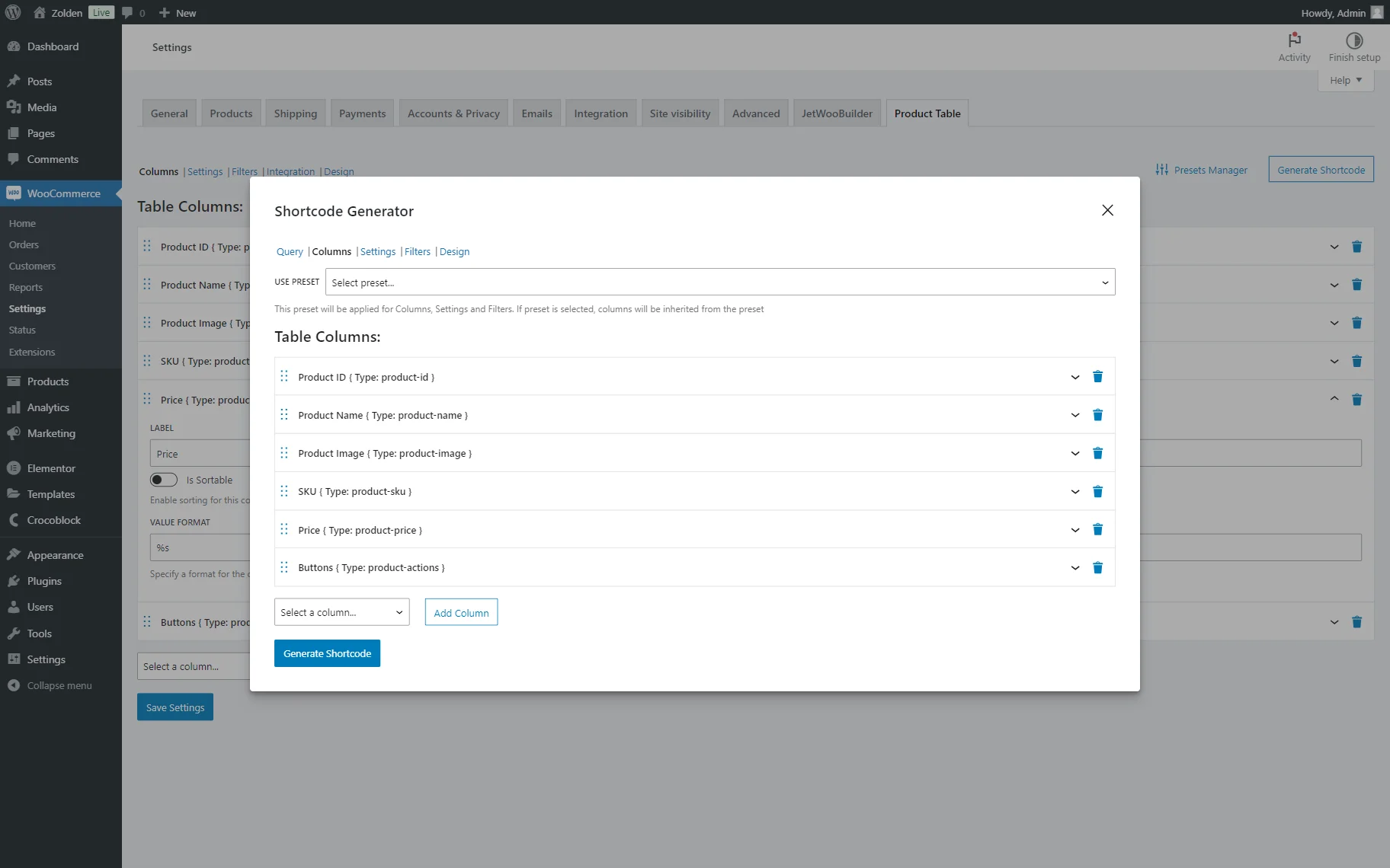
The next tab includes the default columns, as in the main Columns directory. They can be edited or deleted, and one can also add new columns if needed.
Also, one can pick a preset in the corresponding field.
Next is the Settings tab. Here, the preset can be selected as well. Also, two tabs are presented here: General and Navigation.
The General tab includes the same customization fields as those presented in the General tab of the Settings tab in the global directory and the Navigation tab as a Navigation tab correspondingly.
One can enable filters in the following Filters tab and adjust them like in the global Filters directory.
The Design tab doesn’t contain any settings, although all the style adjustments can be made in the global Design settings.
That’s all about the settings available with the JetProductTables plugin for WordPress websites.