How to Use the Slider Widget
This tutorial will guide you through creating and customizing a slider using the Slider widget.
The Slider widget of JetElements will come in handy if you need to attract the visitors’ attention, allowing you to post eye-catching pictures with the title, description, and link button on each of them. There are several types of navigation, animation, and lots of customization settings for this widget. Let’s discover them a bit further.
1 Step — Add the Slider widget to the page
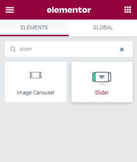
Go to the dashboard of your website, find the page where you would like to place a slider, and open it with the Elementor page builder. Find the Slider widget and drop it into a new section.

2 Step — Add the content
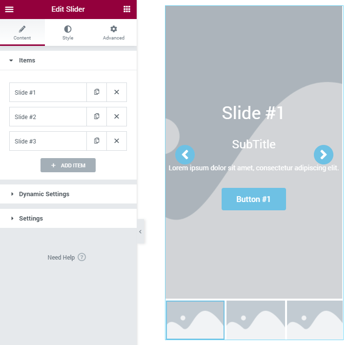
Navigate to the Content tab and unfold the Items section. By default, there are three items here and each of them shows a single slider. You can add more sliders by clicking the “Add Item” button and filling it with content.

To customize a slide click on it and od the necessary changes. Besides adding an Image you can also add some useful information. Let’s take a closer look at each of the features.
- Content Type. This drop-down has only two options and allows you to decide if you want to create the layout and styling from scratch or use a ready-made template;
- Icon. The icon you choose here will be displayed over the title. You can choose it from the library or use an SVG file stored on your PC;
- Title, Subtitle, Description. These three fields contain all the text you can attach to the image. The Title gives it a name, Subtitle give more details to the title and in the Description text area, you can write some interesting or sufficient data. For the Title and Subtitle you can choose the HTML Tag that will define their size and importance;
- Primary Button URL, Secondary Button URL. You can place two buttons over the slide. In these fields, you can paste the links for them. You can also make the link open in the new window and add a nofollow tag to it by enabling a corresponding toggle. Primary and Secondary Button Text fields are for the text that will be shown over the button;

3 Step — Go through the settings
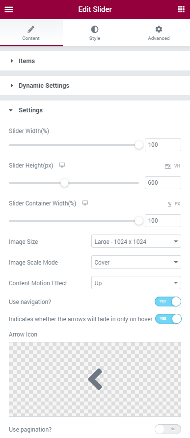
Move on to the Content > Settings block. there is a big amount of features to customize here, so let’s go through each of them.
- Slider Width, Slider Height. Those features define the size of the slider. When set, they will be applied to all the slides of the slider. The Width could be set in percent of the slider block width. The Height has two possible units of measurement, pixels (PX) and percent of the browser window height (VH);
- Slider Container Width. The text that overlays the picture on the hover is placed in the container. In this option, you can change the container width. It can be set in percent of the Slider Width and in pixels;
- Image Size. This drop-down list allows you to select the size of the picture inside the slide;
- Image Scale Mode. To fit the slider the picture you put into is scaled. In this drop-down menu, you can choose how it will be scaled. The Cover option means that the image will be scaled to fit the height on the slide. The Contain option will fit the picture to the slide’s width and save its original proportions;
- Content Motion Effect. the text content overlays the picture on hover with simple motion animation. Here you can choose how the content will appear – moving Up, Down, Left, or Right;
- Use Navigation. If you want to give your visitors a chance to change the slides manually by clicking the navigation arrows, enable this option. if you want the arrows to appear only on hover – enable the next toggle too. The shape of the Arrow Icon can be taken from the Library of uploaded as an SVG file;

- Use pagination. Enable this toggle if you want to show the dots navigation below the slides;
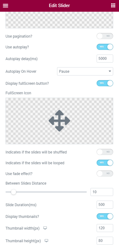
- Use autoplay. You can turn it on in order for the slides to change automatically with different pace, which you can set in the Autoplay delay section. There are also three variants of what can happen when you put your mouse cursor over the slider. Select “none”, “pause” or “stop” option in the Autoplay On Hover section;
- Display fullScreen button. You can enable or disable the fullscreen button, which will appear in the top-right corner of the slider. The FullScreen Icon can be picked in the Icon Library or downloaded as an SVG file;
- Indicates if the slides will be shuffled. Enable this option to display the items randomly. And in case you want to exhibit the slides continuously without stopping turn on the Indicates if the slides will be looped option;
- Use fade effect? Turning this toggle on you can apply a fade effect to the slides so that when they automatically change, one fades and another one brightens in turns;
- Between Slides Distance. The slides have a gap between them that can be seen when they change each other. Here you can choose the with of that gap;
- Slide Duration. The time in ms you set here defines how quickly the slides will change;
- You also can turn on the Display thumbnails option to showcase the image miniatures underneath the slides. Customize the thumbnails in the Thumbnail width and height options.

Finally, proceed to the Style block, where you are able to customize the appearance of the slider widget. When all the settings are done, hit the “Update” button, and check the result.
Now a striking slider is showing off your content web page. Enjoy!