How to Use Progress Bar and Circle Progress Widgets
This tutorial shows the customization of JetElements Progress Bar and Circle Progress widgets for Elementor.
Let’s imagine you need to describe the service you provide. For example, you produce jewelry items and need to specify the time it will take to create the particular one, the difficulty, and the uniqueness under every single article. In this case, the JetElements Progress Bar widget comes to the rescue.
Progress Bar and Circle Progress widgets assist you when you need to visualize the information and want the numbers to speak for you. You can use them to display the stages of a process, progress, use them to compare several items, etc.
Creating a Progress Bar
1 Step — Add the widget to the page
Firstly, find the Progress Bar widget in the Elementor page builder. Then, drag and drop it into a new section on your web page.
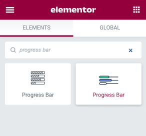
The Progress Bar widget will add a single bar to the page. You will have to do all the settings again for each new bar, so the best way to do the bunch of bars is to customize one and then duplicate it.

2 Step — Set the plugin up
Consequently, open the Content > Progress Bar block, and in the Type section, choose what your progress bar should look like. There are several types of progress bar layouts, like vertical or horizontal layouts, and different positioning for the content that comes with the progress bar.
Input the Title and pick an appropriate Icon from the library or upload the SVG file. Afterward, move on to the Percentage section, where you should specify the state of the progress bar you’re currently editing.
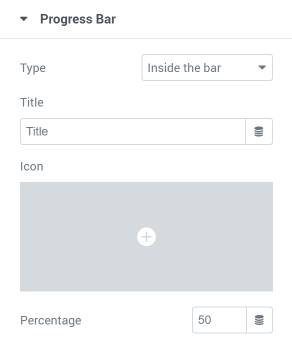
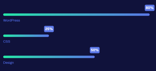
Go forward to the Style > Progress Bar block, where you can specify the progress bar height and width. When it comes to the background type and the status bar, you can make them classic, gradient, or upload an image. If you use an image, pay attention to the Attachment block, where you can choose the Fixed option. After that, go to the Title block and customize the icon and the title to make them eye-catching. And in the Percent block style, up the percent digits. This is how your progress bars block could look like:
Adding a Circle Progress
1 Step — Drop the Circle Progress widget to the page
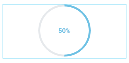
First of all, find the Circle Progress widget in the Elementor page builder. Afterward, drag and drop it into a new section which consists of four sub-sections.
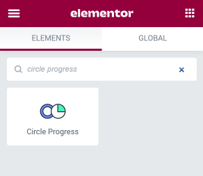
This widget also adds a single circle progress bar only. That’s why you have to choose the layout of the section first and then fill it with the widgets.
2 Step — Do the customization
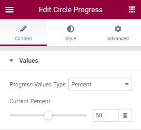
Open the Content > Values block. The Circle Progress widget can showcase not only percent but also absolute values, and you can choose that in the Progress Values Type drop-down menu. And the number of percents shown by the circle bar is set with the help of the Current Percent slider.
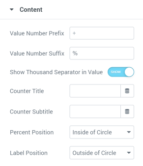
Now, open the Content > Content section. Here you can choose the Value Number Prefix and Value Number Suffix, as well as define if to Show Thousands Separator in Value. Afterward, input the title and subtitle in the Counter Title and Counter Subtitle sections and decide where you want the percent to be placed: either inside or outside the circle. The same with the label. To define its position, navigate to the Label Position option.
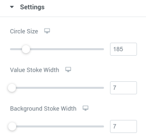
In the Content > Settings section you can specify the Circle Size, the Value Stroke Width, and the Background Stroke Width. Play with the values to choose the combination that will fit your requirements.
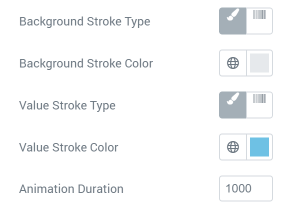
Additionally, you can select the Background Stroke Type and Color and Value Sktoke Type and Color. The Animation Duration feature defines how smoothly the circle progress bar animation will work. The lesser the number in this field – the faster the animation will be performed.
The last step is to design the Circle Progress widget. Move to the Style block and change the style settings according to your needs.
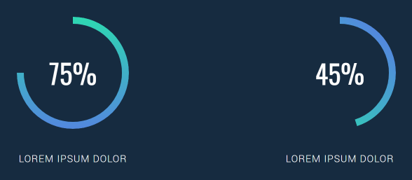
That’s it! Create the web page of your dream with the JetElements plugin easily!