How to Create a Doughnut Chart
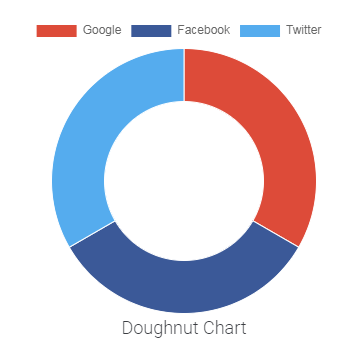
In this tutorial, you will learn how to create a Doughnut chart with the help of the Pie Chart widget from JetElements.
A doughnut chart shows the relationship of parts to a whole which makes it easier for visitors to read at a glance. It’s better to display only a few categories at once. One more neat way to showcase statistics data on your website is a doughnut chart.
1 Step — Working with chart data
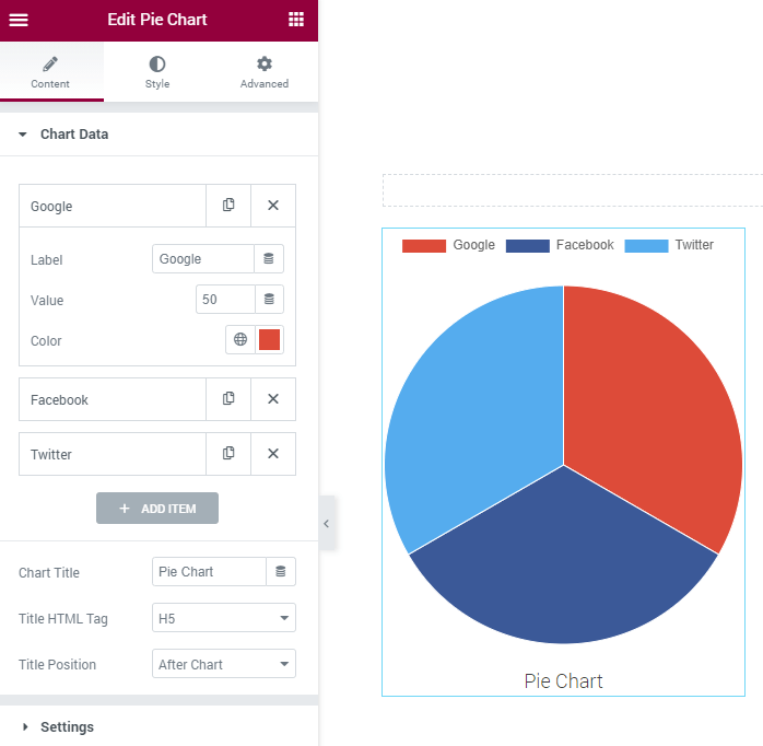
Open Elementor editor. Find the Pie Chart widget. Drag and drop it to the page. Open the Chart Data accordion block and create as many sections of your chart as you need by clicking the Add Item button. Give each item a Label set the Value and assign an appropriate Color.

Name the chart in the Chart Title field and define its position in the Title Position dropdown.
2 Step — Adjusting chart settings
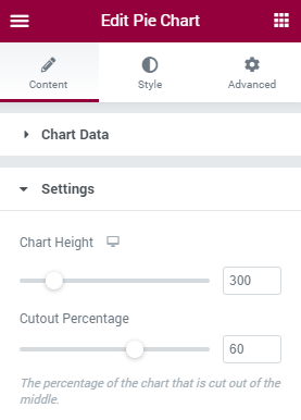
Open the Settings accordion block and first of all set the chart height in the respective field. In order to make your chart look like a Doughnut chart, increase the Cutout Percentage which will be cut out of the middle of the chart.

3 Step — Animating the widget
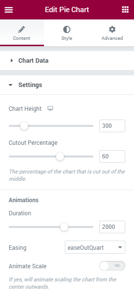
Set the animation duration with the help of the corresponding option. Select the animation in the Easing dropdown list. Toggle the Animate Scale to Yes if you want to animate scaling the chart from the center outwards.

4 Step — The legend of the Chart
Move on to the Legend block where you have to decide if you want the legend to be seen. If yes, then switch on the Display option. Define the position of the legend in the Position dropdown list, which can be Top, Bottom, Left, or Right. Toggle the Reverse option to Yes if you want the legend to be showcased in reverse order. Enable the Tooltips option if you want the legend to be shown on hover.

4 Step — Styling
Finally, open the Style tab and style up the widget.

Congratulations on your first doughnut chart with Crocoblock!