How to Create Components in Elementor
In this guide, you will learn how to build a JetEngine component in the Elementor Page Builder to reuse it later on different pages of your WordPress website.
Before you start, check the tutorial requirements:
- Elementor (Free version)
- JetEngine plugin installed and activated
Build a Component
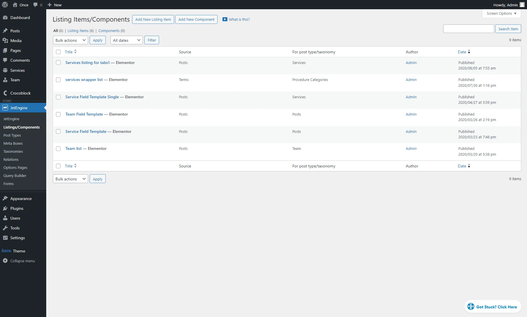
Initially, go to WordPress Dashboard > JetEngine > Listings/Components to start building a component.
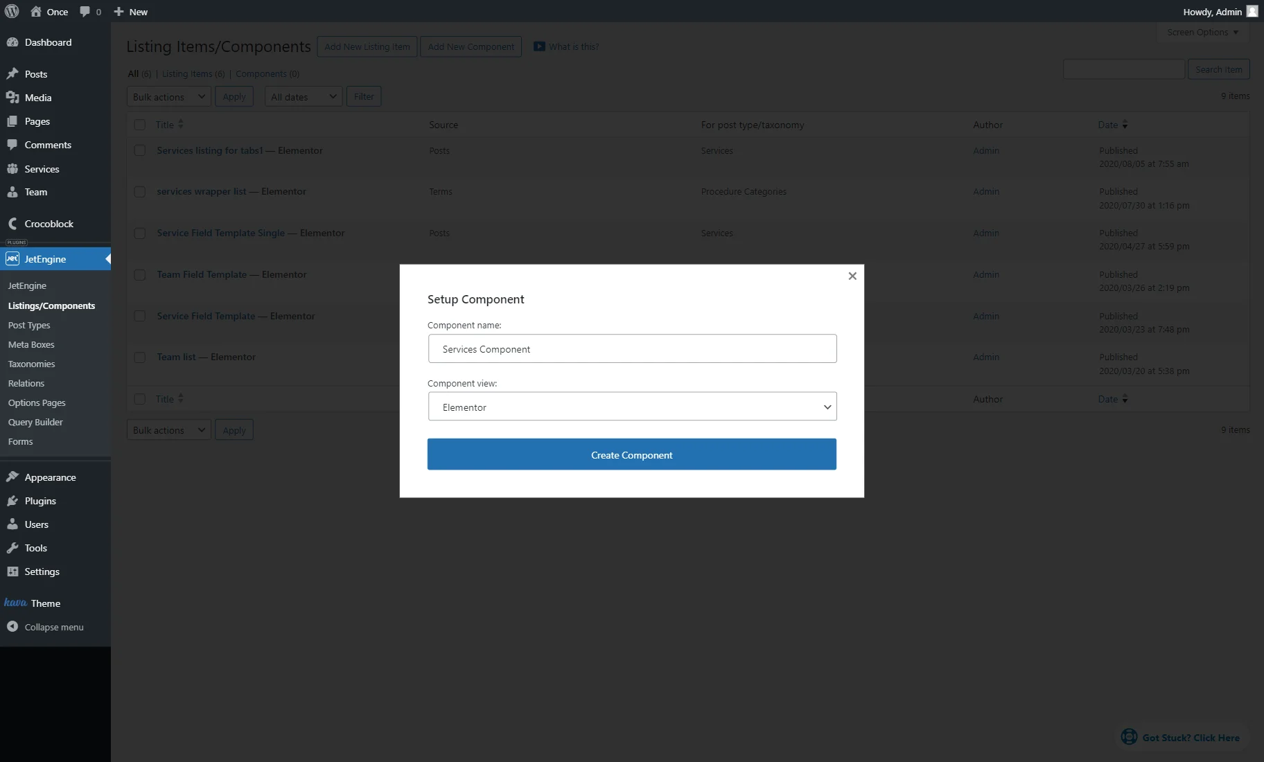
Click the “Add New Component” button.
In the Setup Component pop-up, complete the Component name and select the “Elementor” option in the Component view dropdown.
Press the “Create Component” button.
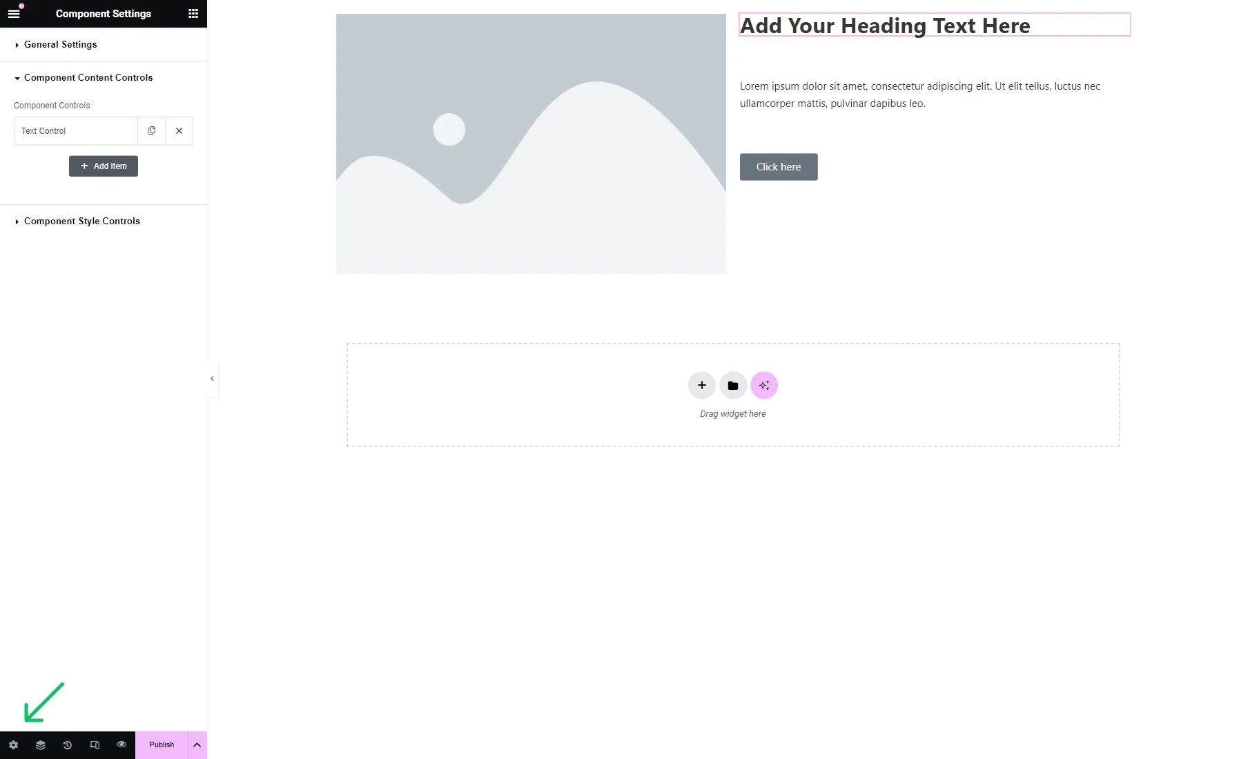
Add the needed widgets that will later become dynamic. For instance, we add the following widgets:
- Image — the image of the service;
- Heading — the title of the service;
- Text Editor — a description of the service;
- Button — a button with the link that leads to the page with additional information about the service.
To adjust controls, click the “gear” icon in the panel at the bottom of the page.
Open the Component Content Controls tab.
The Text Control tab is presented here by default. For now, we delete it by pressing the “cross” icon.
Then, we push the “Add Item” button to create our custom controls.
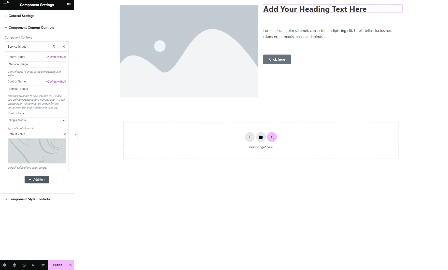
In our case, the first Control Label will be set to “Service Image,” its Control Name to “service_image,” the Control Type to “Single Media,” and the Default Value to the custom image selected in the Media Library.
Then, we press the “Add Item” button to add the next control.
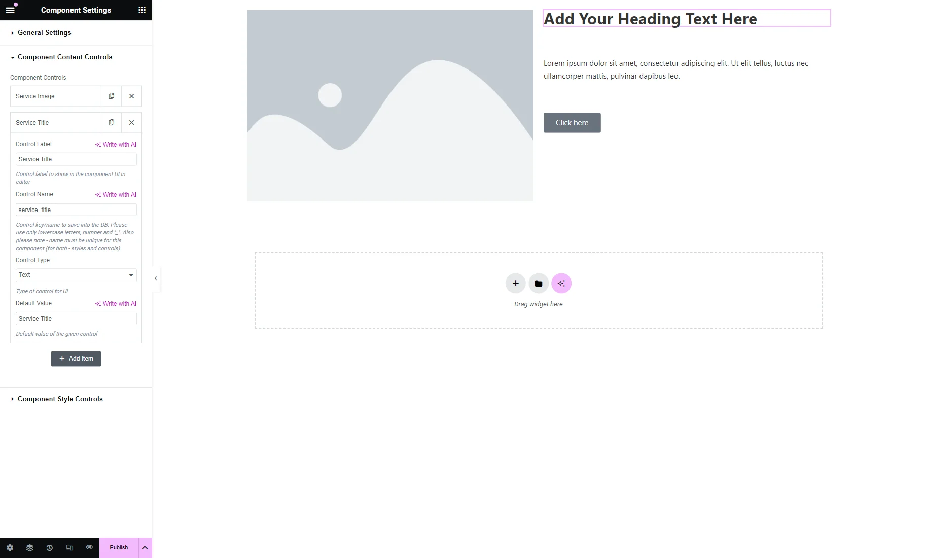
The following control represents the service title, so its Control Label is set to “Service Title,” its Control Name to “service_title,” its Control Type to “Text,” and its Default Value to “Service Title.”
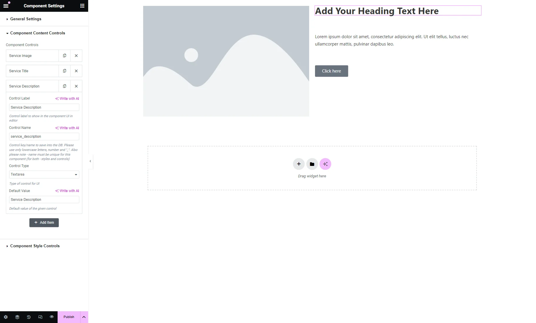
We also add the third “Service Description” control with the “Textarea” Control Type.
The next “Service Link” control is also set to “Text” Control Type.
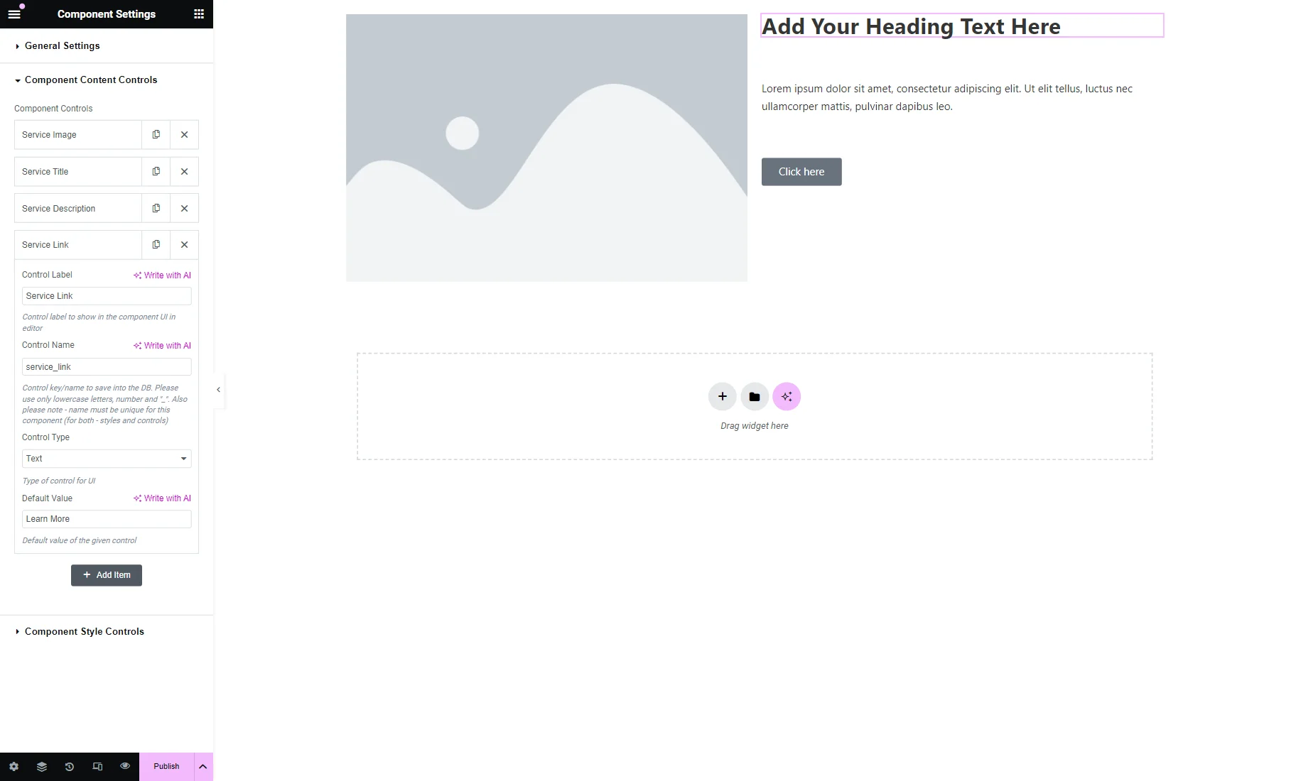
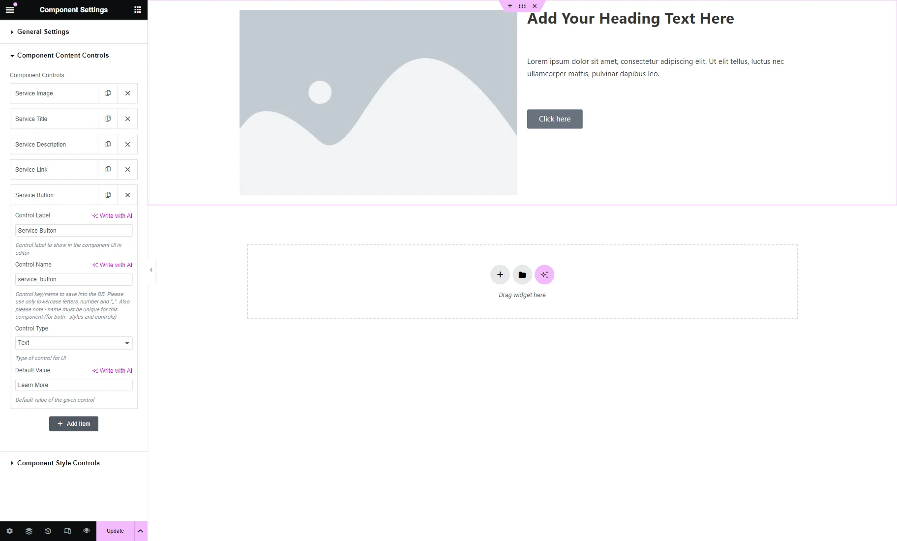
The last control is called the “Service Button” and has the “Learn More” Default Value.
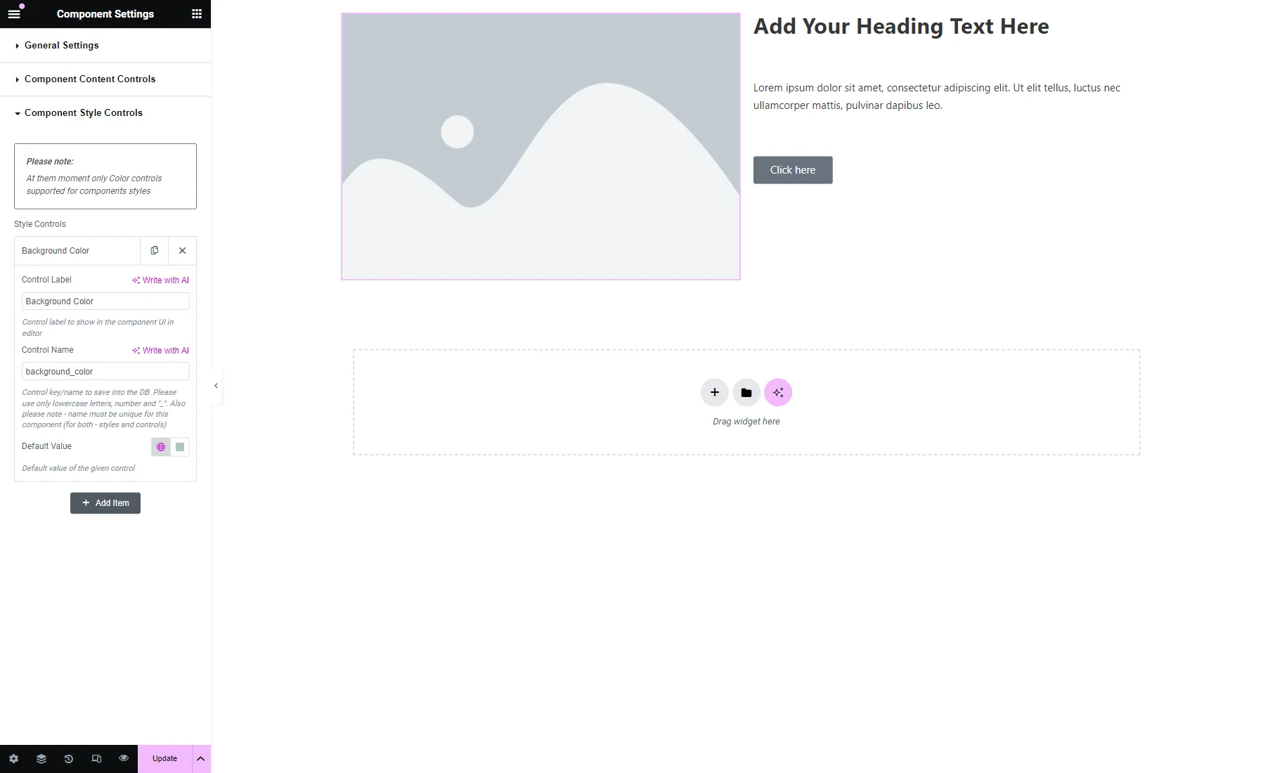
Once all the content controls are added, open the Component Style Controls tab.
Click the “Add Item” button to customize the control.
The settings here are the same as in the Component Content Controls tab.
We set the Control Label to “Background Color” and the Control Name to “background_color” and pick the desired color as the Default Value.
Now, the created controls should be attached to the added widgets.
First, we want to attach the color control to the container. To do so, we proceed to the container editing.
We open the Style settings tab and click the color selector next to the Color field in the Background tab.
There, we press the “Dynamic Tags” button and select the “Component Control Color” macro.

We put the “background_color” value as the Control Name.

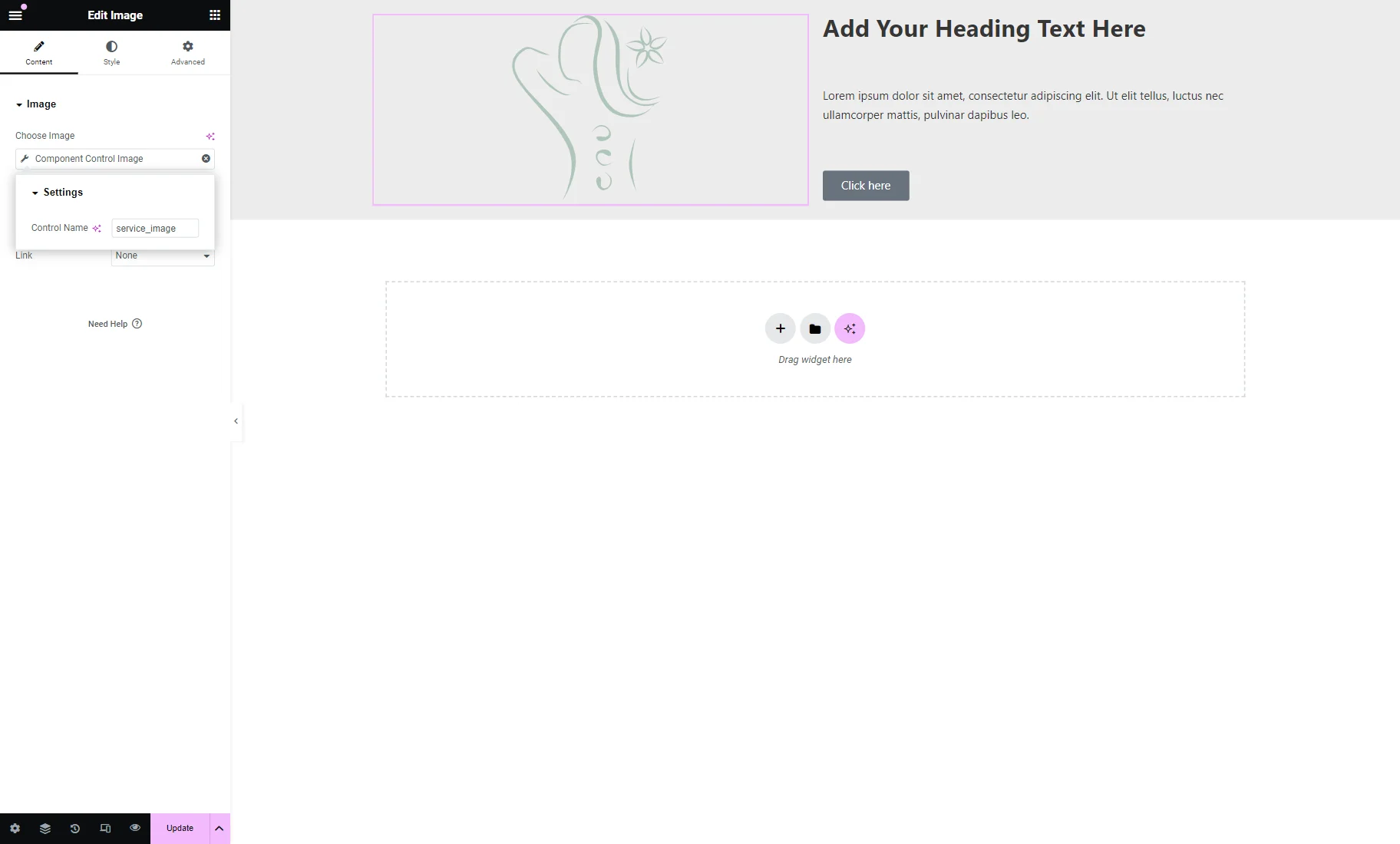
Then, we click on the Image widget to open its settings. Then, press the “Dynamic Tags” button and find the “Component Control Image” macro.
Specify the Control Name you have previously added, which has the “Single Media” Control Type.
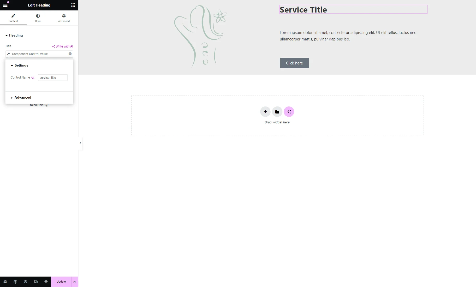
The following widget we attach the control to is Heading.
The control is attached to it similarly to the Image widget. Click the “Dynamic Tags” button next to the Title field and select the “Component Control Value” macro.
Then, specify the needed Control Name.
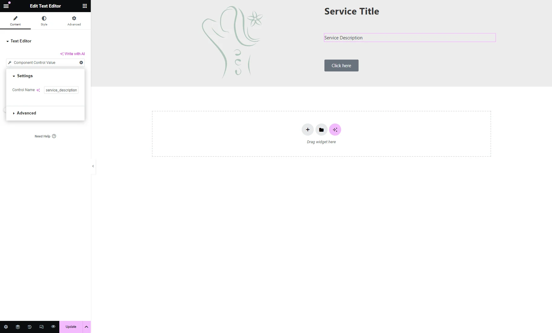
The following widget is a Text Editor. For this widget, the “Component Control Value” macro should be selected, and the needed Control Name specified.
The last widget of the component is the Button.
First, we push the “Dynamic Tags” button next to the Text field. There, we select the “Component Control Value” macro and set the Control Name to “service_button.”
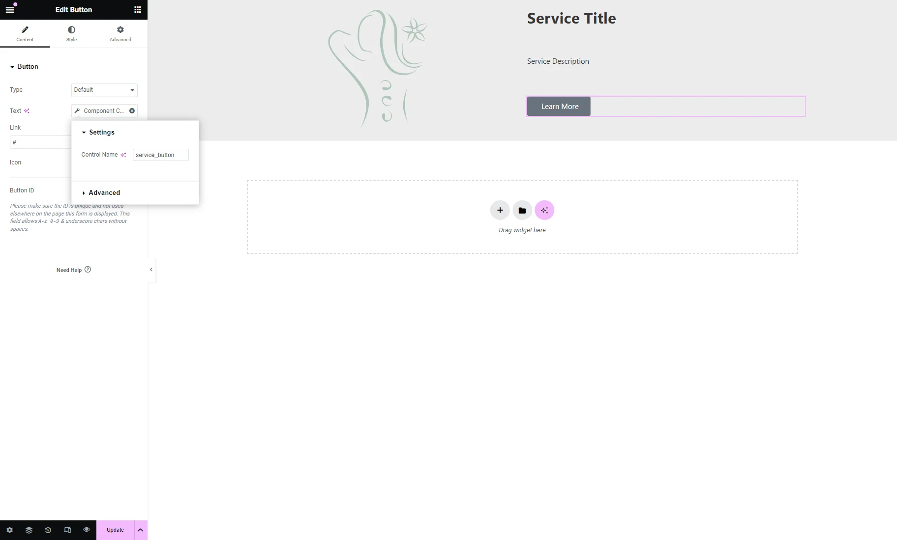
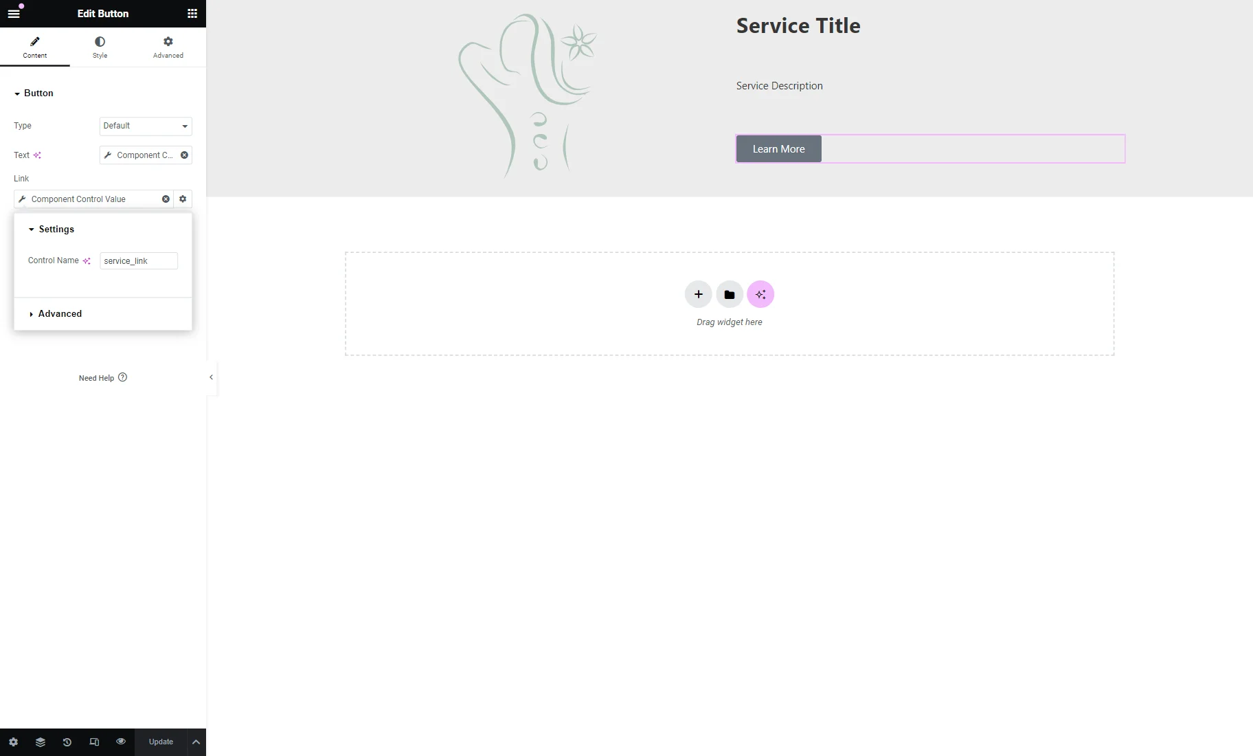
Also, we repeat the same step with the Link field, but this time the Control Name is set to “service_link.”
You can also style the appearance of the component, and once it’s ready, press the “Update” button.
For more visual cues, proceed to our Components creation video.
Add Component to Page
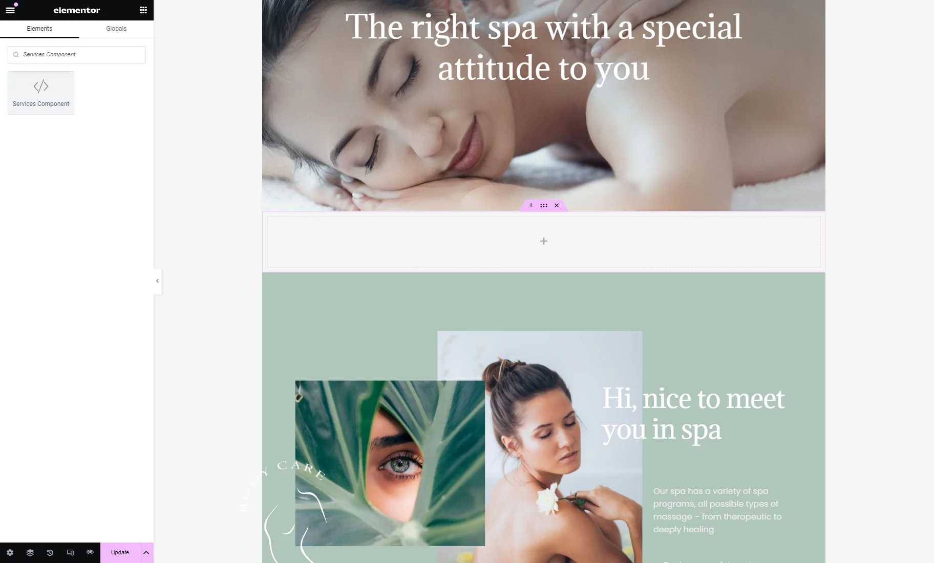
Go to the page where you want to place the component. We proceed to WordPress Dashboard > Pages and open the already-built page in the Elementor Page Builder.
We search for the new component by typing its name into the search bar. Then, we place the component on the page.
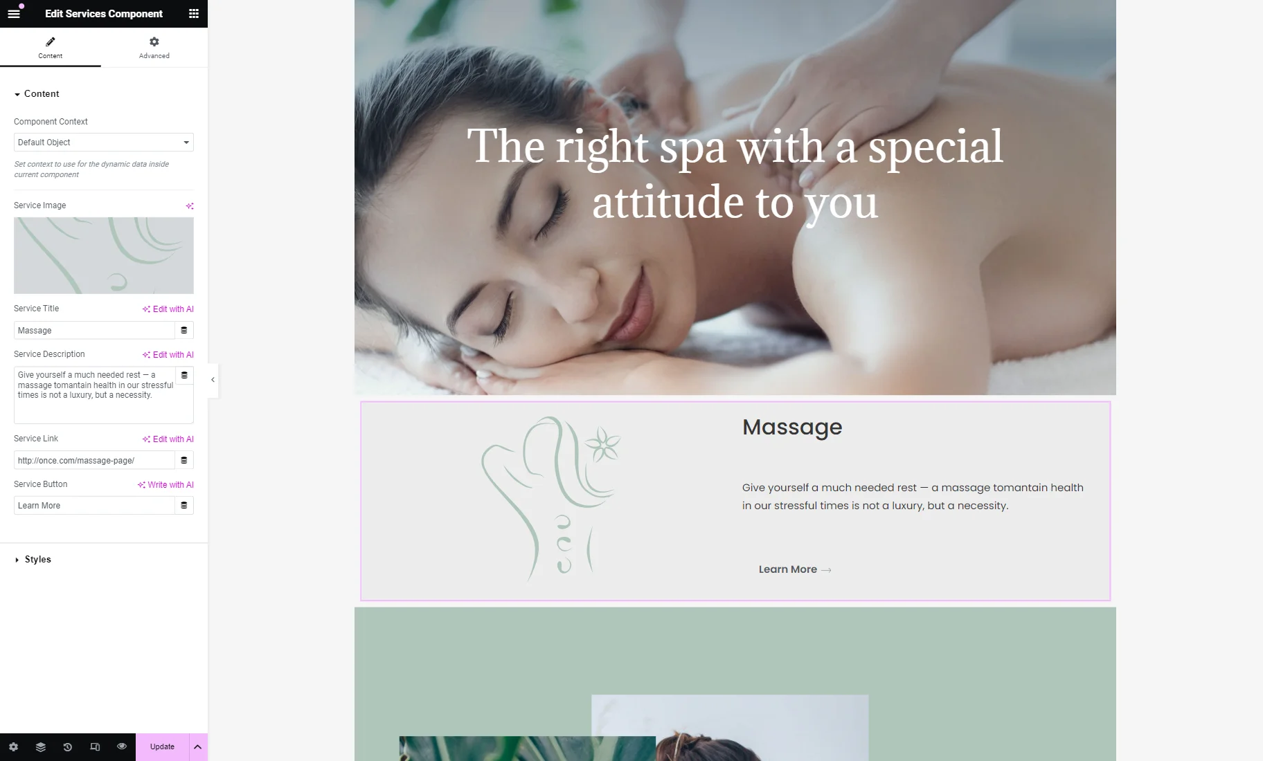
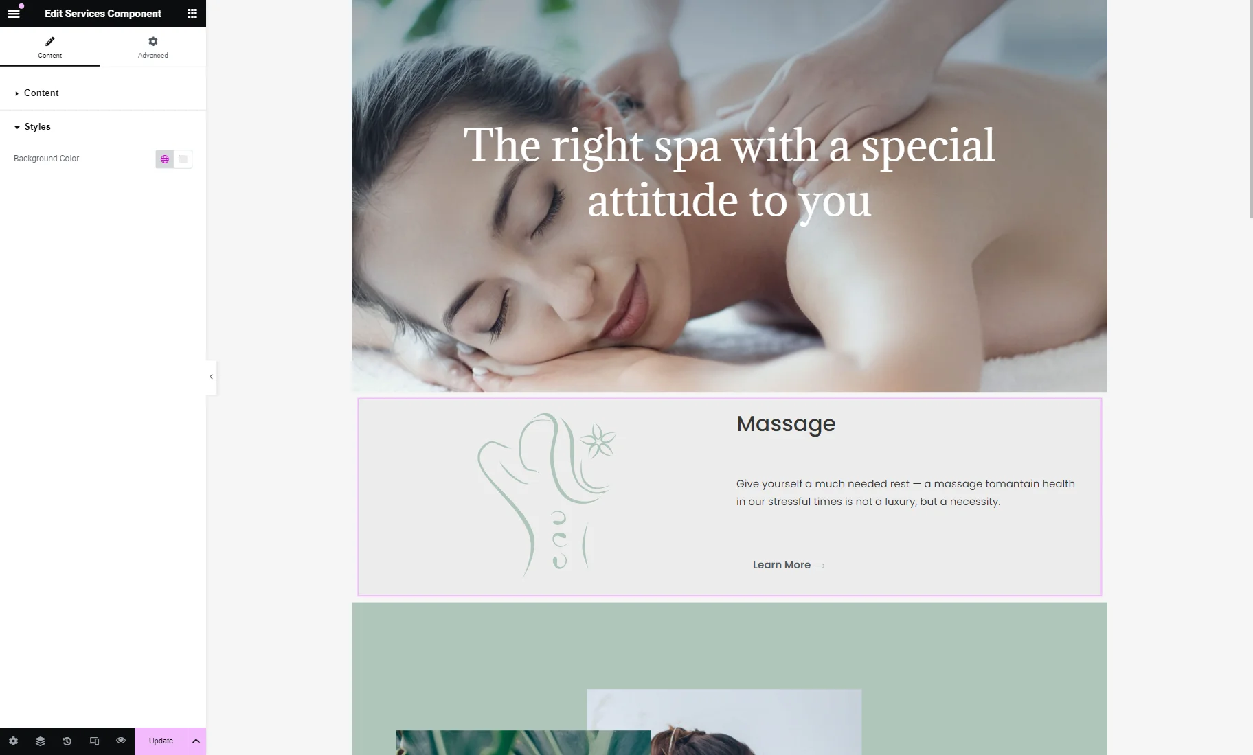
Now, you can observe the Content and Styles settings tabs. Let’s adjust the Content settings first.
You can initially change the Component Context if needed; now, we leave it as “Default Object.”
Then, the controls you created earlier are presented. Ours are Service Image, Service Title, Service Description, Service Link, and Service Button, respectively.
So, we complete these fields with the needed values.
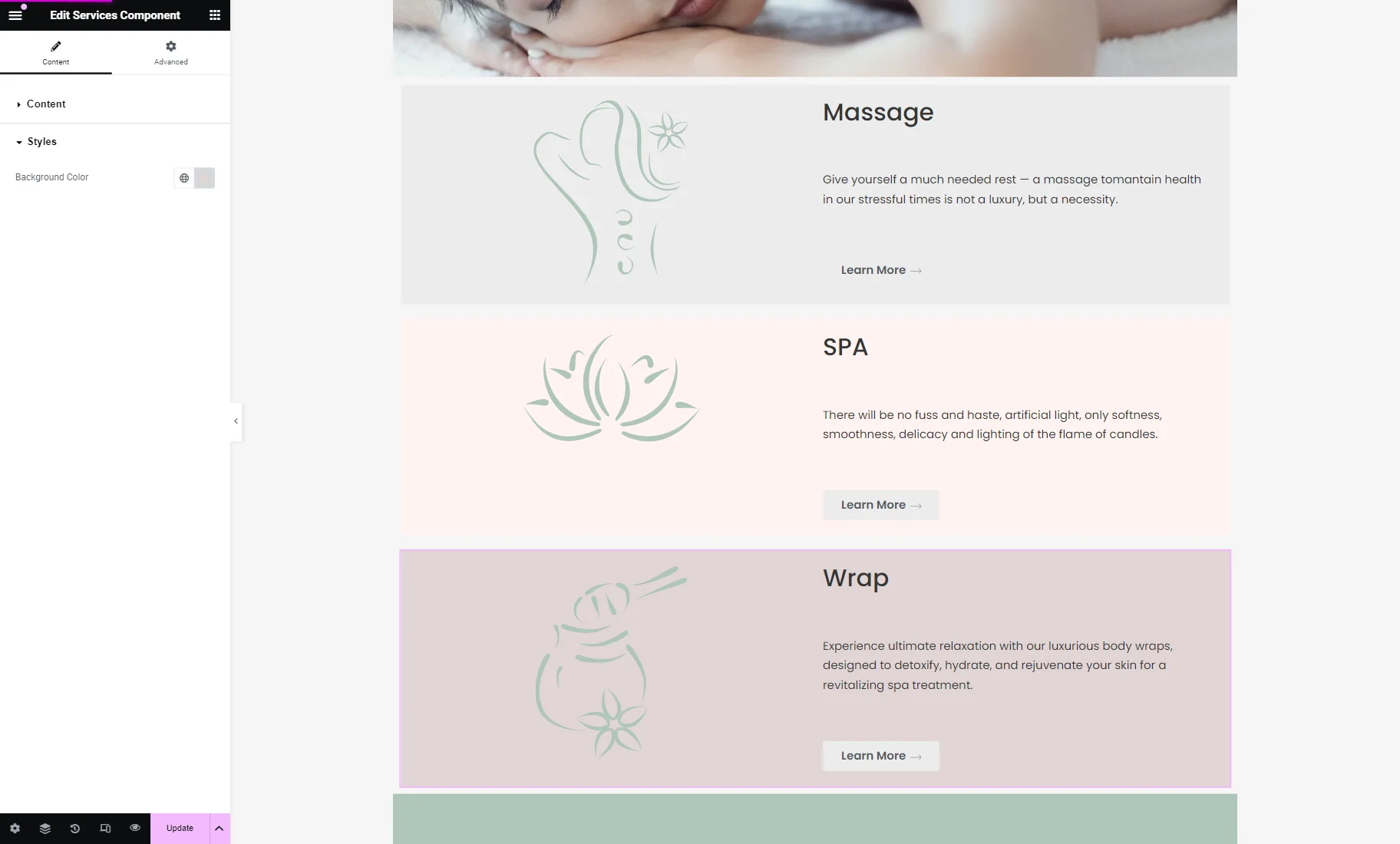
In the Styles tab, the Background Color for the container can be changed if desired.
Then, we add and customize two more components.
Once done, press the “Publish/Update” button.
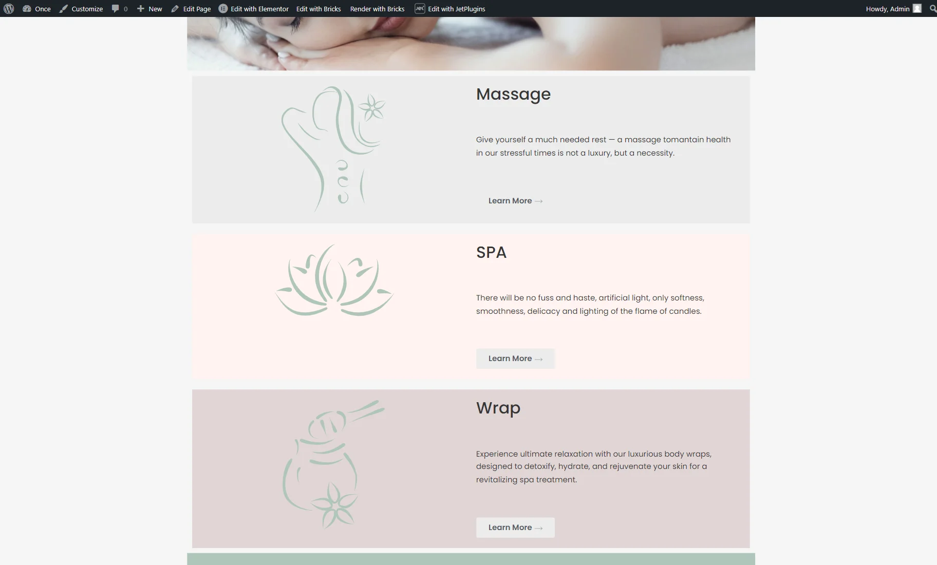
Check the Result
Open the page you created on the front end. The built components are now displayed on the page.
We can also click the “Learn More” button to open the additional landing pages.
That’s all; now you know how to create a component in Elementor with the help of the JetEngine plugin for WordPress websites.