How to Display Product Tables on Mobile Devices
Learn how to manage the appearance of the Product Tables on mobile devices (i.e., set different mobile layouts, specify the columns for displaying, and more).
Before you start, check the tutorial requirements:
- Block Editor (Gutenberg)
- WooCommerce plugin installed and activated
- JetProductTables plugin installed and activated
- a page or post created
Set the MOBILE LAYOUT Options
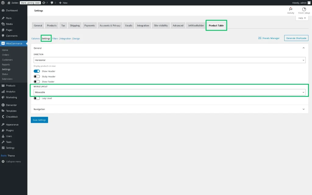
You can specify the MOBILE LAYOUT options via the JetProductTables Dashboard settings or the Product Table block.
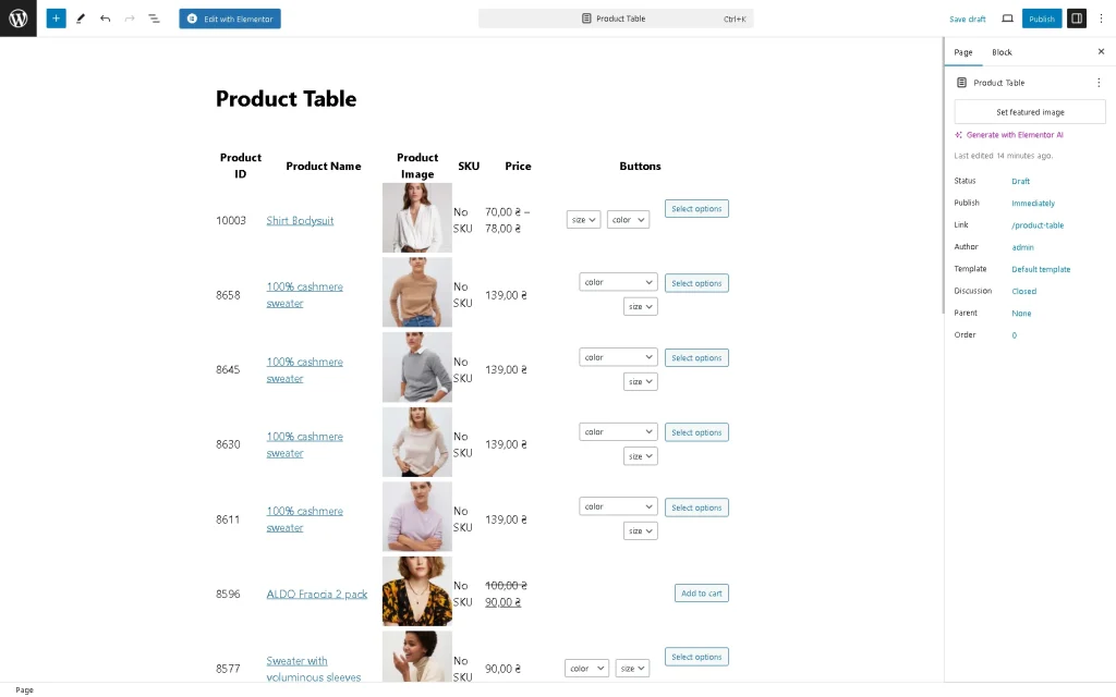
These ways reproduce the same settings, but in this tutorial, we consider the usage of the Product Table block because it allows us to show how the table looks.
To customize such settings via the JetProductTables Dashboard, navigate to the WordPress Dashboard > WooCommerce > Settings > Product Table directory and then unroll the Settings tab.
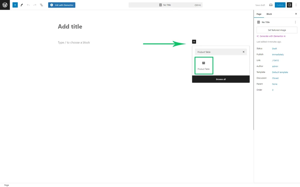
Add the Product Table Block
Set the Mobile Layout
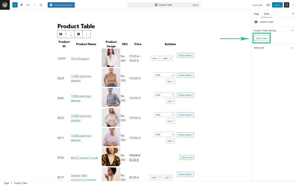
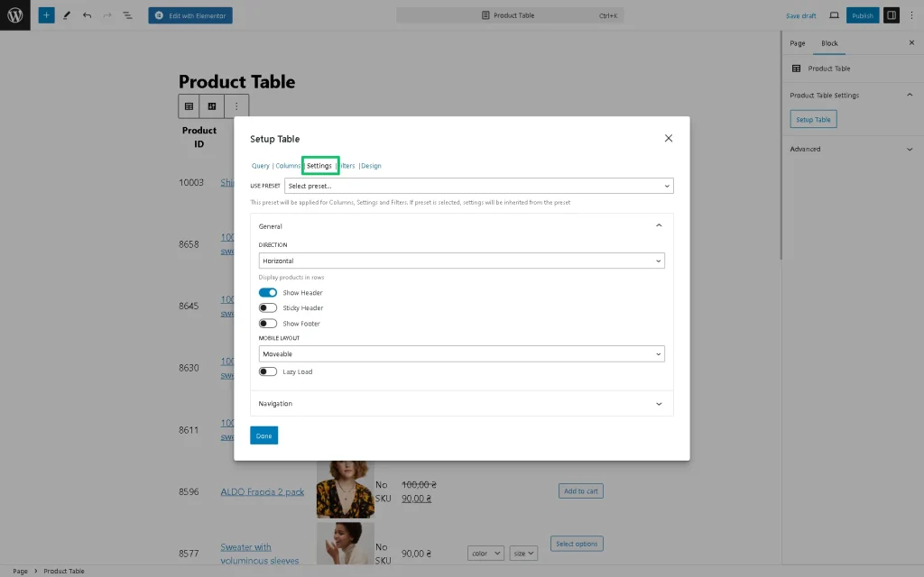
Navigate to the Block setting and press the “Setup Table” button.
In the newly-appeared Setup Table pop-up, select the Settings tab. Scroll down the pop-up to the MOBILE LAYOUT drop-down list.
Movable mobile layout
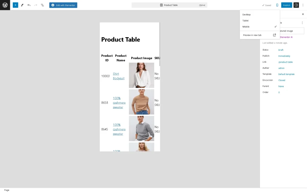
Here, the “Movable” option is set by default. This option does not limit the Product Table functionality and keeps the appearance and content of the table. Also, it provides the horizontal scrolling for the table. The vertical table for this layout behaves the same way as a horizontal one.
To observe how the “Movable” MOBILE LAYOUT looks, navigate to the top of the page, press the “View” button, and choose the “Mobile” view option.
Shorten mobile layout
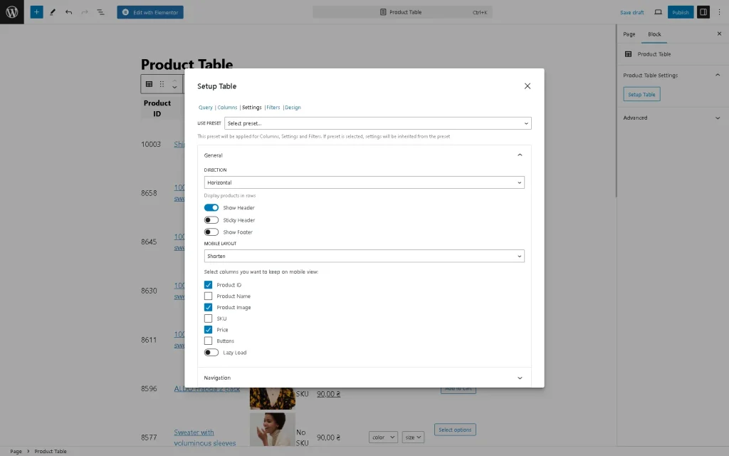
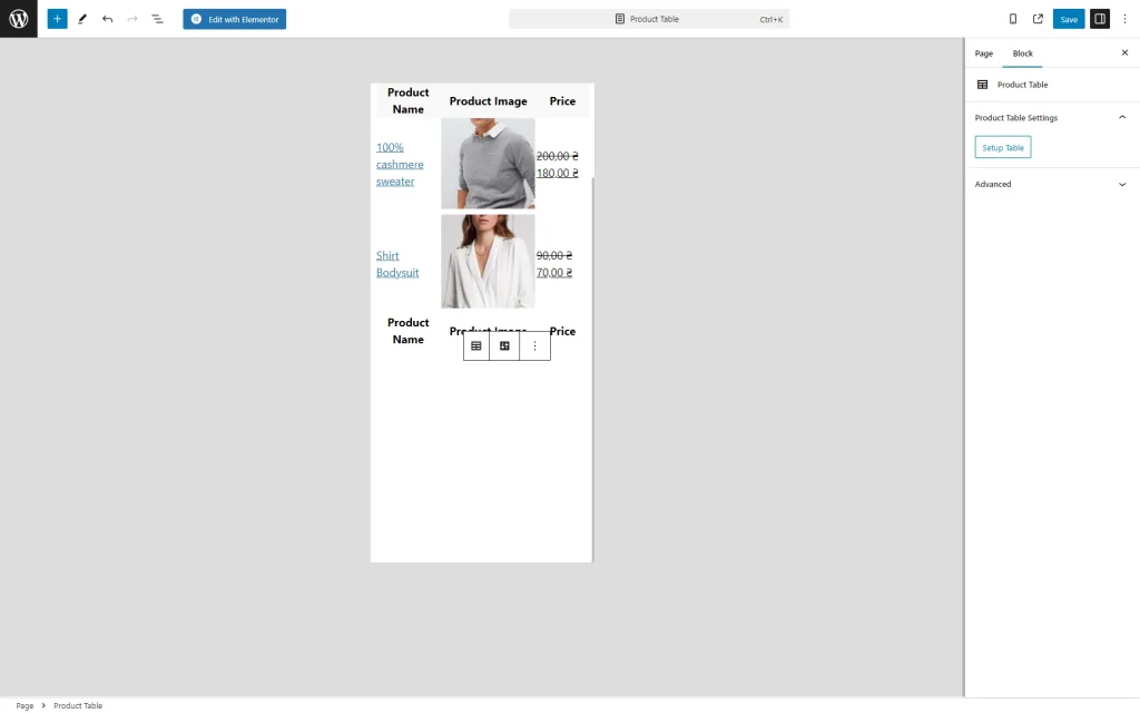
To set the “Shorten” MOBILE LAYOUT, select this option in the MOBILE LAYOUT drop-down list. This option allows users to specify what Columns should be displayed. Thus, the Table‘s content will be shorter.
To specify what columns should be displayed, tick the needed ones and then press the “Done” button on the pop-up.
To observe how the “Shorten” MOBILE LAYOUT looks, navigate to the top of the page, press the “View” button, and choose the “Mobile” view option.
Transform mobile layout
To set the “Thansform” MOBILE LAYOUT, select this option in the MOBILE LAYOUT drop-down list and then press the “Save” button on the pop-up.
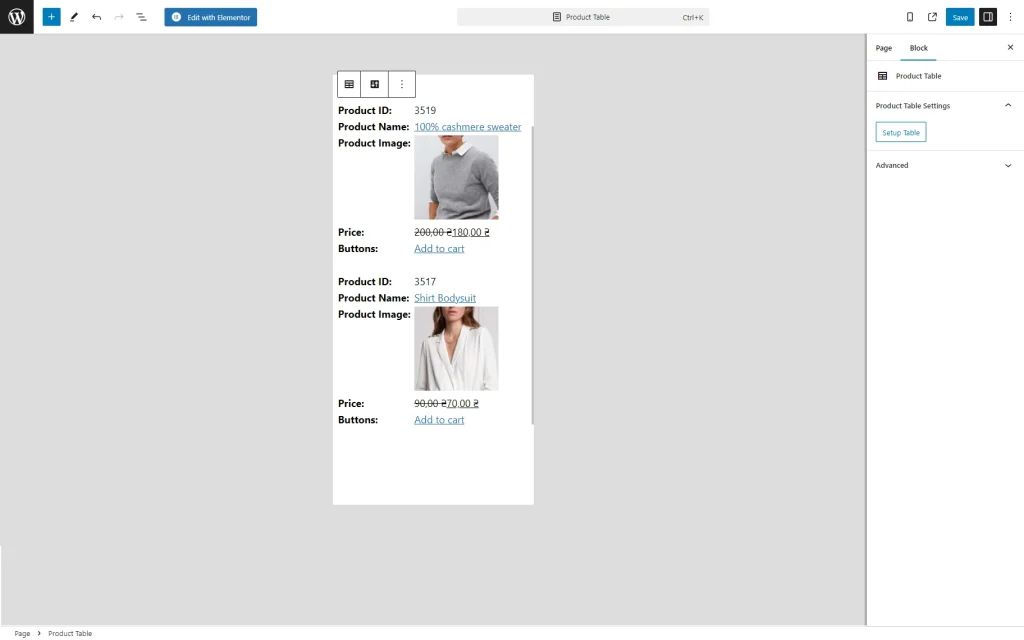
This option, if selected, transforms the content into a set of cards. Each card is a vertical table, where the desktop columns become rows. The first column of this table is the name of the corresponding desktop column, and the second column is its value. For this layout, the content is saved. Still, the visual appearance is completely changed, and the sticky header (because the table now has no global header) and sorting (because the layout changes globally and now there are no corresponding controls) stop working. For vertical tables, it works similarly to horizontal ones.
To observe how the “Transform” MOBILE LAYOUT looks, navigate to the top of the page, press the “View” button, and choose the “Mobile” view option.
Collapsed mobile layout
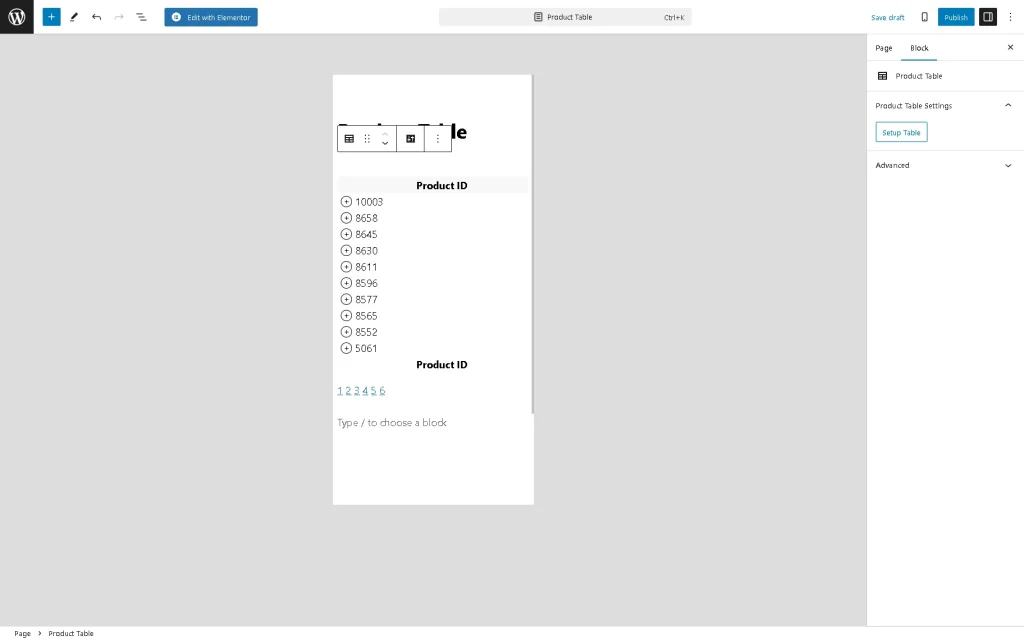
To set the “Collapsed” MOBILE LAYOUT, select this option in the MOBILE LAYOUT drop-down list and then press the “Done” button on the pop-up. This option transforms content into a set of cards. Each card is a vertical table, where the desktop columns become rows. In contrast to the “Transform” MOBILE LAYOUT, this layout is more compact. By default, the users observe only the first column of each line; by clicking on the “+” icon, they can unroll the contents of the rest of the line. Also, a header with the name of the first column is stored, so sorting can work for this Column. The vertical layout works similarly to the horizontal layout.
That’s it. Now you know how to manage the appearance of the Product Tables of the JetProductTables plugin on mobile devices (i.e., set different mobile layouts, specify the columns for displaying, and more).
