Block Style Overview
This overview describes the styling options that become available for you in the Gutenberg Editor after the activation of the JetStyleManager plugin.
Gutenberg editor doesn’t have its own styling options. The only way to change the appearance of the page is to change the template of the whole website. JetStyleManager is a Gutenberg block styles plugin that adds the design customization block for JetPlugins that work with Gutenberg. Though the options in the Block Style menu are mostly the same as the ones in the Elementor page builder’s Style tab, users who have no experience with Elementor can be confused. This overview describes all the style settings to avoid that confusion.
Where could you apply the style settings?
JetStyleManager adds a “Block Style” button to the upper right corner of the editing window of the following blocks:
- JetEngine Dynamic blocks (Dynamic Field, Dynamic Link, Dynamic Image, Dynamic Repeater, and Dynamic Meta);
- JetEngine Listing Grid block;
- All JetSmartFilters blocks;
- JetFormBuilder plugin forms creation functionality;
- JetFormBuilder and JetEngine Form block.
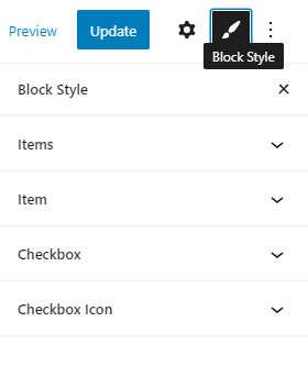
Block Style options
Mostly, the styling settings are similar for different blocks, so we will list all the possible options here in alphabetical order.
- Alignment
- Background Color
- Border
- Border Radius
- Children Offset Left
- Direction
- Field Content Alignment
- Field Content Width
- Field Element Position
- Filter Position
- Horizontal Gap
- Icon Color
- Icon Gap
- Icon Orientation
- Icon Position
- Icon Size
- Margin
- Offset Left
- Padding
- Points Width/Height
- Space Between
- Stroke
- Text Color
- Typography
- Vertical Gap
Alignment
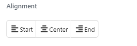
Here you can select an alignment for the element on the page. It can be Left, Center, or Right.
Background Color
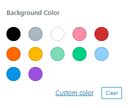
This section allows you to choose the background color of the element. There are 12 default colors to choose from, or you can click on the “Custom Color” button and pick any you need.
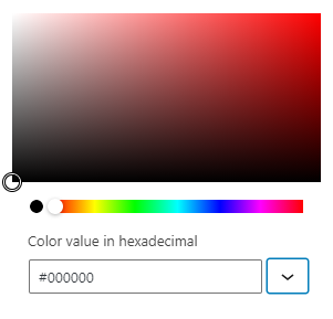
In the separate pop-up window, you will be able to choose the color manually from the palette or insert the hex code into the Color value in hexadecimal bar. If you hit the “Change color format” button with the arrow-down icon next to the hex code bar, you can change the format of color code. There are also RGB and HSL formats.
By clicking the “Cancel” button, you cancel the formatting and return the background to the default color.
In some cases, this feature has several tabs, such as “Hover”. It allows you to set the color of the element’s background if you want it to change when the user hovers the pointer over it.
Border
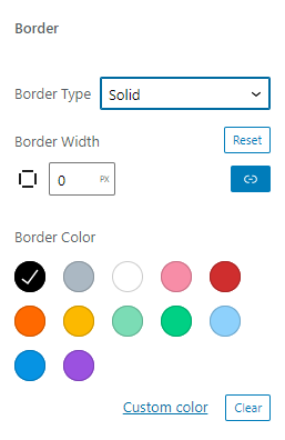
This section allows you to set the border around the element’s edge.
- Border Type. There are five types of border you can choose from – Solid, Double, Dashed, Dotted, and Groove. All the other border settings appear if you choose any of them;
- Border Width. Here you can set the width of the border. If it has to have different width on different sides, click the “Unlink Sides” button under the “Reset” button;
- Border Color. Defines the color of the border.
Border Radius
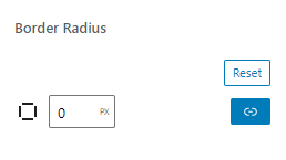
This option allows you to round the corners of the border to create a softer, curvy look. The bigger number you set here, the more rounded the whole element will be. By default, you round all the corners at once. If you want to set the different radius for different corners, click the “Unline Sides” button under the “Reset” button.
Children Offset Left
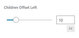
If the filter contains the parent and children options, this feature can help you select the width of the offset for the children options. Set the necessary value by moving the slider or entering the width in pixels into the bar.
Direction
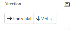
Here you can choose how the list of options placed in the field will be shown to the user. The Horizontal option means all of them will be placed in one row, and the Vertical option will locate the items in a form of a list – in a single column.
Field Content Alignment
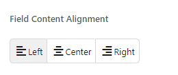
Here you can select the alignment of the content within its box. It can be Left, Center, or Right.
Field Content Width
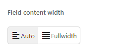
In the case of the multiline text, here you can choose how it will be filling the block box. If you choose the Auto option, the text will be wrapped as it is, and if you select the Fullwidth option, it will be wrapped in the way to fill the whole box without leaving the gaps near the border.
Field Element Position
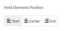
In this section, you choose the alignment of the element within the page. It can be placed on the right side, in the center, and on the left side.
Filter Position
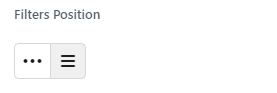
By choosing one of two buttons, you can place the filtering options in a line or into a column.
Horizontal Gap
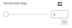
By moving the slider or typing the value into the bar, you can set the width of the gap between the rows of a Listing Grid.
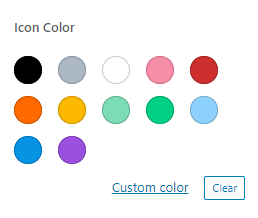
Icon Color
Here you can choose the color of the icon so it matches the color of the rest of the content. There are 12 default colors; or, you can press the “Custom Color” button to choose the one that fits the design.
In this case, you can choose any color manually from the palette or insert the hex code into the Color value in hexadecimal bar. If you hit the “Change color format” button with the arrow-down icon next to the hex code bar, you can change the format of color code. There are also RGB and HSL formats.
By clicking the “Cancel” button, you cancel the formatting and return it to the default color.
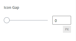
Icon Gap
Here you can define the width of the gap between the icon and the rest of the content. Move the slider to do it manually or type in the number. The width of the gap is set in pixels.
Icon Orientation
This feature allows you to define the positioning of the icon. The Horizontal option places the icon in the same row as the other content, and the Vertical option locates it above the other content.
Icon Position
Here you can choose the position of the icon relative to the text in the field. Before Label will place the icon before the text and After Label – at the end of the row after the text.
Icon Size
By using the slider or typing in a specific number into the bar, you can set the size of the icon in pixels here.
Margin
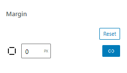
This number shows the width of the space between the edge of the element block and the edge of the section it is placed into. Setting it to the bigger value makes the whole section bigger.
By default, all the sides of the padding are linked, and you change the width of them all. However, if you need to create the padding that will have different widths on different sides, click on the “Unlink Sides” and “Reset” buttons. This will open an option to set every side of the padding separately. When you click on one of the bars to change the value, the square in the left corner will show which side you are setting here.
Offset Left
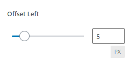
This feature allows you to set the gap between the interactive icon and its label in the Checkboxes and Radio filters. Change it via the slider or insert the necessary value in pixels.
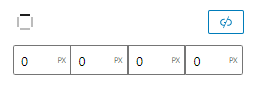
Padding
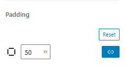
This is the width of the space between the content and the edge of the block. If you set the visible background color, the bigger the Padding – the bigger the element will be. By clicking on the “Reset” button, you can roll the padding value back to default.
By default, all the sides of the padding are linked and you change the width of all of them. However, if you need to create the padding that will have different widths on different sides, click on the “Unlink Sides” and “Reset” buttons. This will open an option to set every side of the padding separately. When you click on one of the bars to change the value, the square in the left corner will show which side you are setting here.
Points Width/Height
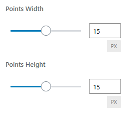
The Range Filter block has two points, one for each of the scale edges. This feature helps you to define those points’ height and width and can be set manually or via the entered number of pixels.
Space Between
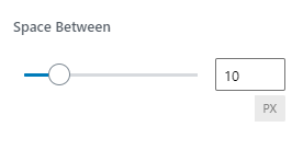
You can control the width of space between the options of the filter by changing it manually via the slider or typing a specific number into the bar.
Stroke
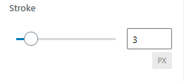
This feature allows you to change the width of the Range Filter scale line. It can be set by moving the slider or inserting a number of pixels into the bar.
Text Color
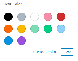
This option allows you to set the color of the text, which will be shown in the block. There are 12 default colors you can choose from, or you can press the “Custom Color” button.
In this case, you can choose any color manually from the palette or insert the hex code into the Color value in hexadecimal bar. If you hit the “Change color format” button with the arrow-down icon next to the hex code bar, you can change the format of color code. There are also RGB and HSL formats.
By clicking the “Cancel” button, you cancel the formatting and return it to the default color.
Typography
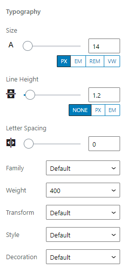
Here you can define all the features of the text that will be shown in the block.
- Size. You can choose the size of the font from 1 to 200 by moving the slider or typing the necessary value into the bar. By default, the size can be chosen in pixels (PX). You can also change the unit of measurement to:
- EM – the size of the font is set according to the size of the parent element. In the case of font, you can set the size according to the size of the default font. So, if you set it to 10 em it will always be 10 times larger than the default font. This unit of measurement works best for responsive sites;
- REM – this one is almost the same as the EM but sets the size of the font according to the size set in HTML;
- VW – one unit of this unit of measurement is equal to 1% of the general height of the browser window. When the user changes the size of the window, the font will become bigger/smaller;
- Line Height. By moving the slider or typing in the direct number, you can choose the height of the text line and, therefore, the spacing between the lines. There’s also an option to change the units of measurement to PX or EM;
- Letter Spacing. With the help of this slider, you can set the width of the space between the letters. The available range is from -2 to 20;
- Family. In this drop-down menu, you can choose the typeface;
- Weight. Here you can choose the boldness of the font from 100 to 1000. Besides that, you can select it to be Default, Normal, or just Bold;
- Transform. This drop-down menu allows you to change the case of the letters in words. The Uppercase option makes all letters capitalized, the Lowercase option makes all the letters in the word lower-cased, and Capitalize option transforms the first letter of every word into a capital letter;
- Style. Here you can choose the Normal, Italic, or Oblique style of the font or leave it Default;
- Decoration. In this drop-down list, you can choose to add the line to the text. You can select the Underline, Overline, or Line Through.
Vertical Gap
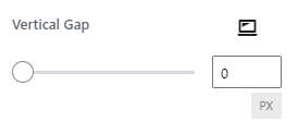
By moving the slider or typing the value into the bar, you can set the width of the gap between the columns of a Listing Grid.
Those are all the main features of the Block Style in Gutenberg. You may meet some other, more specific options, but it will be easy to understand how to use them. Good luck creating great pages in Gutenberg and customizing their design.