How to Add Hotspots to the Image
From this tutorial, you will learn how to add hotspots to any image using the JetTricks plugin functionality.
A hotspot is a mark placed on the image to focus the user’s attention on a specific part of it. They are usually used in online stores to give the user links to products he/she sees on an impressive promotion photo. Hotspots are also commonly supported by tooltips that display some additional information. This guide will show you how to put the hotspots with tooltips to your website’s pictures using JetTricks’ widgets.
Choose the Image
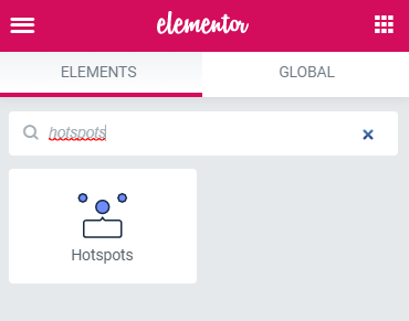
Go to the dashboard and seek for the page or post, where you want to add an image with hotspots. Proceed to edit it with Elementor. Find the Hotspots widget in the left-side widget menu. Drag and drop it to the page.
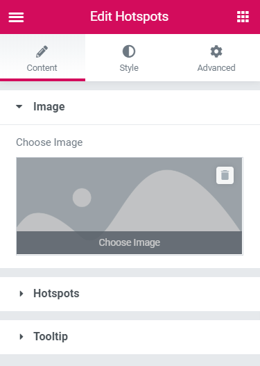
Choose an image that you want to be a base for your hotspots. It is better to take high-resolution photos of good quality if you want this part of the page to look really great.
Define the Settings
As you can see, a hotspot is created by default and placed to the center of an image. Let’s go to the Hotspots section and press Item #1.
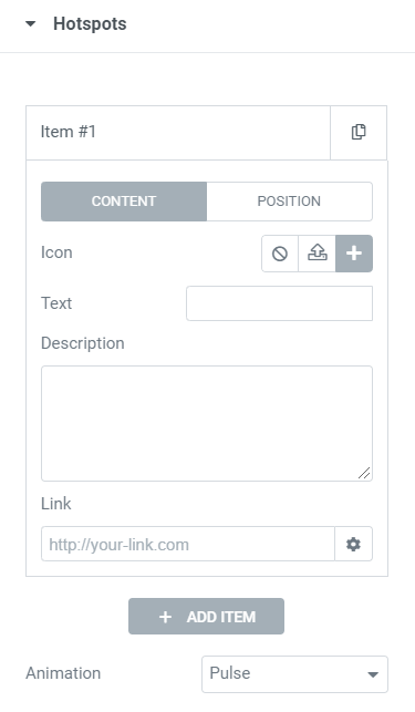
First of all, here you can change the Content or the Position of a hotspot. Probably, you should start with the Content.
- Icon – you can choose the one from the icon library, upload an SVG file, and even choose not to use any icon at all;
- Text – the data you’ll type in here will be displayed by the icon right on the hotspot;
- Description – the text you insert into this text area will be shown as a tooltip of this hotspot;
- Link – you can choose where the user will be led to when he/she clicks on the hotspot.
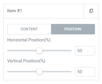
To change the Position, you have two sliders – Horizontal Position (%) and Vertical Position (%). You can either move the hotspot by dragging a slider horizontally or type in the values in percent.
It is possible to add as many hotspots as you want, just click the “Add Item” button. Additionally, you can select one of the animation effects, which will be applied to all hotspots. There are 6 animation types that will be shown in the “waiting mode,” when the user doesn’t hover the pointer over the image.
Set the Tooltips Settings
As was said previously, the text to be shown as a tooltip should be entered into the Description text area of the Hotspot item. And here are some other customization settings.
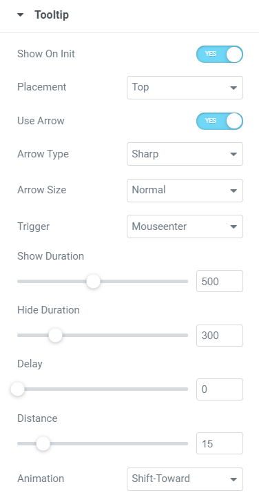
- Show On Init – if this toggle is turned on, the tooltips are always visible, and when it is off, they appear only on hover;
- Placement – here you can choose where to show the tooltip: over the hotspot, under it, to the left or to the right of it;
- Use Arrow – when this toggle is turned on, the tooltip has a little arrow, pointing to the hotspot;
- Arrow Type – you can choose the arrow to be Sharp or Round;
- Arrow Size – there are 5 options of arrow size to choose from;
- Trigger – this option defines when the tooltip will be shown. “Mouseenter” means that a tooltip will be shown when the pointer enters the hotspot’s borders; “Click” will make the tooltip appear when the user hits the hotspot; “None” makes the tooltip always visible;
- Show Duration – it is a value that defines the speed of tooltip showing up after the trigger works;
- Hide Duration – this value defines how quickly the tooltip will be hidden after the pointer leaves the hotspot;
- Delay – the value defining the time between the activation of the trigger and the tooltip emergence;
- Distance – there is a gap between the tooltip and hotspot border, and this value defines the size of that gap;
- Animation – there are 5 types of tooltip appearance animation you can choose from.
Do Some Styling
Go to the Style tab and change the design of hotspots and tooltips according to your taste and needs.
When all adjustments are set, update the page and have a look at the image on the front. Hover on the hotspot, and the tooltip will appear right away.
Well done! Now you can create hotspots for the images with the help of JetTricks.