The holiday season is one of the busiest and most profitable for eCommerce businesses. In 2019, eCommerce sales amounted to 20.9 percent of all holiday shopping.
Shoppers are much more inclined to order online instead of braving the cold and crowds by going in-store. As an eCommerce business owner, this poses a great opportunity to raise some serious profits. But for your website to take advantage of the increased traffic, you must ensure your holiday homepage design is up to par.
Your homepage is the first thing shoppers see when visiting your site, so making a memorable impression is essential. You’ll want to create a lasting holiday experience that will make shoppers want to buy from you and keep coming back.
Are you still trying to figure out where to start? Check out my list of 7 cheerful holiday eCommerce homepage design examples that can inspire your own.
Lands’ End
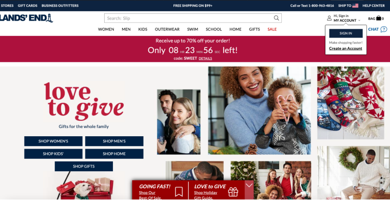
We’ll start our eCommerce homepage with a website that consistently spreads cheer during the holiday season. Lands’ End is best known for high-quality clothing but also features various home goods.
Their homepage is a winner because they are immediately drawn to the cheerful photographs. Lands’ End is also famous for pet products, so the playful dog reminds shoppers not to forget their furry best friends this holiday season.
Lands’ End succeeds in that promotional code is featured in a banner at the top of the page – reminding shoppers how much they can save. The webpage keeps up the fun by decorating each product with a ribbon. These features are essential for any dedicated online store.
J.Crew
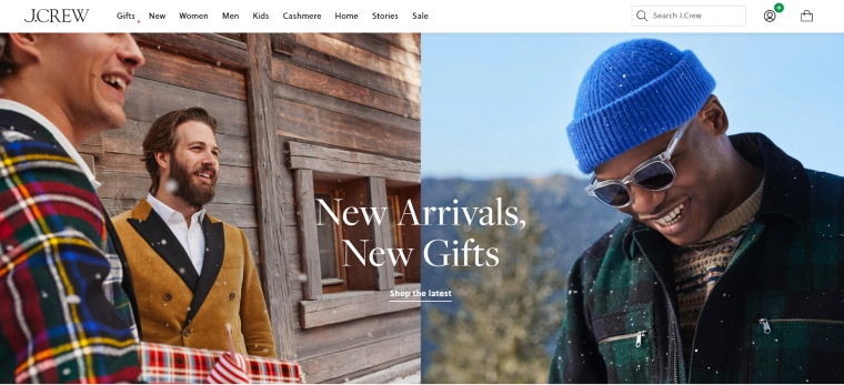
J.Crew’s landing page proudly announces, “The Holiday Collection is here!” and we can feel the holiday cheer from the snowy fun photo featured at first glance. One of my favorite parts about the J.Crew page is that it celebrates a longtime Christmas tradition in my family – getting a new pair of PJs – by featuring a sizeable bold tile with a gorgeous model wearing a comfy flannel sleep set. J.Crew knows that the gift-giving season is here and helps shoppers quickly find gifts for anyone by putting a gift guide right on their homepage. Getting good deals is even more important this holiday season because of inflation.
J.Crew also reminds us that the holidays aren’t just about gift giving but also celebrating and features a large tile of a shimmery black dress saying, “Sparkling conversation starters.” This enticing image lets shoppers see all the hottest holiday party outfits. Finally, J.Crew features a bold banner for their promo code to help shoppers save a few extra bucks this holiday season!
Overstock
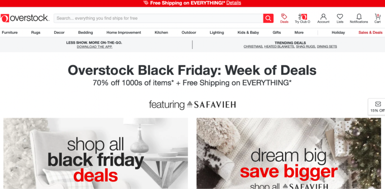
Overstock has always been about delivering premium goods at discount prices and deals on Christmas trees. Like other websites, Overstock greets you with a huge holiday sale reminder. However, Overstock takes the webpage to the next level by featuring a scrolling slideshow, each featuring a different type of sale. Importantly, each slide is festive and fun.
One way Overstock succeeds is that all its photographs have a fun twist on the holiday season. For example, a garland is draped across a wooden table in a picture featuring furniture. Another picture tile, a wreath, and a Christmas tree can be seen. These small details help evoke a feeling of joy that we all associate with this time of the year. Small pieces like fun Christmas ornaments or garlands help evoke a sense of the season on items that might otherwise not be considered holiday purchases.
JetSmartFilters, by Crocoblock, make it easy for shoppers to sort products to find just what they need.
Overstock is an excellent example of how you can make your eCommerce site feel cheery.
Etsy
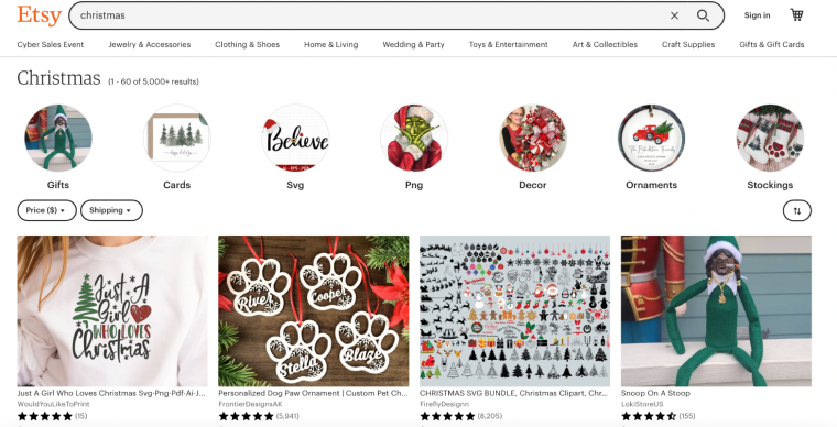
Etsy steps out of the gate with a copy reading, “Holiday magic starts with these merry finds.” Below are numerous circular tiles featuring seasonal items such as seasonal decor. Etsy succeeds year-round by showing shoppers popular purchases. For the holidays, Etsy puts a “popular gifts” twist on this theme and shows what shoppers buy for the holidays.
Etsy also features an entire “Editors’ Picks” section for holiday items under “The Holiday Shop.” The copy there again plays on the fun holiday theme, saying, “special bonds call for special finds! From decor to gifts, discover memorable items at merry prices.”
Importantly, Etsy’s landing page stays consistent with how it looks at other times of the year so shoppers won’t feel lost looking for things. Everything remains where a shopper would expect it, but with a fun holiday twist.
Harry’s
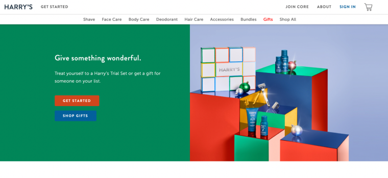
Harry’s landing page shows how to do a sleek modern twist on holiday fun. You might not expect hygiene products to come with seasonal cheer, but Harry’s pulls it off. Instead of a traditional website with garlands, candy canes, and Christmas trees, Harry’s goes sleek, modern, and minimal.
Harry’s takes a minimalist approach and highlights the word Gifts in red on the navigation bar. Below, a large green banner says, “Give something wonderful,” and invites shoppers to either treat themselves or get someone on their list a gift.
Lastly, there’s a large clean picture featuring Harry’s box and their products on top of shiny colorful metallic boxes that echo resemblances of Christmas presents. Overall, Harry’s website comes across as a website that knows the product and wants you to think of them for the holiday season.
Costco Wholesale
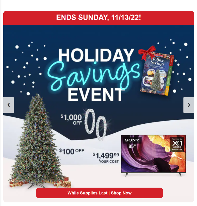
Costco takes a different approach; rather than loading you with cozy images of fluffy blankets and roaring fireplaces, they rely on their deals and pricing to drive holiday sales. Although best known for hotdogs and food court, Costco’s website also features some great holiday cheer. On the landing page, a prominent tile features Christmas trees for sale. Below that is a large Holiday Savings Event Banner with a snowy background and excellent holiday gift ideas.
Costco knows that shoppers need a gift and a gift in their price range. This product-first landing page is great for eCommerce sites known for their product selection and pricing.
Victoria’s Secret
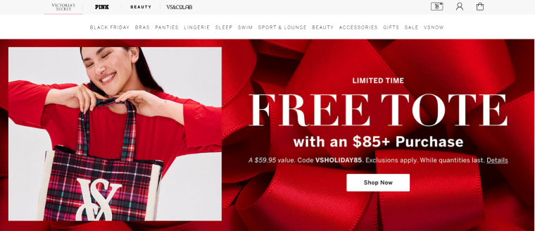
If there’s one eCommerce giant that knows how to make a statement, it’s Victoria’s Secret. Victoria’s Secret does something no other website on this does – uses video on their landing page. Victoria’s Secret features a repeating video showcasing their lingerie and pajama sets, all with a fun holiday twist.
Studies have shown that video is key to driving conversions on eCommerce sales. This makes sense, especially with clothing, because shoppers can see how the fabric or piece lays on a person’s figure. Besides featuring a video, the landing page also shows several fun, festive products, all consistent with the holiday theme.
Also, the homepage is chock-full of sales and discounts, which translates the feeling of Christmas cheer into savings for shoppers. Now more than ever, consumers need to keep their spending in check and avoid getting into more debt. Taking advantage of Christmas sales is the best way to ensure you don’t spend more than you can afford.
FAQs
While you can design your holiday website in many different ways, we recommend sticking with a traditional red and green color scheme. This tried-and-true color palette evokes all the feelings associated with Christmas.
Whatever you do, make sure your design is unique and reflects your brand’s personality.
This will vary depending on your business and what you sell. But, some popular product categories to consider featuring in your holiday design are gift-wrapping, winter apparel, travel gear, and Christmas decorations.
Other ways to make your holiday design stand out include:
1) featuring sales and special sales;
2) Christmas-themed copy;
3) adding payment plans for customers on a budget.
Remember that if you decide to offer payment plans, you must monitor your cash flow carefully. According to a recent survey of small business owners, 70% of respondents reported that they took between one and six months to get paid for services rendered. Hence, keeping a close eye on your receivables during the holiday season is essential.
Final Thoughts
The holiday season is a great time to take advantage of the increased website traffic and boost your sales. By creating a holiday-themed design for your website, you can show your visitors that you’re in the spirit and ready to help them with all their holiday needs.
Remember to keep your design on brand and focus on showcasing products that will be popular during the holiday season. If you do all this, you’re sure to create a holiday design that will wow your visitors and increases your sales.
