It’s time to stop beating around the bush. Let’s talk about it – the WordPress footer.
Starting a new WordPress website, it is virtually impossible to omit a footer. What is it, how to fill it properly, and where to edit the footer? These and other questions will be answered today, so stay tuned.
Table of Contents
- What Is a Website Footer?
- WordPress Footer Must-Have Elements
- What Not to Add to the Website Footer
- A Guide to Editing the Footer
- WordPress Footer FAQ
- Conclusion
What Is a Website Footer?
A footer is the website section spotted at the bottom when scrolling down the page. It normally includes the site logo, contact details, a copyright notice, links to legal documentation, social media icons, and a sitemap.

Despite its seeming simplicity, a footer is a vital website part, and you should construct it properly. Depending on the niche, the website footer can comprise more elements, which you are going to find out about in the next paragraph.
WordPress Footer Must-Have Elements
Logo and brand name
It’s hard to imagine a footer template without a website logo and a brand name. It is a common practice to duplicate the site’s logo and name in the footer because it is the first thing a visitor would notice when scrolling the page to the bottom.
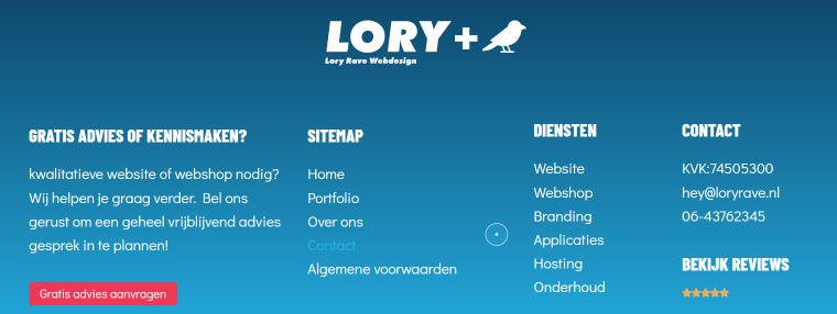
Some brands go the extra mile and animate the logo, making the footer design more creative.
Copyright and legal information
The best tip about a copyright notice: make it clearly visible. People pay attention to it when they want to learn whether the website is regularly updated. Legal documentation links often include Terms and Conditions, Privacy Policy, and sometimes Cookie Policy.
Who said copyright should be boring? Making it sticky is just one creative idea.
Contact details
It is vital to add contact information so the clients and website visitors can reach out to you. A phone number, email, and physical address are typical in the WordPress footer.

Social media links
To include them means to indicate a social media presence, which is always good for branding. Social icons show the website visitors you are modern and easy to reach and help you keep the audience engaged.

These are the main elements a website footer should have. However, the list can be longer depending on the niche, selected design pattern, and personal preferences.
Additional footer elements
Form
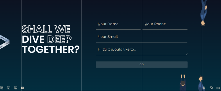
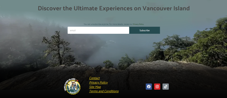
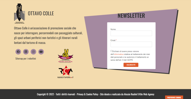
A contact form is not a stranger to the site footer, but what about the rest? “Subscribe to Newsletter” is another popular option since it allows the website owner to grow the audience quickly, generate leads, and offer quality content to those interested.
Navigation links
You can duplicate the website menu in the footer, making the content easily accessible. It’s a bad practice to overcrowd the footer elements, so keep it laconic and simple.

CTA
As a website owner, you might require the visitors to perform some action: subscribe, share, open, join, buy, download, etc. Buttons will help you manifest the exact thing you expect from the audience.

Search bar
Adding a search bar to the site footer might turn out quite helpful. When a visitor scrolls down the entire homepage and fails to find something they need, they can simply type a request and speed up the search.

About Us text
Sometimes it doesn’t hurt to add a quick recap, telling people one more time who you are and what you offer. Such texts shouldn’t be long but must be to the point.
Gallery
Adding a gallery shows you are a real person to which everybody can relate. The gallery certainly gives a homey vibe and shows you as a genuinely invested person.
What Not to Add to the Website Footer
Although we cultivate tolerance when it comes to footer designs, there are some elements and techniques one should almost never use. The so-called bad practices embrace footer content, color scheme, navigation, dimensions, fonts, and some other things.
- Replicating the entire website menu. A WordPress footer template is no place for doormat navigation. It is better not to frustrate users by placing all the links from the main menu in the footer. Fill it up properly, add what is necessary, and remember the “less is more” approach.
- Leaving broken links. Empty and broken links have done nobody good yet. They drive the users away and negatively affect the SEO performance. Always make sure the links in the footer are relevant and updated.
- Making the footer too wide. Wide footers could backfire when you would want to optimize the website for mobile devices. Users might get bored from scrolling and simply leave. When building a footer, try to size it up adequately and make sure it looks good outside the desktop.
- Choosing a non-flattering color scheme. Try to pick colors that go well together – not too contrast, not too similar.
- Using infinite scrolling. It is a bad practice to add infinite scrolling to website pages where you actually need users to see the footer. Especially do not use it on the home page, whose main purpose is to inform the newcomer about the company, its services, etc.
- Redirecting the users. Internal and external links in the footer should not open in the same tab because the users will get distracted and lost.
A Guide to Editing the Footer
When talking about editing the footer, it’s important to figure out what exactly is meant under the “footer” because the procedure is going to be different every time:
- a footer.php file as a container for code snippets;
- a footer as a theme template.
Using the WordPress Customizer
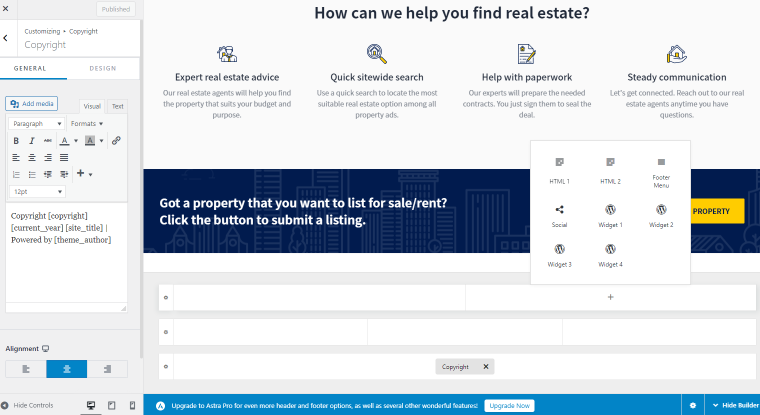
By far, the most beginner-friendly way to edit a footer in WordPress is through Customizer. You can access it in the WordPress dashboard by following the Appearance > Customize pathway. Some themes offer a special Footer Builder, which allows customizing the copyright text and the footer layout by adding widgets, custom HTML, and menus to it.
Editing from the WordPress Widgets area
NOTE
In case you see no footer areas in the Widgets, it is likely that the theme you currently use does not support the widget areas. Use a different method to edit the footer.
Another option involves the WordPress inbuilt widget system, although it only works for themes with a footer widget area. Open the Appearance > Widgets directory from the admin panel. Depending on the used theme, you will see one or several footer areas.
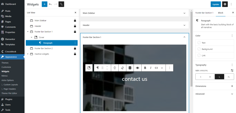
You can fill the footer bar as you wish by drag-and-dropping the necessary widgets. Once you configure them, don’t forget to save the changes.
Editing the footer.php file manually
NOTE
Please make sure to back up a WordPress website before customizing its footer parts.
Manual editing applies to all WordPress themes, but you need coding skills to do everything right. It’s a suitable way to make some minor changes to the footer. Go to Appearance > Theme Editor/Theme File Editor > Theme Files > Theme Footer. Here, you can add the needed code to the footer.php file, customize it, and remove the existing code.
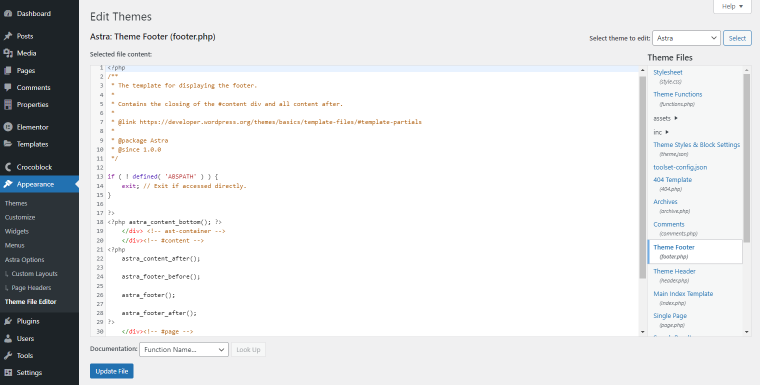
You can access the footer.php file via the FTP agent, too.
Though, it’s not advised to modify the core files without the need. The file structure might be more complex than it would seem. It would be best to edit the footer in the theme editor and use custom CSS when needed.
Sometimes, you may need to add code snippets to the footer to connect some third-party functionality. In this case, the fastest and easiest way would be to use a dedicated plugin. There are three most popular choices:
- WPCode, former Insert Headers and Footers;
- Header Footer Code Manager;
- Footer Mega Grid Columns.
Using dedicated footer-editing plugins
Plugins have several advantages when it comes to footer editing. They are easy to use, visual, and make the whole routine fast. Elementor Pro, Divi, and JetPlugins are just a few names on the list.
Footer-editing plugins have a dedicated Theme Builder where one can edit the entire page structure, not just the footer. Take JetThemeCore, for instance. It allows you to create custom footer templates in the Elementor and Gutenberg page builders and assign them to different website pages using conditional logic.
Site Editor method
Site Editor, formerly Full Site Editing, is the last but not least way to edit a footer in WordPress. Although, you should mind that it is only supported by block-based WordPress themes (like Twenty Twenty-Two). FSE is available through Appearance > Editor. Open the footer part and adjust it by adding the desired blocks.
Despite being a real catch, Site Editor is still in Beta and has limited functionality:
- Its range of covered themes is pretty loose, and those few supported cannot be deemed the most reliable and optimized.
- There are some Gutenberg limitations, touching upon its block generation ability and overall flexibility.
WordPress Footer FAQ
The footer is the webpage part located at the very bottom. It is a “wrapper” section indicating where the body template ends. The footer usually contains a logo, brand name, the company’s legal documents, a copyright notice, and contacts.
There are several ways to do it: WordPress Customizer, Site Editor, editing the core footer.php file, and a third-party Theme Builder. Each method is described above.
Yes, it is. You can use a dedicated plugin to build as many WordPress footer templates as necessary and assign them to different website pages.
Conclusion
The footer template is a thing not a single website can do without. It stores essential information about the company, like contacts, social links, a reach-out form, etc., and provides additional links to useful materials.
There are several ways to edit a footer, from beginner-friendly to advanced. The #1 way is using a dedicated plugin with a Theme Builder feature. WordPress Customizer and Site Editor are decent options, too. The most complicated is manual editing – you’ll need good coding skills (to be able to handle HTML, PHP, and CSS).
Choose the method that suits you best, and feel free to share the routine you prefer in the comments.

