Every breadcrumbs’ meaning you’ll find on the web throws back to the fairy tale about Hansel and Gretel. Perhaps, it was relevant at the dawn of web design, but now this comparison bores to death. Big sites (especially e-shops) look like labyrinths, so I think the connotation of Ariadne’s thread is more appropriate.
Designers place breadcrumb trails on every page except landing and main pages to kill three birds with one stone and:
- provide more usability by correct navigation;
- design the site more impressively;
- make the site more SEO-friendly.
Here, I propose you pull the thread and reach the ball, i.e., delve into the concept of breadcrumbs on the website, the main trends in this field, and the best practices. However, describing the best and most commonly used practices can sometimes narrow your imagination. Therefore, I’d like to tell you about go-to ways in website breadcrumbs design and breadcrumbing examples – both good and not so good. 🙂
- What Are Website Breadcrumbs?
- Discovering Breadcrumbs Types
- Why Use Website Breadcrumbs?
- Breadcrumbs Website Examples
- What to Avoid When Developing Breadcrumbs
- How to Add Breadcrumbs to the Website?
- Sum Up
What Are Website Breadcrumbs?
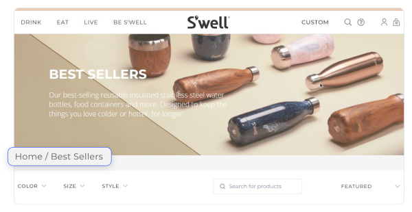
According to usability principles, visitors should not be disoriented on the website. Therefore, answering the questions “What are breadcrumbs?” and “What are breadcrumbs on a website?”, I’d like to say that breadcrumb navigation implements this principle as a secondary navigation system. It means breadcrumbs depict site structure, make website hierarchy more understandable, and provide easy access to other site sections. The breadcrumbs look like a horizontal text line with separators and present visitors’ position on the website.

Despite being the secondary navigation system and providing site hierarchy, breadcrumbs on a website contribute to the site’s usability and SEO; they:
- increase the accessibility of categorized products and decrease the number of clicks to conversion;
- often contain keywords (i.e., not Main page > Products, but Flowers > Roses);
- provide better interlinking between website pages for better indexing;
- make it possible to obtain snippets with navigation trails;
- make the site clear, picturesque, and thus, more memorable.
You see, how much the trail of breadcrumbs matters.
Discovering Breadcrumbs Types
Typically, the breadcrumb refers to its location, attribute, and path. I’d like to present types of breadcrumbs for better understanding:
- location-based breadcrumbs reflect the website hierarchy and show visitor’s current position;

- attribute-based breadcrumbs reflect all attributes chosen by visitors and, therefore, are widely used by e-shops;
- path-based breadcrumbs show an individual visitor’s way and reproduce their trails, even very intricate.

Why Use Website Breadcrumbs?
Let’s look into the matter from the pros and cons perspective.
No wonder that pros prevail, especially when taking into account the best breadcrumbs features:
- they do not take much space on the site;
- breadcrumbs are easy to build;
- users understand them intuitively;
- they contribute to the Page Rank index.
Cons are associated with incorrect building and implementation of the website breadcrumbs:
- They should be visible to users. Web designers traditionally place breadcrumbs on the upper side of the web page, but it is possible to put them in the header. Positioning at any other site point makes the site breadcrumbs invisible and unused.
- The main page, aka the homepage, should not contain breadcrumbs.
- The current page should not be clickable to avoid looping.
- To make better indexing, do not forget about microdata markup.
Breadcrumbs Website Examples
WordPress is used by 43.25% of websites worldwide, while Elementor usage amounts to 7.1%. The issue of how to use breadcrumbs is relevant, especially for Elementor breadcrumbs.
Website breadcrumbs should be attractive, visible, and not contradict the website design. I’d like to present some breadcrumbs examples built with WordPress and Elementor plugins.
As mentioned above, the breadcrumbs look like a horizontal text line with symbols (>, 一, ➡, etc.) that separate higher and lower-level pages.

One can customize Elementor breadcrumbs by applying colors to fonts and icons, gaps, backgrounds, borders, spacings, etc.

I will even say more 一 breadcrumbs can contain images. It is not traditional for web design, but who knows, maybe it would be a new trend. Maybe there will be many different breadcrumb styles. And breadcrumbs will become a decent design element, just like the following WordPress sites show.

What to Avoid When Developing Breadcrumbs?
Yes, failure happens sometimes. I think that the term “worst practices” should not be applied to web design because best practice often means a standard/common practice. The so-called worst practices generally employ unusual sizes, fonts, and icons inside breadcrumbs. Undoubtedly, website breadcrumbs will sometime take their rightful place as decorative elements.
So, the worst breadcrumbs website examples and practices are as follows:
- Minimalism trends envisage minimal space for website breadcrumbs, so too big font sizes, icons, separators, etc., in designing breadcrumb navigation is a bad practice.
- One neglects breadcrumbs for the mobile version.
- One uses breadcrumbs for some pages of the same site and neglects other pages.
- Primary navigation is sacrificed in favor of breadcrumb navigation.
- One uses slashes and left-pointing arrows or symbols in UX breadcrumbs.
- Multi-level sites do not contain breadcrumbs at all.
- The website breadcrumbs string includes the current page.
- There are no intermediate pages in the website breadcrumbs string.
- One ignores website breadcrumbs at all.
How to Add Breadcrumbs to the Website?
You can use two different ways to add website breadcrumbs: plugins or manual creation. I’d like to focus on the easiest way – plugins. Here is my list of the most popular plugins for website breadcrumbs:
- All-in-One SEO and Yoast SEO include SEO options and allow positioning breadcrumbs on the page.
- Breadcrumb NavXT is easy to install and aims to customize breadcrumbs (including templates) that will be displayed on different page types.
- Flexy Breadcrumb is one the accessible plugins in this field;
- Breadcrumbs widget from Crocoblock allows website developers to build custom breadcrumb trails.
WordPress plugins propose possibilities for all tastes. One can try each of them and take the best one.
Sum Up
The benefits of breadcrumbs are obviously SEO-friendliness and usability. No doubt, they should harmoniously fit the overall design and be noticeable to users to provide appropriative navigation. The breadcrumbs vary in type (location-based, attribute-based, and path-based breadcrumbs), style, etc. In general, there is no best breadcrumbs or breadcrumbs design.
I think that breadcrumbs are underestimated as design elements. Therefore, I call you to use plugins to turn these boring strings into the real Ariadne’s thread. As you know, this thread was bright and colorful. 😉


