Pricing Table Overview
This tutorial uncovers the basic ways of working with the Pricing Table widget for Elementor.
The pricing table is the most essential part of any commercial website, so it has to attract attention, be informative, and be stylish. The Pricing Table widget within the JetElements plugin is a helpful tool created especially for adding efficient pricing tables to Elementor-built pages. This widget saves you time because it has all the elements you need already included. You can add, exclude, customize, and organize prices, features, and buttons in any order.
So, let’s take a look at how it could be created.
Pricing Table Settings Overview
Add the Pricing Table widget
Go to the page where you need a pricing table and open it in the Elementor page builder. Click the “Add New Section” button and then select the appropriate structure of the section. Seek the Pricing Table widget and drop it into a new area.
Define the settings
By default, the pricing table looks like that. As you can see, it has all the necessary elements already included:
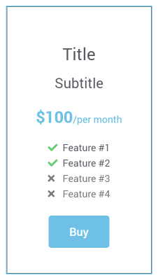
Click on the widget to access three blocks with different settings: Content, Style, and Advanced. There are six sections in the Content block where you can adjust the settings that define the widget’s content. Let’s have a closer look at each of them.
General
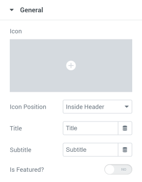
- Icon. This field allows you to choose the icon from the library or upload your own SVG image. If you want to add a hero to the header or even replace the title with an icon, you can do it here.
- Icon Position. In this drop-down menu, you can place the image inside the header or outside of it. If you place the icon inside the title, it will be considered a single row. Otherwise, it will be treated separately.
- Title. You can type in the title of this part of the table here.
- Subtitle. If the title needs some extra explanations, type them into this bar.
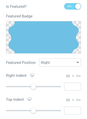
- Is Featured? Turn this toggle on to feature this particular pricing table column. It will allow you to choose Featured Badge (by picking it from the library or downloading an SVG picture) and its exact position.
Price
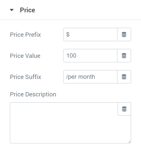
- Price Prefix. It is usually used for the currency sign.
- Price Value. Here you can insert the actual price value.
- Price Suffix. This bar can contain some details about the price. For example, “per month” or “/year.”
- Price Description. This text area is at your service if you need even more details about the price.
Features
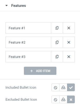
In this tab, you can define how many features there will be in the column of the pricing table. The number can be different for every column. If the features are listed separately, you can leave only the included/excluded icons. Those icons can be chosen individually in the Included Bullet Icon and Excluded Bullet Icon fields.
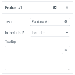
Each feature Item has a Title that can be deleted if you want to leave the icons only. Besides that, you can choose if it should be the included or excluded icon in the Is Included? Drop-down menu. Finally, you can add a tooltip that explains the feature or gives some additional information to the user. The positioning and other tooltip features can be defined in the Tooltip settings section.
Action Button
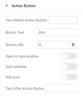
- Text Before Action Button. You can type the text into this bar if you need to somehow introduce the action button.
- Button text. That is what will be written on the button.
- Button URL. Here you can insert the URL of the page where the customer will be led after they click on the button.
- Open in a new window. If you want the page to open in a new window, then turn this toggle on. It is convenient for the users, so we strongly recommend you turn it on – it will improve user experience.
- Add nofollow. This toggle will add a “nofollow” tag to the URL if you turn it on.
- Add Icon. If you want to add an icon to the button, turn on this toggle. Afterward, you will be offered to choose the icon and its position.
- Text After Action Button. As it is evident from the title, here you can insert the text that will be placed after the button.
Tooltips
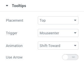
- Placement. In this drop-down menu, you can choose where the tooltip will appear: at the Top, to the Right, to the Left, or at the Bottom.
- Trigger. This field allows you to define when the tooltip appears: once the pointer enters the feature area or when the user clicks on it.
- Animation. There are six types of tooltip appearance animation for you to choose from.
- Use Arrow. If you turn this toggle on, the tooltip will have an arrow pointing at the feature it is attached to. In that case, you can choose the Arrow Type and Size.
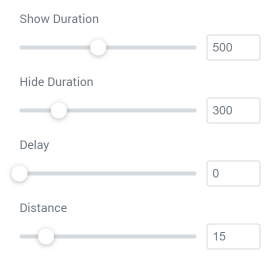
- Show Duration. The value you choose here defines how smoothly the tooltip will appear. The bigger it is, the longer it takes for the tooltip to appear.
- Hide Duration—the same value as the Show Duration, yet defining the length of the tooltip hiding.
- Delay. Here you can choose a time lag between the trigger run-out and the tooltip appearance.
- Distance. This slider helps you set the distance between the feature and the tooltip.
Fold Settings
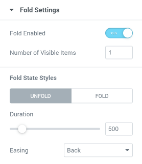
If you enable the toggle, not only will all settings appear, but also an additional settings block titled Fold Button.
- A number of Visible Items. Here you can choose how many features will be visible to the user.
- Duration. This value defines the smoothness of unfolding and folding. The bigger it is, the slower it moves.
- Easing. In this drop-down menu, you can choose one of nine animations for folding and unfolding.
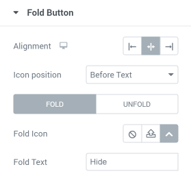
In the Fold Button settings section, you can choose the Alignment of the button, Icon position, the Fold Icon itself, and the Text that will be placed on the button.
When you are done with the settings, proceed to the Style tab, and create a breathtaking design for your Pricing Table. If you need insight, take a look at these amazing pricing table examples. Don’t forget to hit the “Publish” or “Update” button when you finish the styling.
How to Change the Pricing Table Layout
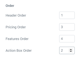
The pricing table consists of several elements: title, subtitle, features, and action button. The pricing table’s layout is the order in which all those elements are organized. The JetElements Pricing table allows you to change the order the way you like.
Open the page with the pricing table, click on the widget, and go to Style > Table. Scroll the settings down, and you will see the Order block at the bottom. All the pricing table elements are listed there. If you have chosen to show the icon outside the header, it will have a separate row. Every element has a bar near it where you can type in the number. That will be a sequence number, and the elements will be sorted according to it, from 1 to 4 or 5.
That’s all. Now you know how to create and display WordPress pricing tables with the help of the JetElements plugin.