How to Use Select, Checkbox, and Radio Fields
From this tutorial, you will learn how to create and use Select, Radio, and Checkboxes fields in the forms using JetEngine Form functionality.
Before you start, check the tutorial requirements:
- Elementor (Free version) or Block editor (Gutenberg)
- JetEngine plugin installed and activated
Select, Checkboxes, and Radio form fields are almost the same and have similar settings. All of them allow the user to select an option from the offered variants. JetEngine Forms functionality allows you to add them to any of your forms and customize them according to your needs. This tutorial will show you how to create Select, Checkboxes, and Radio fields in the form and change their settings according to the purposes of your website.
The Difference between Select, Checkboxes, and Radio fields
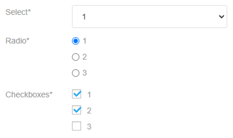
- The Select field offers the user a drop-down list that opens after clicking on the field. The user can choose a single option from it. This type of field is perfect when the list of variants is big, and you don’t want to make the form messy and too long;
- The Checkboxes field adds a list of options with square-shaped checkboxes near them. The user can choose several variants from the list;
- The Radio field creates a list of several options with circle-shaped boxes near each of them. The user can select only one of the offered variants.
Select, Checkboxes, and Radio fields Settings
So, you’ve created a form, added a new field by clicking the “Add Field” button, and chose either the “Select”, “Checkboxes”, or “Radio” option in the Type drop-down menu. The settings will be almost the same, so let’s take the Radio field as an example.
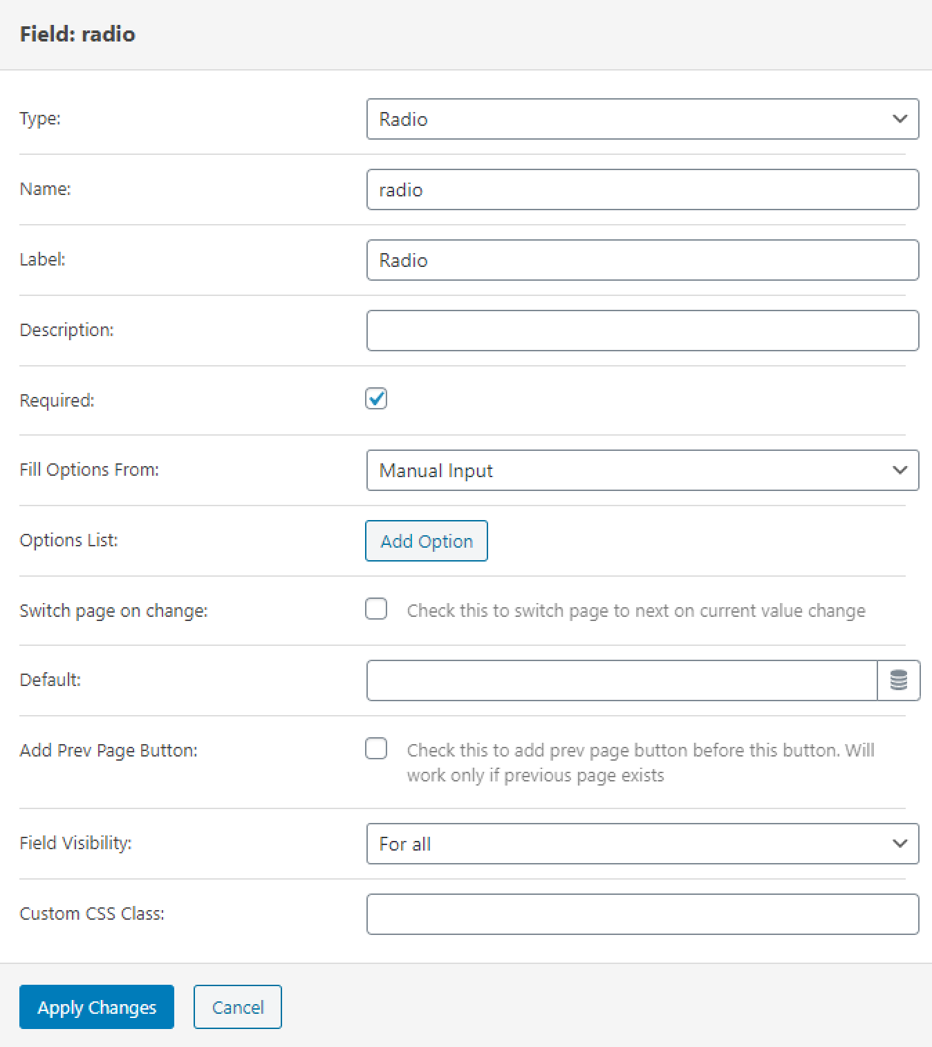
- Name. This a slug or an ID of the field, you will need it to mark the field if you would like to use its values further;
- Label. Here you can type in the text that will be shown over the options list;
- Description. If you want to give the users some explanations about what to place to the field, provide them in this text area and they will be shown below the Label;
- Required. If you will tick this checkbox, the user won’t be able to submit the form without filling this field;
- Fill Options From. Here you can choose how the field will be filled. Below you will be able to read about it in more details;
- Switch page on change. If you tick this checkbox, the page of the form will be switched when the user selects an option in this field;
- Default. If you want one of the options to be chosen by default, you can mention it in this bar;
- Add Prev Page Button. By ticking this checkbox, you add a “Previous Page” button to the form right after this field. Of course, it will appear only if the previous page exists;
- Field Visibility. In this drop-down menu, you can select who will be able to see this field – all users, only those who are logged in or those who aren’t;
- Custom CSS Class. You can put some CSS coding here if you need it.
Field input options
In the Field Options From drop-down menu, you can choose the source of the field values for the Select, Radio, or Checkboxes fields.
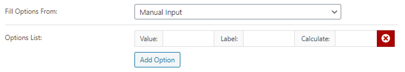
Manual Input. If you choose this variant, you will have to add the options manually. After you click the “Add Option” button, a new row appears. There are three columns in every row that you have to fill. The Value is data that will be used if you would like to use the values of this field. The Label is the name of the option that will be shown to the user. If you add the Calculated value, it will be used in the calculated field. All those values can differ.
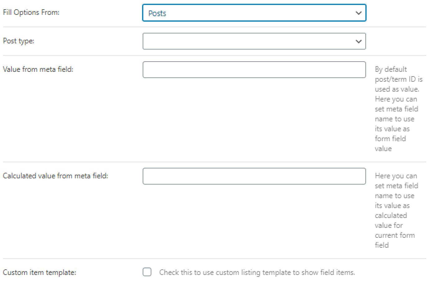
Posts. In this case, the data from the posts will be used to create the options list.
- Post type. In this drop-down menu, you can choose the post type, either the default or custom type, created with the help of JetEngine;
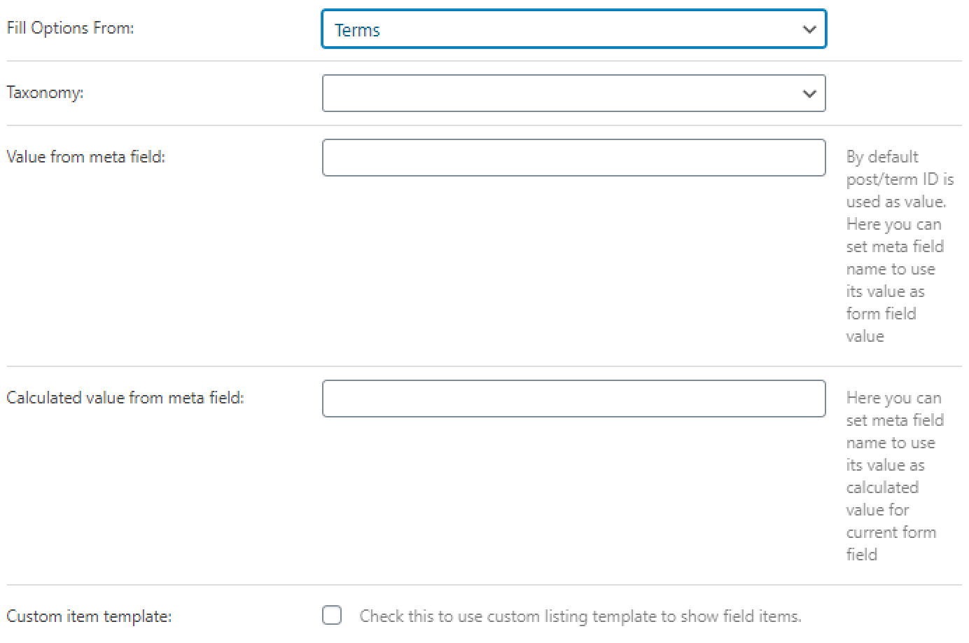
- Value from meta field. If you leave this bar empty, the IDs of the posts will be used to create the options list. Or, you can type in the name of the meta field to take the values from;
- Calculated value from meta field. The values of the meta field you mention here will be used in the Calculated field formulas;
- Custom item template. Tick this checkbox and choose the listing from the drop-down menu if you want the options to be shown in a specific way, defined by the listing template.
Terms. Use this option if you want to use the data from terms’ meta fields to create a list of options. All the settings are the same as the ones in the Posts option.
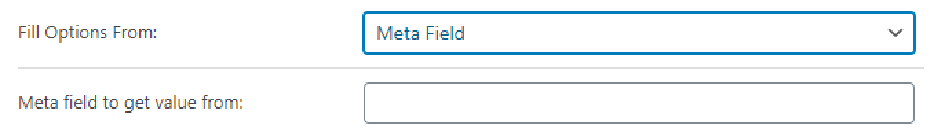
Meta Field. In this case, you can also use the data from the meta field to create a list of options. You type in the name of the meta field to the Meta field to get value from bar. Be aware that only the meta fields of the post where you plan to locate the form can be used.
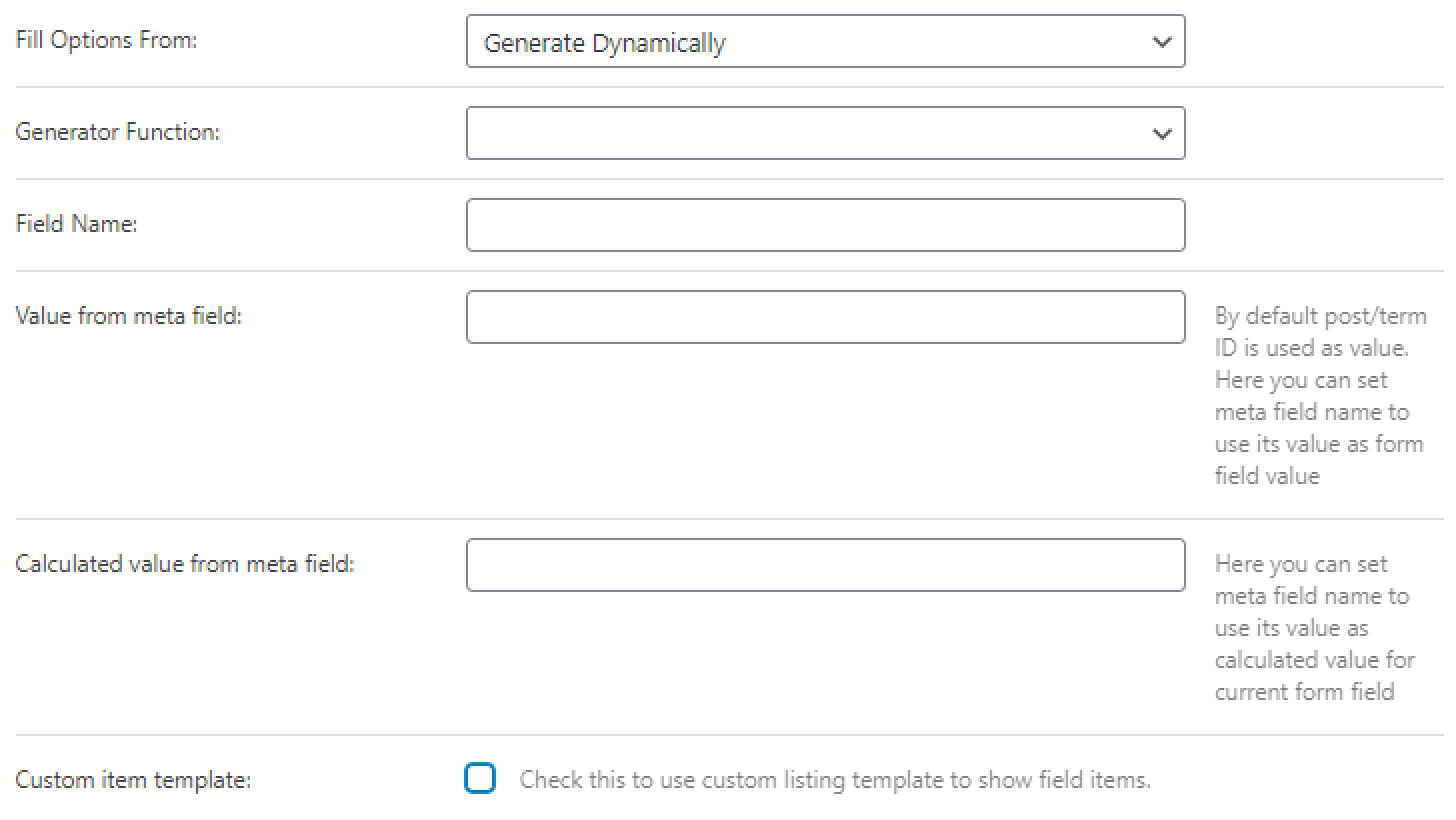
Generate Dynamically. If you choose this variant, the options list will be generated dynamically according to the function you set in the Generator Function drop-down menu. It could be either the number range or values from the database, JetEngine field options, or Options Page. In the Field Name bar, you can set the max number of the range or set the name of the database or meta field. The other settings are similar to the ones in the Posts and Terms options.
When you are done with all the settings, don’t forget to press the “Apply Changes” button to save the customizations.
Now that you know everything about Select, Checkboxes, and Radio field settings, you will be able to create and use them as you please.