How to Create Responsive WordPress Page Templates
This tutorial describes how to create responsive page templates and add the responsive condition to the dedicated header, body, or footer template with the JetThemeCore WordPress plugin.
Before you start, check the tutorial requirements:
- Elementor (Free version) or Block editor (Gutenberg)
- JetThemeCore installed and activated
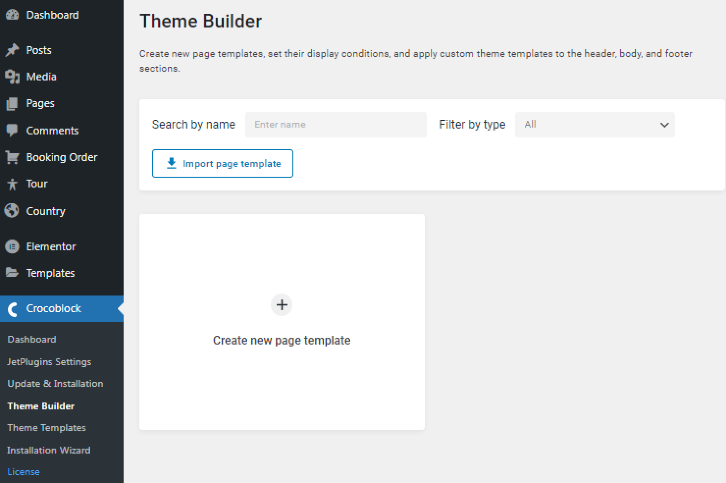
With the JetThemeCore 2.0 plugin version, you can create page templates in the Crocoblock > Theme Builder Dashboard tab, add header, body, and footer to them, and set the conditions, which can also be applied to the dedicated template.
Full JetThemeCore Dashboard settings overview is provided in this tutorial.
Information about all Conditions you can find here.
For the template creation, you need to upload the Elementor free version, or you can use the Block Editor.
To make the templates responsive on the dedicated devices, you can set the Сonditions in two ways.
How to Create a New Page Template with the Responsive Condition
To create a new page template, navigate to Crocoblock > Theme Builder and hit the “Create new page template” button.
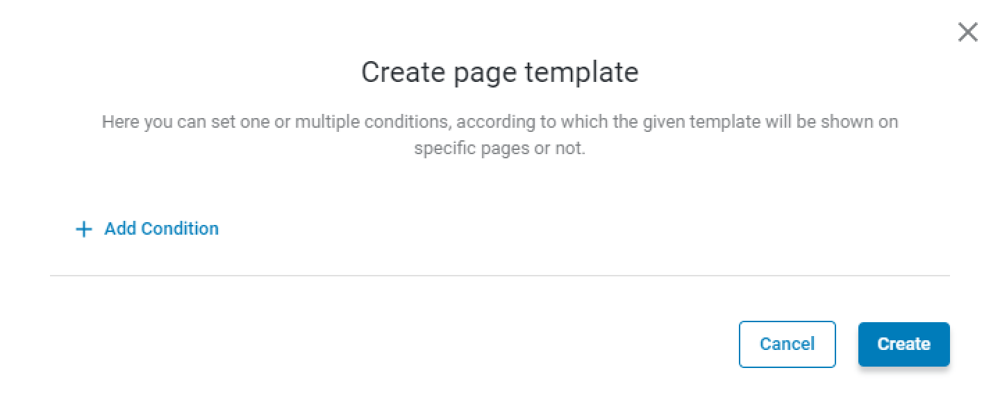
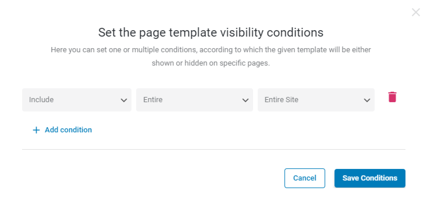
Click on the “Add Condition” button.
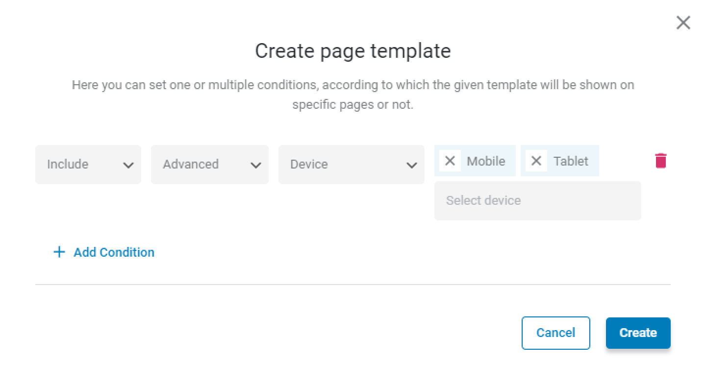
Choose the “Include” (or “Exclude” if you want to hide the template on some devices), “Advanced,” and “Device” options and select the needed device or devices in the last field (“Desktop,” “Tablet,” and “Mobile” options are in the disposal).
Then, push the “Create” button.
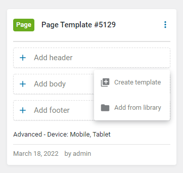
In the newly created Page Template window, click on one of the buttons (“+ Add header,” “+ Add body,” or “+ Add footer”) to add a template to the page with the “Device” condition.
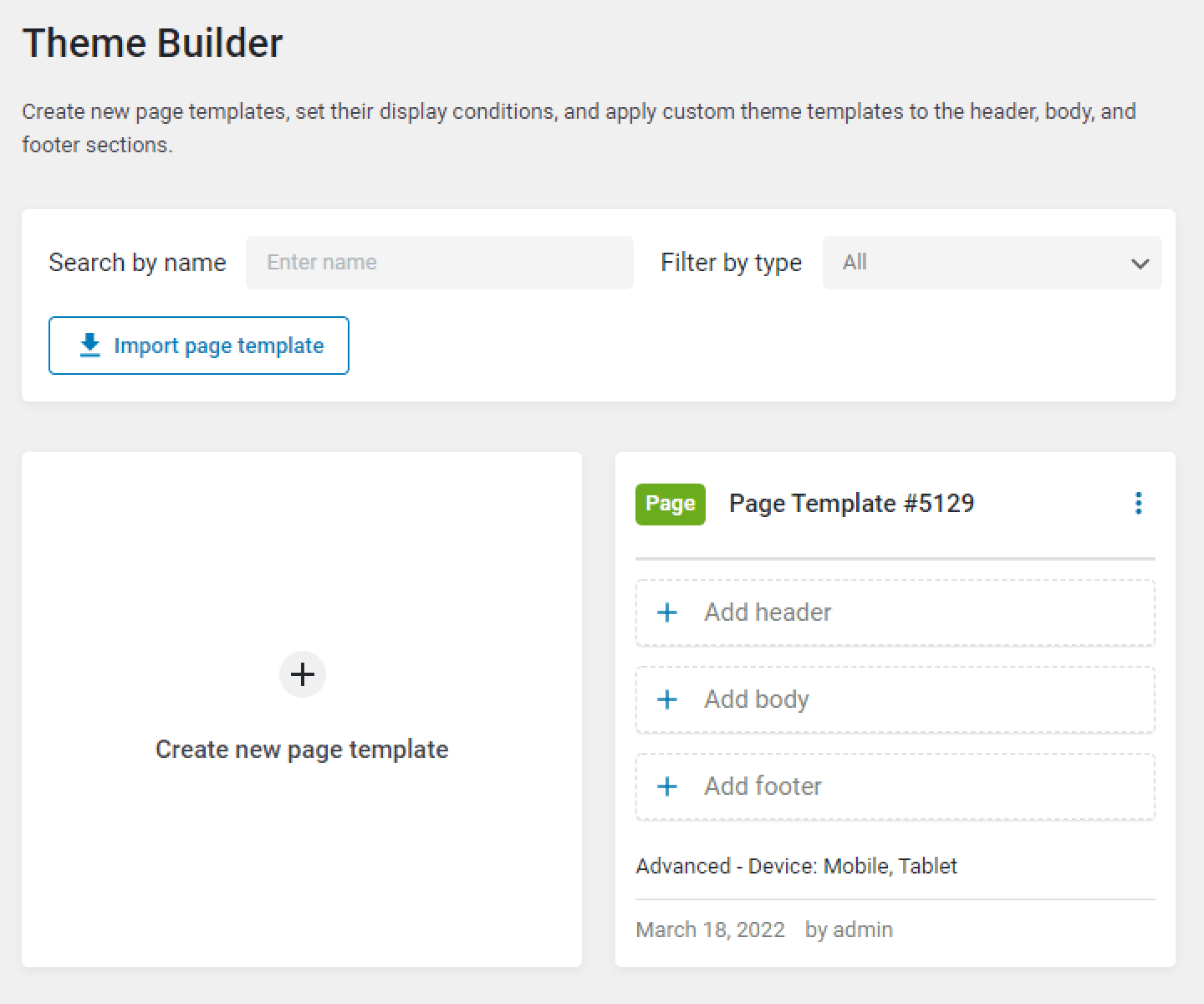
Hit the “Create template” button, or you can add the previously created template from the library to the page.
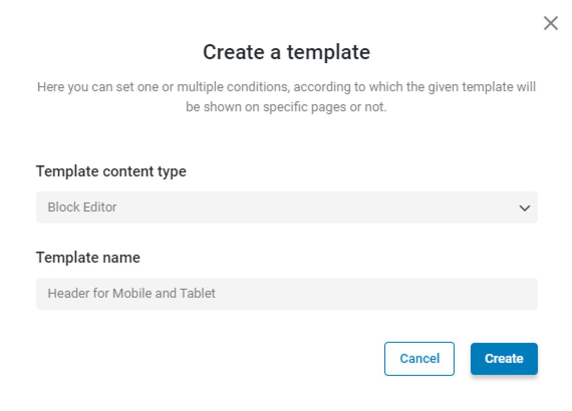
You can create a new template in the Elementor editor or WordPress Block Editor (Gutenberg). For that, select the needed Template content type. Then, enter the Template name and press the “Create” button.
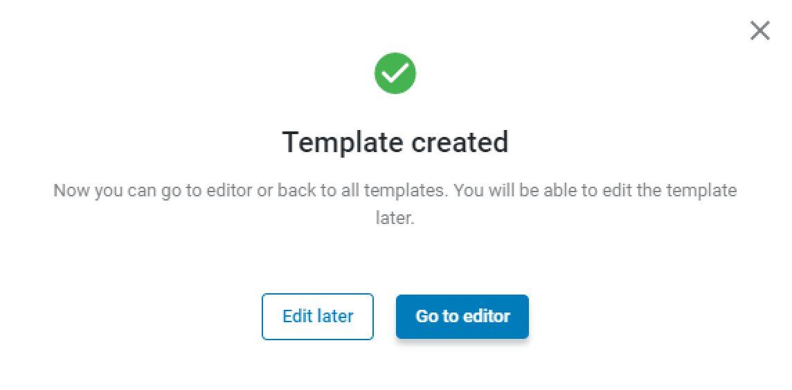
After the template creation, click on the “Go to editor” button to proceed to the Elementor or Gutenberg editor. If you press the “Edit later” button, you will return to the Theme Builder.
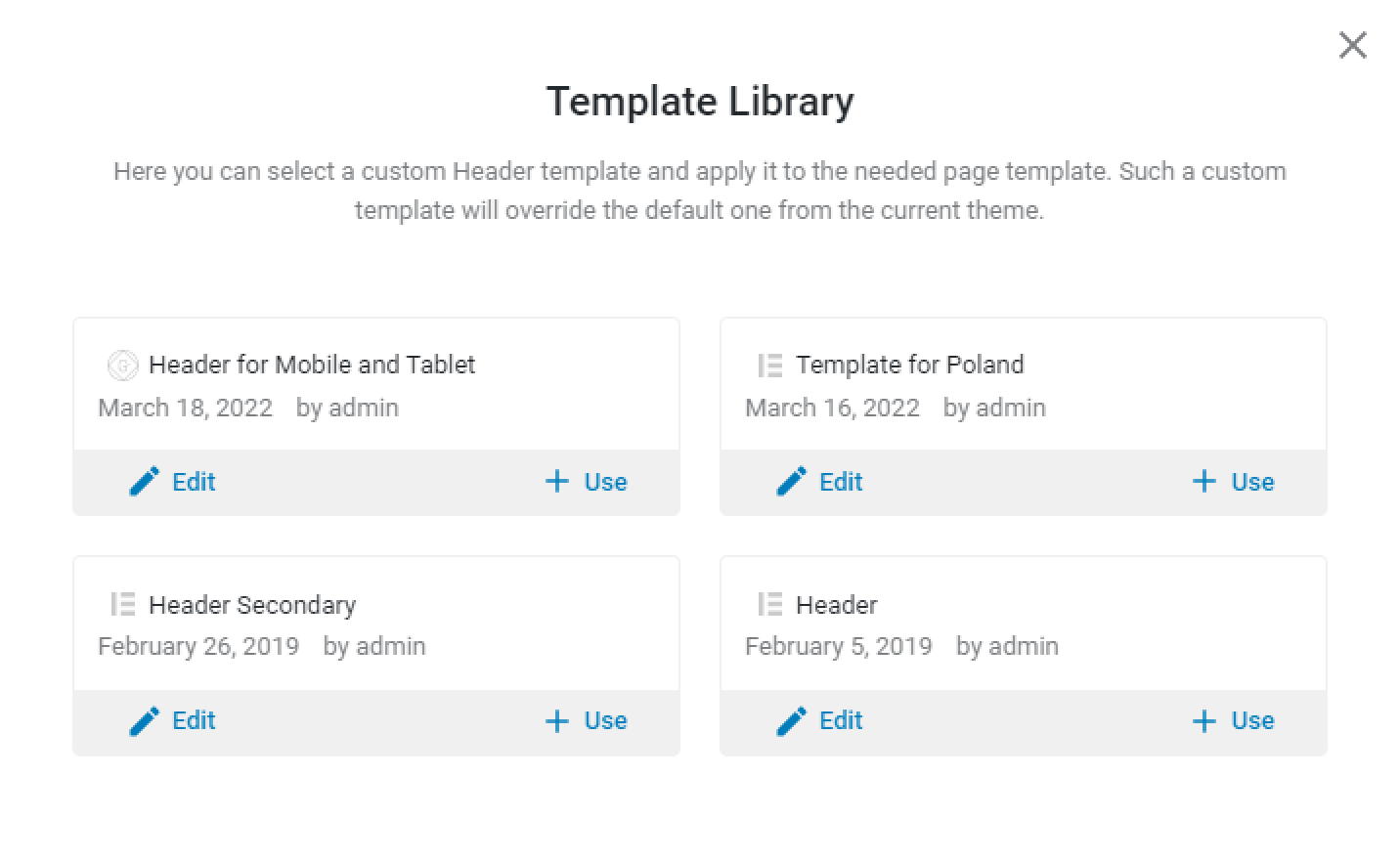
You can add the template from the library by clicking on the “Add from library” button. All newly created templates or those ready for editing will be kept here even if you remove them from the Page Template.
How to Add the Responsive Condition to the Dedicated Template
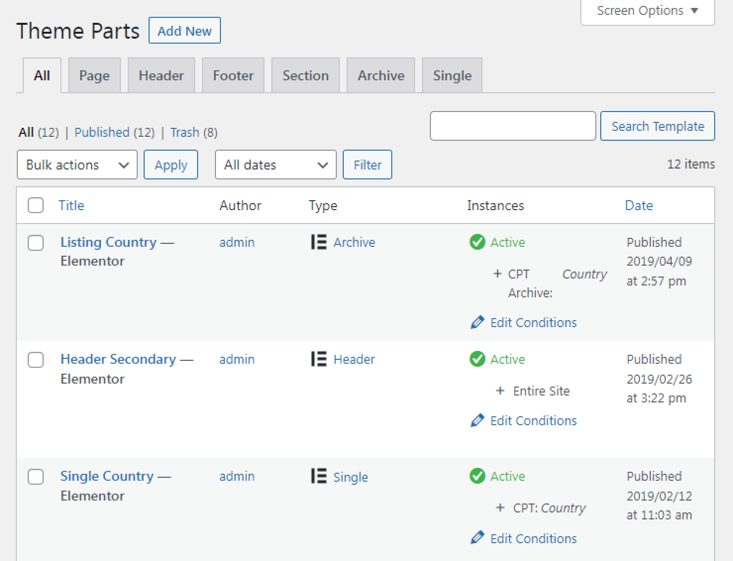
To add the device condition to the existing template, proceed to Crocoblock > Theme Templates and hit the “Edit Condition” button in the needed template.
Hit the “Add condition” button.
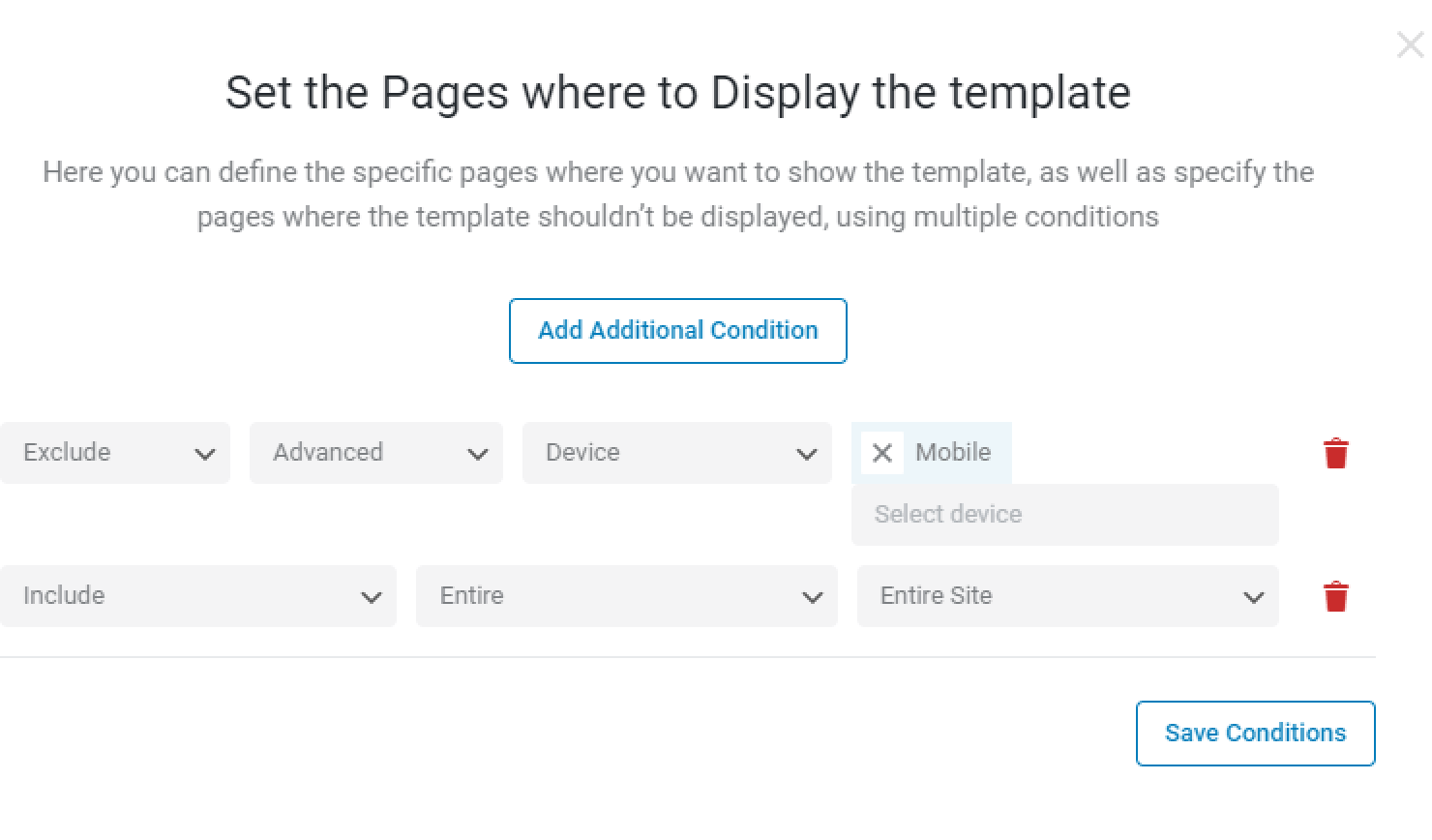
Choose the “Include” (or “Exclude” if you want to hide the template on some devices), “Advanced,” “Device” options and select the needed device or devices in the last field (“Desktop,” “Tablet,” and “Mobile” options are in the disposal).
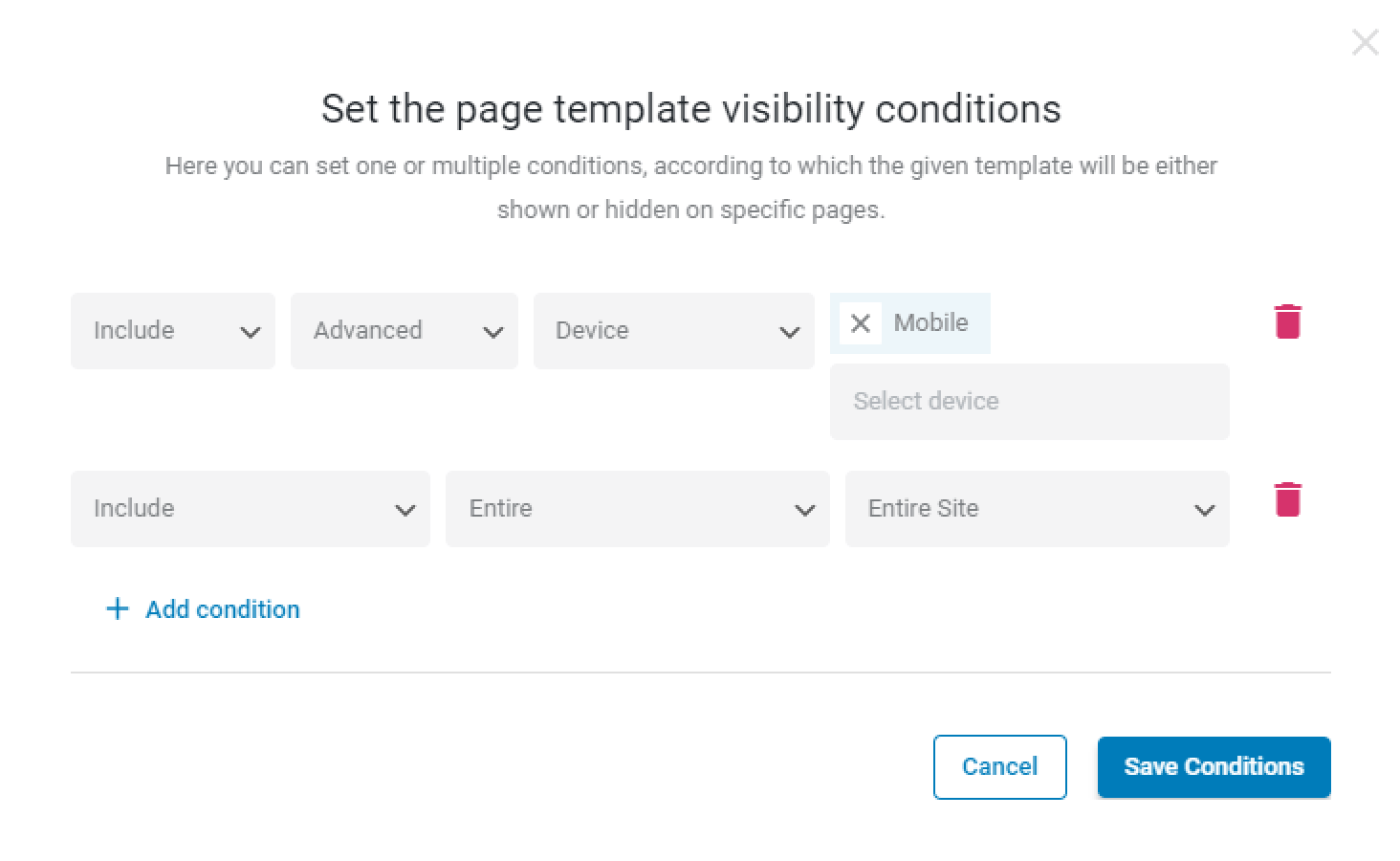
Finally, hit the “Save Conditions” button.
Responsive Condition Use Case
For instance, we have the Header for the home page and the Secondary Header for the entire site.
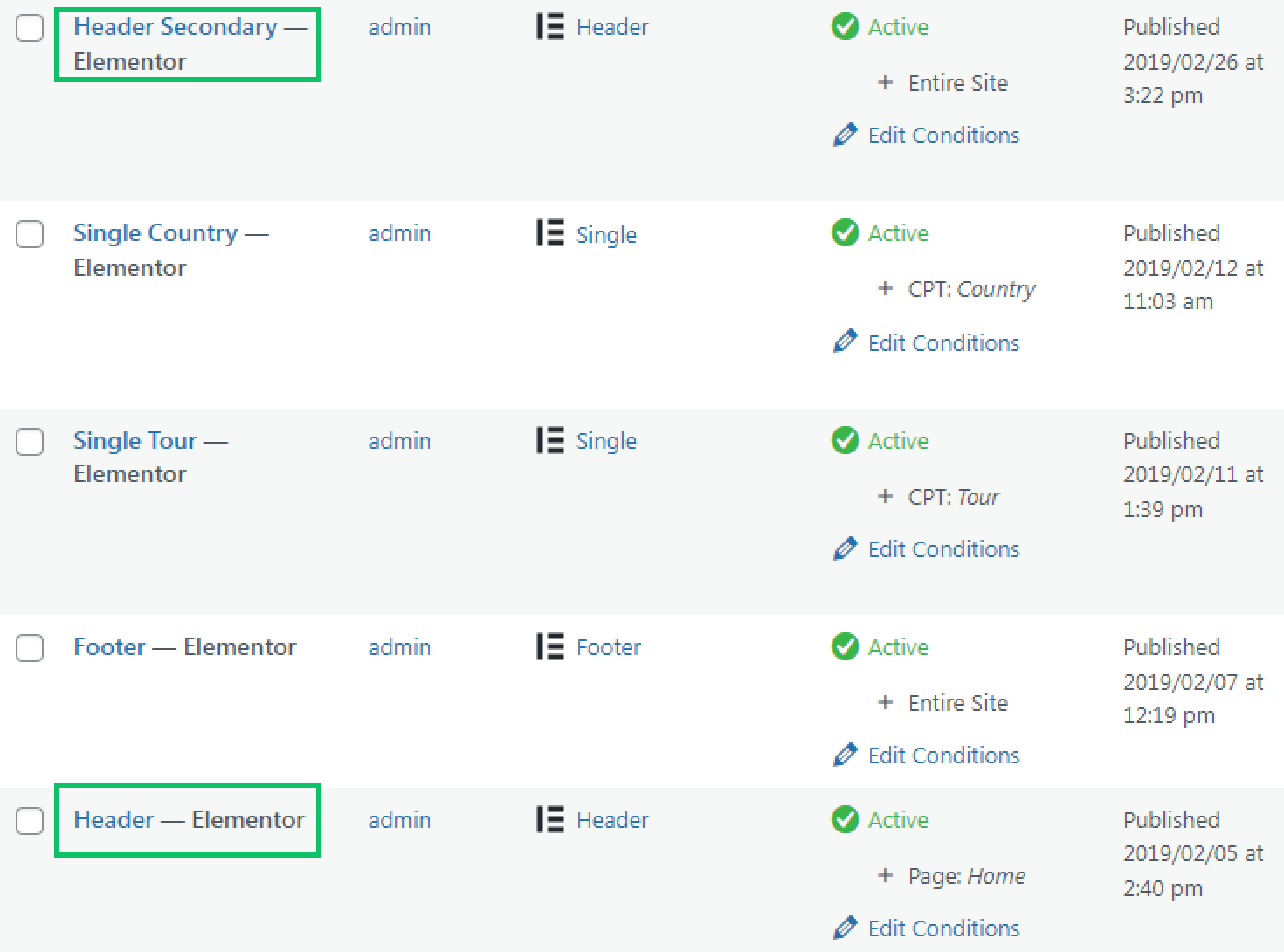
The first header contains the menu, and the second contains breadcrumbs.
With the “Device” condition, we can hide the secondary header with the breadcrumbs on the mobile. We’ve clicked on the “Edit Conditions” button near the needed header and added the additional “Exclude,” “Advanced,” “Device,” and “Mobile” Conditions. Then we hit the “Save” button.
We’ve moved to the front end. Two headers are visible on the desktop.

On the mobile, the secondary header is hidden.

That’s all. Now you know how to create responsive page templates and add such a condition to the created template.