When website visitors want to learn about you or your company, they will most likely visit the About Us page. This page should express confidence in your brand and provide insightful information about your values, team, and services.
The About Us page plays a key role in building a strong connection with the audience, increasing conversions, and boosting retention rates. That’s why it is a good idea to put maximum effort and inspiration into creating this page.
In the following paragraphs, I will discuss the tasks the About Us page can fulfill, reveal the tips for creating effective introductory pages, and list some key elements you can use to make insightful, exciting content. I will also present some of my favorite About Us pages that may be inspirational for building your own websites.
Table of Contents
- Why Use the About Us Page?
- About Us Best Practices
- Examples of Outstanding About Us Pages
- Top Elements to Use on About Us Pages
- About Us Page Types
- FAQ
- Summary
Why Use the About Us Page?
The About Us page is perfect for introducing yourself and your business to website visitors. However, there are more than one tasks that this website piece can accomplish.
Developing trust and familiarity
Trust is one of the most critical factors when choosing a business to work with. And the way people approach websites is similar to what happens in interpersonal relations: the more information we have about a person, the more trust we feel. It’s no surprise for a potential customer to visit the About Us page to verify that they can trust your company.
To build up familiarity and trust, the companies answer a lot of basic questions:
- How long they’ve been around?
- What are the company’s long-term goals and mission?
- What milestones has the company achieved in the past?
- How is it different from everyone else?
Increasing user engagement
The About Us page allows explaining to visitors how the website can be helpful for them. For example, the Store section of a website may showcase the products and include short descriptions. But the About Us page may emphasize that a team of professionals is working in the company and are available for online consultations.
The information on the About Us page provides visitors with ideas on how they can benefit from your services or products. It may encourage them to engage with the blogs section, subscribe to newsletters, or commit other actions.
Humanizing the company’s brand
Humanizing your brand will make it more trustworthy and appealing to new prospectors. Use the About Us page to tell stories about your team and yourself and put up some pics to steer away from an image of a machine-driven corporation.
Finally, recognizing your teammates’ merits will contribute to establishing good company culture.
About Us Best Practices
Some guidelines for creating the best About Us pages are the same as for making any other website pages. The others are dictated by the main purpose of the About Us page, which is to provide your company’s information.
Make it easy to find
Many websites simply call it “About Us” and place the link in the top navigation bar. Often you can see original names like “Get to Know Us” and “Our Story.” That’s fine, but don’t go overboard with the creativity, and don’t hide the link in a three-level mega menu – let the potential customers find what they are looking for.
Answer the questions
Relate to the potential customers and answer the question they would ask. Here are the questions you should keep in mind:
- Who are you?
- When did you start?
- Where are you located?
- What do you do?
- How can you help people?
Make it personal
It should be more than just another boring piece of a website that combines elements of Contact Us and Products pages. Get rid of the industry-specific jargon and instead insert some humor into your content. A punchy text shows there are friendly and fun people behind your site’s interface.
Consistency
This one’s a universal rule for creating web pages: make sure the About Us page is in tune with the rest of the website. The visual design and usage of building blocks should be consistent across the website to enhance its usability and overall user experience.
Make it memorable
While keeping in mind the previous suggestion, bring together all your tech bells and whistles to make this page visually appealing and unique. Similarly, make your text exciting to read and enrich it with some bold lines and catchy headlines. The About Us page will be the first page many visitors see, so make a memorable first impression.
Call to action
If you succeeded in making an effective About Us page and made a compelling introduction to your company, the visitors will likely be ready to take the next step. Providing them with such an opportunity is what the CTA buttons are for. Here are examples of About Us page CTAs:
- “Contact Us”
- “Shop Now”
- “Schedule an Appointment”
- “Join Our Mailing List”
Examples of Outstanding About Us Pages
Let’s now look at the examples of awesome About Us pages for inspiration.
GIPHY
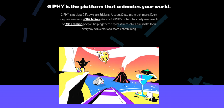
GIPHY’s About Us page illustrates their expertise in short animations. The first animation on the About Us page makes visitors feel they’re on a cosmic roller coaster ride, and it’s hard to take your eyes off the screen until you see where the GIF loop starts anew.
The paragraphs about GIPHY values, philosophies, and recent news are crowded with GIF URLs, so as the mouse cursor hovers over the text, all kinds of animated stickers and short clips pop out on the screen and fly to the top.
GIPHY does a great job promoting its products without turning to a sales pitch. After seeing how fun and diverse the GIFs are, the viewers may want to use more of them.
Elikony
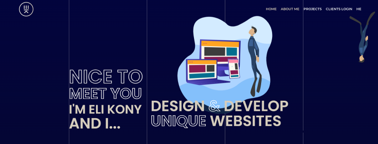
Eli Kony is a web developer and a freediving enthusiast. And you can figure this out as you scroll down the site’s home page: it’s full of unique animation effects and visuals built around the deep-diving theme.
This is a portfolio website. Its landing page is divided into Home, About Me, and Projects sections. The About Me part contains information about Eli Kony’s specialties and skills as well as mentions about his hobby. Instead of writing many words, the author invests his time into creating a stunning interactive design, smooth scrolling effects, and authentic style. Such a strategy seems to be perfect for showcasing web developer talents.
Three of Crocoblock’s plugins support motion effects and dynamic grid layouts: JetEngine, JetElements, and JetBlocks.
Nike
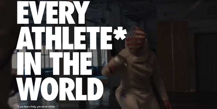
You’re wrong if you think Nike is too big of a company to have an About Us page on its site. The global sports outfitter uses this page to deliver its inspiring message while highlighting the versatility of its products: “Bring inspiration and innovation to every athlete in the world. If you have a body, you are an athlete.” Well played!
To engage visitors visually, the About Us page plays a full-width video in the background. It features famous athletes and random people during physical activities. Finally, there are links to Nike’s stories with images touching on the subject of equality and global access to sports.
In a nutshell, everyone who lands on the About Us page can identify themselves with Nike’s target audience.
SAIA
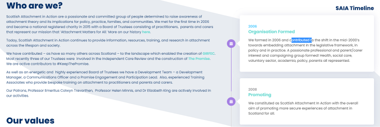
Scottish Attachment In Action is an organization that raises awareness of the attachment theory concerning relationships between children and caregivers. Their website contains a lot of information about events, courses, and projects.
The About Us page has a few paragraphs about the organization’s values, mission, and development team. What sets this page apart is the employment of a vertical onesided timeline created with the JetElements vertical timeline widget. It runs parallel to other elements on the page and tells a story of the SAIA organization.
The timeline element allows for organizing content on the page in an unorthodox layout. Despite packing tons of information, the About Us page does not appear content heavy.
Wendy’s
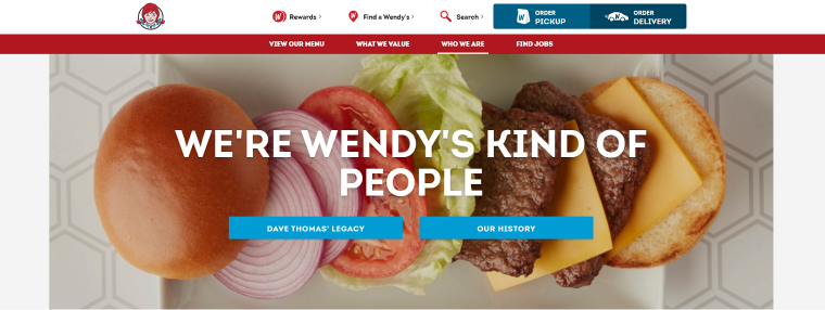
People know about Wendy’s fast food chain menu but not about its history. Wendy’s Who We Are page attempts to break the stereotype about the insensitive corporation by telling a story of the foundation of the first restaurant in 1969.
There are links on the page leading to information that would be useful for potential investors in Wendy’s common stock or those who would like to own Wendy’s franchise. In terms of design, this page is perfectly in line with the rest of the website, featuring corporate colors, logos, and masonry grid layouts.
Brooklyn Soap Company

Brooklyn Soap Co ships natural beard care products worldwide from Brooklyn. It’s not hard to imagine who their perfect customers are – dudes with beards. Their About Us page (called Story) aims to relate to the audience and does it effectively.
The first thing you notice is that the text is unique and exciting to read. Some of the words they choose are manly and even rude, and they get straight to the point. Second, the webpage features high-quality videos about the owners of the company and the streets of Brooklyn. The videos and bold writing strive to make a personal connection with the audience and show a sense of honesty, which is Brooklyn Soap Co’s main quality.
Dell Technologies
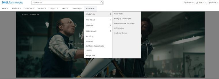
The tech giant’s site features an excessive navigation menu with 28 pages under the About Us section! There are piles of information on these pages about the company’s work, the innovations it implements, the leadership team, the latest news, careers, and much more.
Like the rest of the website, the About Us Pages are based on large blocks with images, headlines, and link buttons, neatly organized in a grid layout. Wherever you are on the website, you get the feeling many people are working to manage the colossal amount of web content.
Funny thing, I checked the Apple website, and there’s nothing like an About Us page there.
EWD
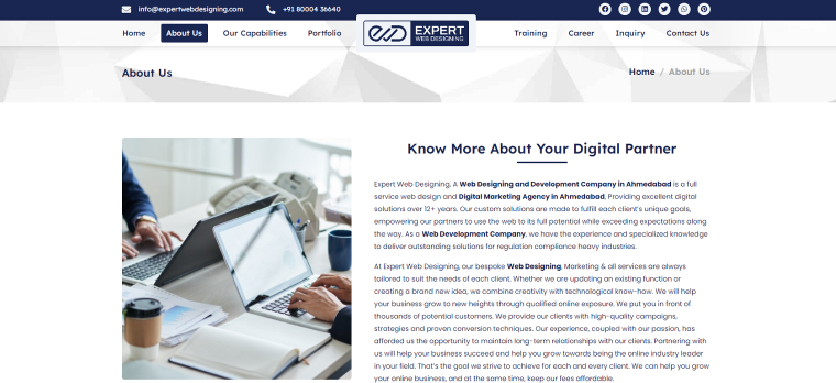
Expert Web Designing website features a business-like About Us page with almost no images. However, plenty of SVG icons do a great job explaining what the attached text blogs are about. The page includes a lot of information typically found on About Us pages: the unique identity of the company, the reasons why customers should choose it, its philosophy, and values.
The About Us page includes a subscription form added by Crocoblock subscribe form widget, CTA buttons, and a vertical timeline showcasing the company’s milestones over the years.
Overall, this About Us page accomplishes many tasks and makes a very positive impression. It’s nice to know that developers used JetElements, JetTricks, JetTabs, and JetBlogs plugins to build this website.
ToyFight
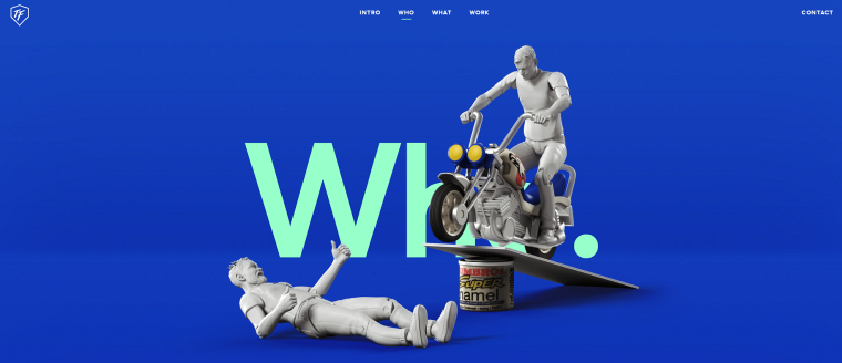
The About Us page is under the Who link. Web developers refused to use conventional building blocks for creating this page (and other pages). Instead, they came up with a creative design so no viewers can doubt they are an award-winning agency.
There’s very little text on the page, only five or six lines about Jonny and Leigh, the agency’s founders. These guys appear as plastic figures caught on camera during a fight (hence the agency’s name), making viewers laugh. But the impressive, attention-grabbing motion effects on this page are no joke.
Top Elements to Use on About Us Pages
We have seen some inspiring examples of About Us pages. Close examination of these pages reveals that some elements are present more often than others. Here’s a list of commonly used elements on About Us pages:
Maps
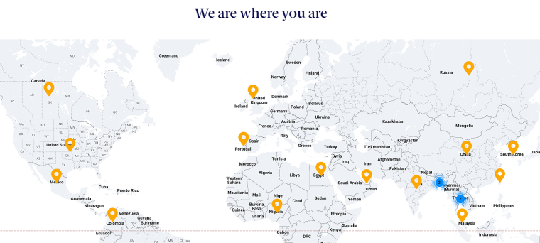
If your business has a physical location, adding a Google Maps form to the About Page has several benefits. It directs users to the brick-and-mortar location and adds value to your business if there’s more than one location. Additionally, it gives your website a more modern look.
Displaying locations on WordPress sites is easy with Crocoblock’s Advanced Map Widget.
Subscription form

Don’t miss out on the benefits of having a direct connection with the site’s visitors. Having many people on the email list helps make more sales, increase traffic on the website, and build a trustful relationship with the audience.
Timeline
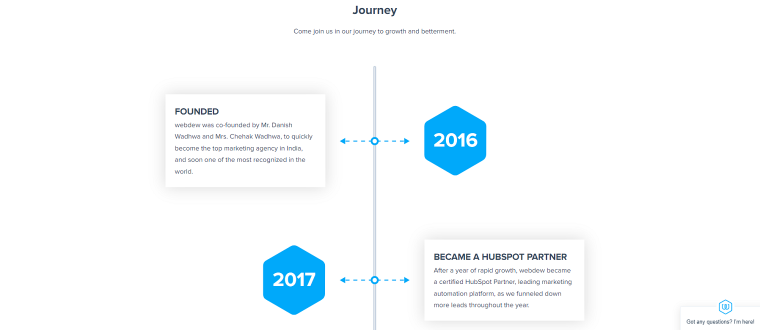
Timelines are another element commonly seen on About Us pages. They provide a way to present a brand’s story in an easy-to-understand and appealing manner. You can include texts and images in the timelines to tell how your company evolved or show important milestones in chronological order.
Testimonials

The website’s About Us page is perfect for presenting users’ testimonials, and they prove the brand’s credibility because they back up your story with recommendations from fellow users. You can find different ways to embed customers’ feedback on WordPress sites in our blog post about testimonials plugins.
Partners showcase

Listing your partners and big-name clients on the About page is an excellent way to prove your reliability to prospects. It is usually done by showcasing companies’ logos. The Logos Showcase Widget allows showing them in the most appealing style and adds links to them.
Team
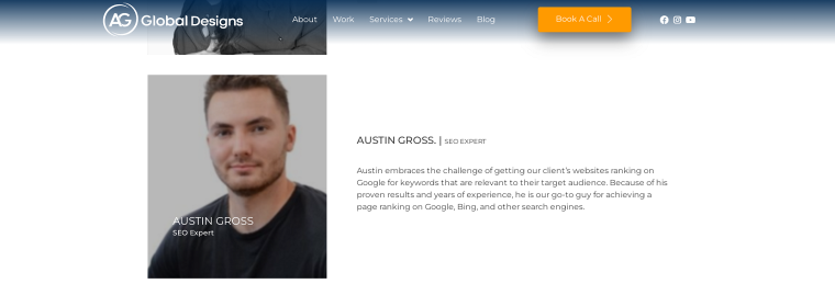
Make your company look like it’s actually run by humans, and include pictures of your colleagues and links to their bios on the About page. The best way to make the team section of the WordPress site uniform and have plenty of customization options is by installing a Team Member Widget by Crocoblock.
Services
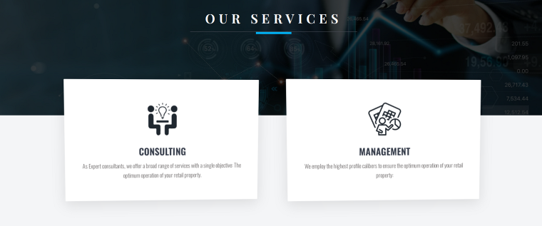
Showcasing services on websites is essential for businesses like car repair services, legal consultations, web developers, and more. Use WordPress Services Widget to share your services on the About Us page to help customers connect with your business.
About Us Page Types
As we have seen in the examples above, the About Us pages can take different appearances and employ an extensive collection of tools to present the brand’s identity to the website visitors.
The About Us pages can be classified according to how they are embedded into the website structure. In this regard, there are three types of pages.
- Typically, About Us pages appear as separate web pages, and users can access them via the permalink located in the top navigation bar and the footer menu. This page can have different names, like Our Story, About Me, etc.
- Some websites don’t need to build a full-size About Us page. Instead, they have only one section on their home page, often devoted to their history or values. This section link is in the top navigation bar under the About Us button.
- At the opposite end of the size spectrum lie websites that aggregate many pages under the title About Us. This is the case with the tech giant Dell website, where 28 separate pages are located under one title in the navigation bar.
FAQ
It is one of the most visited pages on the website. More than half of first-time visitors click on the About Us link.
The primary purpose of the About Us page is to provide information about the company and its services or products.
Besides the general information about the company, the About Us page can include customers’ testimonials, the brand’s history, information about team members, provided services, and a list of publicly known partners.
No. Some websites only include a short section about the brand’s identity on a landing page, while others omit entirely the About Us page. However, consider it a missed opportunity to benefit from the advantages of the About Us page.
Summary
The About Us page isn’t a standard website requirement. An effective About Us page provides visitors with important information about the brand identity, products, and services. In practice, this piece of a website can stimulate sales, increase user engagement, and create a positive image for your business.
If you value your brand, don’t be shy to show off about it, that’s precisely what the About Us page is for.
