Creating a landing page is no easy task, especially seeing as a landing page is neither a website nor a subscription form. It’s something more than that.
The landing page that converts agenda:
A landing page is a standalone page for conversion and/or lead generation for your website. Therefore, a landing page may seem like your average webpage, but it won’t feature elements like an “About Us” button, for example.
On the contrary, call-to-action verbs and a single CTA are paramount and can help you meet your conversion goals:
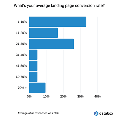
A conversion rate of up to 10% is not easy, nor is it a small number.
But what are the elements of a remarkable landing page that convert?
The Landing Page Tips You’ll Need in 2024
As I mentioned before, a landing page’s sole purpose is to convert. Now, of course, conversion is subjective and could – and would – change over a certain period, depending on your audience, brand, industry, goals, and KPIs.
If you want more referral traffic and lead generation, you will make sure to include an explainer video that will hint at your brand’s value. Suppose you want to set up a landing page to get more sales from your email marketing campaigns, more email opens, and generally boost your email marketing ROI.
In that case, you will need your landing page to have a clear purpose with images that showcase your product and actionable copy and CTAs.
But let’s get a little more specific.
Define the landing page type
Since a landing page can meet different needs, you’ll need to figure out what you need it for, first of all. Creating an eLearning platform, for example, or a series of webinars, requires a specific type of landing page as much as it requires a particular type of webinar software.
The most common landing page types are the following:
- Lead generation landing pages are there to generate more leads by acquiring a prospect’s email address.
- Webinar landing pages are there to capture the details of those interested in your webinar.
- Sales landing pages have one objective, and that is to sell. Therefore, they include all of the information needed to lead someone toward a purchase.
- 404 landing pages. And yes, those can be landing pages, and they can be as creative and fun as you could imagine. Their objective is to engage and reduce bounces.
- Thank You landing pages that can boost your conversion by providing a discount or free shipping code.
Generally speaking, a landing page isn’t here to showcase products. Rather, it’s here to spark interest enough to make the customer delighted and more involved in the company’s lead-gen or promotional purposes.
Let’s revisit the webinar example.
After acquiring the webinar software and organizing your event, you will want to create your lead-gen landing page and, at the same time, your email newsletter campaign that will be leading to the event.
At this stage, you will want to invest in a marketing platform that will give you both a landing page builder to create a landing page as interactive and exciting as possible.
You’ll use an email newsletter tool for that corresponding email to those who give you their contact details through your landing page and the leads that are already in your email list.
NOTE:
However, a beautiful landing page and an enticing corresponding email don’t always guarantee success.
Keep it simple
Visitors won’t bother with a landing page design that is too complicated or bold. Not to mention how they won’t even bother engaging with your landing page copy if it’s too complex or out of context and takes some time to understand.
Your copy and offer need to contain actionable verbs that gently lead the reader toward the action you’d like them to take. So, make sure to use them on your copy and CTA.
Generally speaking, you want potential leads to find your CTA to be a logical continuation of your landing page’s message. Not to mention how important it is to use contrasting colors for the button.
That way, it’ll be easier for leads to take notice. And with some simple language, like “I’m interested!” or “Tell me more”, you’re in for a better conversion rate than you’d think.
You can use FOMO both on your landing page copy and your email copy. Then track your emails and your lead-gen metrics, and you’ll see how a “Limited Time Offer!” can bring you more conversion. After all, the element of scarcity boosts conversion, primarily if you use a countdown timer.
Design, content, experimentation
Your leads need to understand your core message, and landing pages that are heavy on design and colors could take away from that. So, make sure to use colors that contrast and stand out to make your message pop and photography and some whitespace that will make your CTA button stand out.
In terms of content, you can always experiment and not use copy or photography alone. Have you tried to use video on your landing pages? Video is a fantastic way to grow your business and to experiment as well. Just make sure to use some A/B testing tools to ensure that your audience is interested in the forms of content you’re interested in.
Now, let’s go check out some landing pages that were proven to work like a charm for the brands and purpose they were made for.
4 Best Landing Page Examples That Convert
Dollar Shave Club
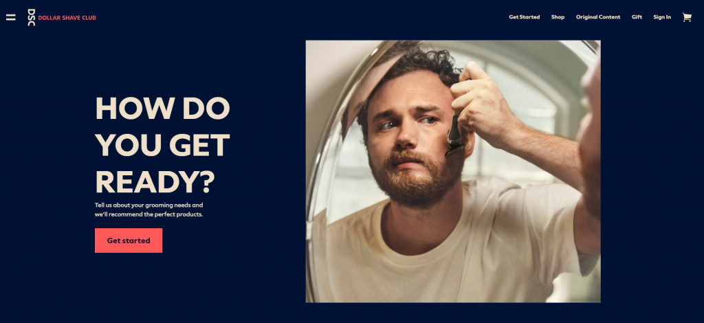
This one is a prime example of a landing page video with massive power and is probably one of my favorite video ideas. It falls under explainer videos, as it aims to educate the audience on Dollar Shave Club’s product.
It was effective because:
- Videos are digestible pieces of knowledge that people seek out.
- It’s more entertaining to watch a video than read a press release on a new product.
- It explains the business’s objective far better than a blog post could.
- It’s genuinely funny.
Don’t forget that videos convert far better than posts and copy. After all, when was the last time you saw the copy of a landing page go viral for telling the brand’s story?
Uber – Drive With Uber
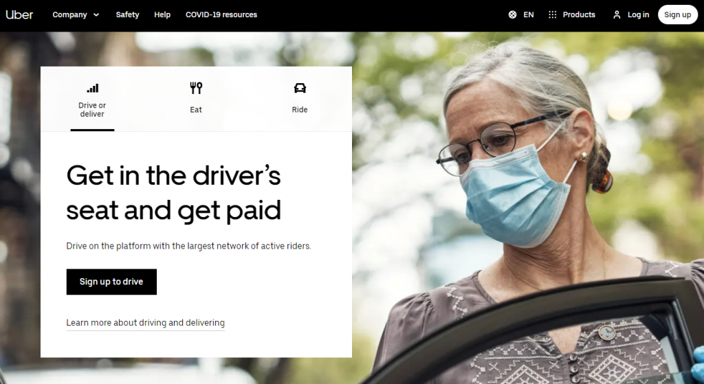
Plain, simple, and with as many visuals as it should have, Uber’s landing page addresses a prevalent issue that its users may have. “Drive when you want. Earn what you need”. Notice how the verbs “Drive” and “Earn” are used in these sentences. The second one is the logical outcome of the first one.
Using content marketing tactics that allow you to have a clear, concise copy and points right where you want it to point will have your leads convert right away.
Not to mention that these verbs create the exact expectations one should have from being registered as an Uber driver.
Breather – Workspace Made Simple
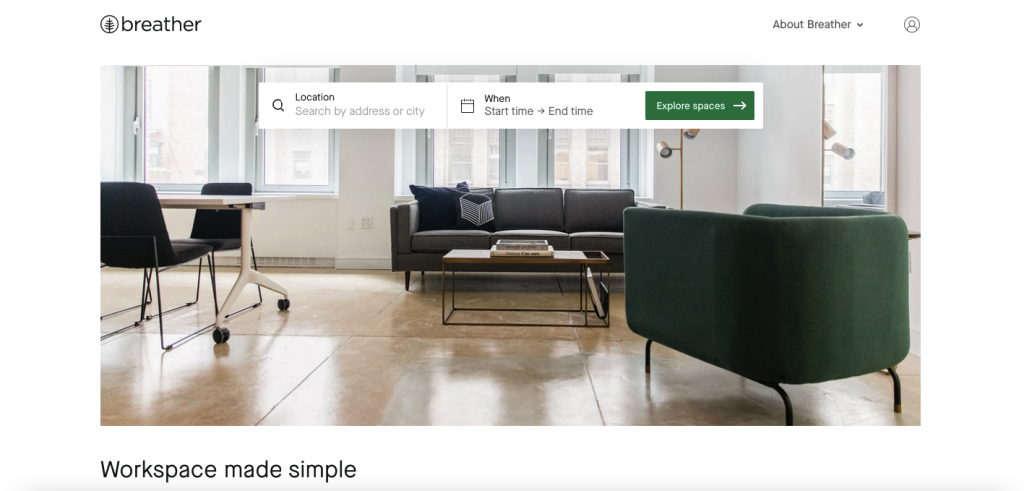
Simple, calm, collected, and professional without being hectic. Breather’s landing page design is one of the most beautiful ones for 2020. As soon as you visit the page, you see the objective: “Explore spaces”.
The design is minimal, simple, and does exactly what it promises to do. There are no power words and popping colors here; the visitor wouldn’t need them anyway. And all of the whitespaces do the brand’s name justice, as it allows the user to “breathe”, enter their dates, and find a workspace—nothing more, nothing less.
EF Ultimate Break – Satisfy Your Wanderlust
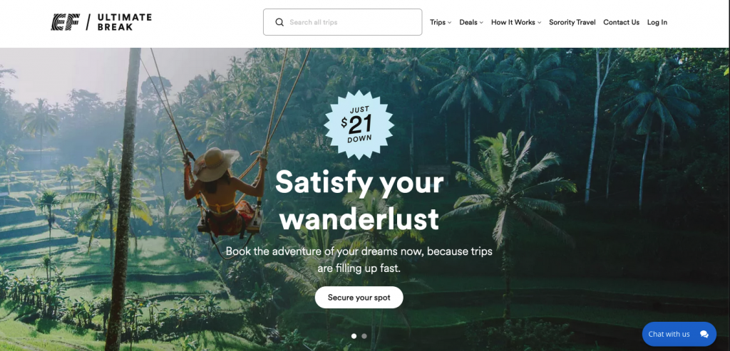
This landing page uses urgency to boost conversion rates and ROI, and it’s doing a great job at it. The imagery is enticing, idyllic, and indeed invites users to go right ahead.
As you can see, all of the vital info is above the fold – the trips, the deals, everything. This solidifies the fact that whatever happens, your leads will be able to find what they’re looking for, whether your page loads appropriately or not. That is not to say that you don’t have to ensure your landing page’s loading times are fast.
Lastly, there’s this sense of urgency that people love to have.
“Trips are filling up fast”.
This, combined with the verbs “Satisfy”, “Book”, and “Secure”, subconsciously promise leads they’ll have a great time upon booking.
The Takeaway
Here is a quick checklist to make the landing page that converts:
- make your design attractive and minimal
- check the loading speed
- create a mobile-friendly landing page
- add call-to-action buttons
- don’t overwhelm with information and promotion
- take care of landing page SEO
Landing page design trends change year-round and follow specific patterns. But some things are for sure.
Make sure that your landing page can load and be viewed on mobile. You can lose a fair amount of conversion if you ignore this and neglect the page’s loading speed. And hitting the “Back” button won’t do you any ranking favors either.
Be very concise on the keywords and SEO efforts – and yes, those apply to your landing pages, too.
And lastly, use whitespace and video on your landing page, and don’t be afraid to mix things up. The last thing your audience wants is for your brand to be dull instead of minimal and easy to comprehend.