The website header is the first section of your site that catches one’s eye. As such, this is your chance to make a great first impression. In this article, we will
- learn what a website header is;
- discover some must-have header elements;
- learn about the best practices to keep in mind;
- discuss great examples of header designs;
- explore how to create an Elementor website header.
What Is a Website Header?
A website header often determines whether a visitor will stay on your site or leave immediately. It is an invitation to browse the website and an opportunity to familiarize clients with the site navigation at a glimpse. That’s why the header should contain noticeable elements like the brand’s logo, a hamburger menu, CTA buttons, and links to the site’s main pages. In this way, the header can prove to be a beacon to direct clients toward the order form or their accounts.
Often, users may underestimate this site element as they regard a header as nothing more than a long, horizontal string at the top of the site. But recently, modern website builders such as WordPress have made this definition redundant
WordPress website header plugins contain numerous design templates that differ in sizes, positions, and presence of elements.
Today, website headers are an area above the menu on the homepage. They are more than just a set of text/buttons, but a field for creative solutions, making them a focal area for any site that wants to use it for advertising or increasing their conversion rate.
Website Header Main Principles
In web design, the website header is the area of a webpage above the content heading. Occasionally, headers contain some of the following elements:
- company logo and contact information;
- a slogan;
- a navigation bar;
- a section to advertise products;
- a CTA;
- a callback button;
- a subscription form for updates or newsletters (including the callback button);
- a search bar;
- a language bar, etc.
Here are the sticky header examples developed with JetPlugins.

Or this laconic one:

There are no restrictions, but you need to scrutinize some elements to build a successful experience for a website developed with WordPress. To design a website header, you should:
- attempting to build a better header or the most creative header, note that all site elements should contribute to site indexing;
- avoid images such as the graphical logo, as it complicates search indexing;
- avoid using numerous graphics or animations because they annoy users by slowing down their browsing speed;
- use technical (not graphical) menus in headers as they have better readability and can be modified easily;
- make sure the header should not interfere with the site’s readability but be convenient and intuitive.
What Are the Must-Have Website Header Elements?
Typically, there is no restriction when it comes to design, but you need to focus on the details. The more widespread elements of website headers have been presented above. Particularly, the website header should be readable but not too creative.
This means that the main element can be a logo, as this site has done:

Other elements can be hidden in the menu, as this site did:

Other sites focus on the search bar:

You can increase the header height of your website to fit the necessary elements:

Some use contrasting fonts to highlight numerous elements:

To sum it up:
- headers vary in sizes, designs, and resolutions but are subjected to the types of elements you want to use;
- the header size should be enough to include at least contact information, logo, and company’s name. You can also include a horizontal menu and a search bar;
- the header design should be laconic, well-structured, and readable (you should use proper fonts);
- too bright and sticky website headers may be completely inappropriate for some websites (medicine, legal services, etc.);
- the header design on the inside page is a short version of the main page header;
- traditionally, header width is 1240px, but height ranges from 200px to 350px depending on the information that should be presented;
- Nevertheless, the header’s width of 960 pixels works for most websites, and The minimal resolution is 1024px.
Although the website header serves a similar purpose from site to site, the main secret is a custom header with a custom size.
Website Header Best Examples
Awwwards.com demonstrates that the sky’s the limit in web design, and header design in particular.

Let’s look at the Best Website Practices 2021 to generalize some common features.
At first glance, minimalism prevails. The following sites preferred this style:

This is one side of the coin, as there is a rather informative site header by Andrea Kuo from Singapore:

A website header by this site from Portugal also deserves attention:
Users will see that some sites present something fun and joyful in both the header and the content, and people prefer sites with minimalist style over video or large headers. You just need to select the element that attracts attention.
How to Create Elementor Website Header?
Currently, WordPress powers 43% of the world’s websites, and among the many page builders for WordPress, users prefer Elementor over Gutenberg or Divi builder. Elementor’s modern builder combines simplicity and visibility with unlimited and unique possibilities, such as:
- 100+ free templates, widgets, and sticky elements;
- autosave and version history, hotkeys (for example, copy/paste, undo, etc.);
- users can apply built-in library fonts, as well as Google, Adobe, and custom fonts;
- complex animation (motion effects);
- end-to-end widgets that can be simultaneously managed;
- automatic insertion of dynamic content into any part of the template;
- HTML-free and live site development;
- teamwork is possible;
- CSS styling and APIs configuration;
- an abundance of free tutorials, and guides, including videos, etc.;
- easy access to plugins and apps (i.e., Crocoblock plugins, Popup Builder, Visual Form Builder, Theme Builder).
Elementor Pro allows you to build any headers you want.
To create a website header with Elementor Pro just go to: Dashboard > Templates > ThemeBuilder > Add New Template > Header > Create Header.
Even an experienced user feels like a child in a candy store, marveling at the unlimited options bars. In general, possible groups of header widgets are:
- Auth Links;
- Hamburger Panel;
- Logo;
- Register;
- Breadcrumbs;
- Login;
- Nav Menu;
- Search Bar;
- Extensions as Sticky Order and Column Order.
You can find more information in this WordPress header templates creation tutorial. If you are looking for a credible alternative for creative header designs, check out Crocoblock’s JetPlugins for Elementor. For example, JetThemeCore will allow you to create website header design templates, and the JetBlocks plugin contains the necessary widgets to fill them with content.
Everyone can create the website header using the free Elementor builder and JetBlocks or JetMenu. Serious projects need custom elements like a cool header or menu, and JetThemeCore with JetBlocks empowers web designers to create a customized site element from scratch.
These plugins customize headers and footers to enrich them, making them well worth the $19.99 price tag. Let’s explore the functionality of the JetBlocks plugin in further detail.
Why Is JetBlocks the Right Fit for Header/Footer Creation?
Once in a while, users will want to expand Elementor’s functionality. In this case, the JetBlocks plugin is one of the best solutions. It targets headers/footers and makes them more than a boring, horizontal line by advancing elements like the search bar, logo, cart, hamburger panel, etc.
Furthermore, JetBlocks has the following features that advance header design and usage:
- Fixing the header to remain at the top of the page when scrolling;
- paying attention to Z-index to position elements on the page;
- specifying section margins, paddings, and different levels of transparency;
- varying options on the background and its shadow;
- adding animations and selecting their transition durations.
Thus, the JetBlocks plugin for Elementor enables both newbies and experienced users to build header templates faster and more efficiently using tools. More details on how to use JetBlocks to make a miracle are here.
Best Elementor Website Headers Built with Crocoblock
Here are the best header examples to follow built by our clients Crocoblock, worldwide. Despite some restrictions in website header designs, their experience in this field has made it possible to specify some features. They are:
- headers of sites for services contain right-side sticky buttons;

- design studios or creative agencies decorating their site headers with their logos;

- slogans (texts) are welcome;

- sites contain the sticky element often pertinent to the logo;

- sites present pictures in the headers;

- for all sites, the search button or box are separated and shaped/colored differently;

- headers comprise intuitive icons of contacts, social networks, carts, etc.;

- headers with Mega Menu and/or drop-down menus;
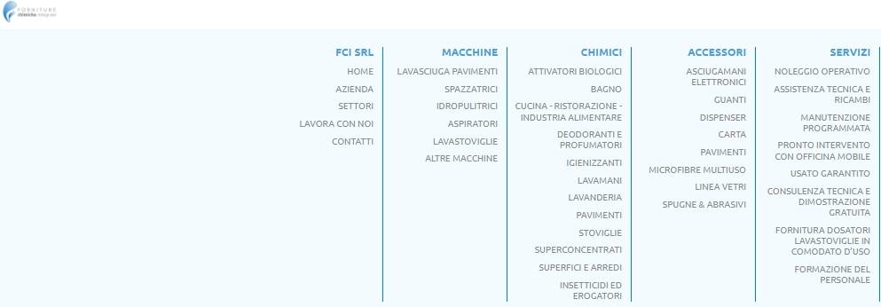
- headers can have short messages;

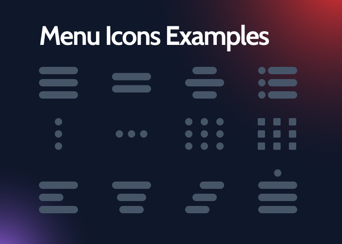
- a hamburger menu varies and contains a different number of lines;
- abandon the header at all;

- put the header anywhere, for example, not on top, but on the side. This is a good idea, isn’t it?
Conclusions
Headers are a crucial aspect of website design, as they determine whether a visitor will engage further with your page or not. Therefore, it is important to create an interesting and convenient header, and Elementor Pro is one of the best tools for the job.
Crocoblock’s JetBlocks plugins for Elementor expand web design creativity for everyone, regardless of coding skills. Small but frequent updates will allow your website to progress dynamically, due to the many useful and interactive features. Creating headers with Elementor Pro, especially using Crocoblock’s plugins, will help you make a great first impression on website guests, and increase the functionality of your page.


