Branding is, very much, a sum of experiences your customers have with your business, including reading. It has long been agreed that typefaces can connote additional meaning over the original meaning conveyed by linguistic structures. In this article, I’ll explain why choosing fonts is essential for brand identity and what steps are necessary to create brand typography.
Table of Contents
- How Fonts Influence Brand Identity
- How to Choose the Right Font for Your Brand
- Use Cases
- Closing Words on Brand Fonts Fonts
How Fonts Influence Brand Identity
It’s hard to imagine a brand that doesn’t use text – it’s in ads, emails, product descriptions, slogans, and logos. That’s why it’s vital to know how the choice of fonts influences readers’ perception of the content and how we can improve communication through text.
Fonts convey meaning. One of the reasons there are so many fonts is that they transmit different emotions and moods. Every font has a distinct collection of connotations and can present your brand differently.
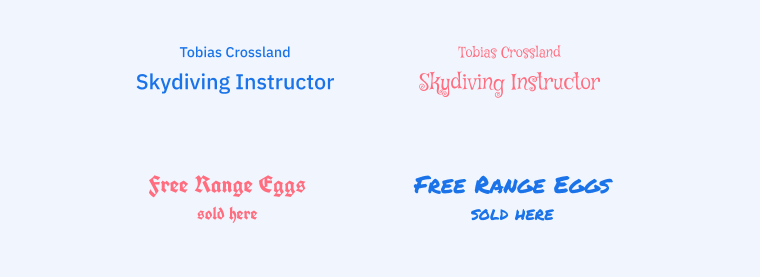
Typography mistakes can make readers interpret your message wrongly and give your brand false meaning.
Typography provides brand recognition. Distinct fonts not only affect how users see your brand but also help them remember it enhancing the brand’s visual identity. By using typography consistently, you improve user experience by providing the feeling of familiarity and trustworthiness. Many big companies, like Coca-Cola and Disney, develop unique fonts to make typography a more influential and memorable part of their brand personalities.
Fonts impact user experience. Your content presents people with the sum of experiences: one is conveyed by the semantic meaning of the words, the second is emotional connotation through letterforms, and the third is the text’s readability. Readability issues can occur because of the wrong font size, contrast, or design and can negatively affect the perception of your brand.
How to Choose the Right Font for Your Brand
Define your brand’s personality
Before picking the right fonts to match and strengthen the brand identity, determine what type of personality you want to express through visuals, including typography. Clarify for yourself the company’s essentials:
- Vision: what are the brand’s aspirations, and what impact does it make on its customers and the world?
- Mission: what is the purpose of the brand’s existence, and what goals does it strive to accomplish?
- Values: what principles are the foundation of the brand’s operations? What beliefs does the company stand by?
You should also think about the audience the brand tries to reach through text materials. Defining their values and challenges is essential for establishing a more understandable brand identity.
Once you’ve clarified these facts, you can articulate the brand’s personality. Think of a brand as a person you need to describe, make it look or sound appealing, and find the adjectives to describe it.
Search for typefaces with matching personalities
You might be surprised to find out that different typefaces are also described with qualities usually attributed to humans. This happens because certain letterforms evoke emotional reactions from readers, and the sum of such emotionally charged elements results in how we perceive particular fonts as a whole.
It’s not always easy to distinguish what designs in the fonts make us feel one way or the other because such emotional triggers work with our subconsciousness. Often they are forms that have historic traits or resemble real-world things.
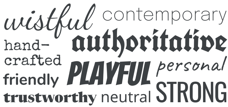
Learning about all possible letter forms that can affect the reader’s perception of the content, and hence brand personality, is time-consuming. As a designer creating brand typography, you must be confident about what moods different fonts convey.
When picking fonts for your brand, read their description. Now that you know what words should be used to describe your brand, pin down fonts with matching adjectives in their descriptions, and find the ones that suit your brand the best.
You should know that all fonts are categorized into groups with common descriptions:
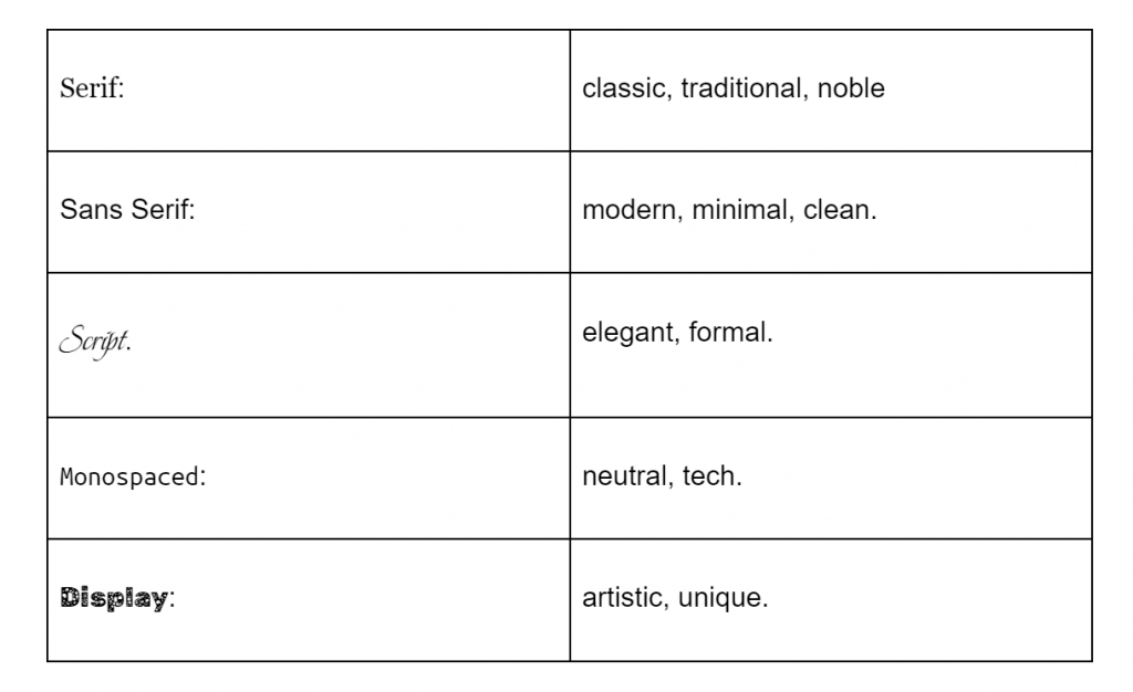
Knowing how the fonts are categorized and what are each category’s traits will help you narrow down your search and pay attention to creating the right tone for your brand.
A combination of category features and unique design characteristics results in an overall font appearance. However, it’s not only an assumption that certain letterforms influence how readers perceive the written message but also defended in scientific studies. For example, this paper reveals the results of an online survey where participants rated 20 fonts using 15 personality adjectives:
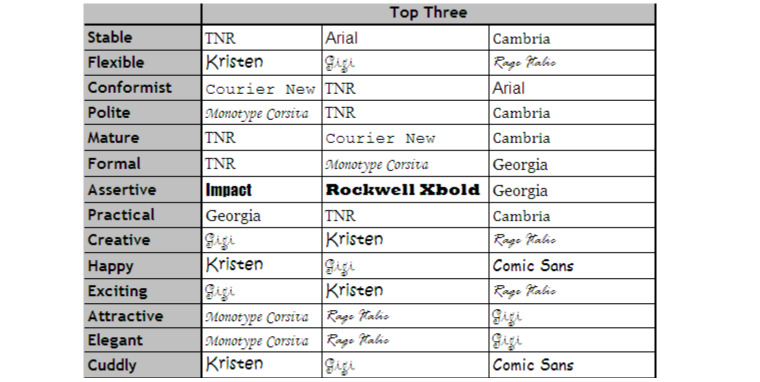
I compiled a list of adjectives used for describing font personalities.
| Abstract Aggressive Attractive Authoritative Businesslike Casual Clean Comfortable Contemporary Cool Creative Decorative Distinct Dominant Dynamic Eccentric Elegant Emotional Exciting Exquisite Fancy Feminine Flexible Formal Forward-thinking | Friendly Fun Glamour Happy Impactful Important Lofty Logical Luxurious Masculine Mature Modern Mysterious Old-school Passive Personal Plain Polite Practical Pretty Rebel Reliable Remarkable Respectable Retro | Rigid Sad Safe Sharp Silly Sociable Sophisticated Stable Strong Stylish Techy Timeless Touching Traditional Trendy Trustworthy Twisted Universal Unstable Vintage Weak Welcoming Youthful |
You will start noticing what letterforms have a crucial impact on the font’s personality as you gain more practice in working with different scripts. Still, don’t choose fonts for the brand solely based on your subjective judgment. You can use your initial emotional reaction to select an array of options but check out font descriptions by font developers and designers to protect yourself from overlooking crucial details.
Choose flexible fonts
Ensure your fonts are compatible with every media (printed and web), as your brand might use them for years to come. It’s necessary to create contrasts to establish font hierarchy and differentiate various text types, so the glyphs must look good in different sizes and weights.
Consider if the fonts you choose can serve such purposes:
- Headings
- Subheadings
- Body copy
- CTAs
- Product packaging
- Emails
- Printed and Internet ads
- Logo
Consider font’s readability
There’s one more way how typography influences readers’ experiences, and that is readability. Any text you create for the brand must be perfectly readable in all sizes. The font you’re using for headings doesn’t have to be as legible as the body text because it’s usually a short piece of content, but still, readers should be available to read it at a glance.
You may notice that the most readable fonts look ordinary and not unique. That’s because glyphs with unusual designs attract more attention than the others, which makes reading slower. It is preferable for large-form texts, like blogs, to use less noticeable fonts.
Hint
Pair neutral fonts in body copy with distinctive ones in headings and subheadings to establish unique brand typography.
Use Cases
There’s nothing better for emphasizing the importance of fonts than looking at examples of successful brands. Let’s see a few brands that put extra effort into developing unique typographies.
The New Yorker
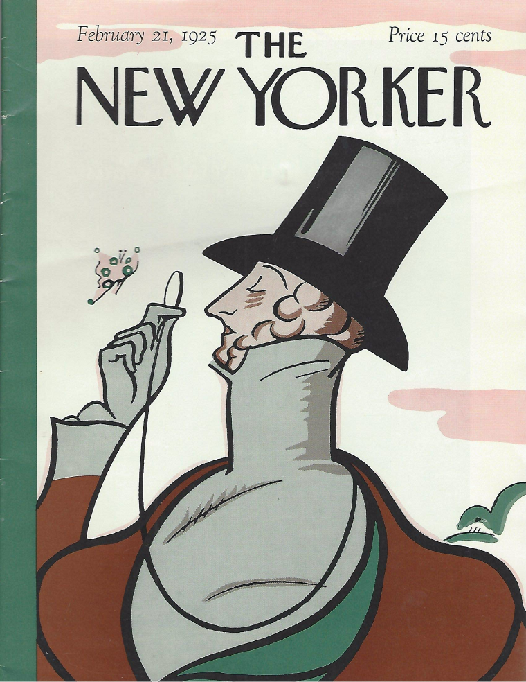
The New Yorker magazine was first published in 1925 and has since covered news, arts, culture, and anything else, mostly with long-form journalist investigations. The New Yorker typography is prominent for using a sans serif NY Irvin font for the title (with little modifications), headings, and subheadings. It’s difficult to mistake this beautiful script for any other because of such distinct forms as slanted “S,” “W” with four spears, a blend of condensed and extended glyphs, etc.
The sans serif typefaces were widely used at the beginning of 20th century for headings and represented modernity compared to classical serifs. In the case of The New Yorker, the design still looks fresh and new, proving that traditions are not synonymous with conservatism. In contrast to other famous New York-based organizations (the New York Post and the New York Times), this magazine has the image of a modern-looking publication with a good laugh, not least through their well-taken-care-of typography.
It’s great to see that brands with outstanding and long histories have confidence in their identities, granting their readers familiarity and contempt.
Paris 2024
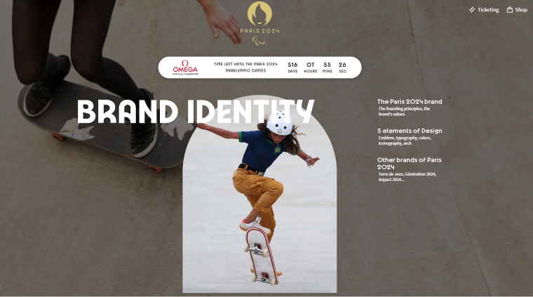
The brand identity for Paris 2024 references the 1924 Olympic Games through the use of an Art Deco-inspired emblem, color scheme, infographics, and typography.
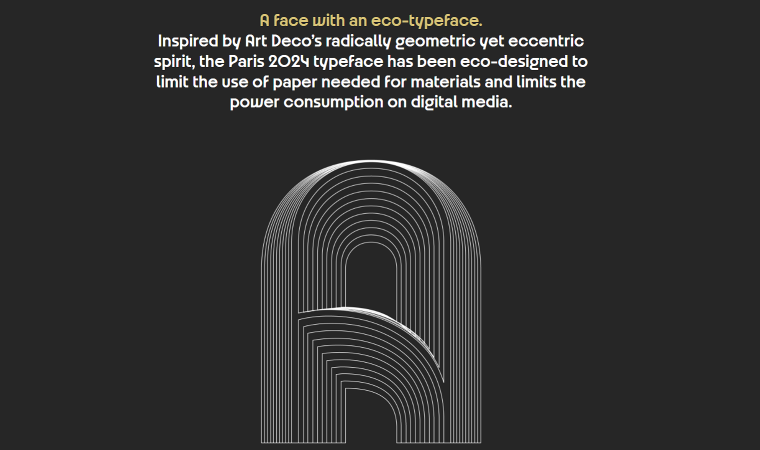
The custom typeface created for Paris 2024 is said by its creators to take its elegance from the French Art Deco movement and its energy from the sport itself. Additionally, the designers rooted such important topics as women’s emancipation and the reduction of power consumption in logo design and choice of brand colors.
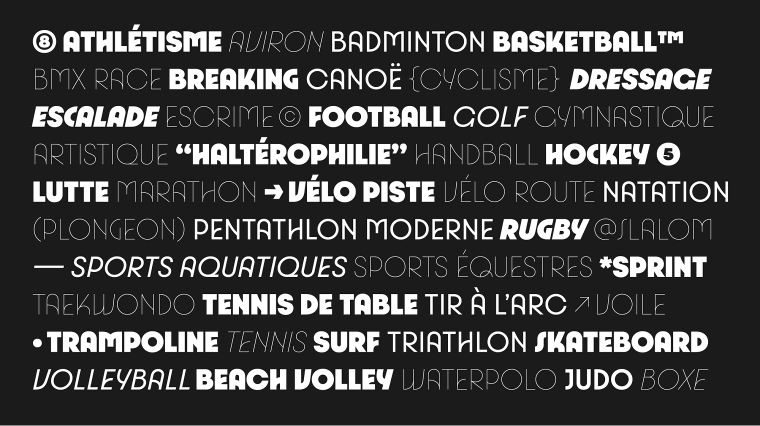
The new typeface offers a variety of fonts spanning seven weights, various special characters, and italics variants to adapt it for all purposes and platforms. Taking into account the enormous amount of resources that will popularize Paris 2024 branding, the distinct letterforms will become indicative of the senses that designers implanted.
Typography as city voice
I have mentioned that many corporations create custom typefaces to enhance their unique brand identities. But it’s not only big corporations that employ certain fonts to make their voices brighter. Many large cities put effort into developing powerful and distinct typefaces that can represent their unique images.
The difficulty with creating fonts for the city is that they not only must be unique but also perfectly legible at a glance, so, for example, they can be used for street name signs and read from a moving vehicle.
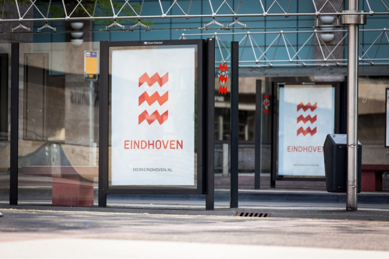
The city of Eindhoven uses a geometric modular typeface with rough edges reminiscent of the city’s logo of three energy bolts in the shape of the letter “E.” The font fits perfectly with the once-industrial city history and transitions the energy of modern dynamic culture.
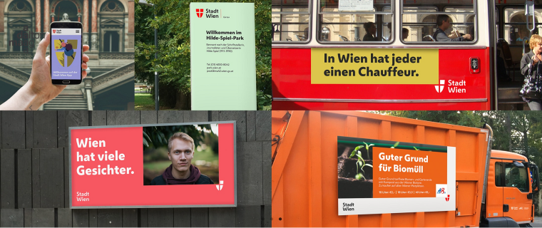
The typeface family employed by the city of Vienna is compact and efficient, with traits of the city’s history and culture. For example, the shapes of the letters “W,” “V,” and “t” pay tribute to the coat-of-arm. Open counters, tilted horizontal lines, and rounded diagonals give the fonts a warm and welcoming feeling while keeping them perfectly readable. With this typeface, the designers enhanced the identity of a modern city with the feel of tradition.
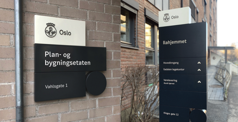
The city of Oslo uses a typeface named Oslo Sans (yes, the typefaces created for cities don’t have very original names). It is simple, clean, and very legible, meeting any design requirements for city use. The timeless sans serif design is enriched with wavy details adding uniqueness to the font’s character.
Closing Words on Brand Fonts
Crafting brand typography is not easy, yet it holds immense significance as it has a direct impact on the success of a business. The right fonts can amplify the brand’s message, foster a deeper sense of trust with customers, and set the brand apart as a distinguished entity among competitors. With its power to evoke recognition and uniqueness, well-designed brand typography is a crucial element in establishing a strong brand identity.
To create your brand typography, follow these steps:
- Define your brand personality.
- Find the fonts that have characteristics matching your brand personality.
- Select fonts that are flexible to serve different purposes and are readable.
Finally, to get inspiration, look at successful brands and consider their typography. Look for brands that express a similar mood to the mood you want to create with your content.


