There can’t be one right answer to what font is best for you without knowing what you need it for. And even after clarifying the circumstances for its intended use, it’s still not easy to pick one: there are over 200,000 typefaces in the world and even more fonts!
This article provides information to help you identify and choose typefaces based on their visual appearance. First, we’ll talk about five basic typeface groups and when they are commonly used, and then I’ll show you some design characteristics to pay attention to when picking a new font.
Table of Contents
Typeface Classification
First of all, let’s clarify the difference between fonts and typefaces. A typeface is an underlying visual design assigned to many fonts in the same type family. So, we use fonts to represent typefaces. Often, these two terms are used interchangeably.
Don’t be surprised when you find a different way to classify typefaces, as some authors may pay value to other factors than me – like historical significance and intent. I feel that the following way to group typefaces is the most convenient for helping web designers choose typefaces.
Serif typeface
Understanding the difference between the serif and sans serif (“without” serifs) typefaces is one of the fundamentals for choosing fonts, although it is quite obvious. Serifs are short strokes added to the ends of the main lines that make up characters. There are a few subclasses in the serif typeface category based on the design of the serif itself, including hairline, curve, wedge, and slabs serifs.
Serif typefaces have a long history, as they were the first ones to be used for printing books and have their roots in Roman square capitals. Old-style fonts like Garamond, transitional fonts like Perpetua, contemporary fonts like Bodoni, and slab serif fonts like Rockwell are famous examples of serif font types.

Serif makes letters more distinguishable at smaller sizes, so serif fonts have been traditionally used in printed newspapers. The Internet version of the New York Times uses Georgia classical font as its main type.
Sans Serif typeface
Sans serif typefaces have no serifs, in contrast to serifed typefaces. They became widespread in the 19th century when advertising and media needed types to create headings that people could easily read from a distance. Sans serifs inevitably became indicative of the modern industrial era.
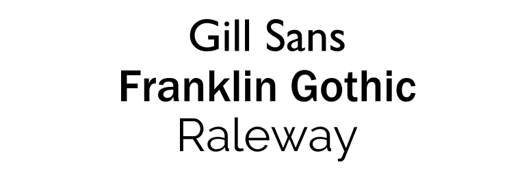
Examples of sans serifs include humanistic typefaces like Gill Sans, transitional typefaces like Helvetica and Franklin Gothic, and geometrical typefaces like Futura and Raleway.
The absence of additional strokes at the ends of the lines is the main visible difference from serif typefaces. Though both serif and sans serif typefaces are used for headings and body text, there’s a clear contrast in the usage of these typefaces. Sans serifs are often considered more casual than formal and traditional serif fonts; hence they are often favored by digital publications and magazines than books and newspapers. The letters are more recognizable without the serifs, so sans serifs are often used in children’s learning materials.
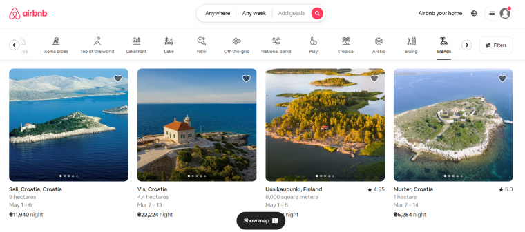
Sans serif fonts are universal workhorses that can be used for titles, body text, and infographics, as can be seen on the Airbnb website.
Script typeface
Script typefaces are designed to resemble characters written by hand with an ink pen, paintbrush, marker, etc. They’re not easy to read, especially at small sizes, so they’re unsuitable for long-form texts. Instead, designers use them sparingly. Script typefaces include formal scripts like Bickham, calligraphic like Vivaldi, and casual scripts like Brush.

These scripts are beautiful and powerful when used correctly. Because they are so diverse in appearance, they can be used in different settings and convey various emotions. Calligraphic scripts are great for movie and book titles, signatures, brand names, and restaurant menu items. Casual scripts often appear as written quickly and suggest informality and friendliness, so they often find their use in advertisements.
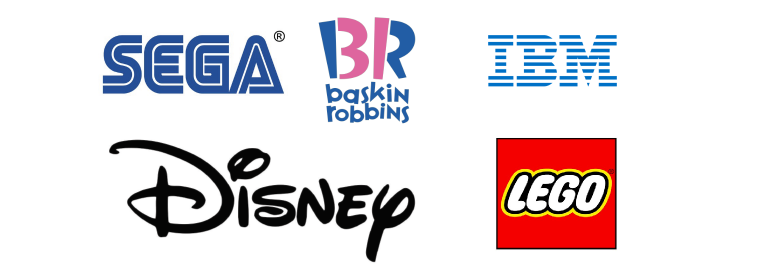
Script fonts add a feeling of uniqueness and timelessness, so they are a popular choice for logos among brands from breweries to tech giants.
Monospaced typeface
Monospaced typefaces are called so because each character takes up the same width. Originally they were invented to fit the requirements of mechanical typewriters and featured some “distinctive” designs such as condensed ‘m’ and oversized serifs on ‘i’ letters that were adopted to serve the font’s functionality.

The uniform spacing means monospaced typefaces are less efficient and generally less legible than serif and sans serif typefaces. They do make it easier to read compressed code syntax, however.
Designers use them in titles and logos to add a nostalgic feeling. And some brands use a monospaced font to bring a unique minimalist style to their websites.
Display typeface
This is the most diverse typefaces category consisting of fonts designed mainly for short-form and large-format applications. Often, they are developed with one specific use in mind and are associated with cultural aspects or themes.
Some display fonts may be based on serif, sans serif, script types, or have unusual letter forms. The only characteristic all display typefaces share is they are always unique and eye-catching. And even though tons of such fonts are available, most businesses decide to develop their own fonts to stand out.
Font Psychology
Learning about different groups of typefaces is essential for choosing the right font for your project. As web designers become more experienced in working with different fonts, they find out which of the type properties are fundamental for creating font design and influencing font style and legibility.
We already touched on font psychology when we made general descriptions of different font types. But even within one typeface class, different fonts can convey different emotions as they have their own personalities. The main psychological factors that evoke feelings and thoughts are cultural hints and associations with real-world traits hidden in the forms of font designs.
Let’s now see examples of font psychology in action.
Slanted fonts convey dynamic energy. Just imagine how runners move – they’re tilting forward. Nike’s logo provides the feeling of motion, and because it uses bold and condensed letters, it also looks powerful and reliable.
You can also use slanted words in body text to express fast speech.
Italic fonts resemble handwritten calligraphy. They’re different from slanted or false italic fonts created simply by slanting the existing upward fonts, and they convey different emotions, too. The Dove logo uses a custom cursive typeface that looks light and delicate. It lacks the decorative details that many script fonts have, emphasizing its products are designed for all people.
Airbnb uses a geometric sans serif font based on the overall roundness of designs. Round forms convey safety and friendliness, and the minimalist style makes it look uplifting and joyful. The Airbnb logo is reminiscent of the font forms, and more symbols are ciphered in it: heart, the universal sign of love, and the location tag sign.
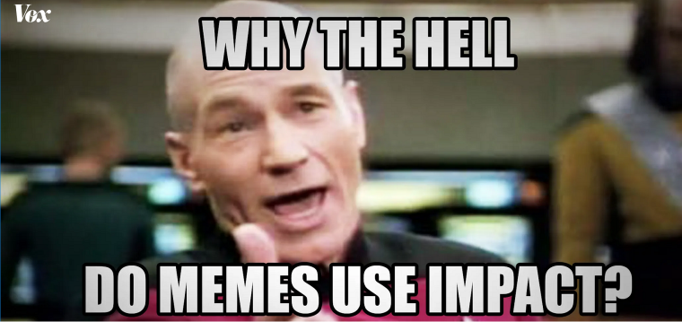
The impact is a bold sans serif font used for headlines and brief ideas. In contrast to the previous example, its design is based on uniform rectangles, which convey trustworthiness. Combined with the thick and dense lines, it overwhelms all other text and provides a strong and even authoritarian tone to the message, making it perfect for punchlines.
In 2008 Pepsi completely redesigned its logo. The new lettering features a distinctive wavy cross in the ‘e’ letter. It pays tribute to the classic Pepsi globe design and resembles a refreshing liquid in a glass. This is how one typographic detail can evoke cultural cues and associations with a real-world thing at the same time.
You need to create a logo that will help you attract the attention of the site’s users. It’s necessary to connect a logo to your brand. There are so many great fonts available for logos these days, like tattoo fonts.
Rules to Make Your Text Readable
While considering the font type is important in determining the style and mood of the text, designers must follow some fundamental principles of typographic composition when creating blocks of text which we’ll discuss in this section of the article.
Letter-spacing
Letter-spacing, or tracking, refers to increasing or decreasing space between characters. By increasing the distance between letters, the text becomes more legible, so by manipulating this characteristic, we can make the readers read faster. However, overly widening the words will make the text layout less efficient. Thus, if it has to be changed at all, letter spacing must be tackled with care.
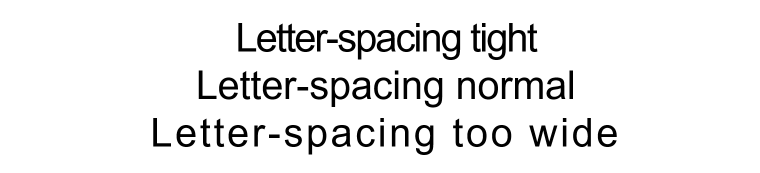
You don’t need to adjust letter spacing when using well-designed typefaces. However, it’s safe to increase letter spacing in these circumstances:
- Words may look clumped at larger scales. You can adjust letter-spacing for headlines.
- Capital letters usually precede lower-case letters. When you write text in all capital letters, the space between them will appear too tight.
- When you’re typing text smaller than 9 points, the letters will start to merge, and reading will become problematic. Use letter-spacing.
Line height
Line height is another font property that is often left at its default values and thus neglected by novice designers. Also known as leading, it refers to the distance between two adjacent baselines in a block of text. Line height is proportional to the type size.
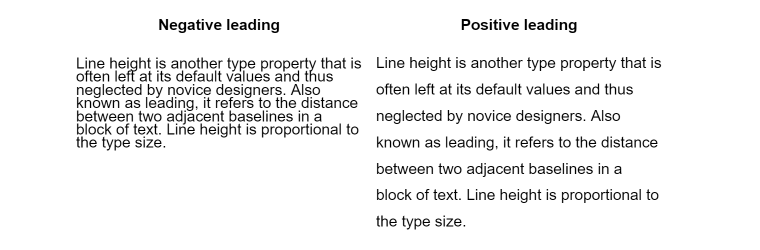
When the line height is set to equal or less than the font height, it is known as negative leading. In such a case, the text appears darker and provides the author with a more serious tone.
Positive leading, on the contrary, provides an elegant and lighter mood and is preferred in advertising. In general, web designers must consider changing the default line height settings to enhance readability depending on the typeface and many other factors.
Here are a few tips to improve line height techniques:
- If the line length of the body copy exceeds 70 characters, increase line heights, making it easier for the eye to find the beginning of each new line. You can decrease leading for texts adapted for reading on mobile devices.
- Use different line heights for different typefaces. Typefaces with a small x-height (distance from the bottom to the top of a lowercase letter), like Baskerville, already provide much white space between the lines compared to typefaces with a larger x-height, like Arial.
- Use tighter spacing between lines for large headings, so it comes as a single strong message.
- When using white type on a dark background, it tends to glow and spark, impairing reading. Try increasing the line height slightly.
Type alignment
Type alignment refers to how the text appears in space relative to the edges of the container. When the type is left-aligned, each line starts at the left margin; when it’s right-aligned, each line ends exactly on the same vertical axis on the right; and when it’s center-aligned, the lines sit in the middle of the space assigned for the text.
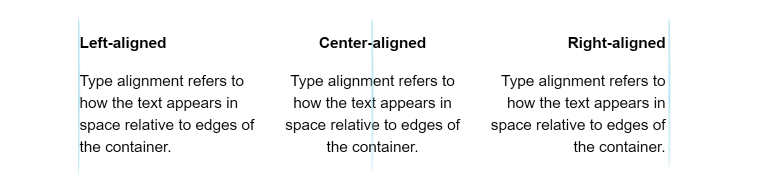
The left-aligned type is the most common option for left-to-right languages. Center-aligned and right-aligned texts are considerably harder to read, so they are not used for long-form texts. Instead, they are employed to distinguish short messages, such as side notes and quotes.
It’s possible to align the text to both sides and make it look perfectly symmetric. Such alignment is called justified text. However, this will create small and big gaps between words, making the reading pace uneven and tiring, so it isn’t recommended for body copies at all.
Summary
Choosing fonts may be difficult if you don’t know where to start. There are so many typefaces it may be tempting to pick any font that seems unique and proceed with your project. However, each typeface has properties that evoke various emotions you might be unaware of. That’s why web designers must approach typography with all seriousness.
Learn how different groups of typefaces are used and which design details affect readers the most before picking the right font. After that, learn to adjust the default font settings to make the text even more appealing and understandable for the audience.
