It is the dream of any web designer: to capture attention and make the visitor feel the idea, the vibe, and the website’s purpose from the very first look, isn’t it? That’s why hero blocks exist. Let’s talk about the best practices and ideas you can implement into your website to capture your clients’ hearts with the help of a hero image.
Table of Contents
- What Is a Website Hero Image?
- Hero Block Types and When to Use Them
- Hero Images: Examples and Ideas
- Tips for Creating a Great Hero Block
- FAQ
- Final Thoughts
What Is a Website Hero Image?
A hero image is a large image or video placed on the top of the main page. Usually, there’s also text and a CTA button. The purpose of this design element is to capture attention and deliver an important message about the brand, product, or service to the visitor using eye-catching visual content. It can take up the whole first screen or have a website banner image size.
Hero Block Types and When to Use Them
Focus on the product
Product in details
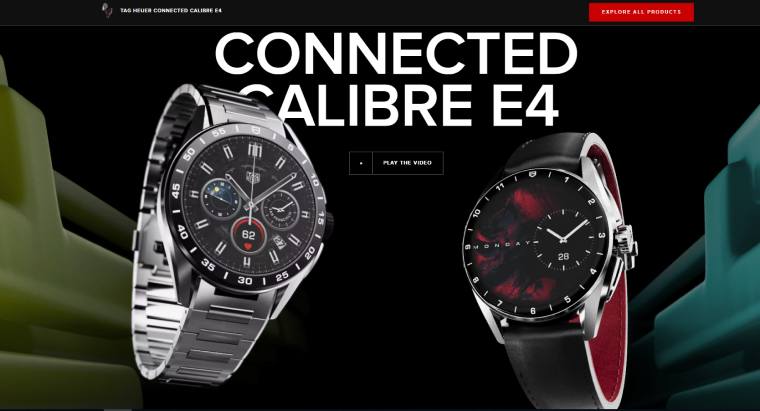
Watches, jewelry, gadgets, and cars are products that can look fascinating if photographed closely because their beauty is in detail. So why not take advantage of this feature and place such photos as a hero image? By the way, the parallax effect will work perfectly with this kind of image to make it feel even more realistic and make clients want to touch it and try it.
Product creation behind the scenes
Luxury brands often use this technique, and for a good reason. When it’s important to emphasize that it’s a bespoke product that requires a lot of attention to every detail, showing behind the scenes is a great way to convince customers that the high price is totally justified.
Product in context
We all have seen those epic aerial videos of the cars racing toward the sunset against the backdrop of breathtaking scenery, haven’t we?
This is a great example of showing the product in context, and it makes customers think not only about the product but how their life becomes better when they own it. Other examples are kitchenware or gadgets involved in making mouth-watering food; beautiful people full of energy using sport equipment; the list can go on and on. Such pictures, in most cases, sell not just a product but a dream about a better life, promoting a lifestyle.
Focus on the person
This person can be either the one representing the brand (e.g., a professional if it’s a portfolio website or a founder if it’s a bigger company) or a composite character of the client, usually portrayed with the help of an illustration.
Such hero images help to establish some kind of interpersonal connection and show that the service of the product is very approachable.
Accent on emotional engagement
Sometimes the service the website promotes is intangible, so the best way to depict it is to show people’s emotions. Charity organizations, funds, and some medical institutions often use this type of hero image.
Emphasizing the idea
Some products and services are even more intangible. Showing people’s emotions will not work here, so you need to use abstract illustrations, animations, and images. Websites of software companies or research agencies are good examples of when such a hero image might be needed.
Bold typography
Typography is another way to depict abstract concepts, but not only. Typography art is a powerful instrument that can be used in any niche, and the key to the success of this type of hero block is a talented designer and illustrator who specializes in this kind of illustration and design.
Hero slider
Using sliders in a hero section is useful when you need to show product variations, emphasize several advantages simultaneously, or show a big assortment of goods in the shop. In this case, it’s important to be creative, use autoplay and pay attention to this block’s technical and SEO optimization.
Hero Images: Examples and Ideas
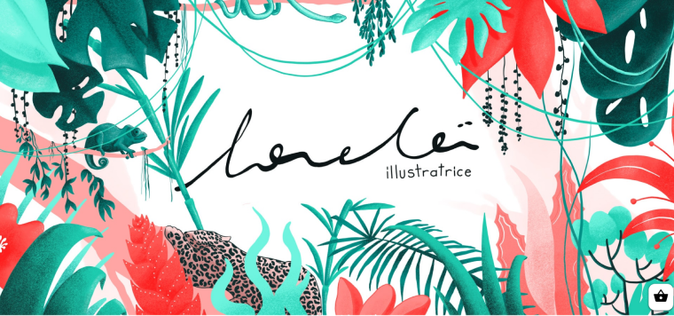
Illustrations and typography
This is a website of a designer and illustrator. And from the first look, the website gives us a clear understanding that it’s a page of a professional working in the visual field.
Engaging interactive Slider
The Mogu Mogu website offers a variety of drinks, and so does the slider, which also has an added parallax effect. This slider is well-optimized, so the page loads fast, it has autoplay, yet pictures can also be changed with click.
Typography that tells stories
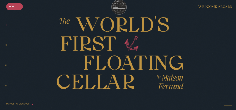
It’s a hero image and the first slide of the landing page that tells the story of the small artisan company that produces spirits and has a floating cellar on a barge. Definitely, this design is a great beginning of this story.
Abstract illustration with animation
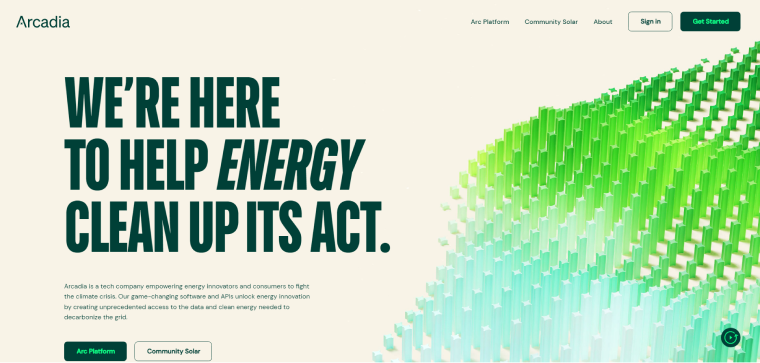
Arcadia is a tech company empowering energy innovators and consumers to fight the climate crisis. And this abstract illustration, with some animation, conveys this mission very well. A similar illustration can be created using a video background or Lottie animation.
Engaging video hero block
Brandt Weine is a Swiss wine online shop that offers a collection of artisan wines. The hero video here is looped but creates a sort of immersive experience and sets the atmosphere.
Minimalistic product hero image
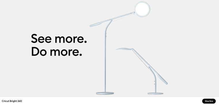
This company makes smart cutting machines and accessories for workshops. Specialized and highly adjustable lighting is one of those products. This image is extremely minimalistic but, at the same time, gives a clear idea that the lighting is very flexible, made for particular purposes, and there’s a button to shop it.
A detailed view of the product with parallax
A classic hero image for watch brands, but it doesn’t make it less visually appealing, especially when enhanced with the parallax effect. By the way, this hero image has a nice unobtrusive button to video presentation instead of placing that video in a hero block – a great solution indeed.
Tips for Creating a Great Hero Block
For creating a better hero image, it’s essential to take inspiration from different sources but also to understand some main principles:
- First and foremost, the hero image or block should create added value and trigger emotions. Imagine the website without that hero block and ask yourself: “Does this website look worse from the user’s perspective? Is something important missing now?” If the answer is “yes,” your hero image is most likely great and does its job.
- Authenticity and brand representation. Unfortunately, there are so many very typical hero images (mainly made of free illustrations) that can be found all over the Internet. If there’s no budget to create the whole set of unique illustrations or make a great photo shoot to use it for the hero block, you can always modify the free graphic to align it with the brand colors and visual style. It’s important because the purpose of the hero image is to give a unique visual impression associated with the brand to be remembered by visitors.
- Don’t use typical photo stock photos of people (I guess we all know “Harold hiding pain,” right?) if you don’t want your hero images to become memes. Use photos of real people instead. Or, at least, photos from stocks where people, their emotions, and the whole setting look more or less natural.
- Hero image should be aligned with the website’s general idea and message. Otherwise, it will simply cause a feeling of inconsistency and a bad user experience.
- Use a hero section to place CTA (Call To Action) and emphasize the USP (Unique Selling Proposition).
- If you do so, and there’s a text with the company’s USP or a CTA button in the hero block, it’s important to reinforce it somewhere else on the same page, so there will be the next logical steps of the customer’s journey.
- Don’t place several CTAs on different slides if you use a slider in a hero block; definitely don’t do it if there’s one image or video.
- Use A/B tests to see which hero image works better.
- Don’t forget about the speed optimization of the hero images and videos. Remember that they are placed on the top of the main page, there are some scripts and styles involved, not to mention the graphics, so it might cause render blocking issues and slow down the page load if not optimized properly.
- Pay attention to hero image size and how it will look on each type of device, including large screens. Certainly, it should be responsive, so it’s better to create a version for mobile devices where the hero block looks just perfect instead of just hiding there.
FAQ
It is a button placed on the top of the hero section, a Call to Action button.
More than half of all website visitors use mobile devices to view them. That’s why a proper mobile version of the site is not just important but essential.
Common sense, a great web designer to create it, a smart marketing specialist to work together with the web designer, and a talented web developer together with the SEO specialist to optimize it.
A hero image width between 1200 and 1600px is considered to be optimal. The height depends on the type of the hero image: either it should cover the whole first screen or be around 500px (in case it’s a banner type of a hero section).
Final Thoughts
Using hero images is a great way to conquer the attention of your target audience and create the right atmosphere. There are several UI/UX rules to follow, as well as performance and SEO optimization guidelines to make it work on a real website. But creativity and bold ideas are still the main ingredients of a great hero section.
