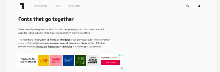
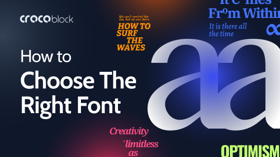
Let’s begin with the riddle: Which element of website design impacts content balance, alignment, hierarchy, contrast, rhythm, proximity, and space? It’s all about typography, particularly fonts.
There are over 550,000 great fonts, and some sites propose font galleries or even hold competitions for the best font. While these fonts can make a site look fantastic, incorrect combinations could potentially hinder a project’s success.
While choosing typography is a vital aspect of website design and can be enjoyable, it’s important to strike a balance. Overusing various design elements is often a novice mistake, whereas selecting inappropriate fonts can be noticeably detrimental to the site’s overall appeal.
Let’s talk about how to choose the best font combinations for websites. In this guide, I’ve gathered some life hacks and rules to make your website picturesque and efficient.
Why Do Fonts Matter?
Readability and content comprehension are directly connected to typography. At the same time, fonts and their positions are visual elements in web design. Well-chosen fonts and font pairings enhance the site’s aesthetics and create emphasis during reading, often serving as a cornerstone of the design. The size, width, and color of fonts significantly influence user interaction with the site in the following ways:
- contribute to the brand style;
- highlight the crucial info by making the accents;
- complement graphic balance;
- draw attention to specific sections of the site.
Exploring Font Styles
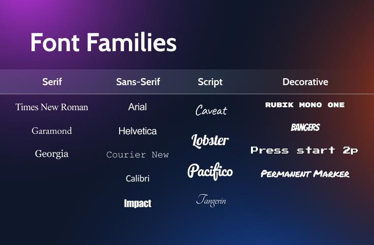
What exactly is a font? Let’s look at the main font styles and how people usually perceive them. There are the following font families:
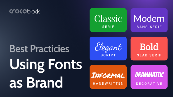
- Serif fonts, characterized by small lines or strokes attached to the ends of their letters, convey a sense of tradition and formality, often used in print media.
- Sans-serif fonts, lacking these embellishments, offer a clean and modern look, making them ideal for digital screens.
- Script fonts mimic handwriting, ranging from elegant calligraphy to casual cursive, adding a personal, artistic touch.
- Decorative fonts, with their unique and often thematic styles, are used to grab attention and create a specific mood or aesthetic.
Interestingly, despite the vast array of stylish options available, most websites stick to basic fonts. There are numerous ways to experiment with font combinations, such as using a font pairing chart, testing appearances through CMS platforms, website builders, font selection services, font pairing collections, or font pairing generators.
Sharing Typography Basics
How to find the font? Fonts and font combinations are key design elements in web design, as evidenced by Awwwards nominees. Here are the best practices in this area:
- Typography fonts should complement the overall site design and align with the company’s business profile, much like a brick-like font on a construction company’s website.

- All fonts should be large enough to be easily readable against the background.

- Even standard fonts are OK. Arial is a good font for the designer’s site.
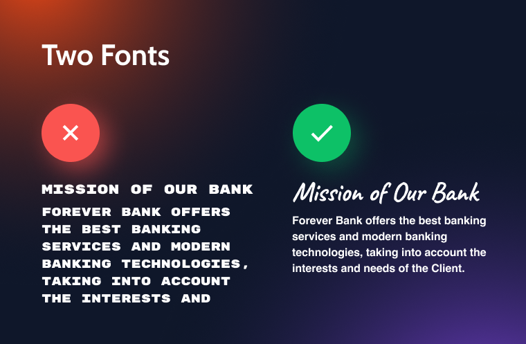
- There is no need to use many fonts; two fonts are enough.

- Weird fonts are great for promotion only.
Choosing the Right Font
The general recommendations here are the following:
- Consider the target audience and avoid overly artistic fonts for conservative groups. For example, don’t use comic fonts or acid colors for professional sectors like legal firms and banks.
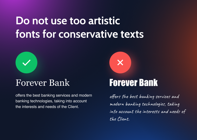
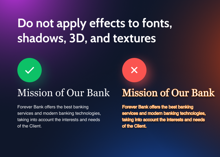
- Do not apply effects such as shadows, 3D, and textures to fonts, as they interfere with the text’s legibility and perception.
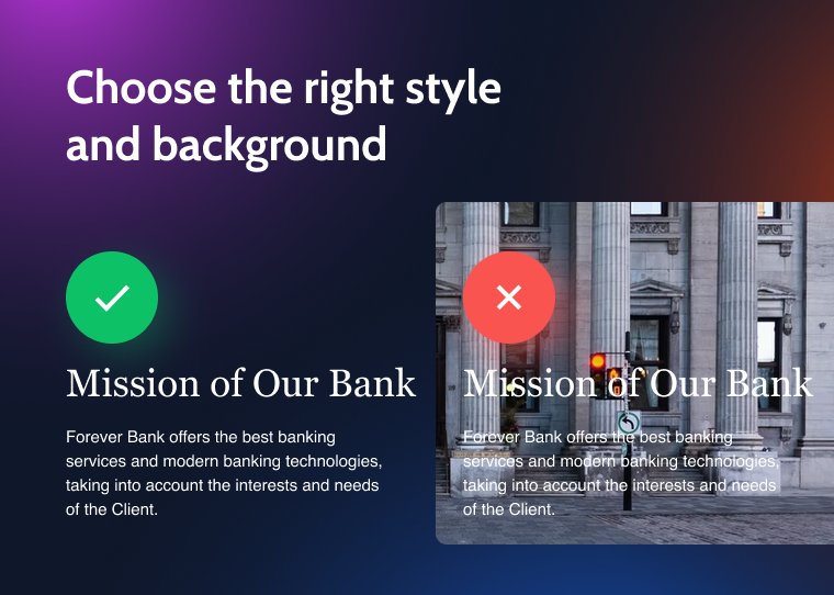
- Use a uniform style for the content and choose the right background.
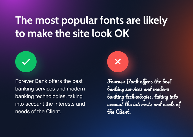
- Using the most popular fonts is the tried-and-true method to make your site’s typography appealing and effective.
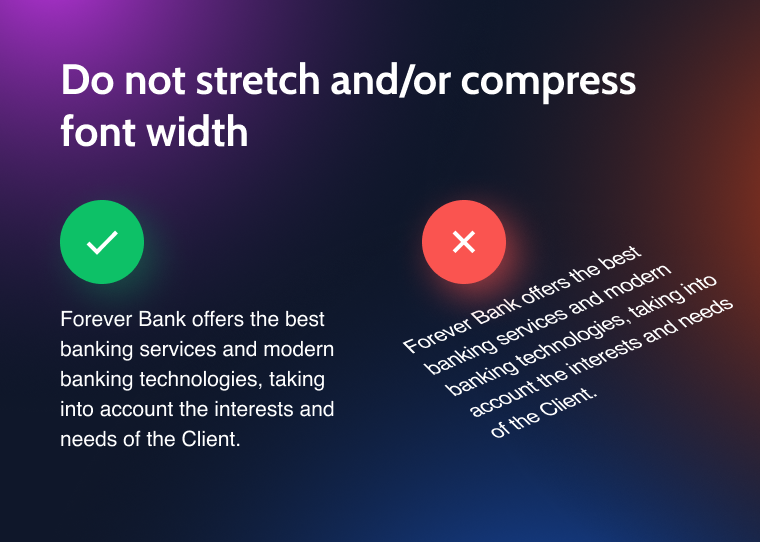
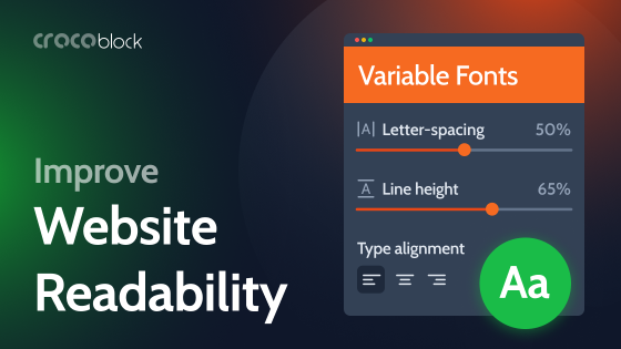
- Stretching or compressing font width reduces its readability.
- Avoid adjusting the spacing between letters excessively or making text rows too dense.
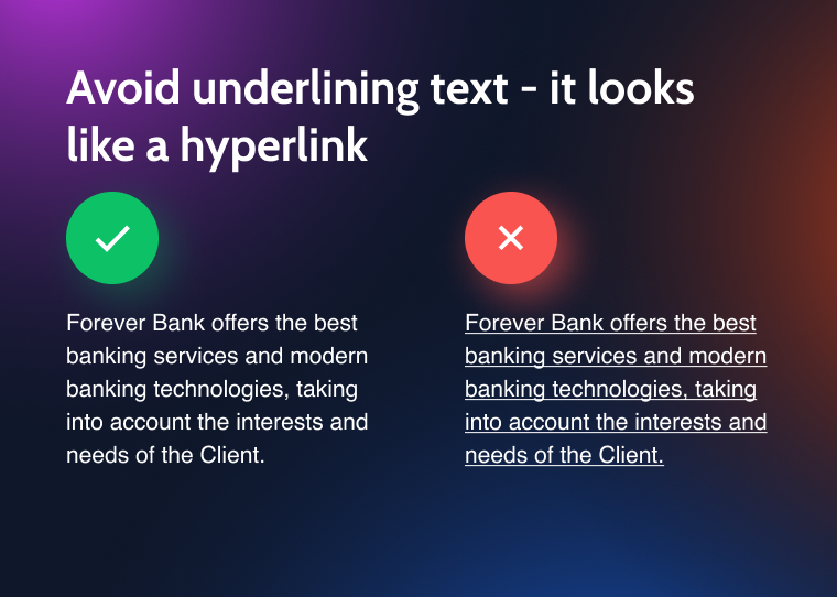
- Underlined text looks like a hyperlink and decreases readability.
- A row with a single word at the end of a paragraph or the beginning of the next column is visually unappealing.
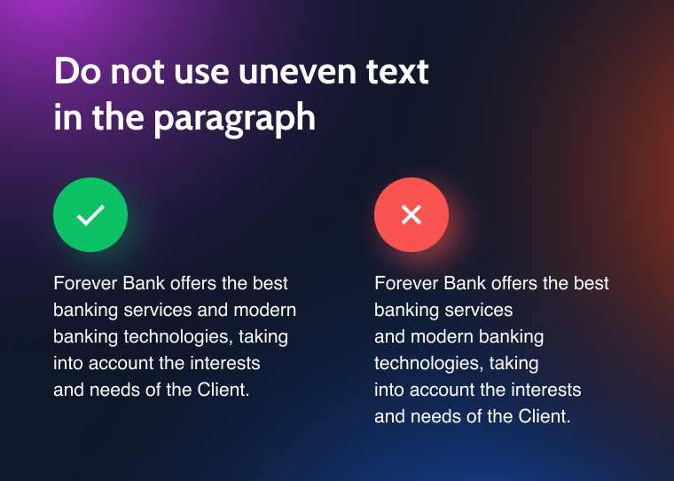
- Too much uneven text in the paragraph looks distracting.
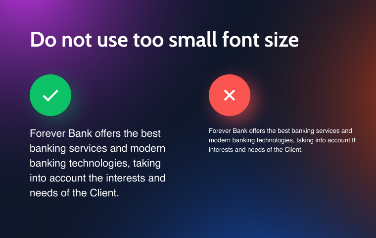
- A font size that is too small makes the text illegible.
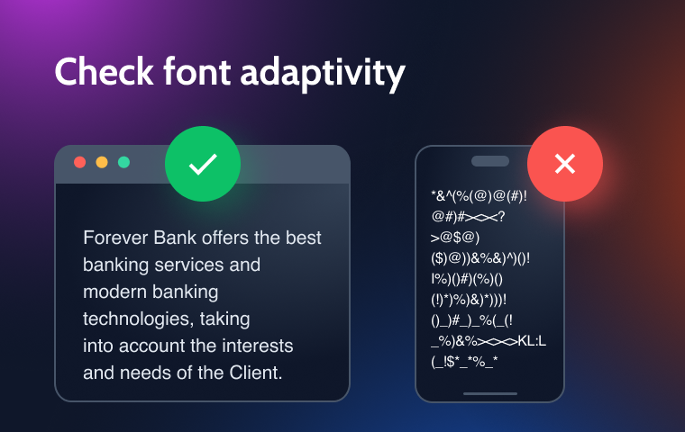
- Consider font adaptivity to different browsers and devices, and use system and web fonts, as well as font libraries.
That was an overview of single font usage. Next, I’ll discuss the interplay of fonts, focusing on pairings and combinations.
Font Pairing Best Practices
Successful font combinations rely on principles of harmony or contrast, where fonts either share common features or are distinctly different.
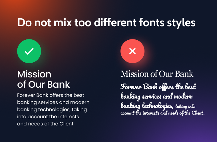
Poor font combinations often result from mixing excessively different fonts and font families or blending styles that are too contrasting.
The images below illustrate the good (right) and bad (left) font combinations.
- Combining a serif font for the headlining with a sans serif font for texts often provides attractive results.
- Balancing the font size on the page is crucial, as people are more likely to leave the page than zoom in on their browsers. The preferred font size ranges from 14 pt (text) to 25 pt (headings).
- Manipulating font size provides a method for establishing a visual hierarchy. For example, make the H1 title 300% larger than the body text font size and the H2 title 200% larger.

- Limit your design to two fonts, including bold and italic variations, to ensure sufficient contrast in the text. Avoid using italics for headings and body text simultaneously; instead, consider using a script font for titles and italic styling for the main text.
Font Combination Tools
When selecting fonts and font combinations for a project, it’s better to explore a wide range of options. Pairing multiple fonts, which could be time-consuming, is easier with online font combination tools. Here are some of my top picks.
Fontjoy
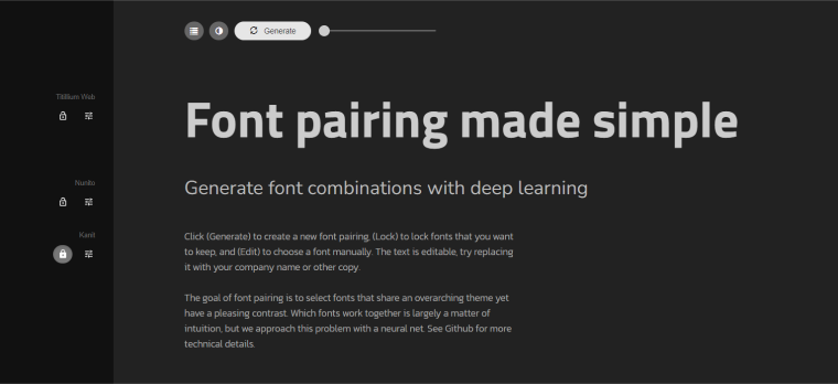
Fontjoy is an online AI-driven tool that generates font pairings using deep learning. Users can adjust a slider to control the contrast between selected font combinations, making it easier to find visually harmonious or contrasting fonts for their projects.
The user interface of Fontjoy is intuitive and easy to navigate: select a font for a heading, subheading, or body text, lock your selection, and click the ‘Generate’ button to explore AI-suggested font pairings tailored to your choices. Use the ‘Contrast-similar’ slider to experiment with various matches.
Fontpair
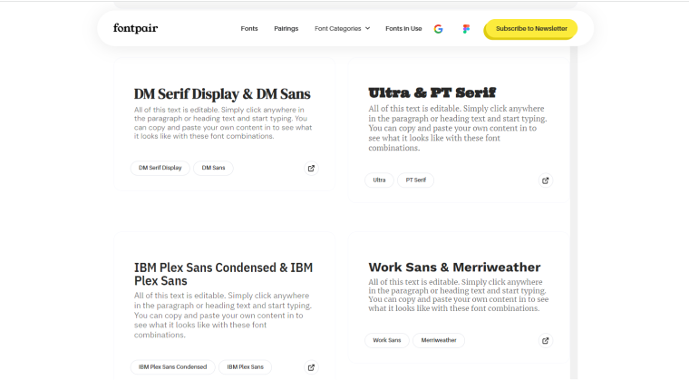
Fontpair is an online resource that simplifies selecting complementary font pairings. This tool offers a curated selection of font combinations, primarily focusing on Google Fonts, to ensure compatibility and ease of use for web projects.
The interface of Fontpair is straightforward and user-friendly: users can browse through a variety of pre-selected font pairings for headings and body text. Each pairing is displayed with sample text, giving a clear preview of how the fonts will look together. Fontpair is ideal for those who prefer a more guided approach to font selection, providing reliable and aesthetically pleasing combinations with minimal effort.
Typ.io
Typ.io is a dynamic online tool designed for exploring and discovering effective font combinations. It showcases real-world examples of font pairings used on various websites, providing users with practical inspiration.
The interface of Typ.io is engaging and informative, helping users understand the context in which the font pairs are used. Additionally, Typ.io offers insights into popular styles in typography, making it a valuable resource for designers seeking to blend creativity with current trends. This tool is especially handy for those looking to see how font pairings translate in real-life applications.
FAQ
A font is a specific design of textual characters, including size, weight, and style variations. In typography, fonts encompass different typefaces, each with unique features that give the text its distinct appearance.
Choosing the right font pairing involves considering the purpose of your website, the content’s tone, and your brand identity. Aim for a balance between readability and aesthetic appeal, and consider using no more than two or three fonts on a web page.
Visual hierarchy in typography is the arrangement of text that guides the reader’s attention to the most important information first. It’s achieved through varying font sizes, weights, and styles to distinguish between text elements, such as headings, subheadings, and body copy.
Conclusions
Nothing detracts from a site’s aesthetic quite like a poor font combination. Thus, selecting the right font pairings is crucial for enhancing style, usability, and overall appeal. Not every font can be aesthetically pleasing and well-suited for your specific needs.
Before choosing fonts, consider the roles they will play within the framework of your site’s objectives. They can prompt visitor action, highlight key points, or convey a sense of aggression or lyricism in the text. For expressiveness, mix fonts from different families, such as serifs and sans-serifs. To create visual cohesion, select fonts from the same family.
With various options available, the right font combinations can significantly enhance your design and spotlight crucial information. However, inappropriate choices in font style, width, or spacing can deter users. Ideal font pairings typically involve no more than two or three harmonious sets of characters. The fonts should complement, not compete with, one another. Limit the number of unique, extravagant, or bold fonts to just one within a combination to ensure readability and balance in your typography.