Today, engaging store visitors with interactive, dynamic content is more important than ever. This article will help you get started with Crocoblock’s JetElements widgets for Elementor. I’ll walk you through the process of adding interactive functionality to your WooCommerce store using an assortment of powerful widgets.
Table of Contents
In my demo on the test store Zolden, I’ll showcase several widgets, including a Headline, an Image Comparison, a Section Parallax effect, a Scroll Navigation widget, an Animated Box widget, and a Posts widget.
Top Widgets for “Your Ultimate Style Guide” Store Page
The Zolden test store serves as a live case study, giving you a real-world example of how these widgets come together on a modern, interactive website. Here’s the structure of the page section:
- Section 1 includes:
- Headline widget;
- Text widget;
- Button widget;
- Section Parallax adds depth with smooth scrolling effects on background images for a more engaging experience;
- Scroll Navigation improves UX by allowing easy navigation between sections;
- Section 2 includes:
- Headline widget;
- Animated Box adds animated content blocks to highlight key messages or calls to action;
- Section 3 includes:
- Headline widget;
- Image Comparison creates an interactive before-and-after slider to showcase wardrobe transformations;
- Section 4 includes:
- Headline widget;
- Shortcode widget displays the product table using JetProductTables;
- Section 5 includes:
- Headline widget;
- Tabs widget contains three tabs, each displaying a different product group dynamically via JetProductTables;
- Section 6 includes:
- Headline widget;
- The Post Grid widget displays some blog posts in an organized grid layout.
My Zolden-based demo site is designed to show how combining these elements can lead to a highly interactive and visually appealing WooCommerce page.
Step-by-Step Guide
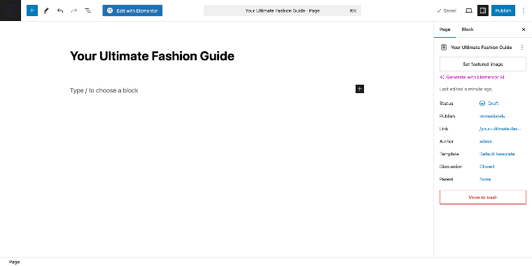
So, let’s start by going to WordPress Dashboard > Pages and clicking on “Add New Page.” Name your page, in my case, “Your Ultimate Fashion Guide,” and then click on the “Edit with Elementor” button.
Section 1 — Hero area
In this section, I add several widgets, including a Headline widget, and customize them to fit the website’s design. It will be a hero section that will contain:
- Headline widget (JetElements widgets section);
- Text Editor widget (Basic widgets section);
- Scroll Navigation widget (JetElements widgets section);
- Button widget (Basic widgets section).
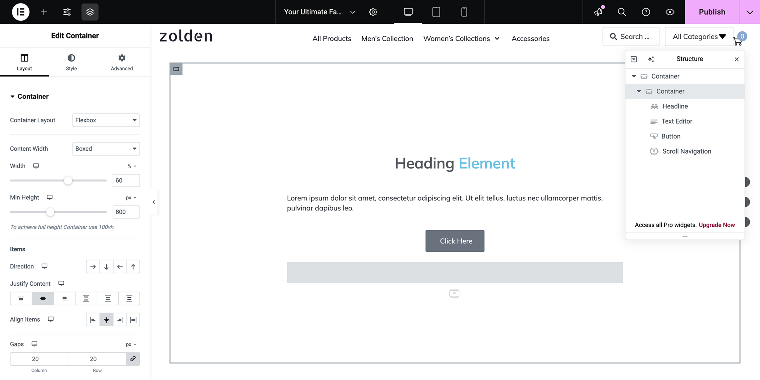
When the Elementor editor loads, I click on the “Add New Container” button, which has a “+” icon.
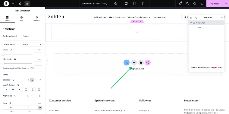
Since I want my content to cover only the middle part of the page, I need to add another Container and fill it with the rest of the widgets.
For the second Container, I’ll use the following settings. The container’s Layout tab:
- Container Layout — set to “Flexbox”;
- Content Width — set to “Boxed”;
- Width — set to “60%”;
- Min Height — set to “600px” (on Desktop);
- Justify Content — set to “Center”;
- Align Items — set to “Center.”
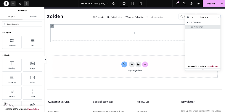
Now, I can add the rest of the widgets. I’ll toggle the Elements panel by clicking the “+” button. To save time, one can use search to find these widgets.
You can also go to the JetElements section to find a Headline and Scroll Navigation widget and to the Basic section, where the Text Editor and Button widgets are located.
As a result, I’ll get something like this:
Now, I’ll customize the widgets one by one.
Headline widget
I’ll apply the following set of settings.
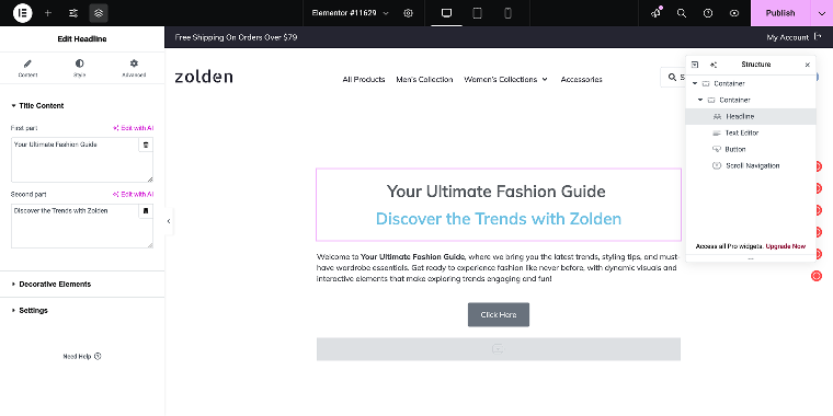
The Layout tab:
- Title Content section
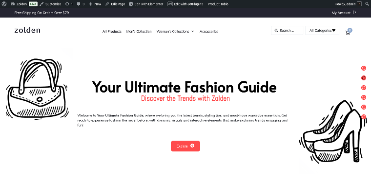
- First part — in this field, I’ll set the value “Your Ultimate Fashion Guide”;
- Second part — in this field, I’ll set the value “Discover the Trends with Zolden”;
- Settings section
HTML Tag — in this field, I’ll select the value “H1.”
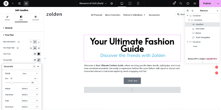
The Style tab:
- First part:
- Vertical Position — set to “Center”;
- Text Alignment — set to “Center”;
- Text Color — set to “#000000”;
- Typography — in the Family select field, I’ll choose “Alata”;
- Size — set to “60px”;
- Second part:
- Text Alignment — set to “Center”;
- Text Color — set to “#FF4C4C”;
- Typography — in the Family select field, I’ll choose “Abel.”
Button widget
I’ve set the Normal state button color to “#FF4C4C” and the border-radius to “10”; you can alter other states if you like.
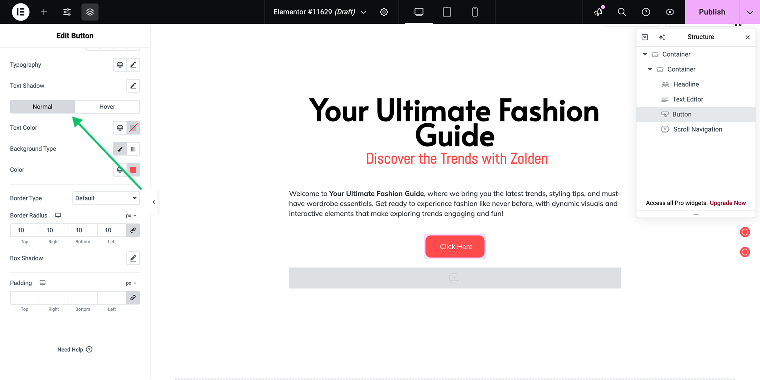
When clicked, the button will scroll the page to the second section, so I’ll go to the Advanced tab, Layout > CSS ID, and set its value to “section_2.”
Section Parallax
First, I have to enable the parallax by going to the WordPress Dashboard > Crocoblock > JetPlugins Settings > JetElements > Widgets and Extensions, scrolling down to the Available Extensions, and activating the switch Section Parallax Extention.
Now, let’s get back to the page editor; in the settings of the main Container, I’ll go to Layout tab > Section Parallax.
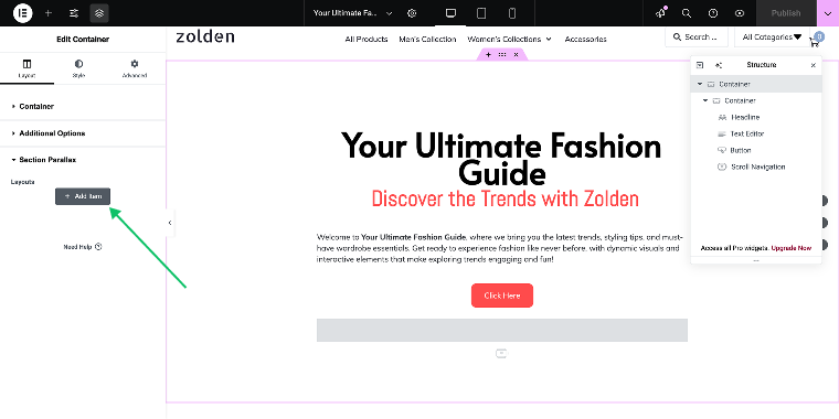
Here, I can click on the “+ Add Item” button to add a parallax layer. I’ll add two items, one on the left upper side of the page and the other on the right bottom side of the page. For this, I need some graphic items, so I’ll go to the Freepik website to download a Fashion Icons Set. From this set, I’ll choose a bag and shoes.
I’ll apply the following set of settings:
Item #1 — a bag
- Parallax Speed — set to 27%;
- Background X/Y Position — set to “0” values;
- Parallax Type — I’ll select the “Mouse move”;
- Animation Property — set to “Transform 3D.”
Item #2 — shoes
- Parallax Speed — set to 20%;
- Background X/Y Position — set to “100” and “90,” respectively;
- Parallax Type — I’ll select the “Mouse move”;
- Animation Property — set to “Transform 3D.”
Let’s check the result.
Scroll Navigation widget
The last widget in this section is Scroll Navigation. It creates anchor points on your page that make it easy for users to navigate between different parts or sections of your page.
By default, the widget has three pre-created items, but since my page has six sections, I’ll add three more. Since I’ve already added it to my page, I’ll click on it to open the settings.
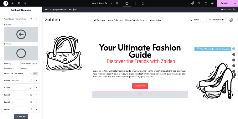
I’ll apply the following set of settings. The Content tab:
- The Items section:
- Hint Icon — in this field, select the icon that is displayed at the end of the hint tooltip, and the Dot Icon is what’s inside the bullet. For the first, I’ll choose the “Arrow,” and for the second, “Circle”;
- Label — in this field, type the main title of the section the same I’ll do for the rest of the sections;
- Section ID — in this field, you need to set the CSS ID for the entire container/section rather than an individual button (as we did above). This ensures that when a navigation bullet is clicked, the page scrolls to the correct section. To do this, select the container/section in the editor, go to the Advanced tab, locate the CSS ID field, and enter the same ID value used for the navigation bullet.
- In the Settings section, adjust the Scroll Speed to “0” while keeping all other settings unchanged. It will ensure instant scrolling without hiccups.
The Styles tab:
This tab allows customizing the visuals.
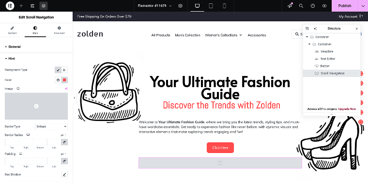
Change only the colors of the Hint and Dot to “#FF4C4C.” To do so, go to Dots > Normal. Then, within Dots Style, click on the “brush” icon to change the Background Type to “Classic” and enable the Background Color field.
Let’s check the result on the front end.
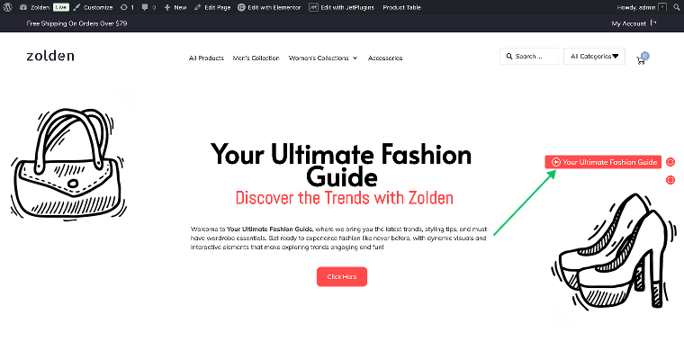
The page currently has only two bullets since I added only two containers. Now, let’s move on to the next section.
Section 2 — Animated Box widget
In this section, I’ll use the Animated Box widget to create engaging content blocks or highlight special announcements. First, I’ll add a container, set its CSS ID to “section_2” (Settings > Advanced > CSS ID), and link it to the Scroll Navigation widget for smooth scrolling. Then, I’ll customize the widgets.
Headline widget
Now, I can duplicate the Headline widget from the previous section and apply specific settings. In the Content tab, the Title Content field will be divided into two parts: “Fashion” and “Essentials.” In the Settings section, the HTML Tag field will be set to “H2.”
Animated Box widget
Before adding this widget, I’ll add another container. I’ll set its Container Layout value to “Grid,” which will allow me to place the Animated Box widgets in columns. I’ll also set the number of rows to “1” since I’m going to add only three boxes.
This ensures a clean and structured layout for the Animated Box widgets. To add a widget, click the “Add Element” button to toggle the widgets panel and type “animated box” in the search field.
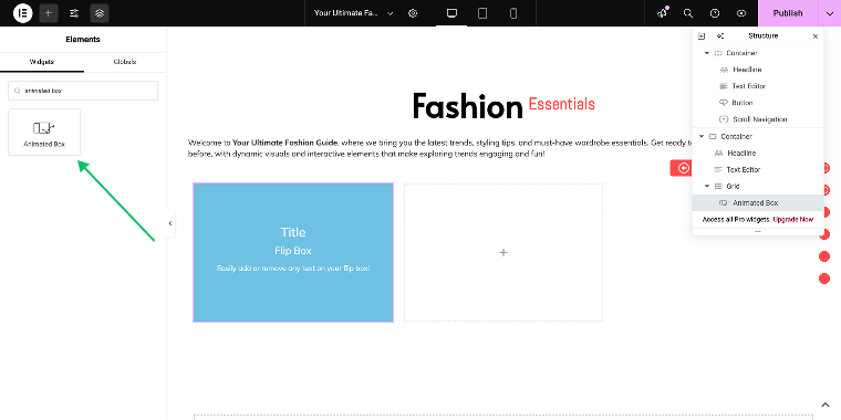
In my setup, all three Animated Box widgets will function as follows: the front side will display an outline graphic of a garment, while the back side will feature an actual product image. When a user hovers over the box, it will rotate, revealing the product image along with a button that links to the product’s page.
For this widget, I’ll apply the following settings. The Content tab:
- Front Side Content:
- Content type — I’ll leave the “Default” value;
- Title — I’ll enter the value “White Shirt”;
- Description — I’ll enter “A timeless classic for any occasion.”
- Back Side Content:
- Button text — I’ll enter the value “Buy a shirt” and remove the rest of the values;
- Settings:
- Height — set to “300px.”
The Style tab:
- General section — “Front”:
- Background Type — I’ll select “Classic” to reveal the Color field;
- Color — set to “#FF4C4C”;
- Overlay subsection:
- Background Type — I’ll select “Classic” to reveal the Image field;
- Image — I’ll select the outline graphics file;
- Overlay subsection:
- General section — “Back”:
- Background Type — I’ll choose “Classic” to reveal the Image field;
- Image — I’ll choose the product image.
The settings for the rest of the widgets are similar. Now, let’s preview it on the front end.
Widgets perform really smoothly, so let’s go to the next section.
Section 3 — Image Comparison widget
In this section, I’ll add the Image Comparison widget, which allows visitors to slide between two images to highlight changes. First, I’ll create a container, set its CSS ID to “section_3” (Settings > Advanced > CSS ID), and link it to the Scroll Navigation widget for smooth scrolling.
Headline widget
Right after that, I’ll duplicate the Headline widget from the previous section and apply a new set of settings. In the Content tab, the Title Content field will be divided into two parts: the first part will contain “Before & After,” and the second part will include “The Power of Styling.” In the Settings section, the HTML Tag field will be set to “H2.”
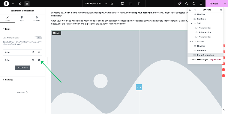
Image Comparison widget
To add the Image Comparison widget, click the “Add Element” button to toggle the widgets panel, type “image comparison” in the search field, and then drag it into the Container.
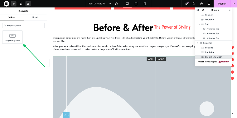
The Image Comparison widget functions as an image slider by default. You should add two images to each slide so users can compare them on the front end.
For my use case, I don’t need multiple slides, so I’ll keep only one. The third section showcases the impact of the Zolden store on users’ wardrobes by using the Image Comparison widget to illustrate how plain black clothing transforms into vibrant outfits suited for various occasions. Here are the settings.
The Content tab:
- Items section — in the image selector, I’ll choose Before and After images.
The Style tab:
- Handle section Normal state:
- Background Type — in this field, I’ll select “Classic” to reveal the Color field;
- Color — in this field, I’ll enter the value “#FF4C4C.”
The widget has many other visual settings, so feel free to play with them. Now, let’s preview the result on the front end.
The widget performs smoothly, so let’s go to the next section.
Section 4 — Product table by JetProductTables
In this section, I’ll add the dynamic table to display WooCommerce products using the JetProductTables plugin to display products dynamically. First, I’ll create a container, set its CSS ID to “section_4” (Settings > Advanced > CSS ID), and apply it to the Scroll Navigation widget for smooth scrolling.
Headline widget
I’ll duplicate the Headline widget from the previous section and apply a new set of settings. In the Content tab, the Title Content field will be divided into two parts: “Your Fashion” and “Your Way.” In the Settings section, the HTML Tag field will be set to “H2.”
Shortcode widget with the product table shortcode
To add a product table, I need to install the JetProductTables plugin. It’s available on the Crocoblock website starting at $43/year.
This article does not discuss the process of table creation. Instead, you can refer to the following guides and walkthrough articles to learn more about JetProductTables’ capabilities:
- How to Create a Preset for Product Table
- How to Generate a Shortcode for Product Table
- How to Showcase Product Table on the Front End
- How to Build Product Comparison Tables for Different Use Cases
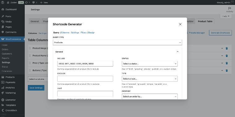
After installation of the plugin, you’ll be able to create a product table through the WordPress Dashboard > WooCommerce > Product Table section. To display the product grid on the front end, you need to generate a shortcode using the Shortcode Generator tool, which will look something like this:
[jet_woocommerce_product_table attributes='{"columns":%{{"_uid":"11552","id":"product-image","label":"","image_size":"large","linked":true,"custom_size":"","value_format":"%s"},{"_uid":"44025","id":"product-name","label":"","linked":true,"is_sortable":false,"value_format":"%s"},{"_uid":"64203","id":"product-price","label":"","is_sortable":false,"value_format":"%s"},{"_uid":"54835","id":"product-actions","label":"","quantities":false,"variations":"dropdown","value_format":"%s"}}%,"filters_enabled":false,"query":{"include":"8630, 8611, 8552, 8565, 8596, 8658","limit":"6"}}']I’ve already created a 4-row table that displays six bestselling products. I’ve selected six product IDs and added them to the INCLUDE field in the Query section of the Shortcode Editor.
To display my product table on the front end, I need to add a Shortcode widget.In the Shortcode field, I’ll paste the product table shortcode that I previously generated. The product table will look like this on the front end.
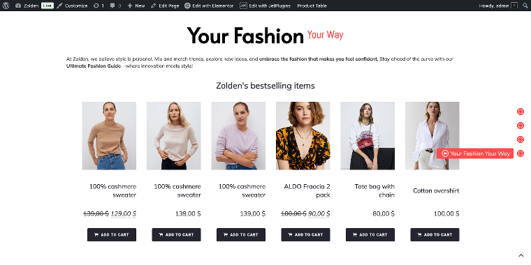
The table looks really clean, so let’s move on to the next section.
Section 5 — Tabs widget by Elementor
In this section, I’ll add a Tabs widget to showcase three product groups. I’ll create a container for the section, set its CSS ID to “section_5” (Settings > Advanced > CSS ID), and link it to the Scroll Navigation widget for smooth scrolling. Then, I’ll add the remaining widgets.
Headline widget
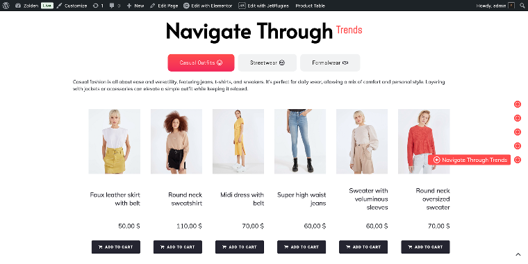
I’ll duplicate the Headline widget from the previous section and apply a new set of settings. In the Content tab, the Title Content field will be divided into two parts. The First part is set to “Navigate Through,” and the Second Part to “Trends.” In the Settings section, the HTML Tag field will be set to “H2.”
Tabs widget
Now, I can add the Tabs widget. You can find it in the General widget section or by using the search function.
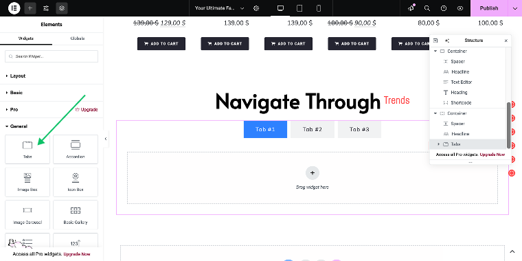
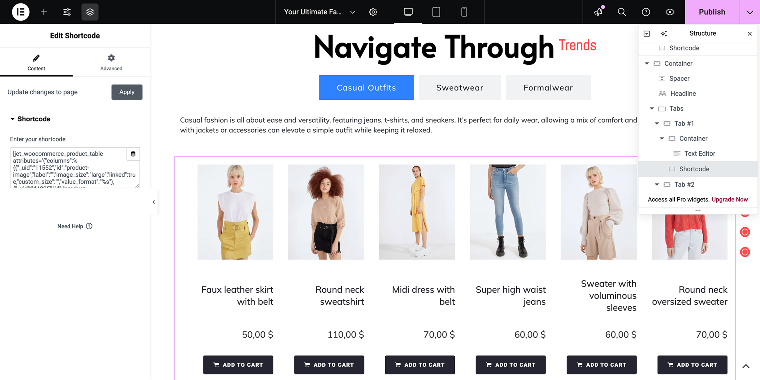
This widget lets us nest multiple Elementor widgets within the tabs, but make sure the Nested Elements feature is activated in Elementor > Settings > Features. In my case, I’ll add a short description (via the Paragraph widget) for each of the three product groups (“Casual Outfits,” “Streetwear,” and “Formalwear”) and a Shortcode widget to insert a product table shortcode, just like in the previous section.
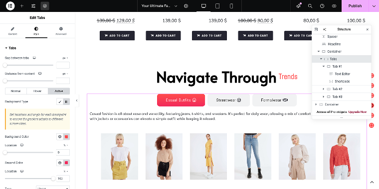
Once I’ve added content to all the tabs, I need to modify the styles to ensure they align with the overall design of the page. Let’s go to the Styles tab of the widget to alter the looks.The color of the Normal state of the tabs is fine with me, but I will modify the background color for the Active state. Regarding the overall styles, I plan to change the border radius and add some icons to the tabs.
Finally, the Tabs widget will look like this on the front end.
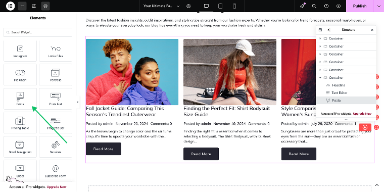
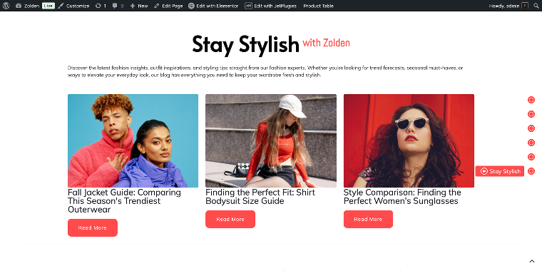
Section 6 — Posts widget
Finally, I’ll add the Posts widget to display blog posts or custom post types in a grid-based layout. But first, I’ll create a container, set its CSS ID to “section_6” (Settings > Advanced > CSS ID), and link it to the Scroll Navigation widget for smooth scrolling.
Headline widget
I’ll duplicate the Headline widget from the previous section and apply a new set of settings. In the Content tab, the Title Content field will be divided into two parts: the First part will be set to “Stay Stylish,” and the Second part will be set to “with Zolden.” In the Settings section, the HTML Tag field will be set to “H2.”
Posts widget
To add a Posts widget, open the Add Element panel and type “Posts” in the search, or go to the JetElements section to find this widget.
By default, the widget shows various metadata, and I plan to remove it for a cleaner look.The Content tab of the widget settings allows us to access various settings. To remove the metadata, I need to scroll down to the General section.
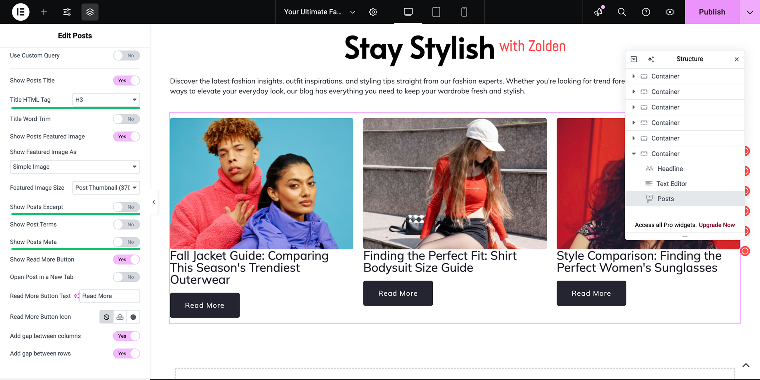
- Title HTML Tag — “H3”;
- Show Post Excerpt — “No”;
- Show Posts Meta — “No.”
To match the button appearance with the earlier settings, navigate to the Styles tab and select the Button section.
The Style tab:
- General section — “Normal”:
- Background Type — in this field, I’ll select “Classic” to reveal the Color field;
- Color — in this field, I’ll enter the value “#FF4C4C”;
- Border radius — “10px.”
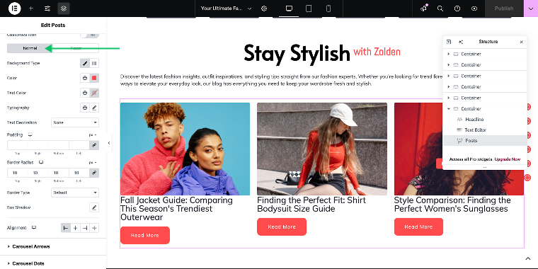
This looks fine; let’s check the section on the front end.
FAQ
Yes, interactive widgets are compatible with most WordPress themes. However, for the best experience, it is recommended that you use Elementor with a theme that supports full-width layouts.
Interactive widgets let you display content that updates automatically based on user interactions or database changes, leading to a more engaging and personalized experience for your visitors.
Each section needs a unique CSS ID, which you’ll input in the widget’s Section ID field.
No, JetElements and the accompanying Crocoblock plugins are built for users with little to no coding experience. You can simply drag and drop the widgets and configure them to suit your needs.
Conclusion
By following this guide, you now have a blueprint for transforming a static website into an interactive one using Crocoblock’s JetElements widgets for Elementor. Whether it’s setting a bold headline, creating engaging before-and-after comparisons, adding visual depth with Elementor parallax sections, or making navigation a breeze, these tools help elevate your website’s design and functionality. With additional widgets and plugins like the JetProductTables, you can organize content in a way that’s both user-friendly and visually appealing.
I encourage you to experiment with these widgets on your site. This Zolden demo is just one example; imagine the possibilities when you add this dynamic functionality to your projects!