When designing a website, there are certain principles of web design you need to keep in mind. For comparison, it’s worth thinking about your experience when you go shopping in person.
When you walk into a store, you need to feel like you are in the right place. You want to see the types of products you are interested in buying. It needs to be nicely laid out, clean, welcoming, and not too overwhelming.
The same is true when you visit a website. You will only stick around if you feel like you are in the right place and it is a pleasant experience.
Here, I look at 19 web design principles for you to keep in mind when creating a new website or improving an existing one. These could be considered usability heuristics as they are mostly general principles rather than strict rules you must follow.
Table of Contents
- Common Principles of Web Design
- Use of Space and Layout
- Other Web Design Principles You May Not Have Considered
- Summary
Common Principles of Web Design
Many of the web design principles in this section might seem like common sense, but it’s good to be reminded of them. Otherwise, it can be easy to overlook them and make fundamental design mistakes.
Huge walls of text are a big NO
Of all the web design principles, this is the most basic, but it is a mistake often made by people more used to writing for print.
Writing for the web is very different from writing for print. When browsing the web, people tend to scan to find the key information they are looking for rather than read through all the text in sequence.
So, don’t have pages upon pages of large paragraphs like it’s a novel. Nobody will read it.
Break up your text with clear, bold subheadings, and keep paragraphs relatively short. Also, add relevant images to further break up the text.
Keep it consistent but engaging
When you think of particular brands such as Amazon, Google, or Coca-Cola, you immediately bring to mind their visual identity. This is why branding is so vital.
When designing a website, it’s important to give the whole site a consistent look and feel. Use the same fonts, colors, layouts, and logos across all pages.
However, you still need to keep your website engaging, so throw in a few surprises here and there to mix things up a bit.
Web designer Charli Marie says it is important to have what she calls “design patterns,” which are a set of rules for your design. She explains the principle in this video:
Make pages easy to navigate
According to a study by Clutch.co, 94% of people say that easy navigation is the most essential aspect of a website.
People will usually come to your website looking for specific information. If they cannot easily find what they came looking for, they will leave. There are plenty of other websites they can visit instead of yours.
The YouTube channel DesignCourse has some excellent tips for improving your website’s navigation:
Use clear buttons and calls to action
If you want visitors to take a particular action, have clear buttons that jump out at them and are easy to click, even on mobile devices. Make sure to use colors that make the buttons stand out against the rest of the website.
Another great example is the BudgetNista website, which has two obvious buttons — one at the top and one further down in the main content:

Marketing expert Matt Diggity has some excellent tips in this video:
Choose your images carefully
A picture paints a thousand words, or so the saying goes, and that’s certainly true with good website design. Images can fulfill many functions on a website, from telling a story, to creating atmosphere, to showing how a product works.
But not all images are equal, so you must be careful with your choices and ensure they enhance your design rather than spoil it. Make sure they are high-quality, high-resolution images and fit the overall look you are aiming for.
Flux Academy has a great video as part of their free web design course, which explains how best to use images when designing a website:
Make it fast and mobile-friendly
59% of website traffic is via mobile devices, and 53% of visitors leave a website if it takes longer than three seconds to load. So, your website needs to be optimized for mobile and fast.
Jack in the Net has a very helpful video showing you how to make your website look great on mobile:
Make it self-explanatory
Of all the web design principles, this one is perhaps the most self-explanatory. But I am going to explain it anyway. 😀
Don’t make your visitors think any more than they have to. When someone arrives on your website, it should be obvious what it all means. When designing it, be sure to get rid of any uncertainties.
An excellent example of this is ExpressionEngine:
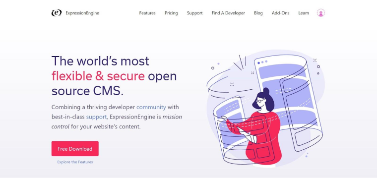
The text you are immediately presented with clearly and concisely tells you what it’s all about. Also, it has a clear call-to-action button to download it for free.
But if you are still unsure and want to find out more, there are links in the top menu to Features, Pricing, etc. It’s all very straightforward.
Understand your audience
When making design decisions, keep your target audience in mind. For example, an online toy store might be designed for children, using lots of bright colors, big round fonts, and childlike imagery. But who is going to be buying from the store? Parents, of course. So, you need to keep that in mind.
An excellent example of a website that fits its target audience is Discount Equestrian, a horse-riding accessories store:
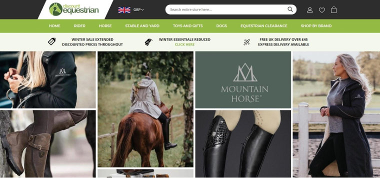
You can see that it fits the audience well. It has images of horses, horse riding boots, and people wearing the clothing in an outdoor setting. Also, the use of various shades of green fits in nicely too.
Keep it simple
It can be tempting to try to make a website as visually stunning as possible. But often, simpler is better. People are usually visiting your website to find information or a product. They have not come to see a bunch of fancy novelty website features.
So, ensure your design does not get in the way of your visitors finding what they are looking for.
An example of a website that’s too visually overwhelming is LingsCars.com:
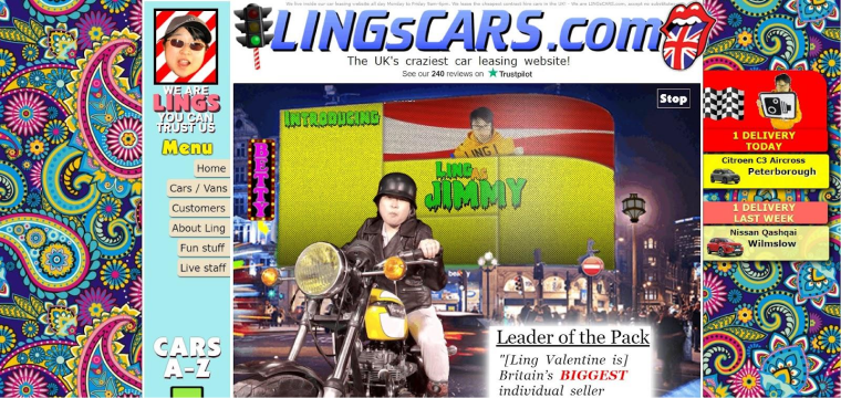
There’s just too much going on on that site. You don’t know where to look or what to click.
An excellent example of a website that manages to be eye-catching and colorful without being too overwhelming is TerrierAgency.com:

Yes, there are some bright colors, but the message is clear and straightforward. There are not too many things competing for your attention.
Use readable and accessible fonts
When deciding on the fonts for your website, you will want to find those that fit the brand’s personality. However, you also need to ensure the fonts have proper colors (contrasts) to be readable and accessible.
According to W3 Schools, the best web-safe fonts are Arial, Verdana, Tahoma, Trebuchet MS, Times New Roman, Georgia, Garamond, Courier New, and Brush Script MT.
According to Siteimprove, the best accessible fonts are Tahoma, Calibri, Helvetica, Arial, Verdana, and Times New Roman.
Italian designer Massimo Vignelli said that designers only need six fonts: Garamond, Bodoni, Century Expanded, Futura, Times Roman, and Helvetica. Flux Academy explains it in this video:
Use of Space and Layout
It’s important to consider how items are laid out on the page, their relationship to each other, and the space they sit within. Some of the following web design principles are known as Gestalt Principles (gestalt is German for “unified whole”).
Make use of white space
White space, also known as negative space, is the area around the various content items on the page. This is not a new design concept, as it has been around for as long as people have been creating art. But it is particularly important in professional website design.
You might be tempted to fill every available space on each page in the hope that something captures your visitor’s attention. But this will only overwhelm them with too much information in one go.
A classic example of a website that makes excellent use of white space is Apple:

Here you can see how there is plenty of space around the images of the computers.
Make it symmetrical
We like it when things are symmetrical, as it gives us a sense of balance. But symmetry need not be boring. For example, take a look at Adam Dannaway’s website:
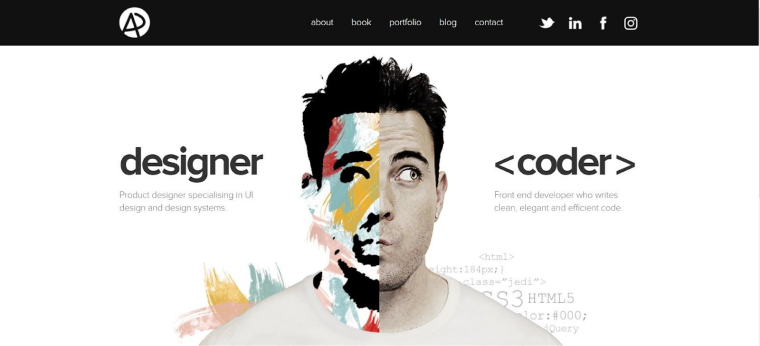
Here, he is perfectly positioned in the middle of the page. Yet the two sides of his face look completely different. The left side looks more artistic to reflect his work as a designer, and the right side looks like an ordinary photo to reflect his work as a coder.
Consider using a grid layout
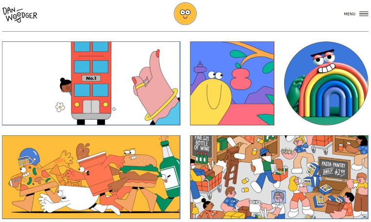
To make your website more symmetrical, you might want to use a grid layout. That doesn’t mean you need to make it look like a spreadsheet with obvious grid lines. Instead, you could separate the different sections of the pages with empty spaces.
An excellent example of this is FoodGawker:

A fun example is Dan Woodger:
Group related items together
According to the Law of Common Region, people tend to perceive items as being related if they are clearly grouped together. This doesn’t mean they have to be tightly packed next to each other. You can achieve the effect by having a border around them or defining a background behind them.
Looking at the Foodgawker website above, you can see how the descriptions relate to the foods because they are within the same clearly defined boxes.
Use Z or F patterns
When we scan through a webpage, our eyes often tend to move in an F pattern. For example, we will read important headlines, then scan down the left to look for bullet points, numbers, or sidebars, and then across to the right again when we come across subheadings or bold text.
Another common scanning pattern is the Z pattern. It’s similar to the F pattern, but instead of going down the left side, our eyes go diagonally from top-right to bottom-left before going from left to right again along the bottom.
Designzillas explains these patterns in this short video:
The F pattern is best for content with lots of text, such as blog posts. Whereas the Z pattern is best for your homepage or a landing page.
Other Web Design Principles You May Not Have Considered
While many of the web designing principles mentioned above may be familiar to you, below are some that you may have yet to come across. But they can be just as crucial in creating a website that is optimized for a positive user experience.
Don’t test your visitors’ patience
Many websites exist to offer products, services, or tools. If you want your visitors to access what you are offering, you need to minimize the demands you place on them for that to happen.
Don’t force visitors to fill out a long form before they can even explore your site and see what products or services are available. People only want to go through that effort if you have already proven to them that it’s worth it.
One good example of a website that doesn’t waste your time is Compressor.io:
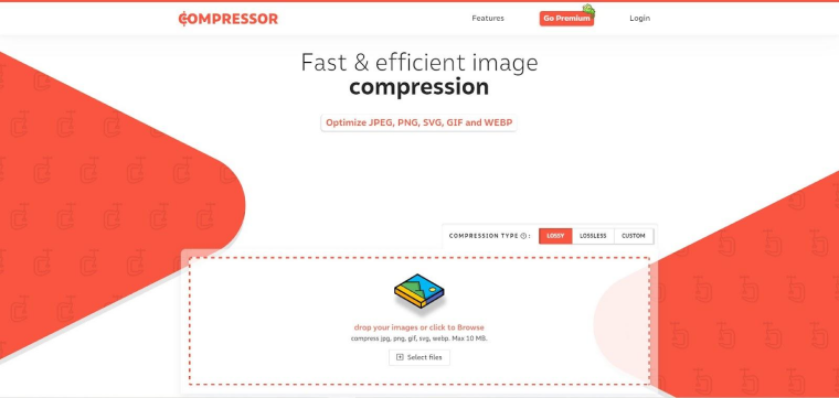
You don’t need to create an account. You just upload an image file, and it turns it into a smaller file size. But if you want to compress unlimited files, you can sign up for a Premium account after you’ve already tried it.
Don’t overload visitors with too many options (Hick’s Law)
Related to the previous principle is Hick’s Law, also known as “decision fatigue.” Essentially, this states that for every extra choice someone has to make, they take longer to decide.
So, limit the number of choices you present to your visitors. That way, they are likelier to pick one of them than if you gave them so many they felt spoilt for choice.
An extreme example of a website that limits your choices is Google Web Designer:

Here, you can see that there is only one option immediately presented to you – Download Web Designer. The decision is simple: do you want to download Web Designer or not?
Highlight the best option(s)
If you are providing several options for your visitors, you can help them decide by highlighting the best one.
Amazon often does this. For example, if I search for “multivitamin,” it provides me with over 1,000 results. However, it highlights two products at the top, Amazon’s Choice and Best Seller.

So, this narrows it down to just two choices – either the one Amazon recommends or the one most people buy.
Test, test, and test some more
Of all the web design principles mentioned here, this is the one you definitely should NOT skip.
Designing a great website is about more than just creating something that works well from your point of view. You need to test it with independent users. You cannot test it yourself, as you are too familiar with it. It needs to be tested by people unfamiliar with how it was developed.
But you can’t just test it once. You need to begin testing early on in the design process and then repeatedly test throughout the project to iron out any issues as they arise.
There are various websites out there that provide website testing services. People can sign up to earn money as independent testers, and if you are developing a website, you can apply to have it tested.
Summary
Phew! You’ve reached the end! That was a lot to go through, I know. But it just goes to show how many important factors go into making an awesome website.
But some of these web design principles will be more important than others, and that will vary depending on the type of website you are designing.
Fundamentally, though, it all boils down to trying to put yourself in your audience’s position based on your experience, and remember, you are creating websites that other people would use. So, answer the questions with users in mind:
- What would you be looking for when you arrived on the website?
- What would make you stick around?
- What would make you purchase?
- What would be a big turn-off and make you go elsewhere?
Anyway, I hope you found this helpful and informative.

