Do you know that the most widely used browser button is the button closing the window? Just a few seconds are enough to lose clients because chances are they will judge a book by its cover, i.e., a product by a site design.
Any eye-candy site is always well-ordered. Web design ordering means structuring the content and ranging it by importance. The grid in CSS is a set of crossed vertical and horizontal lines to create a site template. But this template is not rigid. Every variation in the content is possible.
Any web page design highlights the product benefits and contributes to usability. Therefore, the web grid is a tool for site hierarchy. So, answering the question, “What does a grid mean?” I’d like to say that website pivots around the grid.
Therefore, the grid is not just a table. It is a tool to control specific modulus to make your site more effective by positioning the most crucial information according to eye-tracking patterns. Wonder what the good news is? You can build this table by yourself.
Table of Contents
What Is a Website Grid?
The basic principles of information positioning stem from the publishing business, and modern web design reflects its best traditions. To organize the content on a web page and help users read and navigate, designers use a framework of horizontal and vertical lines called website grids. Without grids, it’s more difficult to ensure consistent alignment and spacing of elements, leading to a less professional website look.
Grids can be simple and consist only of a few vertical columns for content alignment or complex, containing a variety of structures.
Website grid components
Website grids typically include columns, which divide web pages into distinct vertical sections. They provide invisible lines which allow us to place content elements within the borders of one or more columns.
Usually, the number of columns depends on the screen size. The 12-column framework is a popular choice for full-screen devices because it allows splitting screen space into six, four, three, and two even sections. There’s no need to use more than four column grids for the smallest screen sizes.
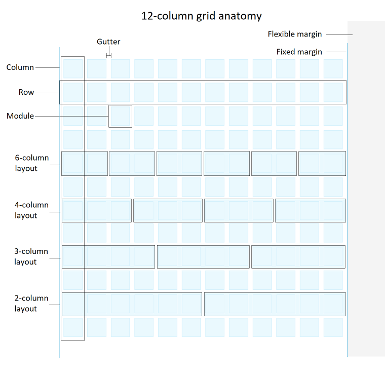
Rows are the horizontal sections of a website’s grid; their height equals the width of columns. They help organize content within each column. The intersections of rows and columns create corners of modules, the individual rectangular cells that provide space for content blocks. The size of a module depends on how many columns and rows it covers.
Gutters are the spaces between columns and rows. They create a sense of rhythm throughout the design, help to separate the content visually and prevent it from feeling crowded. That said, designers may assign gutters a zero value if that serves their design goals.
Margins are the space between the grid and the screen edges. Web designers define the fixed value for the minimal side space for all screen sizes and flexible margins, which occupy whatever space is left if the screen width is larger than the grid and fixed margins.
Benefits of using website grids
Using grids for organizing content on webpages has several benefits for Internet users and web designers.
- Consistency. Grids provide a consistent structure to a website, ensuring that the users can easily understand and navigate all website pages. By aligning the text and other content elements to fixed lines and using consistent spacing, designers can create a visually appealing layout that is more accessible for all users, including those with visual impairments and other disabilities.
- Efficiency. Grids help to speed up the design process by providing structure to work within. Designers don’t have to spend much time aligning each element to create visually appealing and professionally-looking layouts, which can improve productivity.
- Flexibility and creativity. Designers can adjust the number and size of columns and gutters to create unique designs tailored to the specific needs of a website. The grid framework allows adapting content layouts to different screen sizes and devices.
Overall, grids are essential for creating consistent, flexible, readable, and responsive layouts.
Responsive Website Layout in WordPress
Initially, many companies created separate websites specifically for mobile devices. Today, however, this approach to website responsiveness doesn’t work. Users expect the websites to be easy to use and fully functional regardless of their device.
To fulfill their expectations, websites must adapt different layouts for different screen sizes. For example, one desktop screen-size window may show as much content as three or more mobile screens, so the design must account for this by placing important information higher on the page.
As I said earlier, website grids will help you create responsive layouts to fit any screen size. WordPress default settings provide you with control over some grid structures, such as side margins, columns to define the main content width and gutters between vertical blocks. Some WordPress themes and popular WordPress builders like Elementor and Beaver Builder contain pre-built grid templates with customizable settings.
Other ways to employ website grids are using a CSS framework, media queries, and assigning column classes to individual WordPress elements. By far, the easiest way is to use tools that can create a modular grid, such as the JetGridBuilder plugin. The modular grid breaks the layout into modulus, allowing elements on a webpage to be moved freely.
How to create a responsive grid layout with JetGridBuilder?
JetGridBuilder is a WordPress plugin for creating custom grid layouts for posts and pages. You can build designs that look and function perfectly on specified screen sizes by manipulating various grid customization options. Like many other Crocoblock tools, JetGridBuilder provides an easy-to-use interface allowing you to resize and move content simply by dragging it on the background grid with your mouse.
With JetGridBuilder, you have the following options to customize the grid:
- define the number of columns for backing grid to scale the tiles and layout in general;
- set the row and column gutter values to control the gap size between the tiles.
There are many settings to customize the looks of individual posts in the layout, but most importantly:
- you can resize posts tiles by clicking and dragging their corners;
- move them with a drag-and-drop action;
- display post thumbnails, descriptions, meta fields, or all of them.
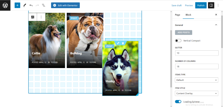
JetGridBuilder is perfect for displaying your posts using a responsive layout because setting up a grid only takes a few clicks.
Suppose you’re creating a webpage with the Elementor editor. In that case, you only have to use one grid framework to make three different layouts for different screen sizes: move the tiles around while your editor is in different responsive modes and click “Update” when ready.
The WordPress native editor doesn’t have a responsive mode feature yet. In this case, you have to create three blocks of grid layouts (or as many as you want) and add CSS media queries with information about breakpoints or the device screen sizes that will trigger each block to be visible.
The Best Responsive Layout Practices
To sum up, let me highlight the best responsive grid practices:
- Use a modular grid that will allow you to build flexible layouts.
- The more columns you use in the grid, the more flexible design you can create.
- The 12-column design is popular because it allows splitting screen space into six, four, three, and two even sections.
- Adopt a mobile-first approach: start by designing the smallest screen size layout and then move to the larger versions.
- Identify the most prominent content and ensure it’s visible on all devices.
From our side, we have simplified grid building with our JetGridBuilder plugin. It is mobile-friendly, provides a 100% responsive design, customizes the backing grid and post styles, and allows arbitrary positioning of the posts on the webpage.
Most importantly, it turns the grid system from a pupil’s checkered notebook to an artist’s canvas.

