Do you like boring websites? Do you adore sites where the eye twitches, and you are looking for a way out? I think nobody does.
Design today is one of the pillars determining how long a person will stay on your site, whether they will buy something, and remember your brand. That’s why design is essential.
Modern design is versatile. In web design trends 2024, you can see smoothness and minimalism, sharp corners, unexpected transitions, bright accents, dynamic fonts, abstractness, and realism. This year’s main trend is about interactivity and user involvement, making their website browsing experience more personal and interesting. So let’s figure it out.
Table of Contents
- Show the Video
- Make It Dark
- Let’s Play the Game
- Claymorphism
- The Power of Fun
- Tell Me What to Do
- Motion Without Movement
- Text Is All You Need
- Back to The Past
- It’s So Realistic
- Breaking Rules
- To Sum Up
Show the Video
Video content has been trending for several years now. Because it attracts attention and helps convey the correct information quickly.
You can use video at different stages – showing a product, how it works, talking about a company, or showing satisfied customers.
The main thing is that the video should be dynamic, as short as possible, and play consistently on all devices. Also, you can use animation, which will have the same effect but can be more creative.
To make the website more engaging, you can use animation at every step: loading the webpage, ordering or shipping process, 404 page, etc.
Make It Dark
A dark theme has been popular for a long time among website developers. It has been used for more than ten years. On a dark background, almost any color looks beautiful and expensive.
Bright accents look especially interesting. If you worry about how your site will look with a dark theme, you can put a switcher. It will help users choose the mode that is convenient for them.
Let’s Play the Game
Another involving tool that is easy to apply on almost any site is mini-games. It is not a new trend; even Google uses it (remember the black and white game with the dinosaur, which the user sees, while there is no Internet connection).
Such mini-games immerse the user in childhood, engage, and force them to stay on the site longer. For example, you can offer to move some separate elements on the website or add interactive components you need to press. Feel free to use such features on different website pages: from the main one to page 404.
Claymorphism
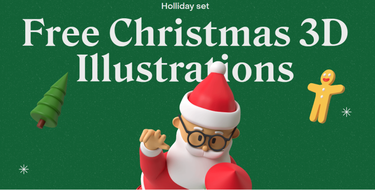
Claymorphism is a fresh trend that has already significantly influenced the design. Its idea is to give the website a hero character. It can be the user himself, then “his hand” or name may appear on the site. Or a 3D character that looks like a person.
These characters can only be on the first screen or appear in different parts of the website, telling a story. In any case, such a design looks engaging.
The Power of Fun
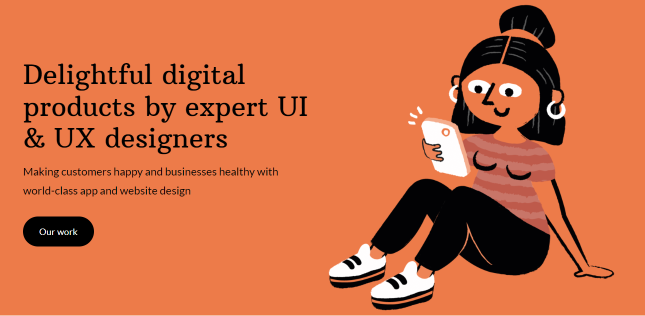
This is one of the most striking website design trends. Cartoon characters, bright colors, funny elements, children’s drawings, and photos of laughing people lift the mood and help keep the visitor on the site. Kind, funny, cute elements leave a pleasant impression and are liked by users.
Today, designers use them in various places — from educational applications to online stores.
Here is one such example:
Tell Me What to Do
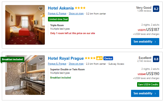
Behavior design is a design that guides the user through specific actions. You had seen this design when you were told, for example, that there was only one room left or when you were offered to complete a quest on the site. You can nudge a person to act using color, arrows, lines, fonts, and specific text.
What makes this web trend a success? The secret is in combination with psychology and design solutions. People love dialogue, interaction, and play – it is part of our nature. You can create this kind of dialogue and play effects through your best website design.
A famous but still relevant example from Booking.com:
Motion Without Movement
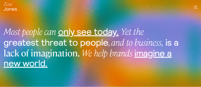
The complex gradient is a design element that creates the effect of motion without movement. With the help of smooth transitions and the right combination of colors, a person gets the impression that the site they see is not just a dull canvas of text but something unique. Color transitions attract attention and make you want to consider everything in detail.
A gradient can stand on its own or complement your website design and make it more interesting.
For example, look at this site. The smooth change of colors attracts attention and complements the text we see, making us stay on the site longer.
Text Is All You Need
Fonts have become one of the leading design elements today. The right font can make a website unique, engaging, and dynamic, even on a plain white background. It can be thick, thin, and used as an independent element and combine parts of the image.
You could achieve this by using:
- font size;
- dynamism.
Large fonts are one of the most unusual web design trends in 2022. But be careful. A couple of extra millimeters make the font bulky, whereas the correct size garners attention.
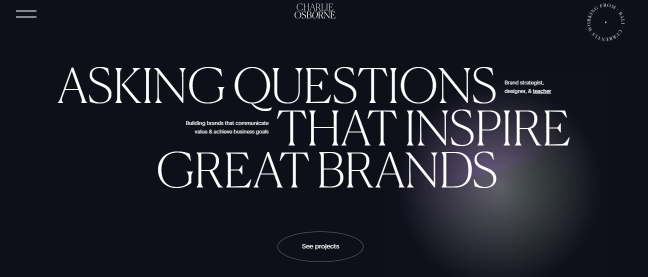
The second trend is dynamics. Many designers create websites where fonts take on a life of their own. They jump, decrease or increase, highlight, move out, and disappear. Letters have evolved from a means of conveying information into a fantastic design move. No pictures, photos, or animations, just text.
Be careful with dynamic text because your message can lose the essence behind the movement. Look at this example. Here the font is the leading player, which attracts attention and makes you want to read further.
Back to The Past
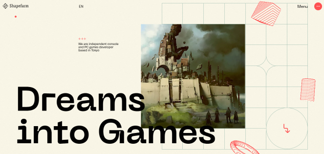
The next on the list of website design trends is retro design. It makes the site elegant and trendy. You can use different elements of this kind of design: pictures and photos associated with the 70s and the 90s of the 20th century, appropriate colors, and fonts.
Crown, beige tones for a 70s-style site, and acidic, bright accents from the 90s make users feel nostalgic and look through the site.
It’s So Realistic
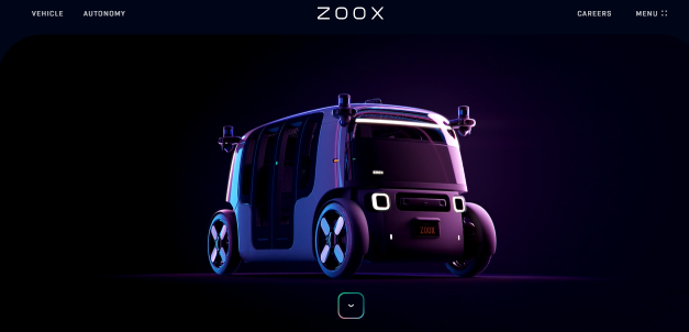
The 3D design impresses with realism and versatility. It allows you to feel like a “participant in events.” Images on the site with such elements look very realistic. It’s like you can touch everything.
Designers use shadows, layers, and animation to add depth and realism. In addition, different combinations of these elements create other visual effects.
Three-dimensional elements help show the design of buildings and interiors, which is especially important for web resources of different studios.
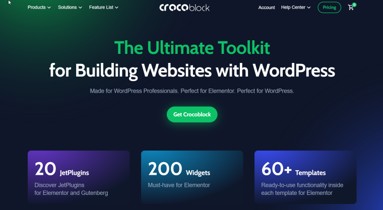
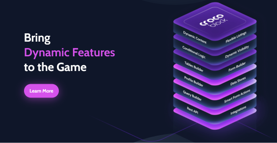
Here is another interesting example of 3D design from our site. These blocks look very realistic thanks to the right combination of colors:
Breaking Rules
This year, designers can embody any of their most daring ideas. It is no longer necessary to adhere to strict lines and rules. You can make different text sizes and overlay them on top of the picture, do not care for intervals. The main thing is to ensure the site is user-friendly and the information is presented clearly and conveniently.
So don’t be afraid to experiment in 2024.
To Sum Up
Making something attractive, engaging, and interactive is not easy. But now, you have ten trends that will help you when you have no design ideas. With this knowledge, you can create even more interesting sites that will always hit the mark. Use it for your web design inspiration.
Test, try, and we are sure that your next work will be a real masterpiece bringing a lot of pleasure to your clients.

