Poorly designed websites may disengage users and make them go look for the content they need elsewhere. Research is conducted to determine which specific elements of website design are crucial for user engagement. There are over 20 design elements revealed in research and articles that discuss factors that affect user engagement, such as organization, content utility, simplicity, graphical representation, credibility, and others. But the most frequently discussed design element in this regard is website navigation.
The UI quality is defined by how users are offered to travel through webpages, and thus developers must pay close attention to the website’s main “travel route” – the navigation menu.
In this article, I will present basic rules for building effective and well-organized WordPress menus, talk about different menu layout styles and their functions, and showcase examples of menus created with a premium WordPress menu plugin.
Table of Contents
- WordPress Menu Building Best Practices
- What Kind of WordPress Menus Are There?
- WordPress Menu Plugin Application Examples
- FAQ
- In Conclusion
WordPress Menu Building Best Practices
Although menus vary greatly in terms of functionality and design, there are some rules that ideally should all be followed to increase the usefulness of menus and make them visually appealing.
- The menu must be easily accessible. The users expect to find the navigation menu where it is commonly located – the top of the page if it’s a horizontal menu and the left side if it’s a vertical menu. A well-recognized hamburger menu button speeds up a user’s search for a navigation drawer. Another tool for increased accessibility is a sticky menu – a fixed WordPress navigation menu that remains visible and accessible as users infinitely scroll down the webpage.
- The website menu has to be responsive. This means its layout and behavior must be altered when used on screens with different screen widths, like mobile phones. Imagine how hard it would be to choose an item from a large rectangular mega menu if only a fraction of it is visible on the screen. That’s an awful user experience.
- Use short descriptive menu titles. Ideally, cut down to one or two words; otherwise, the menu would appear cluttered. Use enough description to tell users what kind of content can be accessed. A precise description is also beneficial for search engines.
- Reduce the number of items in the navigation menu to seven or less. Just like with short descriptive menu titles, multiple items will make the navigation bar look cluttered. A concise navigation bar gives more authority to the linked interior pages making them more likely to rank higher in SEO.
- Limit usage of dropdown menus. Don’t put any more than seven items in dropdown lists. If you have to, break up lists into categories – mega menus are much better for this purpose, with numerous instruments to visually separate different categories. Don’t use dropdown menus that lead to other dropdown menus. Again, mega menus are a better choice for presenting lists with multiple options.
What Kind of WordPress Menus Are There?
WordPress websites adopt different types of menus to fulfill different requirements. Stylistic diversity is caused by functionality and creating a positive user experience. In fact, the functions of menus are inevitably a part of their design.
In this part of the article, I will present different types of WordPress navigation menus and explain the usage of each distinguishable design.
Classic navigation menu
This kind of menu is presented on most websites and placed in the webpage’s header as a horizontal list of links. These links often include options that are most often expected by visitors, such as About, Contacts, and Pricing.
This type of menu is often called a navigation bar, and it is not uncommon to add a “sticky” effect to it. By doing so, the navigation bar stays visible when users scroll through the website. This is especially convenient when used on pages with infinite scroll, so people can search through content and jump on one of the options from the navigation bar at any time.
Vertical sidebar navigation menu
This is another classic representation of a menu often considered out-of-date. The items of the menu are stacked on top of each other and positioned in the sidebar, usually on the left, and stay visible during scrolling. The sidebar is often used instead of the horizontal menu, where more top-level options are needed, and menu items include more than two words. It is also more eye-catching, as it takes up a larger chunk of the screen.
Vertical navigation menus are typically used by agencies and creative businesses that want to showcase more menu links for users to choose from.
Footer navigation menu
A footer menu is typically paired with a horizontal navigation bar and is placed at the very bottom of a page. It expands top-level navigation options by adding items that can’t be found at the top of the page. The footer menu consists of up to 50 links organized into categories providing access to the site’s most important sections.
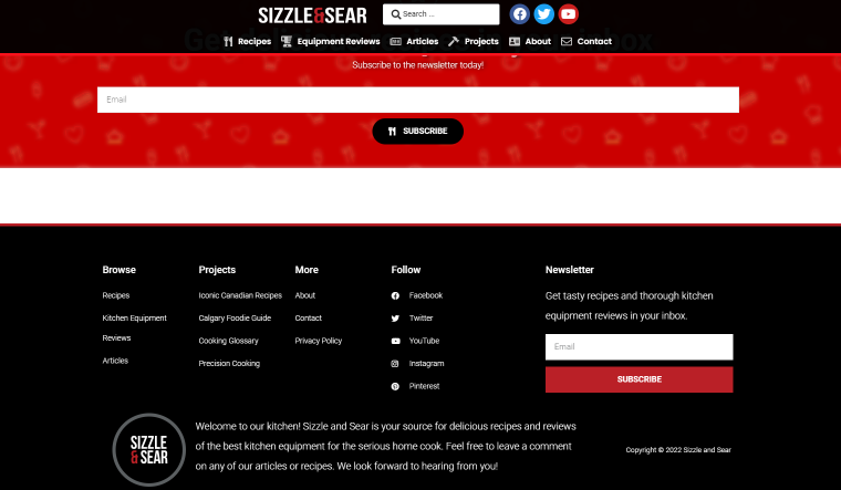
Surprisingly many people read footer options. The neatly styled footer menu signals that the reader has reached the end of a page, reminds of the content displayed above and prompts to click on one of the links.
Pull-down menu
Also known as a linear dropdown menu, it is an original expandable menu that reveals a list of vertically stacked options when a user clicks on a menu button or hovers over it. It is often used in horizontal navigation bars when each item represents a name of a category that holds multiple options.
Traditional dropdown menus are usually avoided by the developers, especially if there are more than a few options that need to be presented in the menu. This is because the linear vertical layout makes bottom options uncomfortable to click on, doesn’t allow grouping items, and overall looks out-of-date.
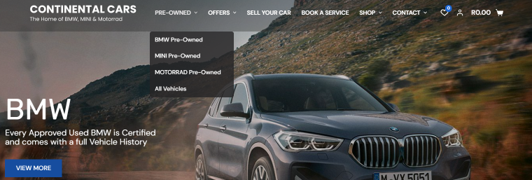
Mega menu
This is a type of expendable menu that displays multiple options at once. It is different from a regular linear menu in that it takes the form of a square or a rectangular organizing menu items in columns. Mega menus are favored by content-rich sites such as online retailers that want to offer their products in one mega panel. In mega menus, items are often grouped into categories using typography, background styling, and other tools.
Hamburger menu
This is the menu most often seen in apps and responsive designs. A three-line icon (a “Hamburger” button) located in the top corner of the screen opens up a vertical list of items. The hamburger menu is a go-to substitution for a navigation bar on responsive websites. It is only intuitive for users on mobile phones to reach for a well-recognized sandwich-looking icon to find top-level options of a website.
In general, this type of menu should be considered if it’s not so important for users to see the basic navigation bar options, but extra space on a screen is welcome.
WordPress Menu Plugin Application Examples
The WordPress engine has instruments to create basic types of menus. All WordPress themes provide at least one location for inserting a menu; usually, it’s in the top header. But what about all the diverse menus we were talking about earlier? Well, there are two options. One is to go into HTML and CSS coding wholeheartedly and slowly improve the WordPress navigation menu through trial and error. The second option, and I’m sure no one will be surprised, is utilizing WordPress plugins.
The JetMenu plugin by Crocoblock is probably the most powerful solution for creating and stylizing all types of menus. This plugin can be used to convert existing linear menus to expendable ones or build new menus from scratch with Elementor or Gutenberg editor. Let’s see examples of what an effective WordPress menu plugin can do.
This real-estate website focuses on displaying eye-catching photographs of rental apartments. It’s not particularly important for website visitors to see the navigation bar options, so it’s completely hidden behind a hamburger icon in the top left corner of the page.
The footer navigation menu copies the header navigation bar, letting the users know they’ve scrolled down to the very bottom of the page and offering them to choose one of the top-level navigation options.

Creative studios and design agencies love minimalistic approaches, and that’s where the WordPress hamburger menu comes in handy.
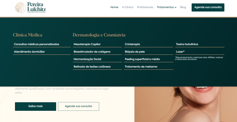
Here, the classic navigation bar is complemented with linear dropdown menus. Note: dropdown menus only have a few options as all products are well-organized. Though this website will look differently on a mobile device.
The navigation bar opens after clicking on the hamburger icon. Developers also added a “sticky” effect to a hamburger icon and a website logo that links to a homepage. This effectively improves UI as users will never feel lost no matter where on the website they are.
This website uses a WordPress mega menu built with JetMenu. Several options for styling menu elements are put to work here, like setting grids and borders colors and changing the background colors when users hover over menu items.
Any type of content can be inserted into a mega menu. Illustrations, icons, and even videos can be used to create beautiful menus and make the searching process easier.
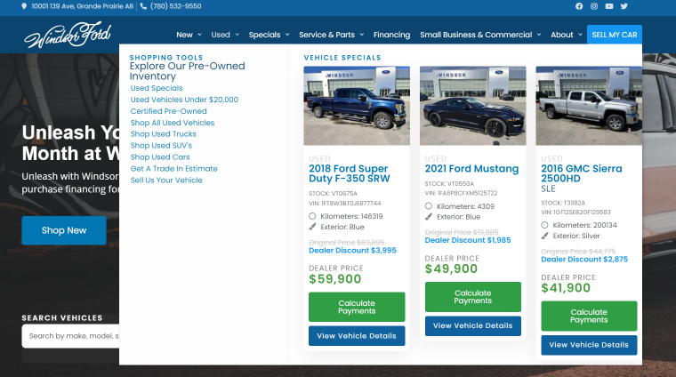
Here’s a feature that makes the JetMenu plugin stand out from the crowd: the ability to add any dynamic content to the mega menu. The example above illustrates how users who enter the navigation bar see top-selling products of an online car dealership.
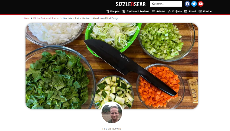
A website about food is obliged to add yummy visual content to its menus. This is also an example of how blog articles become parts of the mega menu, increasing user engagement.
FAQ
WordPress menu is a list of predefined links to pages (most often internal) on a website.
A navigation bar is a webpage section usually located in the header area that contains links to other website pages.
A horizontal navigation bar containing top-level options is the most common type of navigation menu.
It is a type of expendable menu used on WordPress websites that displays multiple options using a square or rectangular layout.
You can build any type of menu without coding skills if you use WordPress plugins like JetMenu by Crocoblock.
In Conclusion
A properly organized navigation menu serves many purposes. It helps users to go from one page to another and find the content they’re looking for. A visually appealing and functional menu improves UI and increases time spent on site, the number of page views, and even on-site sales. Finally, appropriate titles of menu items help search engines to understand what the webpages contain.
Regardless of their style, it is beneficial for all menus to adhere to universal best practices, such as accessibility, responsiveness, and concision.
While WordPress is capable of building basic menus, using WordPress menu plugins is by far the easiest and most effective method for creating a sophisticated navigation system.