What are the best testimonials you dream about? I mean, if you are a business owner (especially if you are a true entrepreneur, trying to make your business dreams come true and prove that your methods and approaches work well), you will definitely want to be appreciated. And hear those cherished words which can impress your future and present clients.
Even the most successful business owners relish great feedback and get nervous when hearing something bad. So, it’s impossible to overstate the importance of reviews.
Table of Contents
- The Difference Between Reviews and Testimonials
- Mistakes to Avoid with Website Testimonials
- Inspiring Examples of WordPress Testimonial Design
- Top 5 Testimonials Plugins for WordPress
- FAQ
- Wrapping Up
The Difference Between Reviews and Testimonials
Reviews and Testimonials are very similar, but there is some difference in their nature, form, and purpose. So, let’s break it down into several points.
- Testimonials are collected by the company for displaying on the website and rarely elsewhere. They aim to showcase clients’ positive feedback about the products or services. And the initiative in collecting feedback, first of all, belongs to the business, not the clients. In contrast, reviews appear mainly on the client’s initiative and are placed on third-party websites. Google or Facebook, Trustpilot, or TripAdvisor reviews are great examples thereof.
- Testimonials are mostly positive, while reviews may contain more negativity than the company really deserves. The reason for it is that the business owners, apparently, would not rush to showcase bad feedback, right? So they mostly reach out to happy customers to get their testimonials.
- At the same time, bad experience with the company becomes a powerful driving force for clients to go to third-party websites to express their dissatisfaction. Leaving such reviews, they have a clear goal: to warn future customers against the company or the products, get their money back, etc. When they are happy about the purchase or service, they rarely spend time on reviews unless they are reminded about doing that multiple times or if their experience was awe-inspiring and exceeded all expectations.
- As a rule, reviews are short (and can be just a star rating), while testimonials are longer and more detailed. The main goal of reviews is to rate the product, while the primary goal of testimonials is to share personal experiences.
But when it comes to testimonials or review plugins for WordPress, the capabilities are basically the same. For testimonials, the most important thing is the design’s flexibility and different layouts to show things beautifully.
For reviews, though, it’s also essential to have the functionality of submitting them and verifying users to be sure that they are clients and that the information they provide is reliable. Later in this article, we will talk about great testimonials plugins.
Mistakes to Avoid with Website Testimonials
The testimonials section becomes a weak point of the website incredibly often. It reveals whether the site is abandoned or ill-conceived. Also, most of us dealt with fake testimonials, especially on some shady landings of weird short-lived companies. Depending on the area of business the site belongs to, there can be more or less crucial mistakes. And there are several most common:
- Demo testimonials content.
It is one of the most surprising mistakes and one of the most common. As outlandish as it sounds, so many websites of good companies leave demo content that the testimonials/review plugins initially had, even if it’s self-evident when the “clients” are represented by celebrities and have perfectly-stylized photos. Even some web or marketing agencies do this, even though it’s their specialization, and they repel many clients by neglecting this section of the website.
- Fake or self-composed testimonials.
Even if the company doesn’t have wrong motives when writing reviews on its own, and even if there are real customers who would say the same, the difference will be noticeable, making the review less trustworthy. The thing is, real clients can give genuine insights and pay attention to the relevant details, even if something else seems more important from the point of view of the company representatives.
- Not providing information about clients (when it’s crucial).
For some websites with a narrow specialization, it’s vital to show the job position/role of the testimonial author. Let’s say there’s a language school for children and adults with a wide range of courses. So, the age, profession, and course this person takes adds context and makes the review reliable. If it’s a SaaS company, it’s essential to know the position and department in which the author of the testimonial works.
And this list can go on. But, of course, there are websites representing more general services or shops with some consumer goods, and such details are not important at all. So, paying attention to details and thinking through the client’s experience is critical when designing and putting together the testimonial section.
Inspiring Examples of WordPress Testimonial Design
Let me show you some examples of testimonials that look good and appropriate on the websites they are placed and can give you some inspiration and ideas.
Big and detailed testimonials slider

Sun King company produces, sells, installs, and even finances off-grid solar systems for those regions where people live without reliable access to electricity. So, for them, it’s important to show the regions they work in, the problems they help to solve, and the emotions of people who own their products.
That’s why it’s a full-screen slider, with a big photo and a map. This website has a clear and well-conceived design, including the review section, which fits perfectly into the context.
Stylish testimonials slider weaved into the main page design

Content Coms company creates content for a carbon-conscious world. And it’s amazing how they are very consistent in presenting their services, simultaneously being true to their mission and demonstrating excellent skills in working with content.
Their website is based on slider blocks, and testimonials are one of such sliders. It occupies full width and at least half of the screen’s height. And the testimonials have the name, job position, and the company the author represents. Big visual as a background – and we have a great testimonial slider.
Straightforward reviews in a speech bubble

This is a website of a Digital Global Marketing agency, and I like that there are names of the people the client worked with and very straightforward information about the kind of services they used, as well as the goals they’ve achieved. The speech bubble design fits perfectly the whole website design and the atmosphere of friendliness this company apparently wants to demonstrate.
Minimalistic and elegant slider
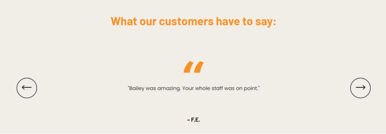
Custom Seafoods website sells seafood on-demand, focusing mainly on product photographs and bold orange blocks. That’s why the testimonial slider also has this color but is very minimalistic and elegant. The fact that they don’t enclose the full names of the review’s authors emphasizes minimalism. And this is an excellent example of the website type where we don’t need to know details about the reviewers because name or profession doesn’t matter in the context of food which any kind of person can enjoy.
Bright and concise review masonry grid
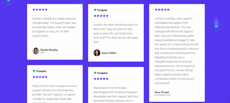
It is a website of Kinsta Hosting, and one of the company’s focuses is excellent client support. So, there’s a big block with testimonials on the main page, which leads to the page, where they are sorted thematically, with the description of the particular services, the strong points they want to highlight, and the reviews about them. Kinsta combines reviews from Trustpilot and the testimonials they collected from the clients personally. It’s good that they show, when it’s possible, the company the client represents.
Thematically designed tiles
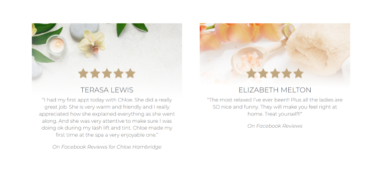
Stonehouse Day Spa salon website uses soft pastel tones everywhere, and the way they’ve stylized testimonials looks consistent and entirely within the site’s context. What is great about this particular testimonials section is that they actually have taken reviews from third-party sources, such as Facebook and Google, which adds credibility. And those reviews give specific details about the staff the client dealt with and the service the client used.
Video testimonials
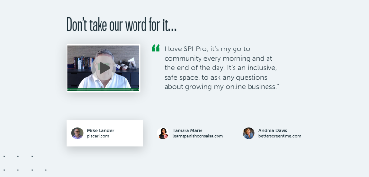
Smart Passive Income website is about podcasts, online courses, and marketing instruments. And not only testimonials but the Home and other pages are filled with video blocks, which has a lot of sense because audio and video are the products they sell and teach others to work with.
Video is an excellent type of content that would add credibility to such sections. On the other hand, getting it from clients is challenging; not everyone has a lot of confidence and time to do this sort of public speaking and filming it.
Testimonial page with filters and different layouts
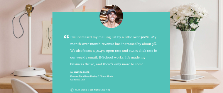
Marie Forleo website of online business school and courses by Marie Forleo took testimonials to another level. Such sections are almost on every page; they have different layouts and can be big and small, with or without photos.
There’s also a whole testimonial page with filters, where you can sort their authors by location, industry, experience level, and goals. There are three types of designs there: hero sections, grid, and list, and for some of them, video versions are available, too. And, of course, many details are given about the reviews.
Top Testimonials Plugins for WordPress
Let’s have a look at the plugins which give a lot of flexibility when it comes to displaying testimonials.
Real Testimonials

This plugin has five layouts for displaying testimonials, ten customizable themes to show cards, a video type with a lightbox, and a ton of customization options. It has a testimonial submission form, which can be modified easily, and notifications are sent to one or several email addresses when the new feedback is submitted.
JetReviews
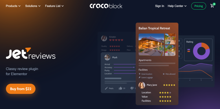
JetReviews plugin allows adding different types of reviews for different post types. The unique feature is that users can upvote and downvote others’ reviews and reply to them. Also, several evaluation criteria could be added (for example, Service, Price, Location, etc.) to each review form. The average rating can be fetched where you need it. And a convenient rating dashboard is available on the backend, where an admin can see the statistics for each post type separately.
There are two types of such testimonials: one is dynamic, and another is static. So the admin can fully customize the static one manually. The functionality of this plugin gets significantly increased when combined with the powerful plugins of the Crocoblock Subscription, particularly JetEngine, JetSmartFilters, and JetThemeCore. Then, it’s possible to display and sort testimonials dynamically, showing them at any place in the theme template and considering different dynamic conditions, such as the current page, post type, user, etc.
JetElements
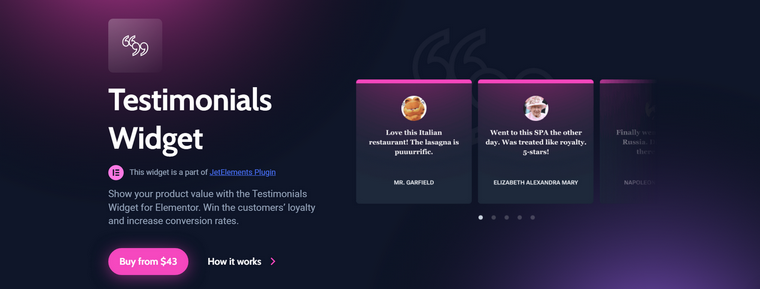
JetElements is actually a plugin with 45 great Elementor widgets and effects, and the Testimonials is just one of them. It gives a lot of freedom in displaying various layouts and designs, adjusting every little element and detail visually in no time. You can add them manually or use dynamic functionality to fetch testimonials from meta fields. It is fully responsive, and you can change how the slider is shown on every device.
WP Review Slider
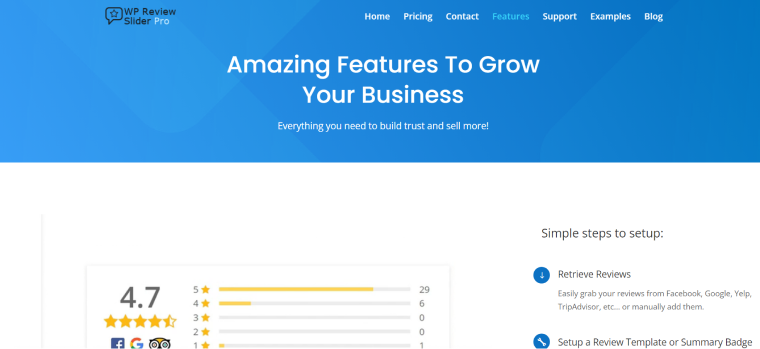
This plugin grabs reviews from Google, Facebook, Yelp, and other platforms and displays them on the website. The design is customizable so that the layout can be not only a slider but a grid, as well as a pop-up or a floating badge. The average rating badge can be displayed, too. Manual testimonials are also available, as well as the website submission form.
Smart Slider
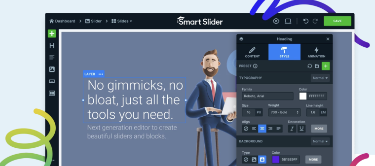
With Smart Slider 3, there’s no tech stress – just awesome testimonial sliders. No coding experience is needed, seriously! Customize layouts, rock mobile screens, and edit visually. Quickstart with six reasons: easy learning, zero code fuss, total layout freedom, mobile magic, drag-and-drop ease, and ready-made templates. Transform visitors into fans with snazzy testimonial sliders, easily added anywhere.
FAQ
Testimonials are the client’s comments about your business, products, or services collected by the website admin and displayed in the way it’s needed. As a rule, only positive feedback is shown because the primary goal of testimonials is to give social proof.
There are three main ways to add them: manually, when the admin does it, automatically (with the help of the submitting form), and when they are fetched from third-party platforms. But in this case, the correct name would be “reviews,” not “testimonials,” unless you can filter them and show only the positive feedback.
It entirely depends on the type of business the website represents. If it’s about the only product or service, it’s wise to place them on the main page. If the website has many products and services, it makes sense to put such testimonials on the corresponding pages.
Wrapping Up
Let’s face it: website testimonials often look dull and monotonous. And because of that, customers don’t pay much attention to them, which is absolutely unacceptable. That’s why website designers and developers should pay attention to them and do their best to make them pop.
In this article, we talked about the common mistakes people make when designing testimonials and review sections, went through different inspiring examples of how they can look, and mentioned plugins that can help a lot.
And what are your ideas about great testimonials, how they should look, and what to consist of? Feel free to leave a comment below.
