How to Create Popup in Gutenberg
Follow the guide on how to create a popup template in the Gutenberg (Block editor) builder, style it up, and assign it to the WordPress website using the JetPopup plugin.
Before you start, check the tutorial requirements:
- Block editor (Gutenberg);
- JetPopup plugin installed and activated
To create a new pop-up, navigate to the JetPopup > Add New Popup tab in WordPress Dashboard.
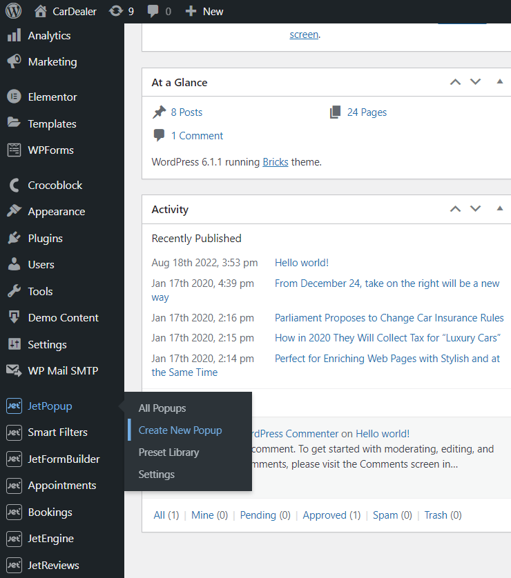
Also, you can proceed to the JetPopup > All Popups tab and press the “Create New Popup” button. In the appeared window, select the “Block editor” Content Type. You can also enter the Name and Choose Preset. When you finish, push the “Create” button.

You will proceed to the Gutenberg (Block) editor. If you choose a popup preset, the editor page will be filled with some blocks.
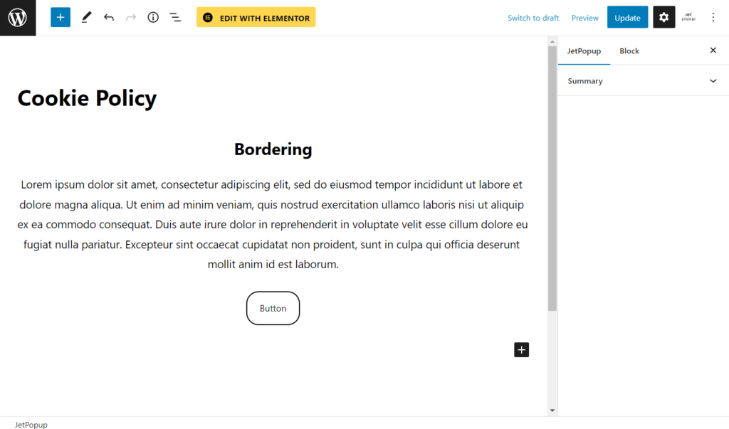
Feel free to use diverse blocks and settings to create the pop-up layout.
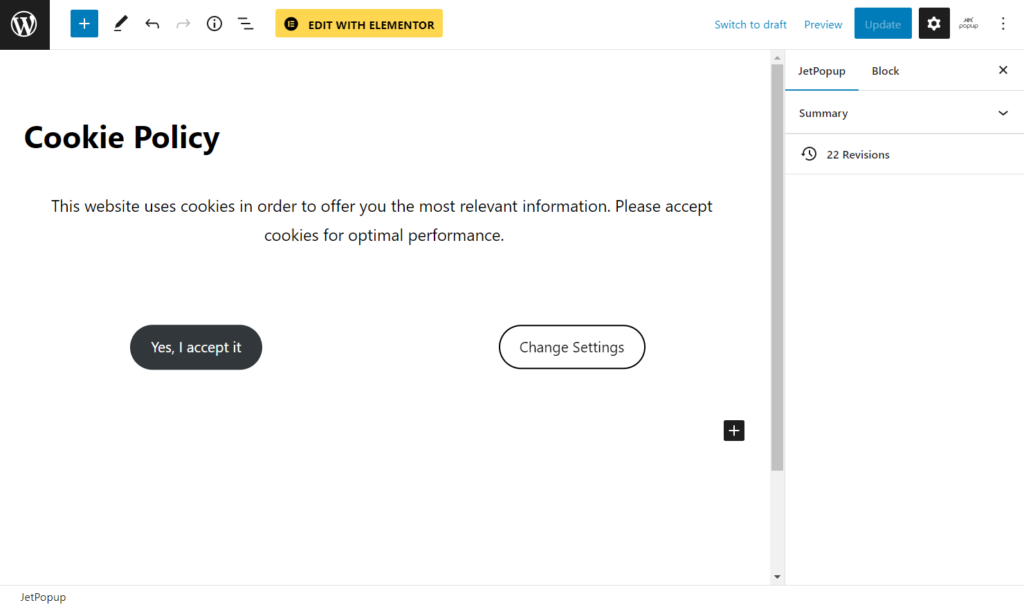
Then, click on the “JetPopup” icon in the top right corner.
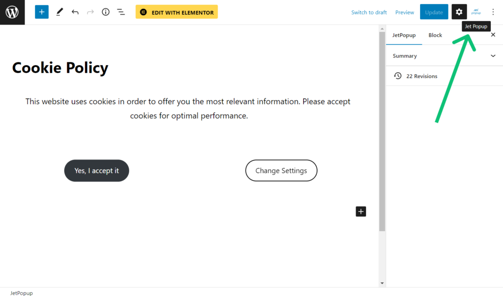
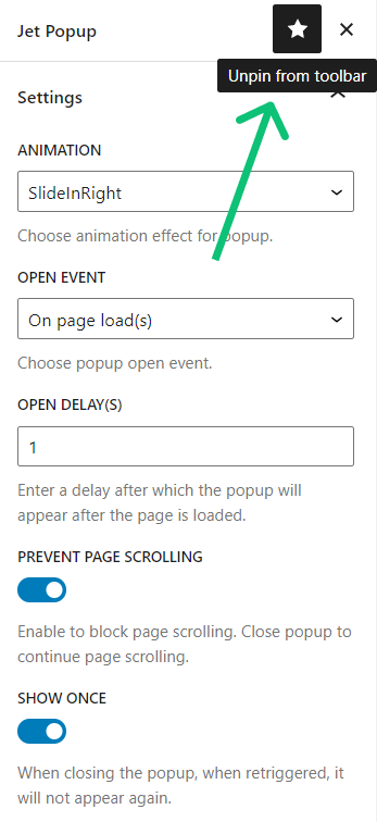
If you close the unpinned tab, you can open it again by clicking the tree-dots icon and hitting the JetPopup option in the Plugins section.
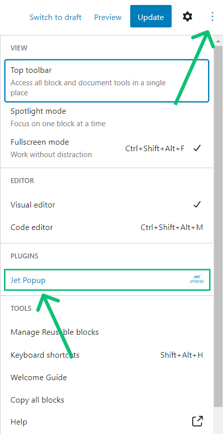
There are such options in the Settings section:
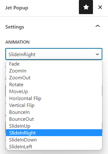
Animation. Select an animation effect for the pop-up;
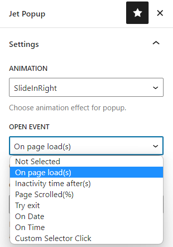
- Open event. Pick the trigger event:
- On page load(s) – the pop-up will be displayed when the visitor opens the new page. You can also set the Open delay in seconds;
- Inactivity time after(s) – the pop-up will be displayed after the visitor has been inactive on the page. Set the User inactivity time in seconds;
- Page Scrolled (%) – the pop-up window appears when the visitor scrolls the page to a certain percent set in the Scroll Page Progress(%) field;
- Try exit – the pop-up will be shown when the visitor intends to exit the page;
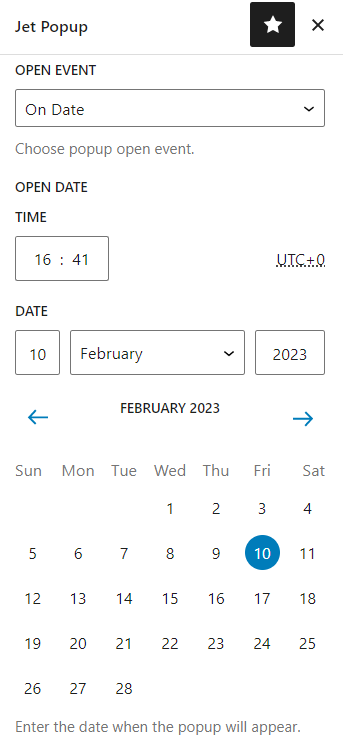
- On Date – define the date and time in the Open Date field to start showing the pop-up;
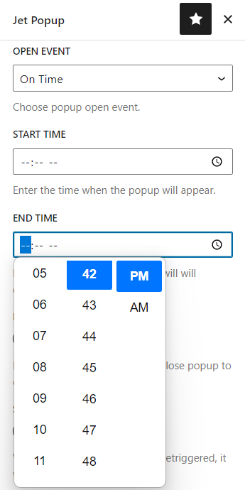
- On Time. Define the Start Time and End Time to show the pop-up on a specific period every day;
- Custom Selector Click – you can insert a custom selector from the widget, which will be a trigger for displaying the pop-up. The first one is the Class selector. To get it, proceed to the front end, push the F12 keyboard button, and copy the selector inside the used widget. When pasting it into the Custom Selector bar, put a dot before it. The second is a CSS ID. It is also copied from the code you see after clicking F12. When pasting this type of selector into the Custom Selector bar, put a hash symbol before it.
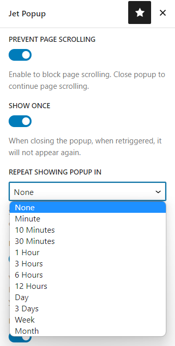
- Disable Page Scrolling. If enabled, users won’t be able to scroll the page after the pop-up appears;
- Show Once. If enabled, the pop-up will be shown only once, but you can also set the timeout caching in the Repeat showing popup in field so that the pop-up will be displayed again;
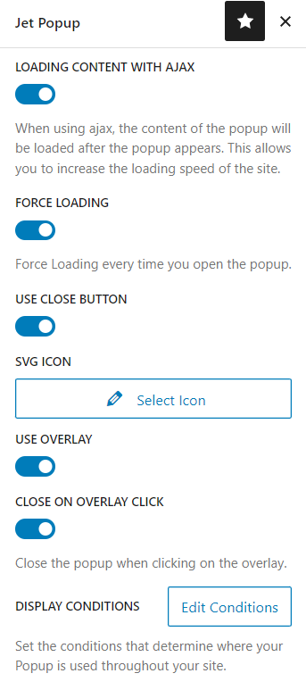
- Loading content with Ajax. The pop-up context loads using the AJAX method;
- Force loading. The pop-up content loads every time it is opened;
- Use close button. If enabled, it adds the button to the pop-up by clicking on which users can close the pop-up;
- SVG icon. Here, you can Select Icon for the close button;
- Use overlay. If enabled, cover the screen beyond the pop-up by darkening the background;
- Close on overlay click. If enabled, the user can close the pop-up by clicking on the overlay;
- Display Conditions. If you push the “Edit Conditions” button, you will proceed to JetPopups > All Popup with the Set the popup visibility conditions pop-up window. You can specify the pages where you want to show the pop-up and where it shouldn’t be displayed using the “Include” and “Exclude” options. Proceed to the following tutorial to learn more: Popup Conditions Overview.
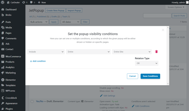
Set the needed conditions and hit the “Save Conditions” button.
Return to the Elementor editing page. To finish the popup customization, proceed to the Popup Style Settings Overview in Gutenberg.
When you are done, hit the “Publish/Update” button.
Open a page where the pop-up is attached and complete the trigger event to check if the pop-up appears.
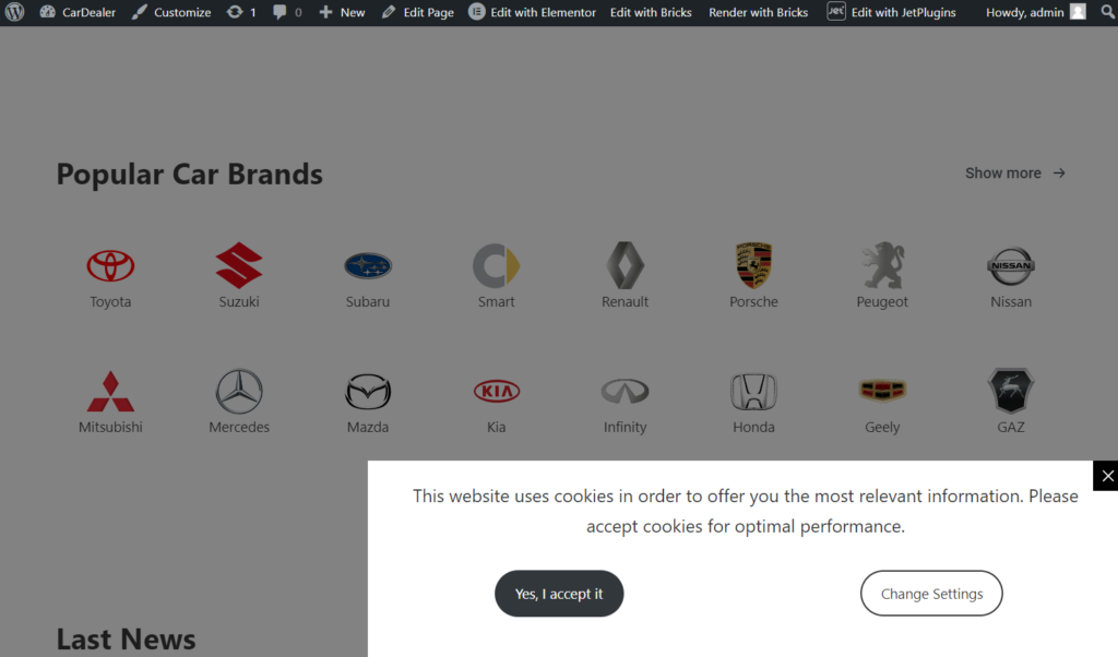
That’s all. Now you can create different pop-up layouts in the Gutenberg builder with the help of the JetPopup plugin.