Popup Style Settings Overview in Gutenberg
The JetPopup plugin is full of versatile settings and conditions. This tutorial will show you around JetPopup style settings in the Gutenberg builder.
Before you start, check the tutorial requirements:
- Block editor (Gutenberg)
- JetPopup plugin installed and activated
You don’t need to use the JetStyleManager plugin for the Gutenberg blocks because you can style the pop-up using the settings from the Container Styles, Close Button Styles, and Overlay Styles tabs.
Firstly, create a new pop-up in the Gutenberg editor and customize the Settings tab in the JetPopup section.
Now, let’s look through the style options.
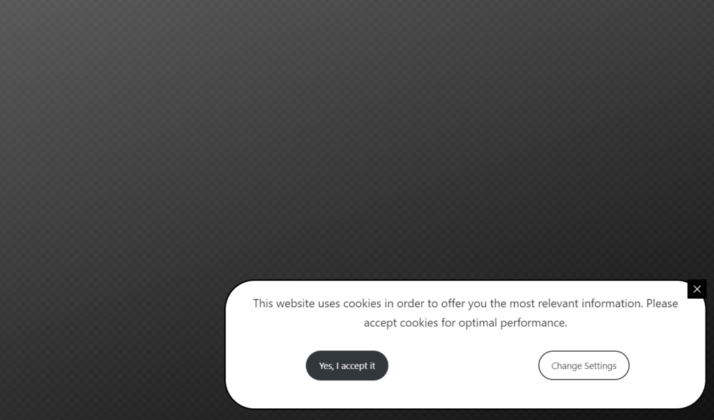
In the Container Styles tab, you can set the following:
- Container Width and Container Height. To change the height, enable the Custom Height toggle;
- Horizontal Position and Vertical Position. With these two options, you can set the pop-up position on the page (e.g., in the bottom right corner or webpage section);
- Content Vertical Position. You can set the content vertical position inside the pop-up container;
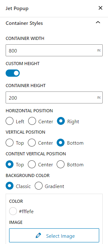
- Background Color. With the “Classic” option, you can set the monochrome-colored background or image on the pop-up background, and with the “Gradient,” you can set the color gradient background;
- Horizontal Padding and Vertical Padding. You can set the space between the pop-up content and container border;
- Vertical Margin and Horizontal Margin. You can set the space beyond the pop-up container;
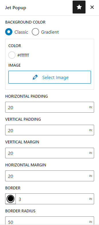
- Border. You can customize the border color, style, and width in pixels;
- Border Radius. Rounds the corners of the pop-up container’s outer border edge;
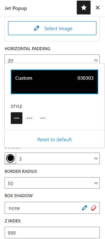
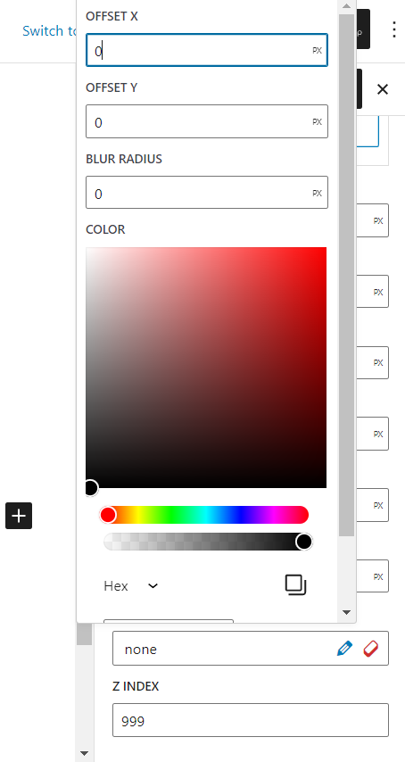
- Box Shadow. Adds shadow effects around the container’s frame. Hit the pencil icon to open the pop-up with settings, and click the eraser icon to roll back to the default settings;
- Z Index. Use this option to place the pop-up either in the background or the foreground of other elements on the page.
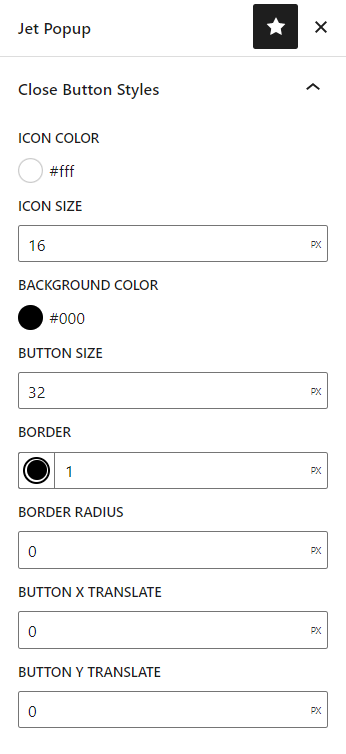
In the Close Button Styles tab, there are the following options:
- Icon Color. Here, you can specify the color of the default cross-shaped close button icon or the SVG Icon that you downloaded in the Settings tab;
- Icon Size. Set the size of the icon;
- Background Color. Define the background color of the close button;
- Button Size. Set the size of the whole close button;
- Border. You can customize the border color, style, and width in pixels;
- Border Radius. Rounds the corners of the close button’s outer border edge;
- Button X translate and Button Y translate. With these two options, you can move the close button to whatever place you need.
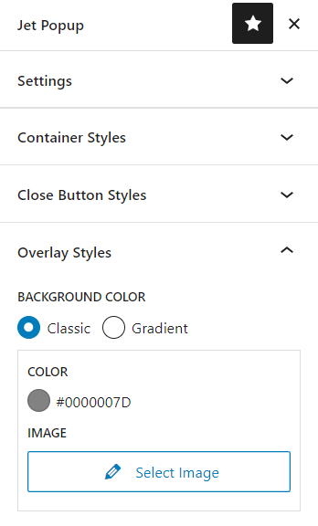
Before you proceed to the Overlay Styles tab, make sure to enable the Use Overlay toggle in the Settings tab. Here, you can set the Background Color of the cover of the screen beyond the pop-up. As the background, you can specify either the monochromatic or gradient color or an image.
You can update the pop-up in the Gutenberg editor and hit the “Preview” button to check the minor changes, or you can proceed to the front-end page where the pop-up is attached and check the final result.
That’s all. Now you know more about the JetPopup style settings in Gutenberg (Block editor).