Compare Widgets Overview
This overview reveals the functions of all three comparison widgets of the JetCompareWishlist plugin: Compare Button, Compare Count Button, and Compare.
The JetCompareWishlist plugin allows creating comparison lists that highlight the features of selected WooCommerce products, helping visitors compare options and make informed choices.
This overview covers all the details of customizing the comparison widgets.
But, borehand, the comparison functionality should be enabled as detailed in the How to Enable Comparison Functionality for WooCommerce tutorial.

Compare Button Widget
This widget adds a button to each product. When clicked, the product is added to the comparison list.
It is better to be used in Single and Archive product templates.
The widget has such settings:

- Icon — this toggle enables the display of an icon on the compare button. If turned off, the Label can be shown only;
- Icon Position — a dropdown that defines where the icon is displayed in relation to the Label (“Left,” “Top,” “Right,” or “Bottom”);
- Normal / Added — tabs that allow configuring different icons and labels depending on the button state:
- Normal — before a product is added to compare;
- Added — after the product is added to compare.
- Icon — allows choosing an icon from the Icon Library or uploading an SVG file as a display for the button;
- Label — a text field for the label that will be shown alongside or instead of the icon.
The Added tab also contains the Use as Remove Button toggle, which allows using this button to exclude the added product from the comparison table.

Compare Count Button Widget
This widget creates a button with a counter. When users click it, the page with the comparison table opens. It also shows the number of products that were already added to the comparison list.
The Compare Count Button can be added to any section, either the header or footer.
The widget has such settings:

- Label — a text field for setting the label of the button, shown alongside or instead of the icon;
- Icon — this toggle enables the display of an icon on the button. If turned off, only the Label is shown;
- Position — a dropdown that defines where the icon is displayed in relation to the Label (“Left,” “Top,” “Right,” or “Bottom”);
- Icon — allows choosing an icon from the Icon Library or uploading an SVG file as a display for the button;
- Count — this toggle enables showing the number of items added to comparison;
- Hide Empty — if enabled, hides the counter when no items are added to comparison;
- Format — defines the display format for the counter. The %s placeholder is used for the item count;
- Position — sets the counter’s position relative to the icon (e.g., “Top Right”).
Compare Widget
With the help of this widget, the comparison table can be displayed on the chosen page to illustrate the comparison of the selected products.
In the Compare settings tab, one can set the WooCommerce product data that will be displayed in the comparison table. One can either change the default items or add a new one by clicking the “Add Item” button.

Every item has two default settings: Data Type and Title.
The “Remove Button” Data Type also allows specifying the Button Label and Button Icon.
The “Title” allows selecting the Title HTML Tag.
The “Thumbnail” enables picking the Image Resolution. Also, it contains the Enable Image Link toggle.
The Action Controls settings tab contains the Clear Table, Highlight Differences, and Differences Visibility toggles that activate the corresponding actions.
Every action has additional customization options for icon and label in the normal and active states.

The Settings tab provides a few more options:
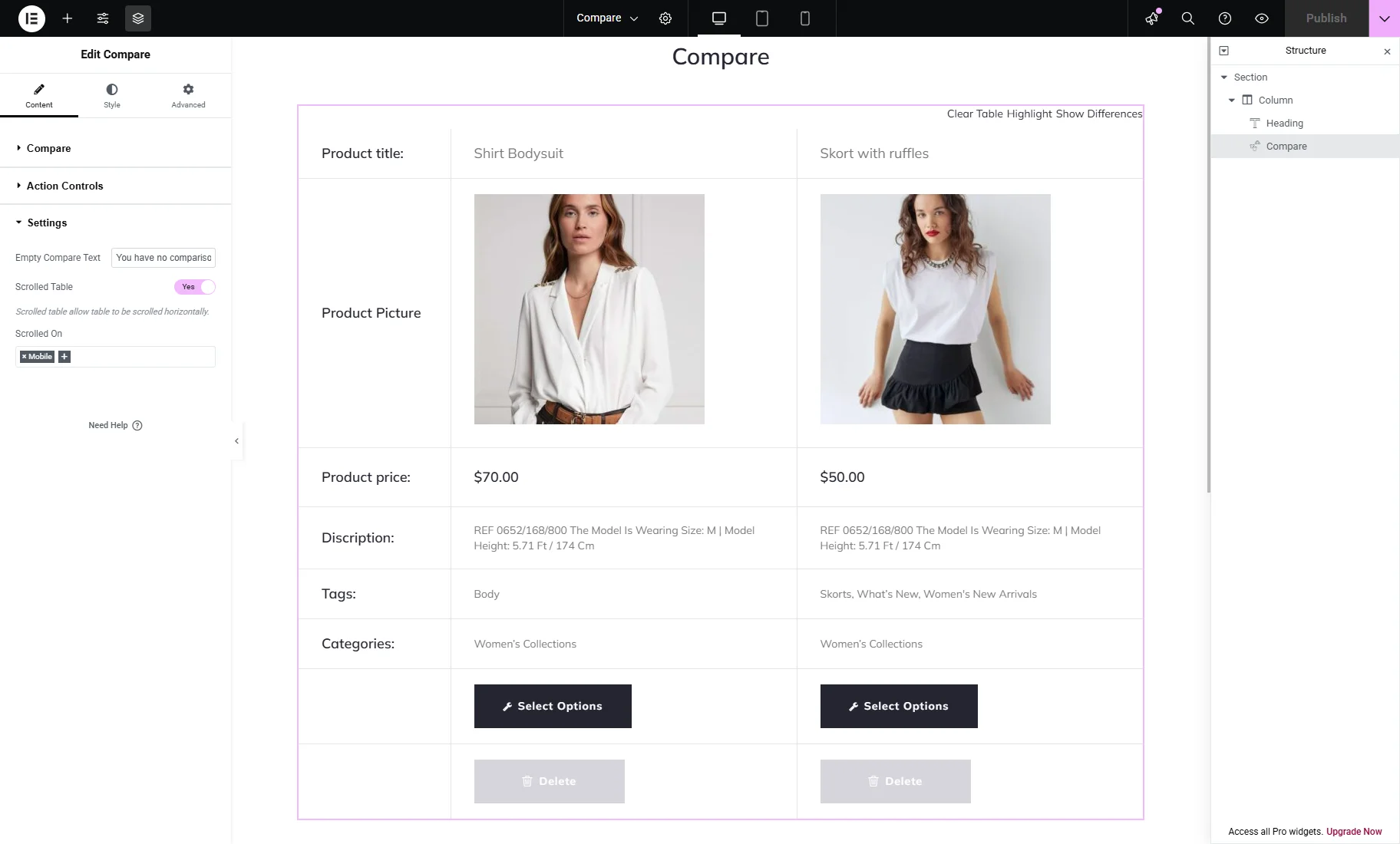
- Empty Compare Text — a text which will appear if there are no comparison lists;
- Scrolled Table — a toggle that allows the table to be scrolled horizontally;
- Scrolled On — a dropdown menu to select devices where the scroll function is enabled (“Mobile,” “Tablet,” or/and “Desktop”).
That’s all. Now you know all about the JetCompareWishlist plugin widgets’ settings for the WooCommerce products comparison on your WordPress website.