Categories Grid Widget Overview
This tutorial will be your guide in the world of the Categories Grid widget by the JetWooBuilder plugin for Elementor.
Looking for a way to display your products on the shop page in a stylish grid? Then, we think you should definitely use the Categories Grid widget included in the JetWooBuilder plugin.
Pay attention that you should have at least several WooCommerce products with categories, thumbnails, and descriptions to work with the Categories Grid widget.
To find the widget, open the needed page with the Elementor page builder, find the Categories Grid widget, and drag and drop it to the page.
Let’s move to the settings panel and look through some of the settings. Navigate to the Content tab and unfold the General settings section.
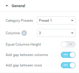
- Category Presets dropdown can change the way how your grid can look in different variations. Depending on the preset you choose the description of the product can be placed in versatile locations.
- Select the number of columns for your grid in the Columns dropdown, it is fully compatible with Elementor Custom Breakpoint;
- Using the Add gap between columns you can either show or hide a gap between the columns. You can also add a gap between the rows by toggling the Add gap between rows option to “Yes”.
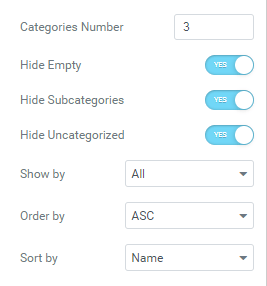
- Specify the number of categories you want to be displayed on the page in the Categories Number field.
- You can show the products by all the categories, only parent categories, or show by category IDs in the Show by dropdown.
- You can also order the categories by the ascending (ASC) or descending (DESC) order in the Order by dropdown.
- The categories can be sorted in several different ways: by name, by IDs, or by count in the Sort by dropdown.
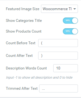
- Specify the size of the thumbnail images in the Featured Image Size dropdown.
- Enable the Show Categories Title if you want the categories to be displayed in the grid.
- Turn on the Show Product Count toggle in case you want the number of products to be seen.
- Fill in the Count Before Text and Count After Text field with the required information.
- Specify the number of words for the description which will be visible using the Description Words Count option.
- Add the symbols showcased after the trimmed text in the Trimmed After Text text field.
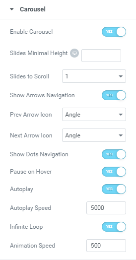
- You can also showcase the products with a carousel, to do so go to the Carousel accordion block, and turn on the Enable Carousel toggle.
- Set the number of slides to scroll in the Slides to Scroll dropdown. There can be either one or two/three/four slides scrolled at a time.
- In case you want your users to be able to scroll the carousel by themselves, enable either the Show Arrows Navigation or Show Dots Navigation option.
- To make the carousel scroll on its own, switch the Autoplay option on. Set its speed value in the Autoplay Speed field.
- In order for the carousel scroll to never stop moving, enable the Infinite Loop option.
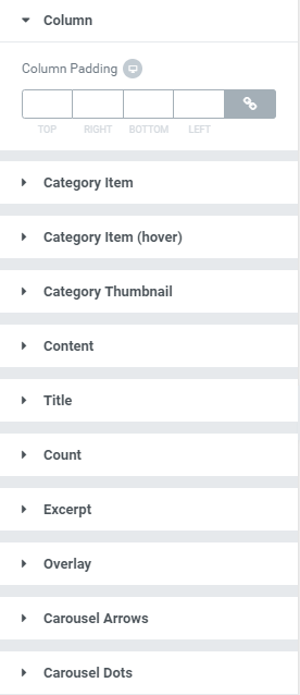
Finally, go to the Style tab to adjust the styling options. Here you can design the columns, category items (when normal and on hover), thumbnails, content, title, arrow/dots, etc.
So now try to experiment with the available options to find the right combination for you!