Posts Navigation Widget Overview
Read about the Posts Navigation widget usage, its settings, and its interaction with other JetBlog widgets.
The Posts Navigation widget adds navigation arrows to the previously arranged posts by the JetBlog widgets (i.e., the Smart Posts Tiles and Smart Posts List widgets). It works with dynamic content (with the JetEngine plugin) and archive templates (with the JetThemeCore plugin).
This tutorial explains the Posts Navigation widget usage and explains its settings.
Activation of the Posts Navigation Widget
Activate the Posts Navigation widget to use it
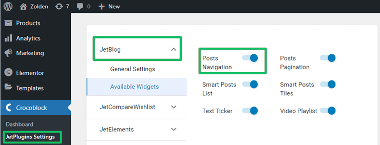
To activate the Posts Navigation widget, log into your WordPress dashboard, navigate to the Crocoblock plugins, and find the JetBlog plugin. Toggle on the Posts Navigation widget to activate it.
Adding the Posts Navigation widget
Open the previously created page/post with posts or pages arranged by the Smart Posts Tiles or Smart Posts List widgets.
This tutorial explains How to add a paging control to the Smart Posts List widget from JetBlog.
For correct work of the Posts Navigation widget, you should have enough published pages to display and slide.
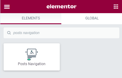
Find the Posts Navigation widget and place it where you want on the page/post with the Smart Posts Tiles or Smart Posts List widgets.
Customization of the Posts Navigation Widget’s Settings
Customization of the Items settings
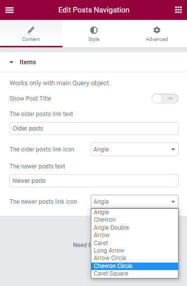
The Item settings block has the following settings:
- Show Post Title toggle to show the title of the next and previous post;
- The older link text and The newer link text fields to type the text to be displayed instead of the Older post and the Newer post texts by default;
- The older posts link icon and The newer posts link icon drop-down menus to choose the view of the arrows, for example, Angle, Chevron, Caret, etc.
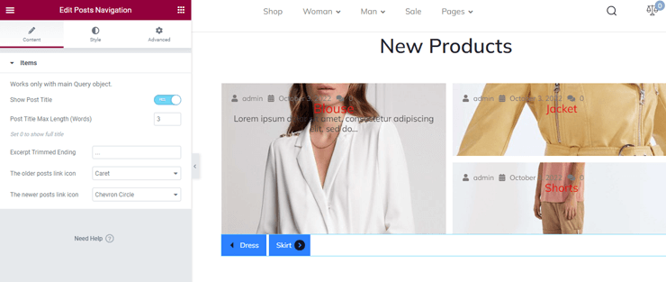
If the Show Post Title toggle is enabled, the following settings are turned on:
- Post Title Max Length (Words) field to specify the number of words shown on the arrow buttons instead of the Older post and the Newer post texts. Setting zero shows the full title.
- Excerpt Trimmed Ending field to type the signs to show the excerpt ending instead of the “ … “ (ellipsis) by default.
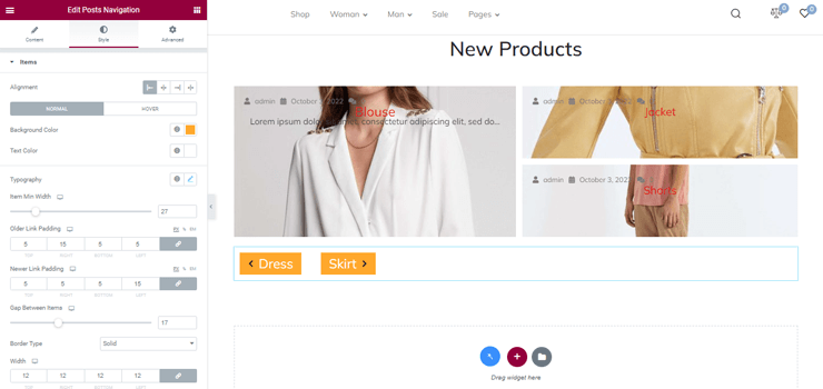
Styling the arrows buttons
To style the arrows button, navigate to the Style tab, unroll it, and customize the following settings:
- Alignment settings to choose the position of the arrow buttons: Left, Center, Right, and Justify.
- Background Color and Text Color to choose a custom or standard color for the appropriate settings.
- Typography to customize the settings referring to the text, in particular Fonts Family, Size (responsive), Weight, Transform (drop-down menu), Style (drop-down menu), Decoration (drop-down menu), Line-Height (toggle and field) to type the appropriate option in pixels or percentage (responsive), Letter Spacing toggle and field (responsive setting), and Words Spacing toggle and field (responsive setting).
- Item Min Width toggle and field to type the item’s minimal width in pixels or percentages (responsive).
- Older Link Padding and Newer Link Padding fields to type the padding options for the order and newer links in pixels or percentages (responsive).
- Gap Between Items toggle to choose the gap distance in pixels between the buttons (responsive).
- Border Type drop-down menu to choose the buttons border type from the None, Solid, Double, Dotted, Dashed, and Groove options.
- Width fields specify the buttons’ width in pixels or percentages (responsive).
- Color to choose a custom or standard color for the border.
- Border Radius fields specify the padding buttons’ borders radii in pixels or percentages.
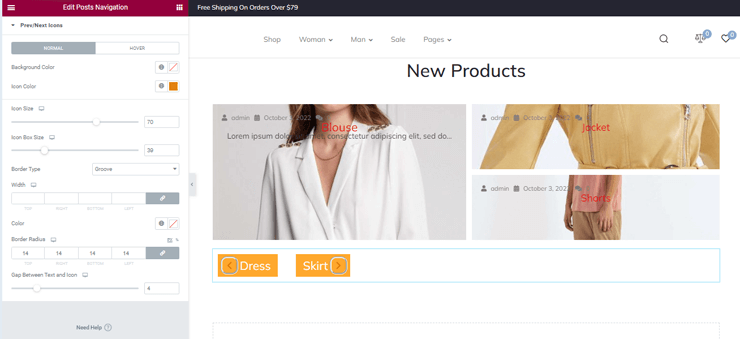
Styling the icons
To style the icons, navigate to the second group of the Style settings 一 Prev/Next Icons settings. Unroll it and customize the following settings:
- Background Color and Icon Color to choose the appropriate colors or take the standard one.
- Icon Size and Icon Box Size toggles and fields to specify the appropriate sizes in pixels or percentages (both are responsive).
- The Border Type drop-down menu chooses the icon border type from the options: None, Solid, Double, Dotted, Dashed, and Groove.
- Width fields to specify the four options (left, right, top, and bottom) for the icon width (responsive).
- Color to choose the icon border color or take the standard one.
- Border Radius fields specify the icon’s four radii borders in pixels or percentages (responsive).
- Gap Between Text and Icon toggle to specify the distance in pixels or percentage between the text and icon (responsive).
That’s all about the Posts Navigation widget’s settings.