Hamburger Menu Block Overview
This tutorial reveals the Hamburger Menu block settings that become available after installing the JetMenu WordPress plugin.
JetMenu is a plugin that enables the creation of a hamburger menu in the Gutenberg editor. With its feature, one can add the relevant content to a menu using corresponding blocks and style it as needed.
You can proceed to the JetMenu Demo with Gutenberg Blocks and see the Mega Menu and Hamburger Menu blocks in action. To read about the Mega Menu settings, navigate to Mega Menu Block Overview.
Menu Creation
Before adding a Hamburger Menu block, one should create a menu in the WordPress Dashboard > Appearance > Menus directory. More information about mega menu creation can be found in the How to Create a Mega Menu in Elementor tutorial.
Adding Hamburger Menu Block to Header
To check the Hamburger Menu block settings, one should add it to the header in the Gutenberg editor. For instance, it can be done with the JetThemeCore plugin.
To do so, one should proceed to the WordPress Dashboard > Crocoblock > Theme Builder tab, choose the header to which the Hamburger Menu will be applied, click the three dots, and then hit the “Edit content” button.
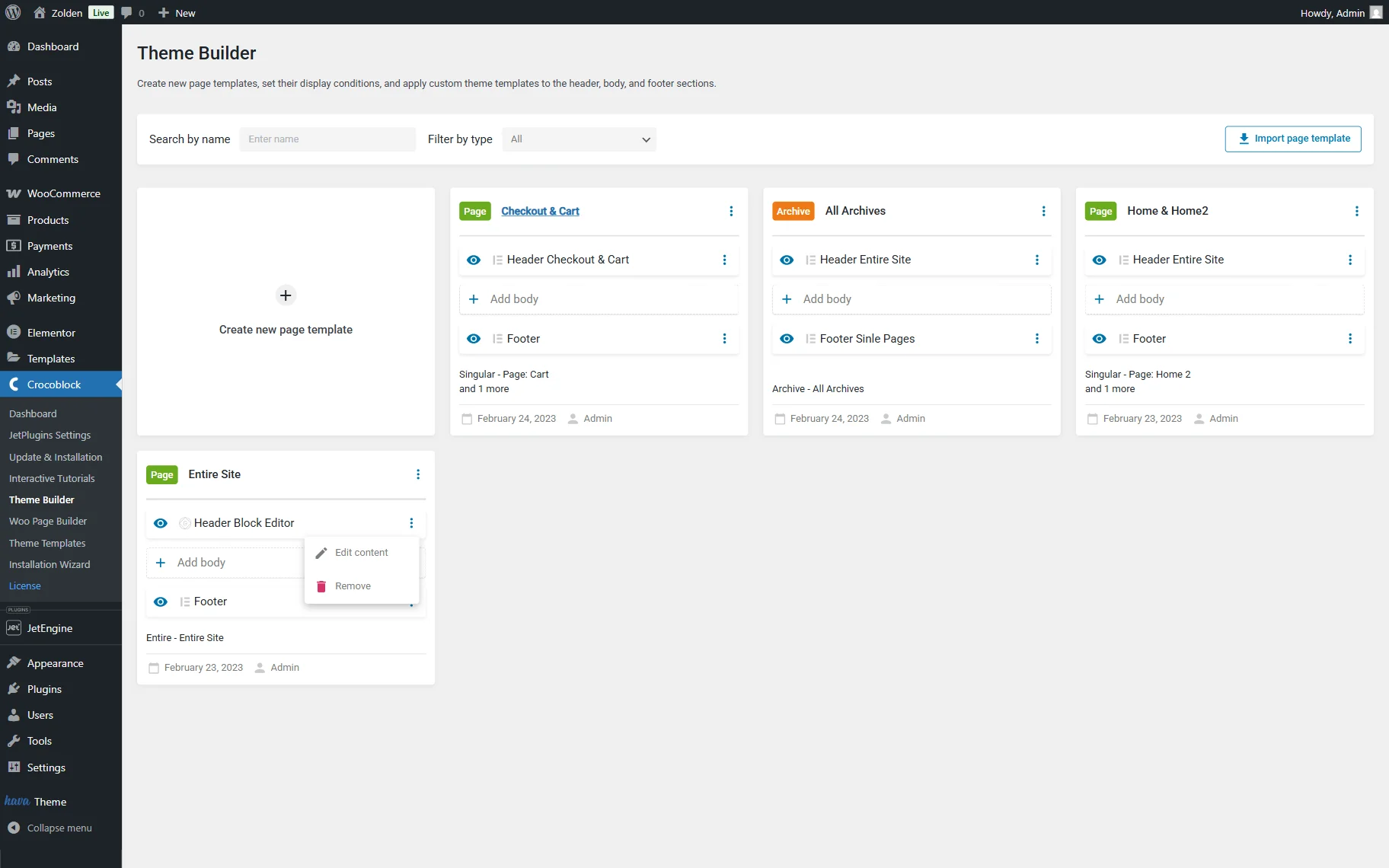
Once the WordPress block editor is open, one should add the Hamburger Menu block to the header.
Such settings are available in the Options tab:
- MENU — the menu that will be displayed;
- MENU FOR MOBILE DEVICE — the menu that will be displayed on mobile devices. The same menu as for the previous field can be used, or a menu for the mobile view specifically can be built;
- LAYOUT — a layout of the menu. Among the options: “Slide Out,” “Dropdown,” and “Push.” If the first option is selected, the menu slides out from the right or left side of the screen (according to the further settings), and the background darkens. If one selects this option, the “Default,” “Fixed to top-left screen corner,” or “Fixed to top-left screen corner” TOGGLE POSITION can be set;
- CONTAINER POSITION — the menu container position (“Right” or “Left”);
- SUB MENU TRIGGER — the submenu trigger (“Click” or “Hover”);
- TRIGGER ELEMENT — the element that triggers the menu (“Item” or “Sub Icon”);
- SHOW SUB MENU LAYOUT — the “Slide In” or “Dropdown” layout;
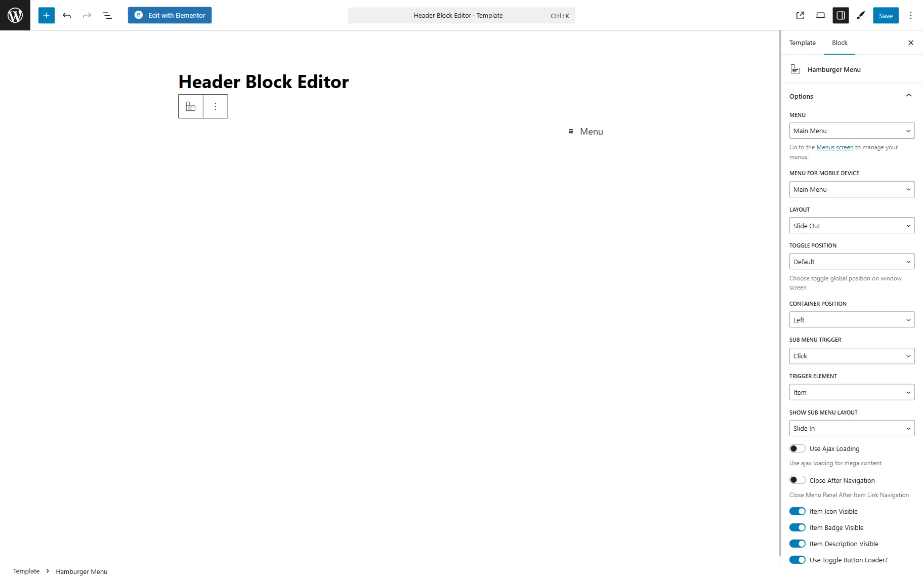
- Use Ajax Loading — a toggle that, if enabled, loads the menu using AJAX;
- Close After Navigation — a toggle that, if enabled, closes the menu container after clicking the item link;
- Item Icon Visible — a toggle that, if enabled, makes an item icon visible. The icon itself can be customized in the WordPress Dashboard > Appearance > Menus directory by clicking the “Settings” button near the needed menu item;
- Item Badge Visible — a toggle that, if enabled, makes an item badge visible. The icon itself can be customized in the WordPress Dashboard > Appearance > Menus directory by clicking the “Settings” button near the needed menu item;
- Item Description Visible — a toggle that, if enabled, makes an item description visible. The icon itself can be customized in the WordPress Dashboard > Appearance > Menus directory by clicking the “Settings” button near the needed menu item;
- Use Toggle Button Loader? — a toggle that, if enabled, adds the loader circle if the menu cannot be opened immediately for some reason (bad internet connection, for example);
- LOADER COLOR — a field that appears only if the previous toggle is activated. If enabled, one can select the loader color;
- Use Breadcrumbs? — a toggle that, if enabled, shows users their path through the menu;
- BREADCRUMBS PATH — a breadcrumbs path view. One can pick the “Full” or “Minimum” option to show the full user’s path or only one previous menu item.
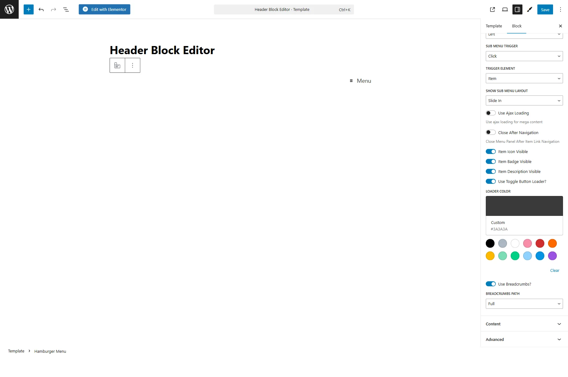
In the Content tab, such settings are presented:
- TOGGLE TEXT — the text that will be placed near the hamburger icon;
- BACK TEXT — the text that will be displayed near the closed icon.
Here, one can also select the Toggle Closed State Icon, Toggle Opened State Icon, Container Close Icon, Container Back Icon, Submenu Icon, Submenu Opened Icon, and Breadcrumbs Icon.
The Advanced settings tab contains one field:
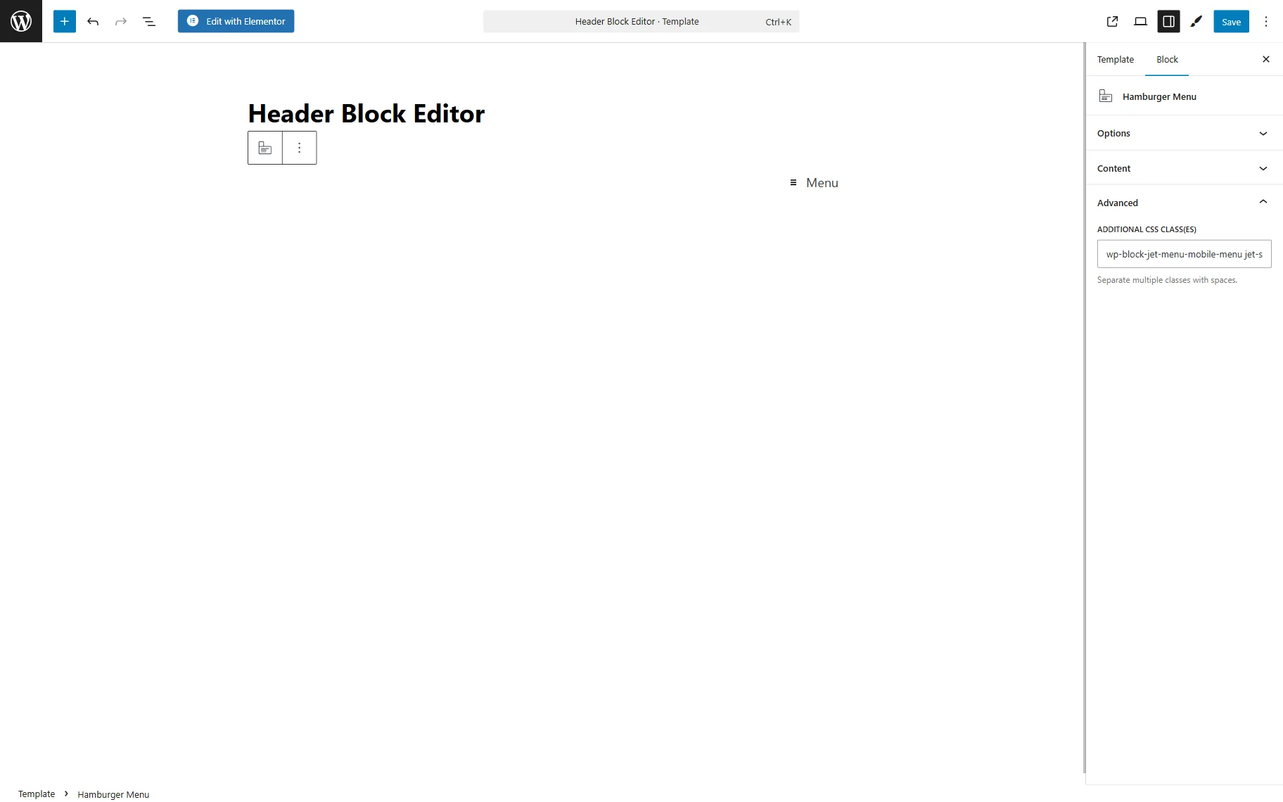
- ADDITIONAL CSS CLASS(ES) — a field that allows adding CSS classes to the block.
With the JetStyleManager plugin, one can customize the appearance of the Hamburger Menu block.
Then, the changes in the header should be saved by clicking the “Save” button.
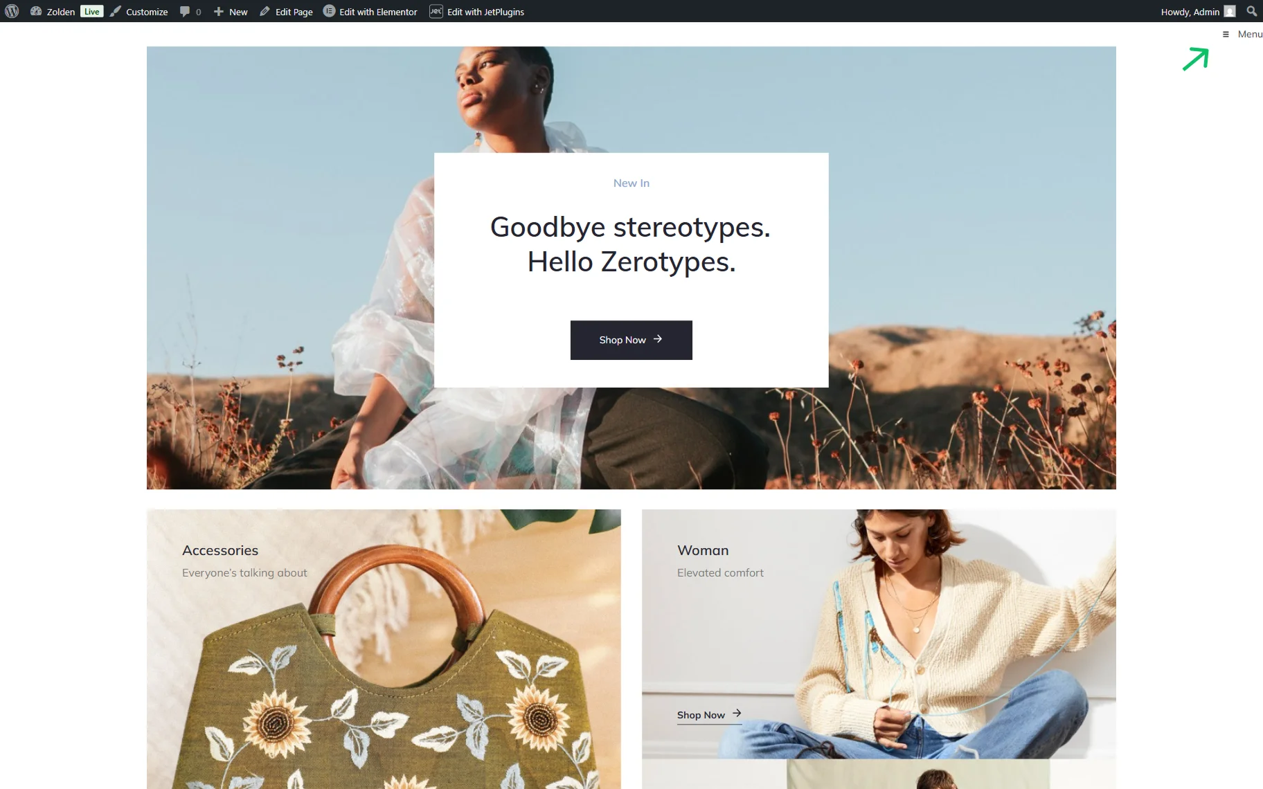
Hamburger Menu on the Front End
After the header is saved, the result can be checked on the page where the hamburger menu is placed.
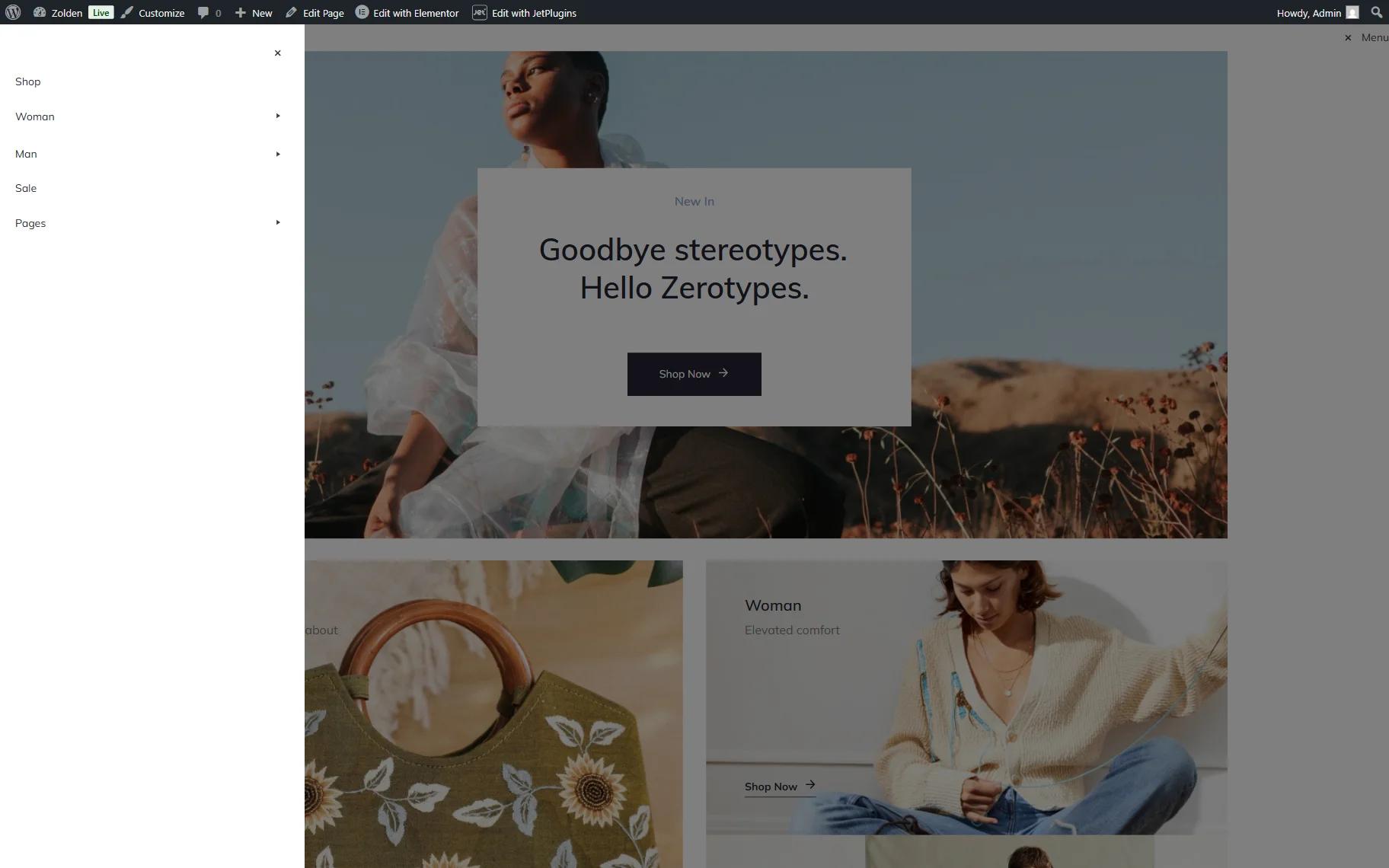
To open the menu, users can press the hamburger icon in the header.
They can also open the submenus if present.
That’s all about the Hamburger Menu block and its settings, which are available with the JetMenu plugin for WordPress.