Mega Menu Widget/Block Overview
In this overview, the Mega Menu widget/block settings will be described.
The Mega Menu widget/block is intended to display a previously developed menu; in action, this block/widget can be observed on the Mega Menu Widget and JetMenu Demo with Gutenberg Blocks demo pages.
Additionally, the How to Create a Mega Menu guide can be checked to learn how to prepare the mega menu and place it in the website’s header.
Mega Menu Widget Settings
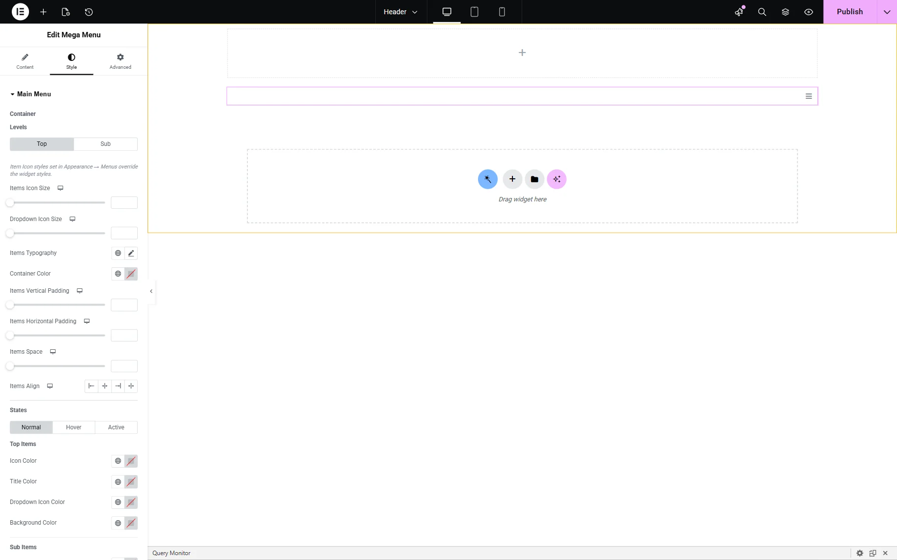
The widget can be added on a page as any other widget in Elementor 一 by finding the Mega Menu widget in the search bar and dragging and dropping it where needed.
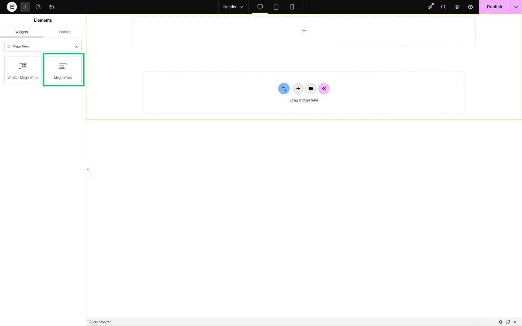
After inserting the widget, the Layout block of the Content settings will be unrolled. Here, the menu will not be displayed on the page until it is selected in the corresponding drop-down list.
Layout settings
The following fields are available:
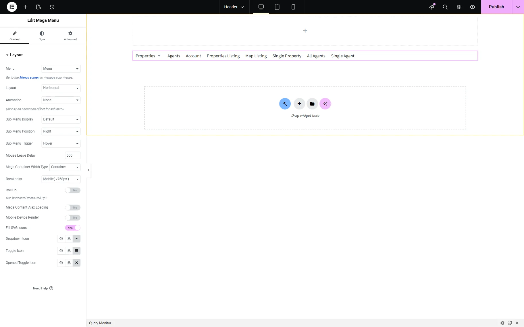
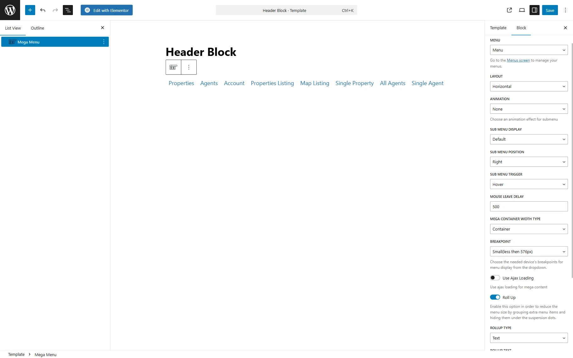
- Menu — a drop-down to select which WordPress menu to display in the Mega Menu;
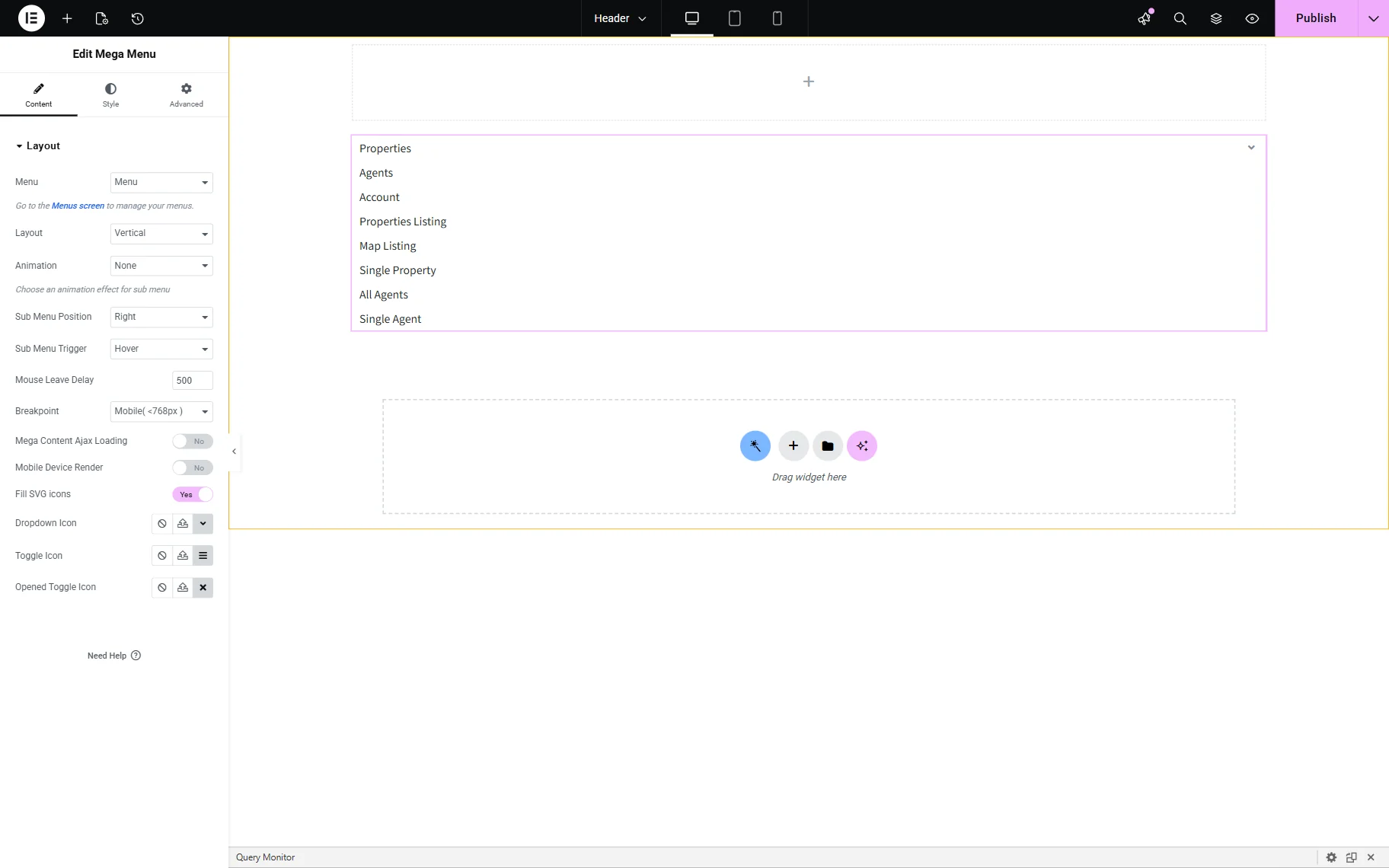
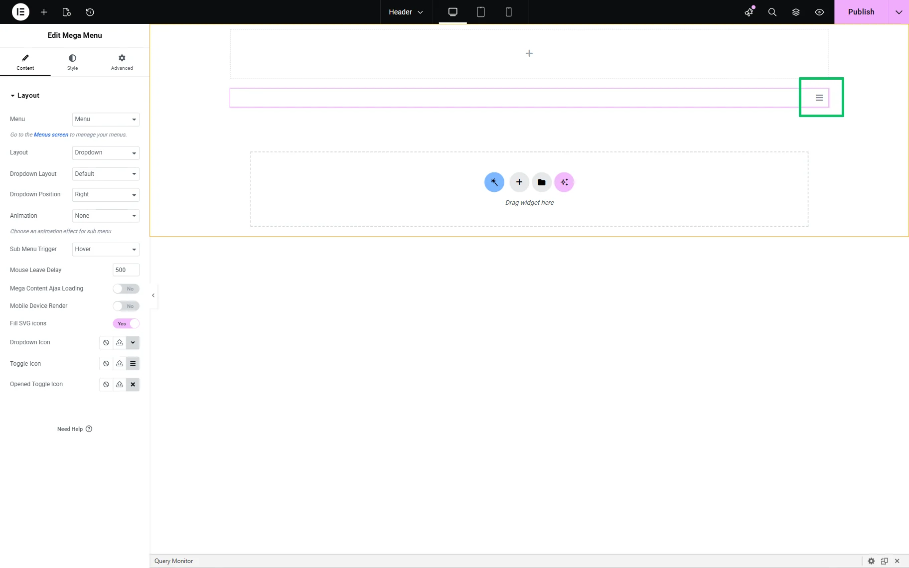
- Layout — a drop-down to select the menu view:
- Horizontal — displays the menu items side by side;
- Vertical — stacks menu items vertically;
- Dropdown — displays a “hamburger” icon that allows users to expand and view the submenu items. Also, it activates the Dropdown Layout and Dropdown Position options.
- Animation — a drop-down that is available if the “Horizontal” or “Vertical” options are set in the Layout drop-down field. The control is intended to set the animation style when submenus appear (“None” or “Fade”);
- Submenu Display — is available if the “Horizontal” option is set in the Layout drop-down field. The drop-down list is intended to set the way to display a submenu (“Default” or “Accordion”). If the “Default” option is set, the Submenu Position drop-down will show the “Right” or “Left” options;
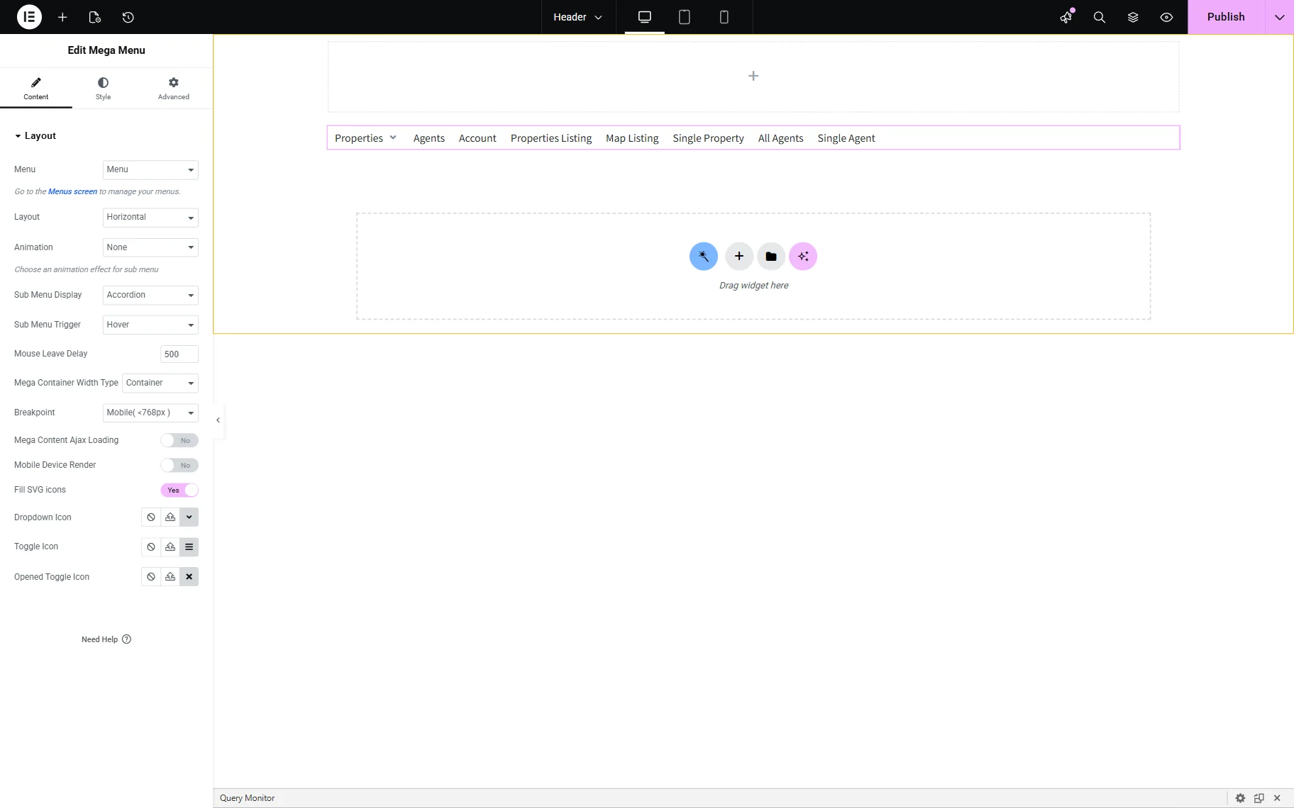
- Sub Menu Trigger — a drop-down list to specify which user interaction opens the submenu (“Hover” or “Click”). If the “Click” option is set, the next fields are active:
- Submenu Target — sets the “Item” or “SubIcon”;
- Sub Menu Close Behavior — defines how the submenu closes in the click mode: “On Mouse Leave” or “On Click Outside”;
- Mouse Leave Delay — a field to insert a delay time to close the submenu after the cursor exits the menu, depending on the number of milliseconds set (“500” is the default);
- Mega Container Width Type — a drop-down list to define how the width of the mega menu container is calculated. The following options are presented:
- Container — an option that allows the mega menu to match the width of the main page container;
- Selector — an option that adds a Custom selector to determine the width;
- Items — an option that allows the mega menu to match the combined width of the parent menu items;
- Breakpoint — a drop-down list to set the screen width (in pixels) at which the Mega Menu switches from desktop to tablet or mobile layout (“None”, “Tablet (<1025px)”, or “Mobile (<768px)” options);
- Roll Up — a toggle appearing if the “Horizontal” Layout and “Default” Submenu Display options are activated. The toggle is intended to prevent horizontal overflow by grouping excess items. If enabled, it activates the RollUp Type — a drop-down list to choose between “Text” and “Icon” to display the grouped item. In turn, depending on the specified option, the RollUp text or RollUp Icon field will be shown;
- Mega Content Ajax Loading — a toggle that, if enabled, loads content only when the menu is interacted with. The setting can be useful for optimizing large menus;
- Mobile Device Render — a toggle that activates the Mobile Menu block of the Content settings for customizing the menu on mobile devices;
- Fill SVG Icons — a toggle that ensures SVG icons adopt the site’s color styles;
- Dropdown Icon, Toggle Icon, Opened Toggle Icon — fields to set icons by uploading SVG files or selecting from the Icon Library.
Mobile Menu settings
This block of the Content settings is available if the Mobile Device Render toggle of the Layout settings is enabled.
It contains such options:
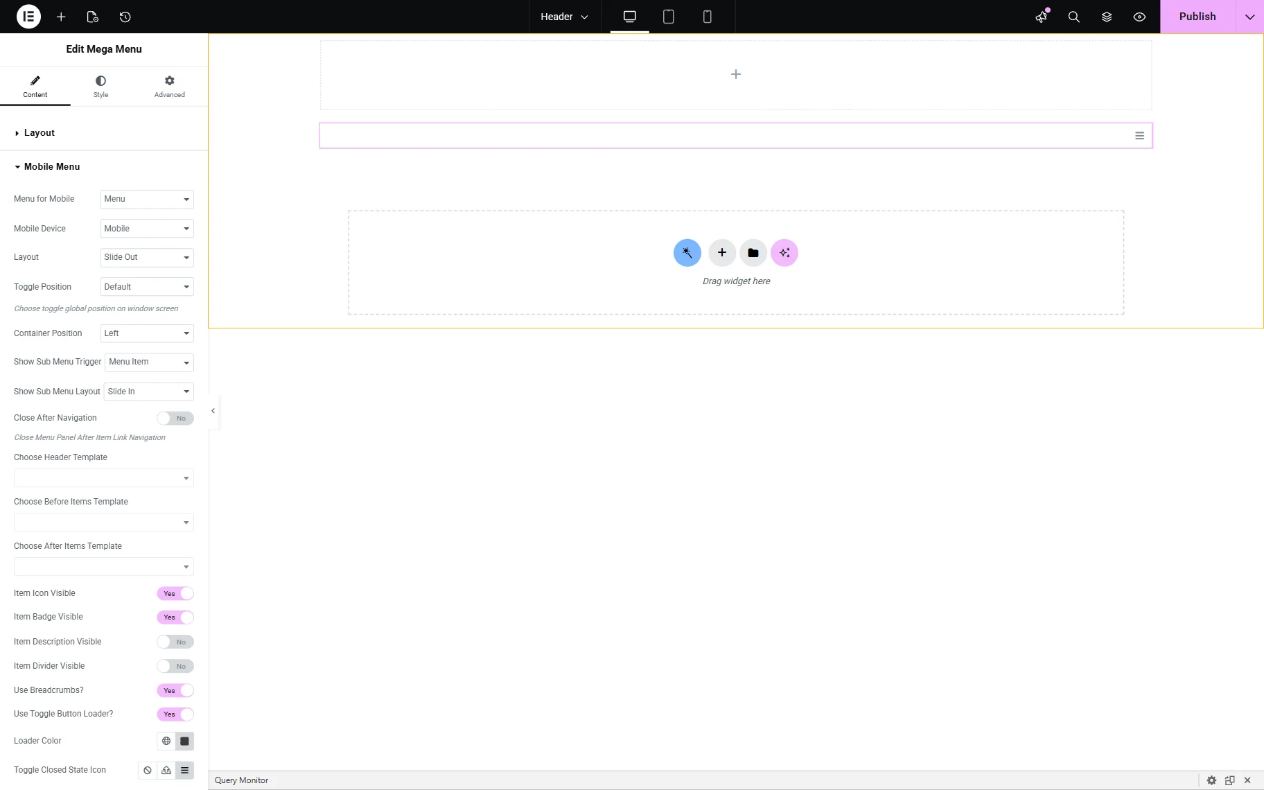
- Menu for Mobile — a drop-down to select which WordPress menu to display on mobile devices;
- Mobile Device — a drop-down list to choose if the menu will be shown on only mobile devices, or mobile and tablet devices;
- Layout — a drop-down list to select how the menu appears (“Slide Out”, “Dropdown”, “Push”);
- Toggle Position — controls the position (top-left or top-right) of the menu toggle (“hamburger” icon);
- Container Position — defines where the entire menu panel slides in from (“Left” or “Right”);
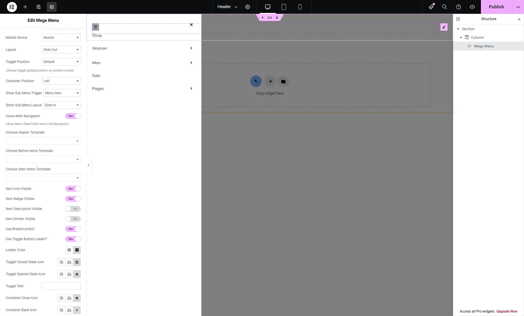
- Show Sub Menu Trigger — defines how users access submenus (“Menu Item” or “Sub Marker”);
- Show Sub Menu Layout — defines how submenus are animated (“Slide In” or “Dropdown”);
- Close After Navigation — a toggle that, if enabled, causes the menu to close automatically after a link is clicked;
- Choose Header Template — a drop-down list that allows selecting a saved template (e.g., logo/header info) to display at the top of the mobile menu;
- Choose Before Items Template — a drop-down list to select a saved template before the menu links (e.g., user avatar, CTA button);
- Choose After Items Template — a drop-down list to select a template below the menu items (e.g., social links, footer);
- Item Icon Visible — a toggle that shows icons next to each menu item (if defined in the menu settings);
- Item Badge Visible — displays menu item badges (if defined in the menu settings);
- Item Description Visible — shows brief descriptions under menu items (if defined in the menu settings);
- Item Divider Visible — displays a line between items for visual separation;
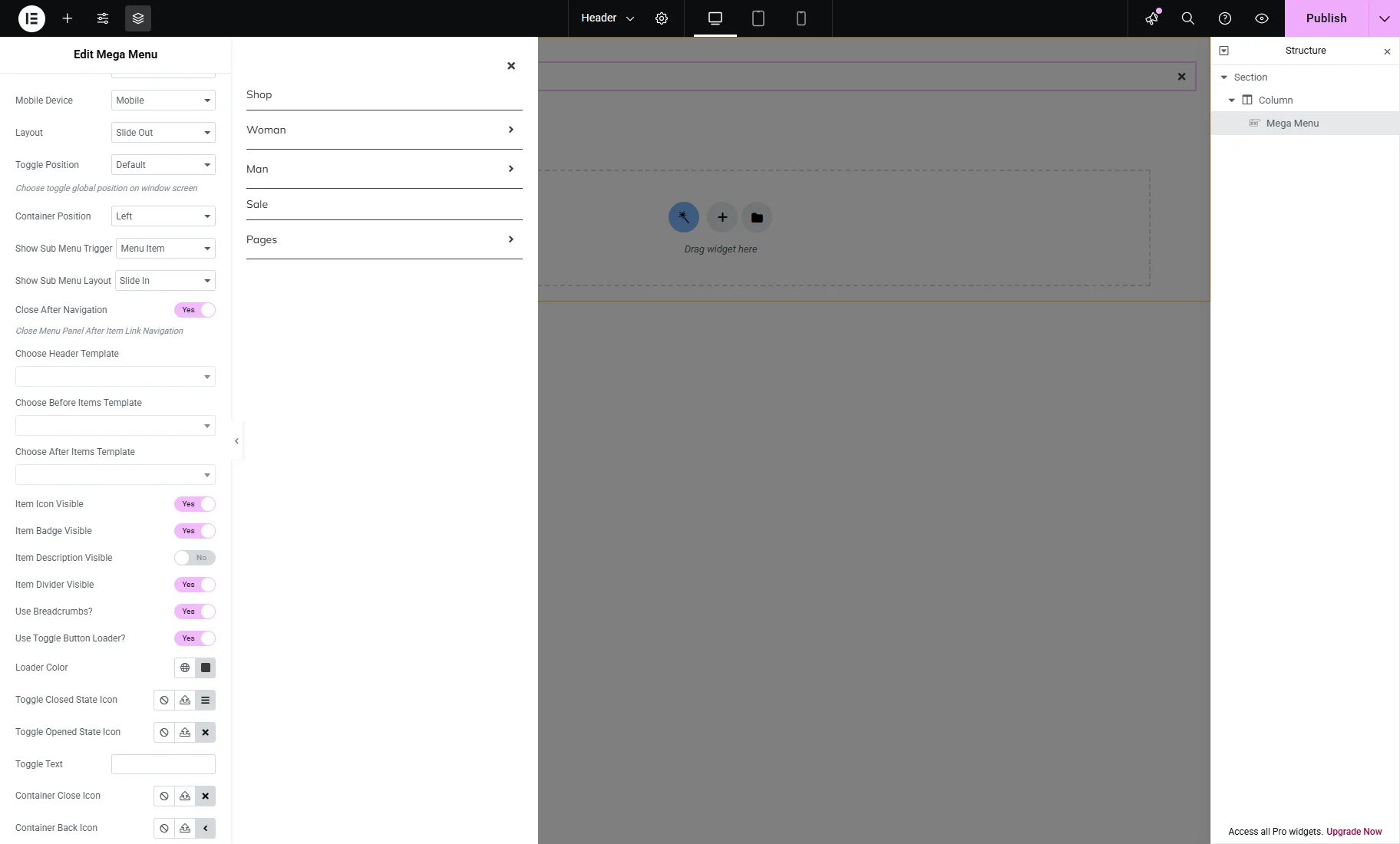
- Use Breadcrumbs? — adds a breadcrumb navigation inside the menu (e.g., Home > Products > Shoes);
- Use Toggle Button Loader? — a toggle that, if enabled, shows a loading spinner when the menu is opening/closing;
- Loader Color — a field to select a needed loader color among the standard and custom ones;
- Toggle Closed State Icon and Toggle Opened State Icon — fields to set the needed icon for the corresponding toggles (“None,” “Upload SVG,” and select from the “Icon Library’);
- Toggle Text — a field to display the needed text on the toggle;
- Container Close Icon and Container Back Icon fields to set the needed icon for the corresponding toggles (“None,” “Upload SVG,” and select from the “Icon Library’);
- Back Text — a field to insert the corresponding text;
- Submenu Icon and Breadcrumbs Divider Icon — fields to set the needed icon for the corresponding submenus(“None,” “Upload SVG,” and select from the “Icon Library’),
Style settings
The Style settings tab is presented by the Main Menu, Dropdown, and Mobile blocks of settings. The Mobile block is added if the Mobile Device Render toggle of the Layout settings is enabled.
Here, the Icons, Typography, Padding, Space, Alignment, Colors, Background, etc., settings can be customized.
Advanced settings
The Advanced settings tab is presented by the Layout, Motion Effects, Transform, Background, Borders, Masc, Attribute, Custom CSS, and other groups of settings intended to customize Margins, Paddings, Width, Position, and others.
Mega Menu Block Settings
The block can be added on a page as any other widget in the Block editor 一 by finding the Mega Menu block in the search bar and dragging and dropping it where needed.
The Mega Menu block’s General settings are the same as for the widget’s Layout settings.
That’s all about the Mega Menu widget/block settings that become available after installing the JetMenu WordPress plugin.