How to Display Content in the Classic Accordion Widget
Look through this tutorial in order to learn more about displaying content using the Classic Accordion widget.
Look through this tutorial in order to learn more about displaying content using the Classic Accordion widget.
How to Use Classic Accordion Widget
Let’s open the page where you want to add the Classic Accordion widget for editing with the Elementor editor. Once you’ve done so, feel free to follow the guide below to learn how to use it and fill it up with content.
Drag and drop the Classic Accordion widget from the elements panel in Elementor. Also, you can insert a .json file from the dummy-data folder. In case you have the JetThemeCore plugin, you can add the accordion template from the Magic Button library, located in Sections > Accordion block.
Now, in the editor, click the first item and start adding content to it.
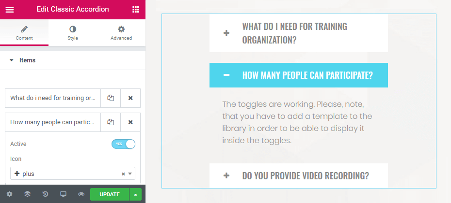
If you toggle to the “yes” Active option, the content will be displayed permanently. Disable it if you want the user to click the item in order to unravel the content.
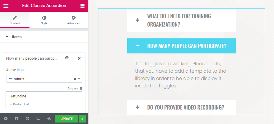
Select icons if needed and enter the label title. As you can see, there is a Dynamic option so that you can pull the title of the label from the custom fields and meta boxes in case you’ve got any dynamic content added with JetEngine and available for the template where the Classic Accordion widget is added.
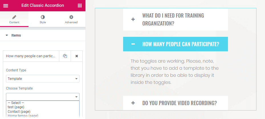
The next thing you should do is choose the content type. If you need to add simple text content, select Editor from the dropdown. But the coolest thing is that you can alternatively choose a template that you have created previously to be displayed, so you’re not actually limited by the content type. Any content from the template you’ve got will be displayed in the accordion block. Select Template option in the Content Type dropdown and select the needed template from the list (if you haven’t got any templates yet, make sure to create one, and only then select it).
Customize the other accordion block items, and add as many as you need to have in your accordion.
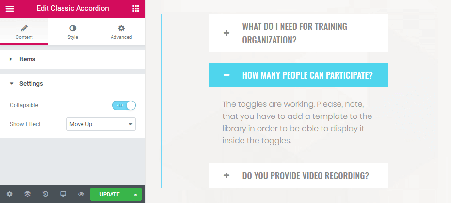
Let’s switch to the Settings tab. Here you can enable Collapsible option, which allows leaving the item unwrapped. Also, select the Show Effect to apply it when the content opens up or closes.
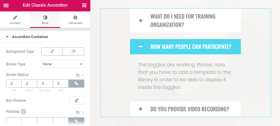
How to Style Up the Accordion
As usual, in Elementor, you can style each element of the section. You can adjust the colors of the accordion container, toggle, toggle fields, and the content of the toggle.
Note that you can adjust the style of the accordion itself as well as edit the templates which you’ve selected to be shown inside the accordion blocks. Just click the Edit Template button shown on top of the template in the accordion block, and you’ll be redirected to the page of the particular template, where you can make changes.
Also, proceed to Advanced settings and customize margin, padding values, responsiveness, etc.
Hope this tutorial makes it clear, and now you can go ahead with displaying content using the Classic Accordion widget.