People buy from people. Whatever product or service you sell, showing the team behind the whole process has always been good practice.
You can have a lot of gems in your team – from an SMM manager to a developer, from a junior to a senior. Someone draws well, somebody likes active sports, and someone brings home-baked goodies to the office. Whatever the case, show your customers that you are real people, and blend the line between you and them because it can help you gain more trust for your brand.
This article will show some attention-worthy team page examples you can use as inspiration.
Table of Contents
- Why Create a Meet the Team Page
- What You Should Add to the Team Page
- Top 10 Meet the Team Page Examples
- FAQ
- Last Words
Why Create a Meet the Team Page
This page’s main task is to show your business’s face. Because people tend to trust those they know. For the same reason, you should include a support agent’s photo when live chatting.
Secondly, you show potential employees with whom they will work and manage to build trust at several levels at once.
In addition, it is beneficial not just to show the name and position of a team member. For example, write which employee is a Harry Potter fan and who has already climbed Mount Everest twice. Such small details increase brand loyalty.
What You Should Add to the Team Page
You can use different styles and ideas to create a team page. For example, make it minimalistic, use different colors and non-trivial structures, and use any design you want.
📚 Read also: 20 Nontrivial Web Design Inspiration Sources for Designers
But there are a few things that you should definitely add to the meet our team page.
- All team members’ headshots. Show that you are proud and value every employee.
- Name and job description. Let your customers know who exactly helps the brand to function and evolve.
- CV upload/contact button. Some people might want to work for you, so give them the opportunity to reach out to you and see whether they make the right fit.
- Social links. You can add a team member’s social media links in case some customers want to befriend/follow them.
Feel free to experiment and add other essential elements. Make your team website page unique and exciting. ✨
If you don’t have much time to design and add various elements, you can use Crocoblock’s ready-made Team Member Widget for Elementor.
With it, you can place the team member block anywhere on the website, add the necessary information, and apply creative hover effects. All this is already in the widget, and you can edit all parameters freely.
Top 10 Meet the Team Page Examples
Lateral
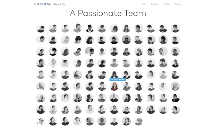
Here you can see an inspiring idea for a page showing all the Lateral development and design team members. The photos are animated and made so that team members “follow” the cursor. The team member’s picture becomes colored once you hover over it, and the others remain black and white.
The animation effect looks fresh and attractive while gamifying the page a bit.
Series Eight
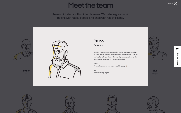
The About Us page design on the Series Eight website certainly draws attention. When you click on each portrait, you see a pop-up with information about the employee. There is general information and specific details: what a person likes and dislikes.
A light background and hand-drawn avatars are a non-standard solution that shows off all employees favorably.
Digital Marmalade
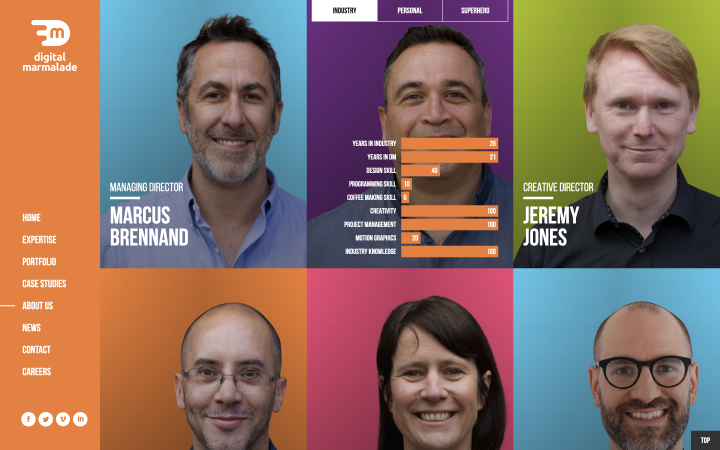
This engaging and bright page’s purpose is to introduce team members and show their position. When you click on Flipbox, you’ll see more information about each person. Moreover, it is organized into tabs – Industry, Personal, and Superhero – each containing different statistics. Such an approach definitely adds interactivity.
The “Industry” tab contains work-related stats. If you click the “Personal” tab, you’ll see extra information about every team member and their childhood photos. And when you click on the “Superhero” tab, you’ll see a funny gif and some info about their superpowers.
MOZ
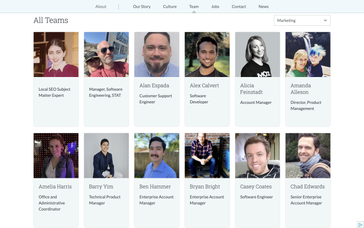
MOZ is a well-known SEO company. They produce educational materials, hold conferences, and more. To manage such a workload, the company employs many specialists. For you not to miss anyone and see who is doing which job, you can pick the needed department in the dropdown select field above the table. The headshot is clickable and leads to the team member page. You can see more information about each employee there.
Crocoblock

The Crocoblock team page is unusual, too. When you go to it, you see photos of all team members broken down by departments and areas of responsibility. But when you hover over any headshot, you see a small animated GIF that helps you better understand each member’s personality and work-associated character.
The page looks interactive.
Atlassian
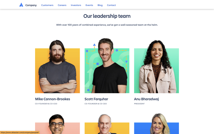
Another well-known company that helps organize workflows is Atlassian. On their About Us page, you will find team members’ photos, names, and positions.
When hovering over the photos, you will see a simple background animation that makes the person stand out. You can find extra information by clicking on the picture.
Rock Kitchen Harris
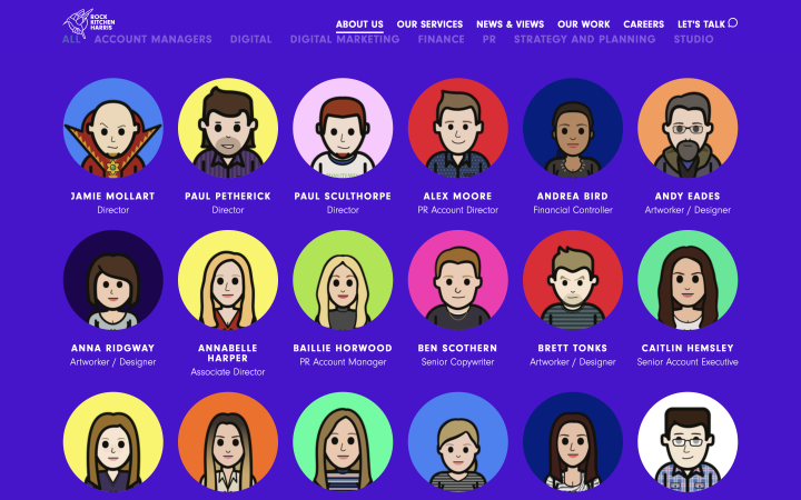
This page stands out from many similar ones because the company decided to move away from using actual photos of employees and created cartoon characters.
Such images look non-standard, well reflect the character and personality of each employee, and look very cool. The background color changes every time you hover over a picture. In addition, they’ve added the ability to sort team members by several departments.
PepsiCo

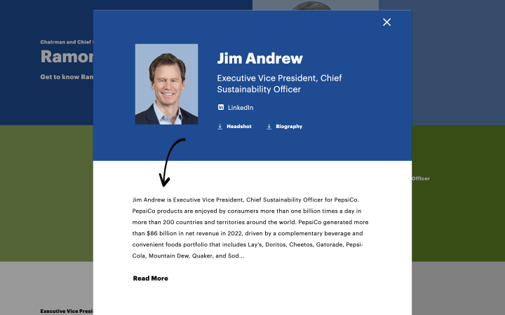
The PepsiCo company page looks simple and colorful, but it does its job well and tells about each team member.
You can also find out more about each employee by clicking their name. A pop-up will appear showing the team member profile, social media, and download links for the headshot and biography. A bright, simple design that makes the PepsiCo page stand out.
Kariz Marketing
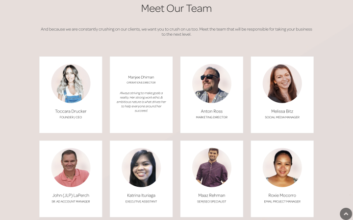
Kariz Marketing’s Meet the Team page also helps you get to know each team member better.
So when you go to the page, you see a photo and each team member’s name. When you hover over a headshot, you’ll see additional information about their working principles.
Humaan
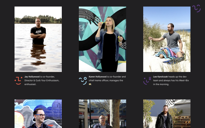
Another interesting page that might inspire you is the Humaan company page. You see employees who look like they are going to a team party. Moreover, all images are animated. This approach reflects exceptional team spirit and makes each team member’s individuality shine.
FAQ
Showing a teammate’s photo and writing their name and position is vital. You can also add information about each: work experience, the most challenging task, hobbies, etc. It will make your page more relatable and engaging.
Yes, you can do it with plugins or widgets like Team Member Widget.
Whatever you can imagine, pursue it. Don’t be afraid to make the page interactive. Add dynamic elements, write specific details about each employee, use creative animations, and show the team in the best light.
Last Words
Meet the Team page helps build more trusting relationships with clients and the team. Clients see who will perform their tasks, and the team sees how much you value each employee.
Don’t worry if the page you’ve created looks too creative. Unless it’s completely unreadable, you should probably rethink some creative choices.
This article will help you find more inspiration and create a stunning company page.
