Minimalistic design is one of the most challenging types, although it seems the other way around. It is necessary to place all the essential functionality using minimum elements while saving space.
In general, minimalistic design is about the skill of working with empty spaces. The ability to concisely place various forms/buttons/text and highlight the most important by space.
Next, we will examine some rules, ideas, and examples of successful minimalistic websites.
Why Should You Consider a Minimalistic Design for the Next Website?
The main advantage of a minimalistic design is its conciseness.
- Simplicity. Let’s imagine that design is one of the ways of communication. The designer conveys his/her idea with the help of symbols and some words. The minimalist website design helps to say the most important things and focus on what really matters without long dialogues and ambiguity.
- Download speed. The following significant difference between a minimalistic design is the site loading speed. Since there are fewer pictures, videos, and other elements, the site loads quickly. Also, a site with such a design displays correctly on different devices.
- This style is ideal for online stores and grocery companies. Because you can show your product and all its benefits without being distracted by unnecessary elements, all attention will be focused on what you are selling.
How to Make Web Design Minimalism Enjoyable?
Minimalism originated many decades ago in architecture. For example, Japanese culture has used minimalist principles in its interior design, clothing, and calligraphy for several centuries. In the 20th century, it became popular in the West as well. So if you’re looking for inspiration for your next minimalist design, look no further than Japan.
In the meantime, we will look at a few principles to help make the minimalist design enjoyable.
- Don’t be afraid of bright colors. You can use bright accents or bright colors on your minimalist website. It doesn’t have to be limited to black and white. You can use 2-3 colors on your site and highlight individual elements.
- Use space to highlight what’s important. White space is the designer’s primary tool when creating a minimalistic website. It can serve to place accents or emphasize some ideas. Try using white space for your thoughts.
- Try different fonts. The font is another tool for creating a minimalist website design. Different letter sizes, slanting, or underlining will help you communicate your point.
- Icons, pictures, and videos reinforce the main idea. A minimalistic design does not mean rejecting pictures, videos, and icons. But they should be concise and not interfere with receiving information. They can serve as a background and confirmation of thought but are not the leading players. Beware of outdated pictures or icons with a lot of elements. Choose something simple.
- Remember functionality and navigation. Sometimes, to create a minimalistic website, designers give up some functionality, for example, placing a too creative or complicated application form on a page. It affects the performance of the site. Don’t design for the sake of visuals. Remember what tasks it should perform and help the user figure it out.
8 Inspirational Examples of Minimalist Website Design
Let’s look at some interesting ideas for minimalistic websites.
Zara
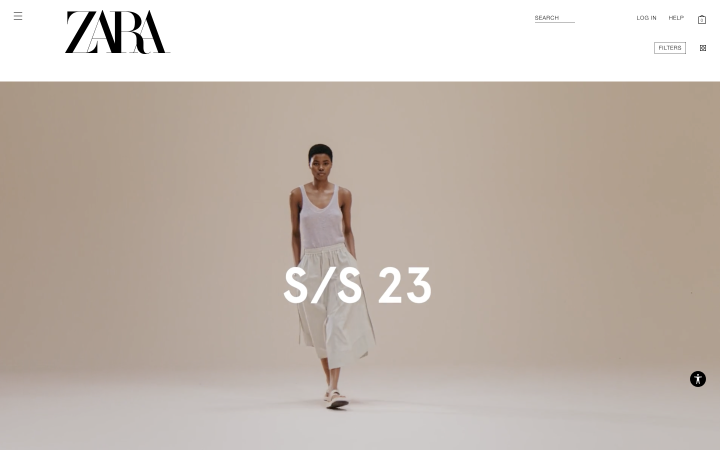
The first example of a website belongs to the well-known company Zara. They posted photos of their models on a white background, thus drawing all attention to the clothes. A convenient slider allows you to scroll through the gallery and see all the details on various photos.
The site is in black and white. Only photographs remain in color.
If you click on the selected clothing model, the user will find a description, sizes, and other details.
Bvlgari
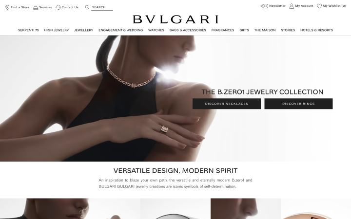
The following brand also makes good use of minimalist design to help the user browse through the products. Colored product images, white background, and easy navigation. Nothing extra that could distract from looking up and choosing goods.
Please note that color photos of goods are also made in calm colors. Also, there are no elements on the site, just for design.
Apple
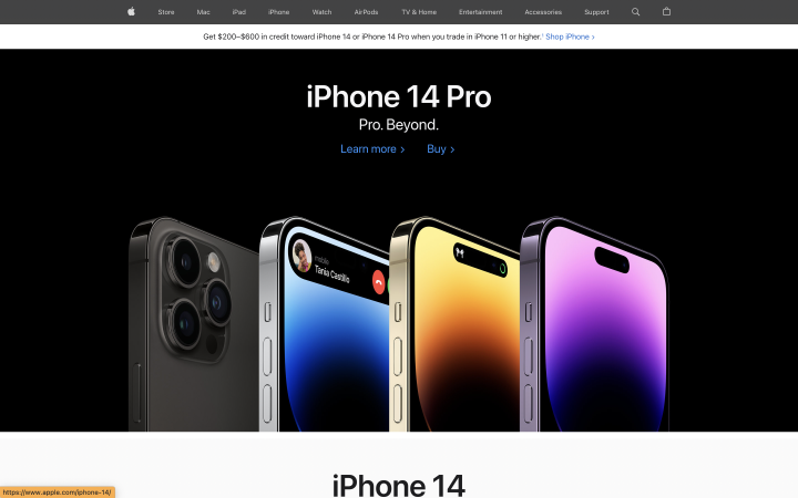
Apple’s website is another interesting example where color accents are placed on the most important things. The Apple website discusses its gadgets and their functionality and shows them from the most interesting perspective.
The site is made in black and white colors, whereas the main one is black. As a result, it makes goods look more expensive. As in the previous version, color accents are made on the company’s products.
Tesla
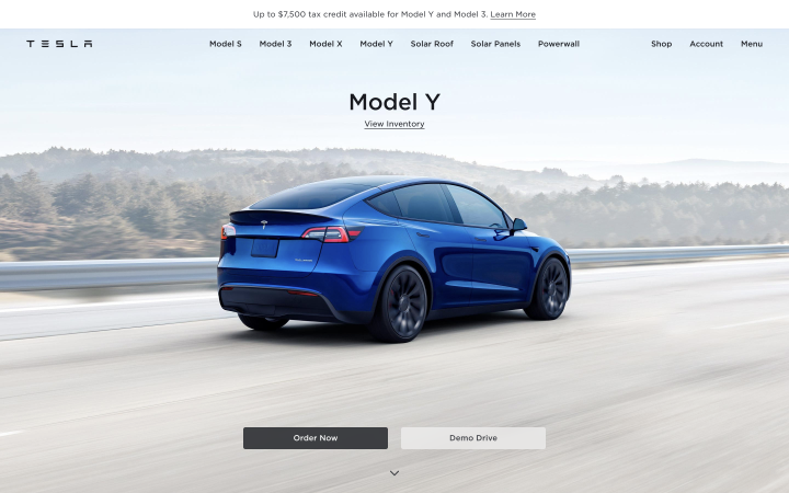
In this example, you see a minimalistic website in color. Bright accents help to see the main product of the company – a car. Navigation is intuitive, and there is nothing extra on it, either.
The site allows you to study the details of each car model or buy it right now.
Sunvest

Web design minimalism does not mean boring and monotonous. In this example, you will find dynamic elements. Different fonts and effects help to learn more about solar energy, its benefits, and the company’s opportunities.
It is an excellent example of how to make something interesting with a small number of elements.
Karnit Melamed
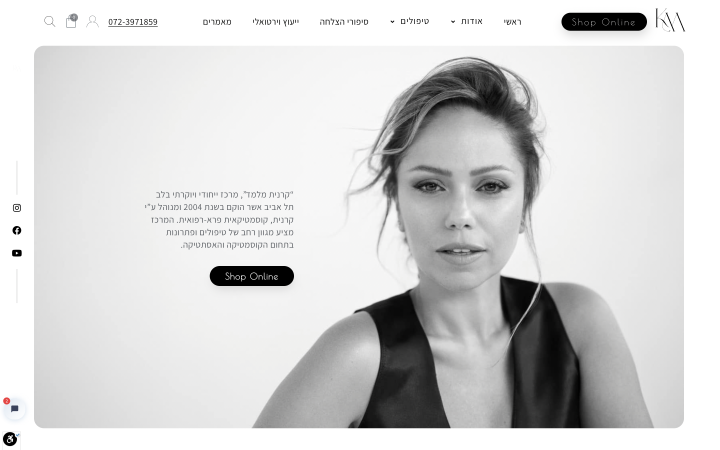
Minimalistic design can be a great help when advertising a personal brand. Here is an example of how this can be done. Post your professional photos, highlight buttons, and tell a story that users will love.
Crown Delta
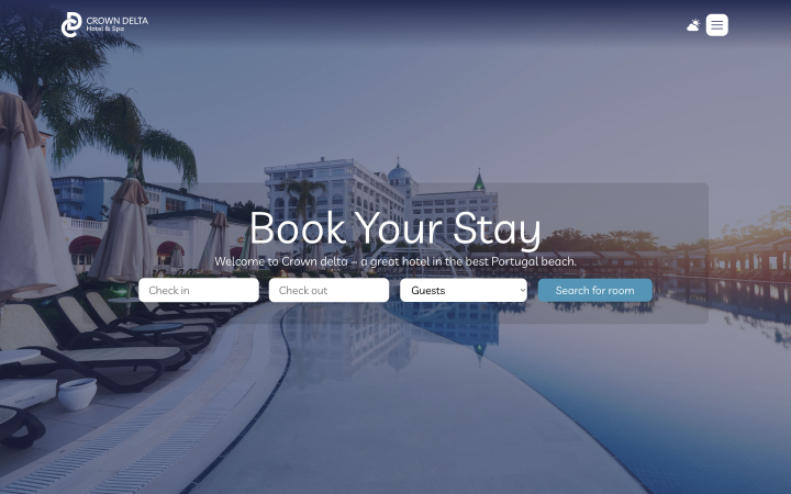
A minimalist design can also be helpful if you’re selling bookable services. In this example, you see a clean website with a beautiful design and the ability to do just one thing – book a room. The minimum number of fields and one button immediately make it clear what is expected from a site visitor.
Anyone who represents some services you must sign up for in advance can have such a website.
Ana Karic
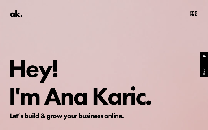
The font plays a central role on the site in this example. Different letter sizes on contrasting backgrounds give an idea of the website owner and her services. In addition to the text of various formats, the site has a small image of the owner herself. Still, all designs and information are generally presented in letters of different sizes.
As you can see, websites with a minimalist design can be absolutely for any goods, services, and products. If you use the right accents, don’t be afraid to experiment and use different techniques.
FAQ
Minimalist web design is concise and straightforward and uses only the necessary elements to convey the vital point.
Consider what information is essential to place on the site. Make sure each word or picture is needed. Remove all unnecessary.
After that, arrange the main elements of the website: buttons and navigation. Highlight accents with color, font, or white space. Review your site again and ask yourself: “Is everything clear? What distracts from the main product, information, or action?” The correct answer is: “Nothing distracts.”
Finally, give your friends a look at your site and ask what elements they think are superfluous.
Yes, this is one of the trends that you can apply. Here is a whole article about trends in design; enjoy it.
Last Words
The minimalist graphic design is bold because those who choose it are not afraid to speak the facts and do not hide mistakes behind many elements.
It is also challenging to create. Because you need to remember about navigation and functionality and give all the essential information while not overloading the website, it is often a difficult task.
But if you cope with it, you will have a website that your customers will like.

